What's new with File Explorer on Windows 11 version 23H2
Windows 11 gets an updated version of File Explorer, and here's everything you need to know about the new changes.
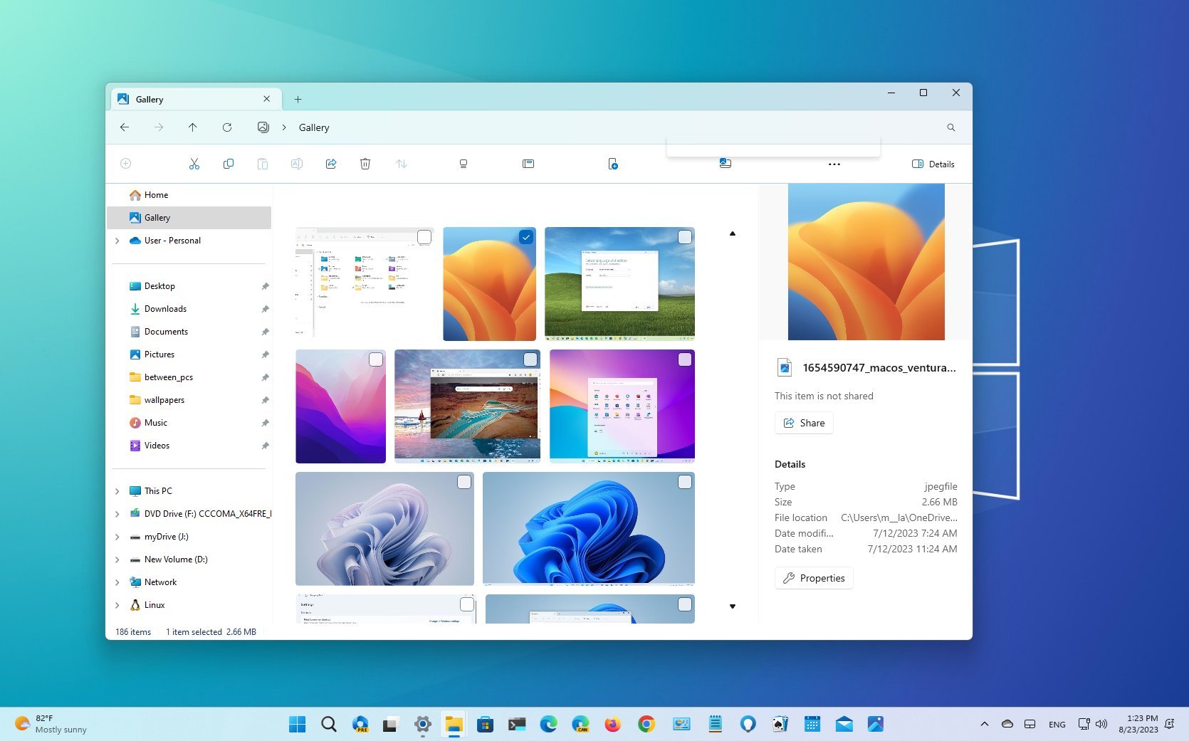
As part of the Windows 11 2023 Update (version 23H2), Microsoft is also making available an updated version of File Explorer that includes a new codebase, visual changes, and new features.
In this new version, Microsoft is updating the codebase of File Explorer using the WinUI 3 from the Windows App SDK (WASDK) and XAML, building a modern file manager but retaining the same familiar look and feel as the legacy version. Microsoft is also updating the header design, rebuilding the "Details" pane, and adding some improvements to the "Share" experience.
Furthermore, the new File Explorer rolls out with a new "Gallery" feature to view and manage your images, and the development team is adding support to open and extract more archival formats (such as RAR and 7-Zip) in addition to Zip files.
This guide will show you the most significant changes and new features coming to File Explorer for the Windows 11 2023 Update.
File Explorer changes with the 2023 Update
As part of the Windows 11 version 23H2, Microsoft is modernizing File Explorer with a new codebase using the WinUI 3 from the Windows App SDK (WASDK) and XAML. However, even though the new version allows the company to continue building new features, the default file manager still retains the familiar interface but with some improvements.
Redesigned header
One of the most significant changes in this release is the new design changes of the header. After updating your device to the new feature update, you will immediately notice that the command bar now appears at the bottom of the address bar with updated buttons.
The refresh button appears next to the navigation controls in the address bar. Also, the address bar removes the green progress bar in favor of a new snipping animation that appears in the tab as you load a new location.
Get the Windows Central Newsletter
All the latest news, reviews, and guides for Windows and Xbox diehards.
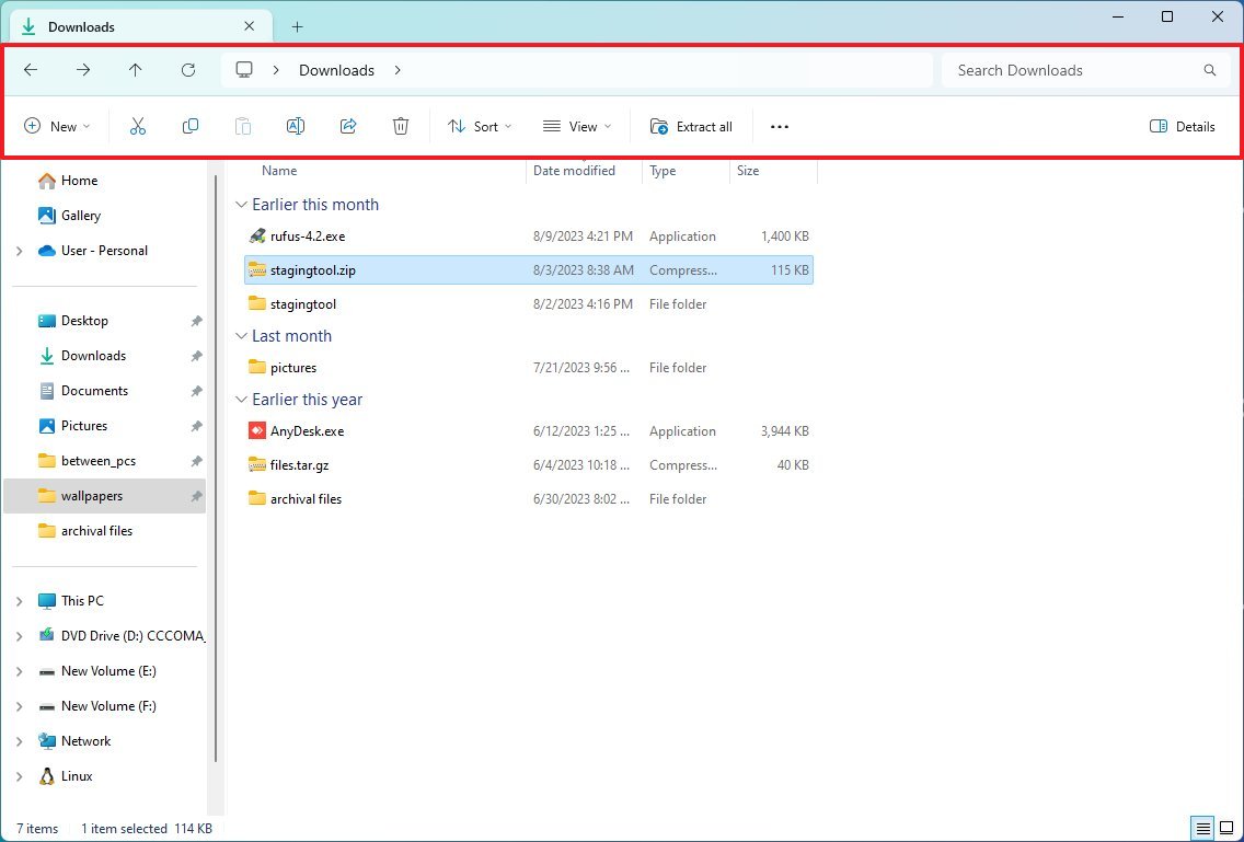
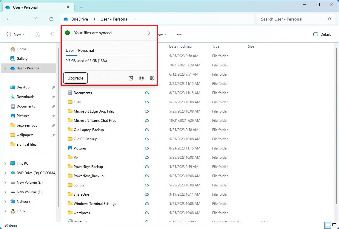
Furthermore, the address bar now shows the sync status for OneDrive files, and as you hover over the OneDrive icon, a new flyout will expand to display storage information.
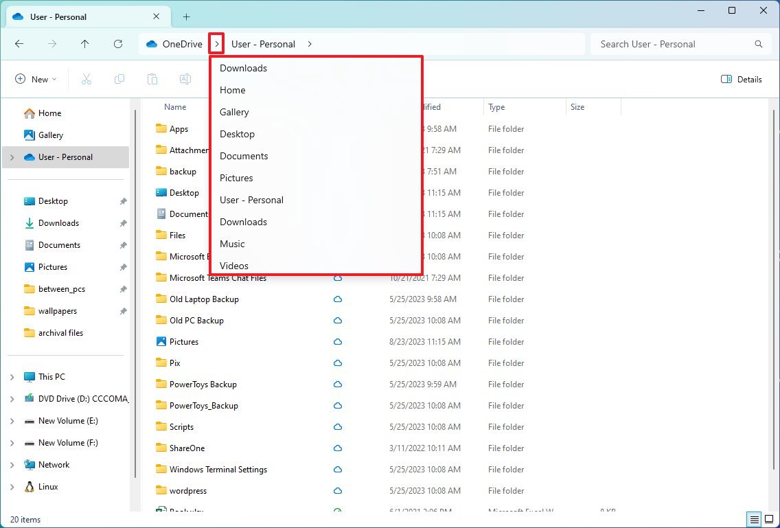
In the path, when you click the chevron button, you'll access an updated flyout design using the modern design style of Windows 11. Also, the address bar and search box now feature rounded corners.
Finally, starting with this feature update, you can now drag tabs out of the window to launch another instance of File Explorer.
New Details pane
The command bar also includes a new button to open the new "Details" pane, which now shows more information and actions for a particular file, folder, or drive.
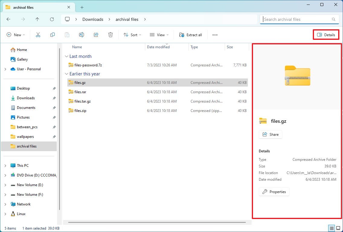
For example, if you select a file, the pane will show different pieces of information, such as type, size, location, and date modified, and actions to share the file or access the file properties.
Home page redesign
The "Home" page is getting a few visual improvements as well. In this release, the development team spent some time updating the page using the WinUI framework, and you'll notice some minor visual changes for the different sections, including "Quick access," "Favorites," and "Recent."
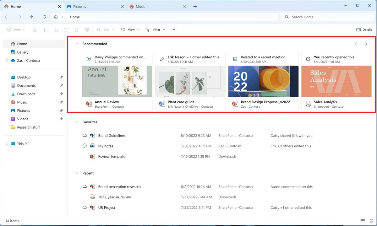
It's important to note that changes in the "Quick access" section are only available for Microsoft accounts. Also, Azure Active Directory (AAD) accounts will get a new carousel with thumbnail previews showing recommendations for files available in the cloud.
New Gallery experience
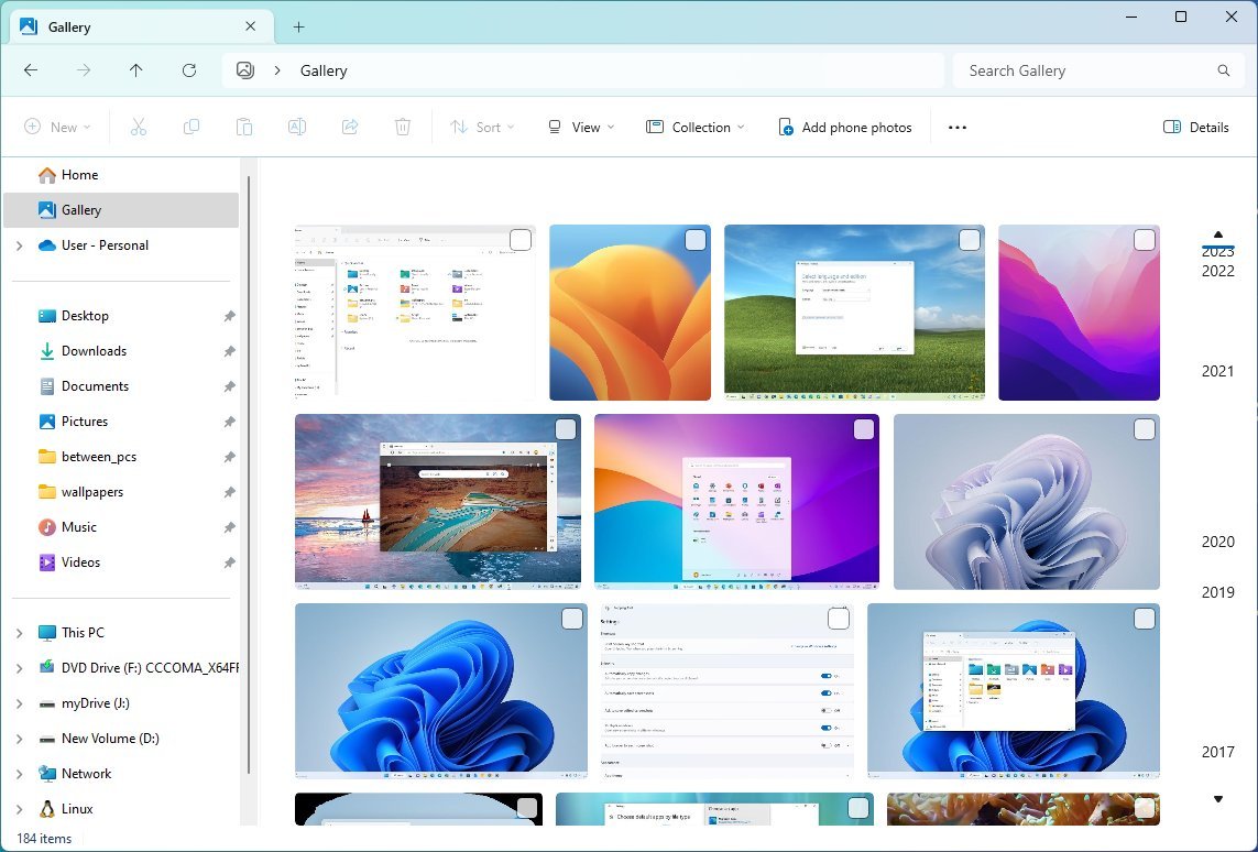
The "Gallery" page on File Explorer is a new experience with an interface similar to the Photos app to view and manage local and cloud images.
The page features different sizes for thumbnail previews (while hiding the file name) with rounded corners and chronological sorting using the right scrollbar.
You can also add and remove folder locations from the "Collection" menu using the "Manage collection" option since the default setting will only show the contents of the "Pictures" folder.
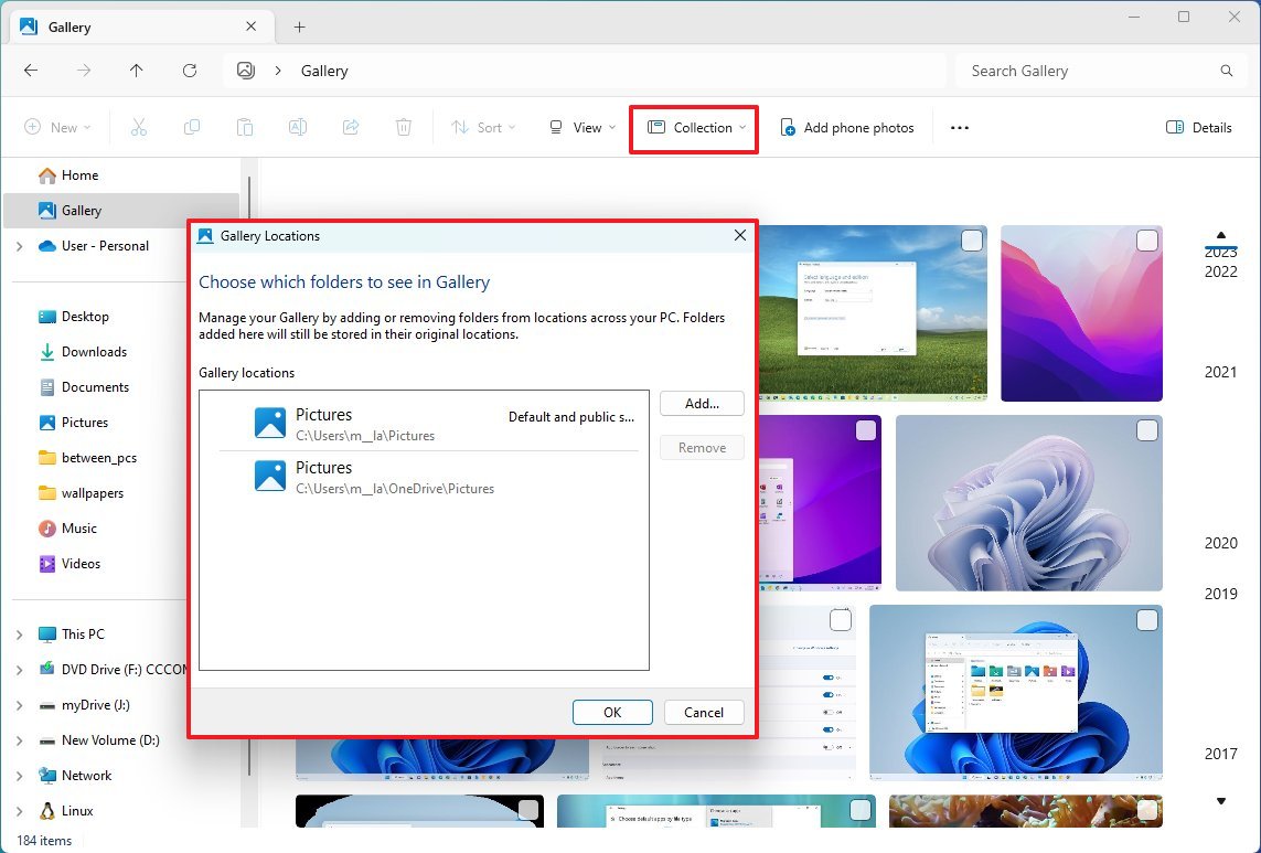
The "Add phone photos" option lets you connect your phone to access your pictures. (You don't need to use this feature if you already have the OneDrive app on your mobile device.)
Share improvements
As part of the file-sharing improvements, the "Share" experience now includes an updated interface, transfer speeds have been improved, and your computers will now appear at the top of the list to make sending files to your own devices easier.
In this release, the development has tweaked the interface design to further align with the design language of Windows 11.
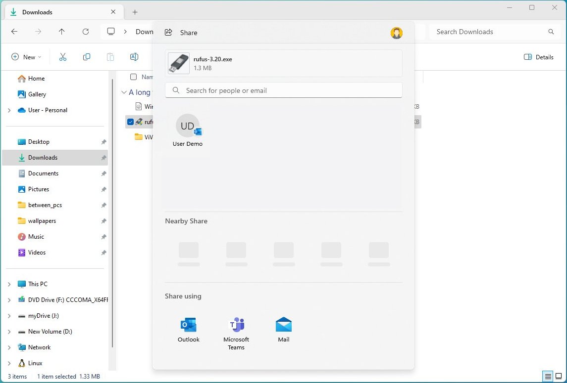
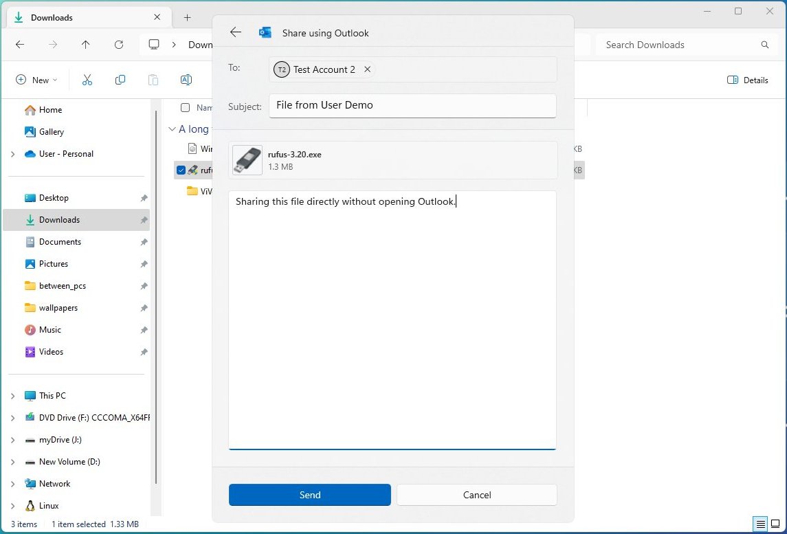
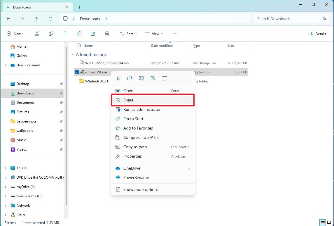
In addition, you can send files through the Outlook app directly from the Share interface, and the right-context menu has been updated to include the "Share" option.
On Windows 11 version 23H2, Microsoft is now using Wi-Fi Direct to improve the transfer speeds of files between devices.
Furthermore, if "Nearby Sharing" is not enabled, the "Share" interface will now show a button instead of a drop-down menu to turn it on, and at the top, there's a new search box to make it easier to find contacts across accounts.
Archival formats support
Although you have been able to open and extract files from compressed folders, this feature was limited to ".zip" formats. However, on version 23H2, Microsoft integrates the "libarchive" open-source project to bring native support for RAR and 7-Zip archival formats.
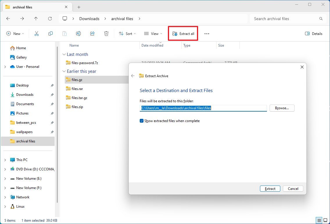
The support will allow you to open and extract many file formats such as ".tar," .tar.gz," ".tar.bz2," ".tar.zst," ".tar.xz," ".tgz," .tbz2," ".tzst," .txz," .rar," and ".7z" from File Explorer using the "Extract all" wizard.
Initially, the support will be available through File Explorer, but the company may bring the support to PowerShell and Command Prompt in the future.
It's important to note that the September update only includes some of the new improvements for version 23H2, including the modern version of File Explorer, and the update won't update the version number. After the installation, the system will continue to read version 22H2. Once the company finishes rolling out the new features, sometime before the end of 2023, an enablement package will be released to complete the upgrade, deploying the rest of the new components and changing the version number to 23H2.
More resources
For more helpful articles, coverage, and answers to common questions about Windows 10 and Windows 11, visit the following resources:
Mauro Huculak has been a Windows How-To Expert contributor for WindowsCentral.com for nearly a decade and has over 15 years of experience writing comprehensive guides. He also has an IT background and has achieved different professional certifications from Microsoft, Cisco, VMware, and CompTIA. He has been recognized as a Microsoft MVP for many years.
-
Iamdumbguy One thing missing: it's janky as all hell. The "header" loads completely separate from the rest of the content. It's basically two apps in a giant overcoat. Somehow Microsoft has come up with a worse app solution than just embedding browsers into Win32 panes.Reply
Why is there a line between the tab and the address bar? Edge has tabs. Notepad has tabs. Terminal has tabs. None of these has a line like this.
The preview button is nice. It's ridiculous you had to dig to toggle this on and off before.
Still can't get to the Recycle Bin without changing the folder view. Why?
What is the point of Gallery? Is this taking another stab at libraries? It was pretty cool when file pickers could embed UWP apps like Photos. But when you open Gallery from a file picker, it doesn't even share the same view as File Explorer.
Pining for the days when Microsoft would even half ass this garbage.
Edit: I just noticed that clicking the new tab + button refreshes the current tab's folder structure in the left pane. Why? It looks like creating a new tab is just really slow.
Edit: The "Home" pane has WinUI checkboxes, while every other pane will only get the legacy tiny checkboxes. It used to be that we'd complain about the dissimilar look and feel between one app and another. Now, they just shove every UI framework into every app.
Edit: You cannot drag and drop files on the address bar to move files. Ludicrous. -
y88cdw The new file explorer (Windows 11, September 2023) has the suggestions dropdown appear on its own randomly and cover some buttons (i.e. the paste button), and won't go if I click anywhere where the files and folders are. I think it should 1) not appear on its own randomly and 2) must hide if I click anywhere. Serious productivity breakdown.Reply -
Iamdumbguy Reply
I don't understand this. Escape closes the address bar pop-up. Clicking anywhere else absolutely closes the pop-up.y88cdw said:The new file explorer broke productivity. After I enter a drive location that I've typed manually or click on the copy/paste buttons in the new file explorer (Windows 11, September 2023), an URL suggestion automatically pop-ups, hides some buttons (i.e. the paste button!) then won't go if I click anywhere in the file explorer window. The only way to escape the URL suggestion is to click on the tab title or an URL choice, which often redirects to an unwanted location. I think it should 1) appear only if I click on the address bar or disappear if I ignored the suggestion (double-clicking on a folder), and 2) must hide if I click anywhere else on the screen. Using a laptop without a mouse that can right-click has made my job a nightmare. Are they doing any sort of testing before pushing their updates?
The pop-up covers the paste button, but the paste button is for files and folders, not for pasting a URL into the address bar. -
y88cdw Reply
Not when it has appeared on its own, the dropdown behaves differently. The bug seems not only specific to my computer and was also listed on Windows Feedback Hub as "With the address bar updates to File Explorer in W11, the suggestions dropdown appears on its own randomly". Just to clarify, I wasn't about pasting URL, but the suggestion dropdown covering buttons that cannot be used for files and folders manipulation.Iamdumbguy said:Clicking anywhere else absolutely closes the pop-up.
Edit: Good news, according to the post on the Windows Feedback Hub, they are working on it. -
rob @Mauro Huculak - Thanks for the detailed breakdown of what's newReply
Has anyone figured out how to easily create a file explorer shortcut on your desktop? (It used to be just a drag-and-drop from the file explorer address bar onto the desktop.)

