Microsoft still has time to fix this hideous Start menu "update"
The new category view in the Windows 11 Start menu needs more time in the oven.

What you need to know
- Microsoft is working on a category view within the Windows 11 Start menu.
- The view groups apps in a way similar to what's seen on smartphones running iOS or Android.
- The new feature has not been announced by Microsoft and requires a third-party tool to enable it, so you can expect some bugs if you do try it.
- Once the new feature rolls out, it appears that you'll be able to toggle between Alphabetical, Grid, and Category views within the Start menu.
A new category view is in the works for the Windows 11 Start menu. While Microsoft has not announced the new feature, the option can be enabled through third-party tools if you're running Windows 11 build 22635.4010, which shipped to Windows Insiders in the Beta Channel recently.
The change was spotted by X user phantomofearth, who also shared a video of the feature in action.
Category view works in a similar way to how apps are organized on iOS or Android. App icons appear within subsections, making it easier to find specific apps. The view differs from using folders, since Windows 11 groups the apps automatically and in a different type of grid.
Article continues belowHere's the new category view in Start > All apps in build 22635.4010 - in this update, it works!Only app icons are shown, some apps are also in smaller groups within categories (trying to open them doesn't work yet). https://t.co/4AsZjWYy5R pic.twitter.com/TgBsAEvAZRAugust 9, 2024
The general concept of category view seems to work well, but I think the design needs refinement. Icons don't look natural within their grid layout and hover effects still seem to be a bit off. Since Microsoft has not even announced the feature yet, there is still plenty of time to refine its design and make improvements. Presumably, category view will also go through the Windows Insider Program, giving Microsoft more chances to receive feedback.
Windows 11 Start menu woes

The Windows 11 Start menu has received criticism since its early days. Design preference is subjective, of course, but there are some common complaints about the menu. Many dislike the plethora of promoted apps and ads within the Start menu, which have only become more plentiful since the initial release of Windows 11. Others dislike the lack of customization options within the Windows 11 Start menu, often turning toward programs like Start11.
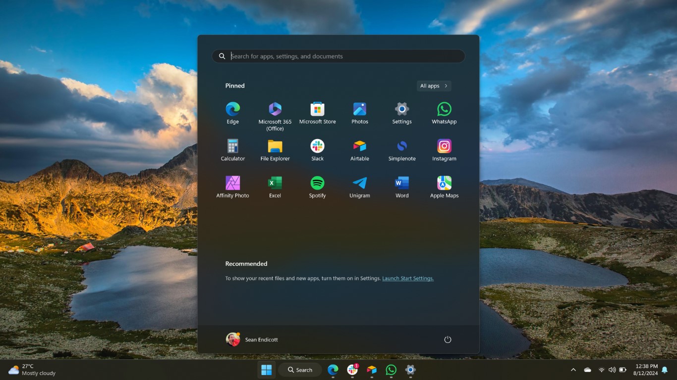
Microsoft also removed some features when moving from Windows 10 to Windows 11, such as the ability to move the taskbar to the top of your monitor. The tech giant also added features that few requested. For example, the notification dot in the image above isn't for anything pressing. Instead, it's a prompt to add my phone number to my Microsoft account. I'm fairly certain Microsoft already has that information somewhere, but I doubt the Start menu knows that.
One comment on X made in response to the new category view in testing echoed sentiments I've seen shared several times. "Anything but removing Recommended," said Meriç Bağlayan. That comment refers to the fact that you cannot hide the Recommended section of the Start menu. Even if you disable all the content that would appear in that section, Windows 11 just wastes the space with a prompt to turn on Recommended content.
All the latest news, reviews, and guides for Windows and Xbox diehards.
I don't hate the general concept of the Windows 11 Start menu. I'm okay with the fact that Microsoft moved away from Live Tiles and shifted toward a more launcher-like approach to opening apps. But Microsoft took out beloved features, added options few people want, reduced customization options, and refuses to address issues brought up by the community. A few design changes and customization options would go a long way for the Start menu. Until or unless those are made, at least we have a hideous version of category view to play with.

Sean Endicott is a news writer and apps editor for Windows Central with 11+ years of experience. A Nottingham Trent journalism graduate, Sean has covered the industry’s arc from the Lumia era to the launch of Windows 11 and generative AI. Having started at Thrifter, he uses his expertise in price tracking to help readers find genuine hardware value.
Beyond tech news, Sean is a UK sports media pioneer. In 2017, he became one of the first to stream via smartphone and is an expert in AP Capture systems. A tech-forward coach, he was named 2024 BAFA Youth Coach of the Year. He is focused on using technology—from AI to Clipchamp—to gain a practical edge.

 Windows Central Insider


