Microsoft is wrong: The new Outlook for Windows is not ready for prime time
The new Outlook is now generally available on Windows, but it still sucks as a default OS mail client.
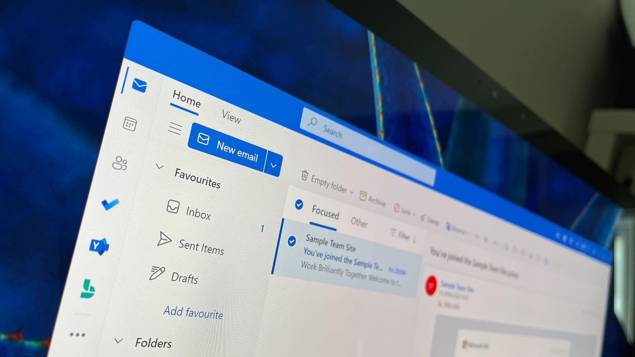
As of today, Microsoft’s new Outlook for Windows app is generally available to the masses. That means Microsoft thinks the app is ready for prime-time use and is removing the “new” badge from the app’s icon and name. It’s now just Outlook, the definitive article.
Confusingly, this doesn’t mean the new Outlook is replacing the old Outlook just yet. That will happen, but for now, the new Outlook (which is now just Outlook) is still an opt-in experience that you can enable within the old Outlook (which is still just Outlook.) So what does general availability even mean for Outlook… the new one, that is?
It appears general availability for Outlook means it’s ready to replace the built-in Windows Mail & Calendar apps. Starting with Windows 11 version 24H2, the older Mail & Calendar apps are no longer installed by default. Instead, the new Outlook is pre-installed and is the default email and calendar experience on Windows PCs with version 24H2.
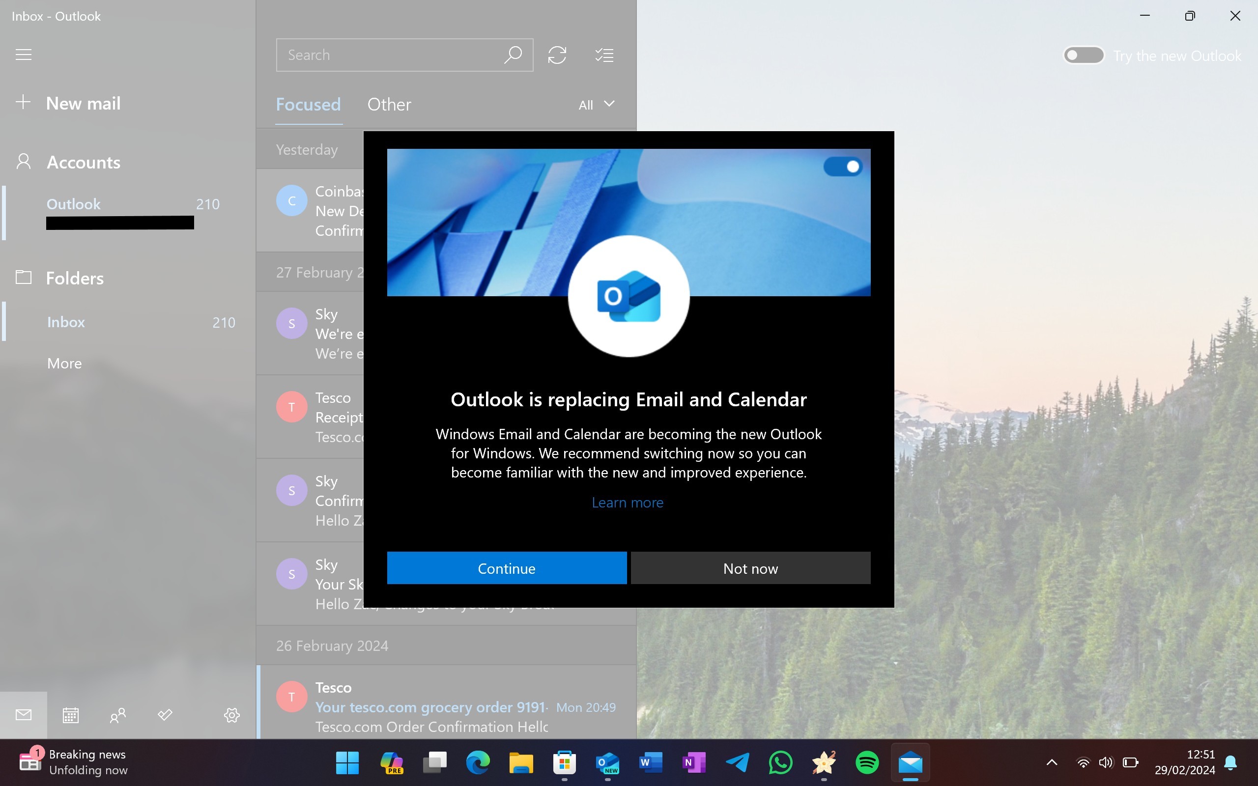
This will trickle down to older versions of Windows too, including Windows 10 now that Outlook is generally available. In the coming days and weeks, the Windows Mail & Calendar apps will be automatically replaced with the new Outlook, and the older Mail & Calendar apps will no longer be available starting January 1.
This is a problem because I don’t think the new Outlook is good enough to be a default email client on any operating system. A few months ago the app was sorely lacking in features and quality, and while many of the complaints I had back in March have been addressed, some important ones still haven’t.
To begin, the app is still slow, much slower than Mail & Calendar. Those apps open instantly and show me new email notifications as soon as they arrive in my inbox. The new Outlook still takes a couple of seconds longer to open, and a couple more seconds to load an email that I’ve clicked into via a notification.
The notifications themselves also trickle in behind other apps, including Outlook on my phone and the Mail & Calendar apps on PC. I don’t understand why the new Outlook isn’t able to fetch notifications as quickly as the other clients, or why it takes up three times as much RAM when open compared to the older Mail & Calendar apps it’s replacing.
Get the Windows Central Newsletter
All the latest news, reviews, and guides for Windows and Xbox diehards.
For a default OS emailing experience, the design and UX are abysmal. Why is this app so darn ugly compared to many of the other built-in utility apps on Windows 11 like Paint, Notepad, Microsoft Store, and Settings? Outlook stands out like a sore thumb and doesn’t even look like a Windows app.
That’s probably because it’s not a Windows app, it’s a web app. For whatever reason, Microsoft thinks it’s okay for the default Windows mailing experience to be no better than a gloried website. When I compare this experience to the clean and lightweight one of Apple Mail on the Mac, or Samsung Mail on a Galaxy Tablet, it’s simply no contest. Those apps are easier to use, smoother to navigate, and faster too.
And if you're using Windows with touch, you're in even bigger trouble. The new Outlook does nothing to ensure a good experience when using a touchscreen or pen. Apple Mail on iPadOS destroys the new Outlook when it comes to navigating the app with a finger. There are no swipe gestures for deleting or flagging emails, no pinch-to-zoom gestures, and no dragging and dropping emails into folders with touch on Outlook for Windows. Even Mail & Calendar had this basic functionality.
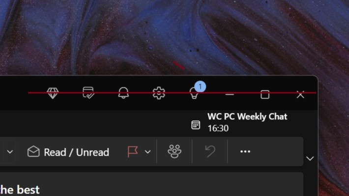
I mean, for a generally available app, the very least Microsoft could do is ensure the buttons that run along the top of it are all aligned with each other. I guess that’s too much to ask.
For those of you who use the classic Outlook app, Microsoft fully intends to replace that with the new Outlook too, but that's not happening just yet. For now, the new Outlook is still an opt-in experience and will become an opt-out experience for new users in the coming months. Microsoft doesn't intend to kill classic Outlook for at least five years.
So, what can Microsoft do to improve Outlook for Windows? First, it should really think about abandoning web tech in favor of a native Windows UI framework such as WinUI 3. I can't fathom why Microsoft thinks it's acceptable for a first-party, pre-installed, essential Windows app such as a mail client to not showcase the best of Windows.
Second, it needs to support basic touch functionality at the very least. Microsoft's best-selling PC is a tablet called the Surface Pro, and now that device is going to suffer significantly when it comes to reading email in the default Windows client. It's just shocking.
Third, it needs to be faster and lighter. If it's not as fast as the old Mail & Calendar apps, I don't want it. Those are so lightweight and easy to use, the only problem they have is Microsoft abandoned them. I wouldn't be mad if Microsoft decided to unabandon them and deliver new features, functionality, and UI improvements to these older apps instead.
In short, I think Microsoft needs to go back to the drawing board. The default Windows mail client should be a native Windows app, not a web app.
-
Kaymd I've personally given up expecting an improvement in the so-called new Outlook. The present Microsoft is all about AI now. If it's not a hot AI application, it's not relevant as far as they are concerned.Reply
I've now switched to Wino Mail. This app is the future of a true native modern Mail and Calendar app on Windows. The main developer behind Wino Mail understands what a first-party mail client should be. While it's still developing and getting improvements, I figure that in a year or two, it'll be a solid replacement for what the mighty Microsoft cannot deliver. -
ShinyProton Microsoft does not seem to understand that many users just don't want Outlook at home. They have enough of it at the office and simply want a quick and uncluttered mail client for home - that is Windows Mail.Reply
And don't get me started with elderly and non-computer savvy people that are very comfortable with Windows Mail...
Microsoft is just stubborn, deaf and idiotic about this topic. -
GraniteStateColin I agree with everything Zac said about the new Outlook. I'll add that (at least as of last check a couple of months ago, so maybe these have changed since then), it's no good with mouse and keyboard either:Reply
1. In other apps (Explorer, Desktop Outlook, file dialogs, etc.) if you drag an item to a folder tree and the folder tree is longer than the window so you need to scroll to access the top and bottom, it will start scrolling up or down when you drag to the bottom or top of the visible folder tree respectively. In New Outlook, it does nothing. There is no way to drag and drop to folders not already in view.
The ONLY way to drag and drop to these folders is to first scroll the folder tree to show the destination. How do you break basic drag and drop when ALL other apps handle this correctly?
2. For misspelled words in all other MS apps (and pretty much all third-party apps too), you right click on word that's misspelled and has the red-underline to select the alternative. Or, for those of us who type a lot, we may use keyboard shortcuts to avoid moving a hand to the mouse. That Menu key (that MS is disturbingly removing from the basic laptop keyboard in favor of the Copilot key, but fortunately Shift+F10 performs this same function) serves as the keyboard cursor equivalent to the right-mouse button. New Outlook doesn't support right-click or menu key to select the correct word when on a red-underlined misspelled word.
Instead, new Outlook requires you to left-click on the misspelled word, which means left-click is now harder to use if you just want to select text and ignore the misspelling (such as you always want to do for rare proper names that you don't want to add to your dictionary) . This is a terrible misuse of the left-mouse button, violating decades of established use -- left click to click buttons and select, right click to bring up the actions menu.
Even if you don't mind how this works in New Outlook (and frankly even if MS has fixed this in the latest version of New Outlook), how could any product manager have ever thought this was an acceptable change? Was the thinking by that team, "The way it works in Word, Desktop Outlook, every web-based text box, PowerPoint, Teams, etc. is wrong. We need to change this and show the rest of MS how spell correction should work?"
The fact that Outlook even went into broad testing with those problems scares me that the team responsible for it doesn't care about users and UX. I have reported these myself many times over the past 2 years. I view that as a bigger concern than their failure to get the performance or all features in yet. It's that they actively show disdain for what millions of us are accustomed to. They actively disregarded the standards and precedent of decades of Windows and Windows apps. There is no way there are so many cases of this that slipped through the cracks by accident. It shows a mindset of, "We don't care what users want. We know better what you should want."
And I'm not anti-MS. I happen to think Teams is the greatest product Microsoft has ever released and reflects the best of what modern Microsoft can do. But new Outlook is at the far, far, far other end of the spectrum. It's horrible. -
joshcsmith13 +920 (for the good ol' days when there was an active WinCentral community ;))Reply
I wish there was some way to convince Microsoft of all these, and more, blatantly obvious shortcomings of the "new" Outlook.
I have given up trying to help my tech-incompetent wife who has unwittingly opted into the New Outlook experience more times than I can count, only to be confused and disappointed every time. Her biggest complaint is that POP mail is not supported! (but good luck explaining that to a non-geek) -
SvenJ "The new Outlook is now generally available"? They try to shove it down my throat on a nearly daily basis.Reply -
Gknapp51 How about a unified inbox? Unbelievable that it would be a feature of the basic mail program but not the "flagship" Outlook program.Reply -
dcworld83 I think it's an absolutely perfect app. Email is overused and abused when so many other more efficient mechanisms of communication exist. Creating a tool that forces people to use email less or reconsider it as their first choice is actually a huge leap forward in product design and a great thing!Reply -
DaveDansey The new Teams wasn't ready for the prime time either, still missing features which I used daily and deem essential.Reply
They have most definitely lost the plot and don't care about writing quality software any more. -
TheFerrango I've been slowly giving up on Microsoft for private use in these last two years.Reply
I'm stil using the full Outlook on my desktop so that hopefully won't be an issue for a couple more years, and on my cheap win8 era tablet there's now Wino Mail.
Fedora has been a blessing on my laptop for the past three years, and I'm really tempted to put that on the desktop too. MS' offerings have been steadily declining in optimization, UX, and functionality, the only things really keeping me here are Outlook and maybe games, but the games I play seem to be working fine on Proton so who knows... -
xenred
This also what puzzles me. Microsoft is a big org and changes lime this has to go through process just like most big companies do. This means collectively Microsoft pretty much think these changes are not just acceptable, but think it's right. But then some middle managers can still overrule or twist some findings to fit their own view, and most if anybody will even notice internally nor can have voice for it.GraniteStateColin said:I agree with everything Zac said about the new Outlook. I'll add that (at least as of last check a couple of months ago, so maybe these have changed since then), it's no good with mouse and keyboard either:
1. In other apps (Explorer, Desktop Outlook, file dialogs, etc.) if you drag an item to a folder tree and the folder tree is longer than the window so you need to scroll to access the top and bottom, it will start scrolling up or down when you drag to the bottom or top of the visible folder tree respectively. In New Outlook, it does nothing. There is no way to drag and drop to folders not already in view.
The ONLY way to drag and drop to these folders is to first scroll the folder tree to show the destination. How do you break basic drag and drop when ALL other apps handle this correctly?
2. For misspelled words in all other MS apps (and pretty much all third-party apps too), you right click on word that's misspelled and has the red-underline to select the alternative. Or, for those of us who type a lot, we may use keyboard shortcuts to avoid moving a hand to the mouse. That Menu key (that MS is disturbingly removing from the basic laptop keyboard in favor of the Copilot key, but fortunately Shift+F10 performs this same function) serves as the keyboard cursor equivalent to the right-mouse button. New Outlook doesn't support right-click or menu key to select the correct word when on a red-underlined misspelled word.
Instead, new Outlook requires you to left-click on the misspelled word, which means left-click is now harder to use if you just want to select text and ignore the misspelling (such as you always want to do for rare proper names that you don't want to add to your dictionary) . This is a terrible misuse of the left-mouse button, violating decades of established use -- left click to click buttons and select, right click to bring up the actions menu.
Even if you don't mind how this works in New Outlook (and frankly even if MS has fixed this in the latest version of New Outlook), how could any product manager have ever thought this was an acceptable change? Was the thinking by that team, "The way it works in Word, Desktop Outlook, every web-based text box, PowerPoint, Teams, etc. is wrong. We need to change this and show the rest of MS how spell correction should work?"
The fact that Outlook even went into broad testing with those problems scares me that the team responsible for it doesn't care about users and UX. I have reported these myself many times over the past 2 years. I view that as a bigger concern than their failure to get the performance or all features in yet. It's that they actively show disdain for what millions of us are accustomed to. They actively disregarded the standards and precedent of decades of Windows and Windows apps. There is no way there are so many cases of this that slipped through the cracks by accident. It shows a mindset of, "We don't care what users want. We know better what you should want."
And I'm not anti-MS. I happen to think Teams is the greatest product Microsoft has ever released and reflects the best of what modern Microsoft can do. But new Outlook is at the far, far, far other end of the spectrum. It's horrible.
This new One Outlook project was something promising years ago, but the reality is basically just a web app wrapped into its own window with Chromium as its engine. Then release to prod despite heaps of shortcomings. They dont care the end users because they think people use web version of Outlook, so its okay to just make it's own window of it and pat their back and release it, then just improve what they feel like it while still being anti-good UX.
Our company removed these from our new M365 deployment since its been auto pushed somehow. It had slipped to few machines that users got unlucky this was a new Outlook but found out to be horrible replacement. It wasn't intentional and we quickly get rid of this and finally stopped getting tickets for it. Still it baffles to me this to think even businesses will even like it's current state or even its future state, since the base is already horrible. We are afraid when this became an only option in the near future. Classic Outlook have some many flaws, but it still generally rock solid and does alot of things well, just needs some modernising and optimisation. We didn't ask for web app to fix Outlook Classic problems. Idk who are the Fortune 500 companies demanded this.
Microsoft is clearly still out of touch both consumers and even to businesses. They make some of the really good products, but also we got these really poorly thought out products that we are scratching our heads how these get approved somehow.