Microsoft is working on a major design update for Windows 11's File Explorer app
A more modern File Explorer app is in the works.

What you need to know
- Microsoft is working to modernize more areas of the File Explorer app
- References to a modernized Home page and side pane experience have been spotted
- This modern design update will integrate with File Explorer's already modernized header UI
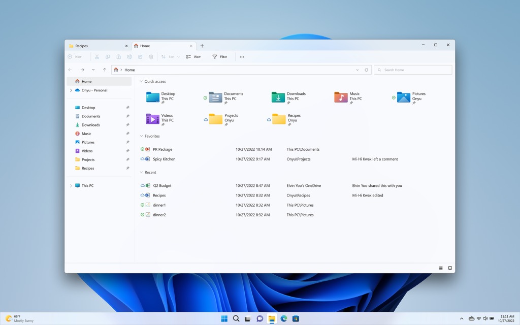
Microsoft looks to be working on a major design update for the File Explorer on Windows 11, which will introduce a modernized Home and folder interface to match the already modernized header first introduced with Windows 11 last year.
Early code and references to a modern Home page and side pane experience have been spotted in the latest Windows 11 preview builds. Currently, the File Explorer on Windows 11 is a mashup of old and new interfaces, with the top part of the app featuring a modern design, and the "main" part of the app featuring a legacy design.
These new modern elements will hopefully complete the File Explorer with a fully modern design based on XAML and WinUI. FireCubeStudios on Twitter has put together rough mockups of what the UI might look like based on the references and code spotted in the latest preview builds.
WIP File Explorer homepage UI reconstruction by Microsoft. It includes the upcoming "Recommended" Items.Everything is clearly very WIP hence why Vive id doesn't workNote: Image is placeholder, text is placeholder except for "Danya edited this"#Windows11 #FluentDesign pic.twitter.com/ENvkg8H8KmJanuary 9, 2023
The screenshots confirm that this work will bring the rest of the File Explorer interface in line with other modern interfaces found on Windows 11, which will go a long way in making Windows 11 feel more consistent and is a big goal for the Windows 11 wave of releases.
The code references also point to new features and areas within File Explorer, including new "Activities," "Conversations," "Shared Status," and "Insights" panes which will likely integrate with Microsoft 365 and provide updates to files such as shared Word documents.
I also hear from my own sources that this new modern design for File Explorer will also be more touch friendly, with larger hitboxes and a simpler UI for areas such as the sidebar and header.
For now, it's unclear when these updated File Explorer designs will make their way to Insiders for testing. If early references are already showing up in Windows 11 Dev builds, we should hopefully see this new stuff appear before the end of the year.
Get the Windows Central Newsletter
All the latest news, reviews, and guides for Windows and Xbox diehards.

