Microsoft could fix Windows 11 widgets with this one change
Why is my widgets panel filled with news?
All the latest news, reviews, and guides for Windows and Xbox diehards.
You are now subscribed
Your newsletter sign-up was successful
Join the club
Get full access to premium articles, exclusive features and a growing list of member rewards.
Last week, a pair of widgets rolled out with an Insider build of Windows 11. It's now possible to test out the Spotify and Phone Link widgets if you're running the latest preview build. Catching up on the story made me realize that I never use the widgets panel and should give it a try, so I pressed WIN+W to get started.
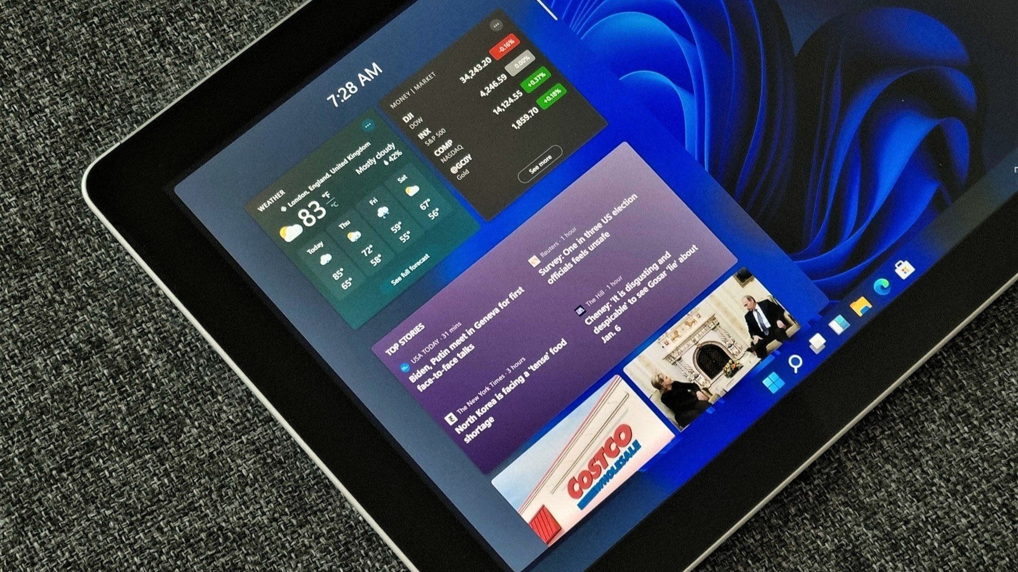
Somewhat to my surprise, I was greeted by a flood of news stories. I knew that Microsoft had news content that it promoted in several places, but I didn't expect almost my entire widgets panel to be a news feed. After all, it's the widgets panel not the news panel.
I figured this would be a simple fix. Click a few buttons, add some of my own widgets, hide news, and I'd be good to go. Nope. I began a journey of trying to hide news widgets that turned out to be in vein. Our guide on How to use the Widgets feature on Windows 11 runs through how to customize the panel, but there isn't an option to remove news.
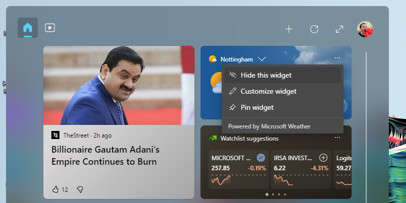
When you click the ellipsis menu for a widget like weather or stocks, you're given the option to hide it. Clicking the plus icon allows you to add widgets by pinning them to the panel. You cannot, however, use this section to remove news widgets (or any widgets for that matter).
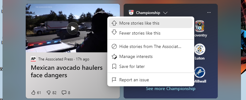
The same ellipsis menu for a news story shows options to see more or fewer similar stories plus a few other options. It does not contain an option to hide news altogether. The eye icon with a line through it lets you express that you don't like a story or to hide a particular outlet, but again, nothing about removing news.
A simple solution
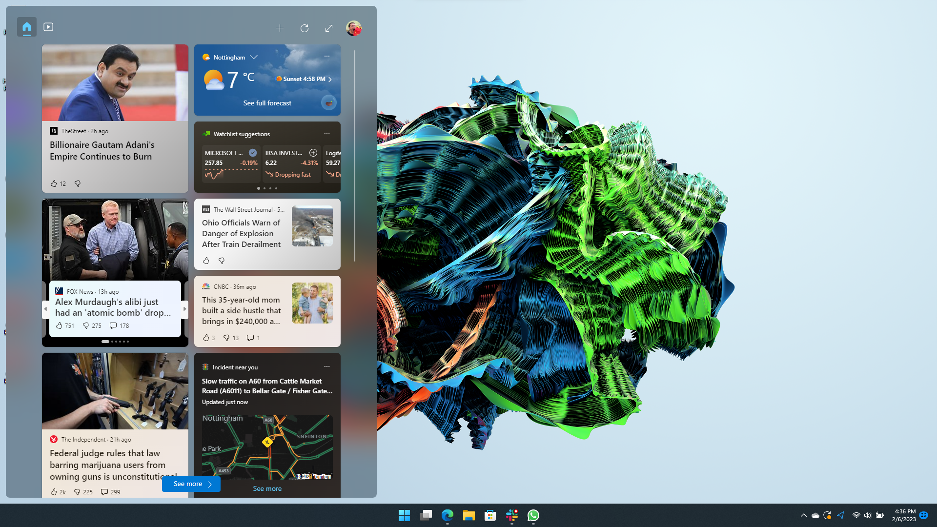
There's a simple solution to this problem. Microsoft just needs to add the option to remove news like any other widget. Why should news get special treatment in a panel designed for widgets? I want to interact with things like a music player or a to do list, not find news. Microsoft has apps for news already and there's always MSN if I'm dying to read the same stories that appear on the widgets panel.
It seems that Microsoft has tried to use the widgets panel as a way to shoehorn content to us once again. I suspect it's part of an effort to make money. More eyeballs on the newsfeed means more clicks. But that doesn't justify the move.
All the latest news, reviews, and guides for Windows and Xbox diehards.
News should be a single widget that can be turned on or off, just like weather, stocks, and Spotify. It shouldn't take over any gap in the entire widgets panel.

Sean Endicott is a news writer and apps editor for Windows Central with 11+ years of experience. A Nottingham Trent journalism graduate, Sean has covered the industry’s arc from the Lumia era to the launch of Windows 11 and generative AI. Having started at Thrifter, he uses his expertise in price tracking to help readers find genuine hardware value.
Beyond tech news, Sean is a UK sports media pioneer. In 2017, he became one of the first to stream via smartphone and is an expert in AP Capture systems. A tech-forward coach, he was named 2024 BAFA Youth Coach of the Year. He is focused on using technology—from AI to Clipchamp—to gain a practical edge.
 Windows Central Insider


