Microsoft accidentally revealed a UI design prototype for the next version of Windows at Ignite 2022
An early UI exploration prototype for the next version of Windows?!

All the latest news, reviews, and guides for Windows and Xbox diehards.
You are now subscribed
Your newsletter sign-up was successful
Join the club
Get full access to premium articles, exclusive features and a growing list of member rewards.
Microsoft is hard at work on the next version of Windows, which is commonly referred to as "Next Valley" internally. I had reported in July that Microsoft was returning to a three-year development cycle for the next major version of Windows, with the next client release currently scheduled for some time in 2024.
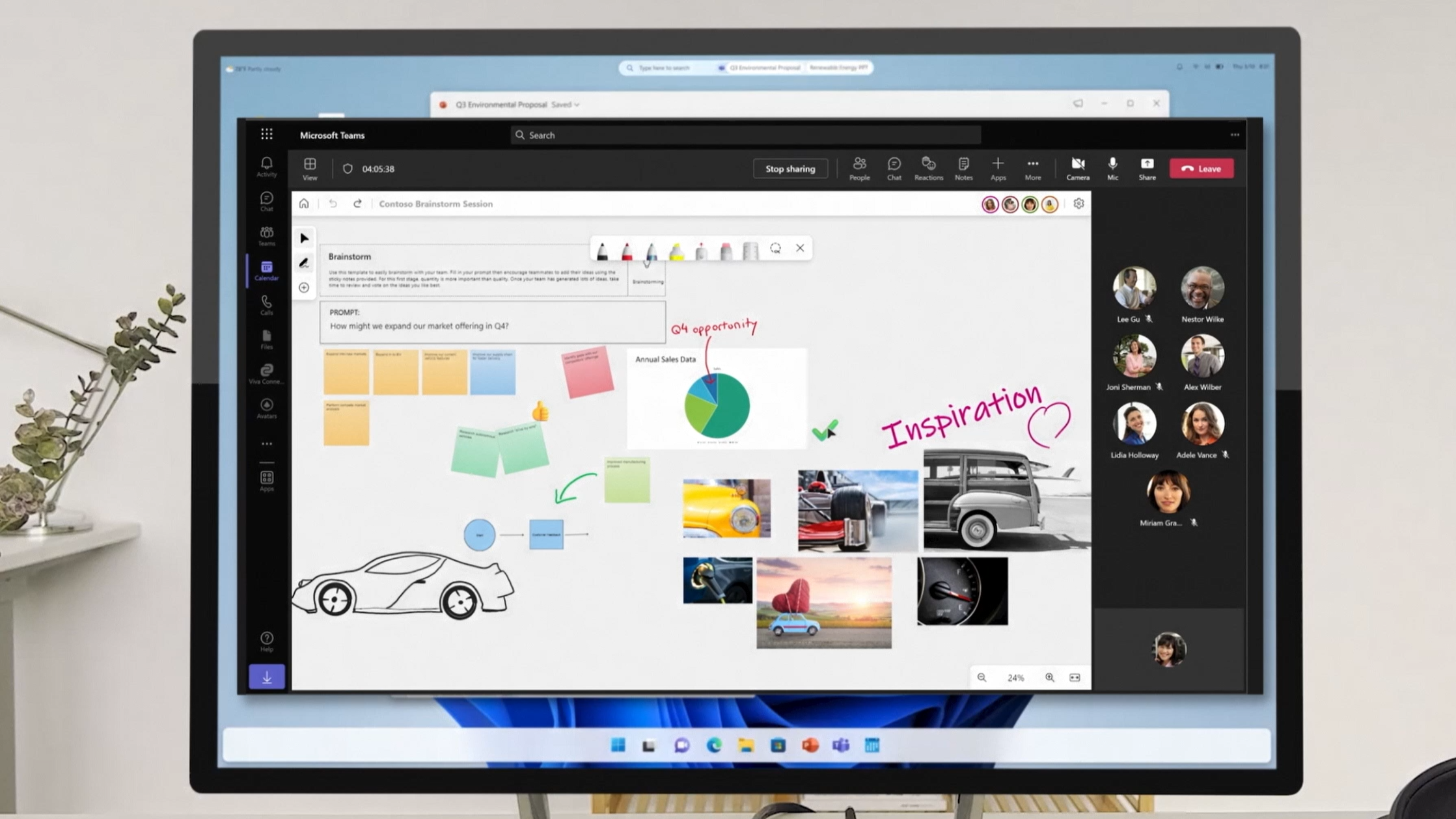
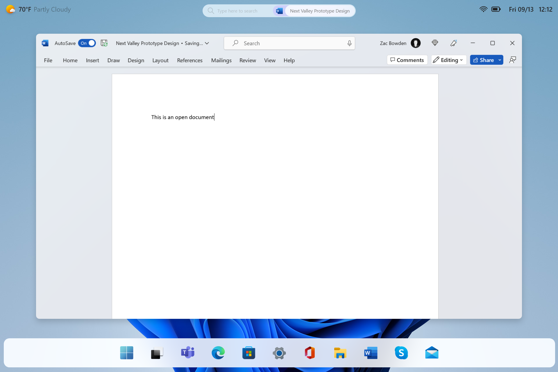
I didn't expect to be writing about the next version of Windows again so soon, but a handful of viewers watching the Ignite Keynote yesterday noticed an updated version of the Windows UI that was shown in a brief cutaway, which had a floating taskbar along the bottom, system icons in the top right, a floating search box in the top middle, and the weather in the top left.
My inbox has since been filled with people asking if I know anything about this design. Is it just a wishful concept by an eager intern or a miscommunication between product and design teams? Normally, I'd have shrugged this off as one of those things, but not this time, as I had already seen this design prototype before.
Article continues belowBack when I first began hearing about the Next Valley release, I was also shown preliminary design ideas that were being explored internally. Microsoft is still in the prototyping stages for Next Valley, but my sources tell me that the UI briefly shown off at Ignite yesterday is representative of the design goals that Microsoft is hoping to achieve with the next version of Windows.
The brief look at the UI mockup during Ignite is very low quality, so I've recreated it to give you a better idea as to what it's supposed to look like:
I've seen different variations of this design layout, including a version that houses the system icons/elements along the top in a translucent bar instead of just floating on the desktop. There are also plans for more sweeping UI updates that were not shown at Ignite, including a new lock/login screen, notification center, and more.
I'm told this proposed design prototype aims to achieve an interface that is better optimized for touch without diminishing the experience for mouse and keyboard users. It's something that Microsoft wants to be able to scale across desktop, laptop, and tablet form factors, including those with foldable displays.
All the latest news, reviews, and guides for Windows and Xbox diehards.
Microsoft has struggled to find a balance between touch and mouse users with previous versions of Windows. Windows 8 was too touch-centric, and Windows 10 was too mouse-centric. Windows 11 attempts to find a balance, but it still leans more toward mouse input first and touch input second.
It's still very early days for Next Valley, and since nothing is committed to code yet, this UI exploration can and likely will change between now and when the next version of Windows is ready to be announced. This is the nature of early work-in-progress planning and prototyping.
For now, we can only wonder how a confidential UI prototype of this caliber ended up in the main keynote of a Microsoft conference.

 Join The Club


