It’s 2022, and Windows 11's dark mode is still frustratingly incomplete
Quite a bit of light mode in your dark mode.

It’s been 6 years since Windows first got a “dark mode” feature. It was first introduced on a Microsoft desktop operating system with the Windows 10 Anniversary Update, and was an incomplete mess thanks to a mishmash of old and new interface designs ranging from UWP apps to classic Win32 applets. Some stuff supported dark mode, but most of it didn’t.
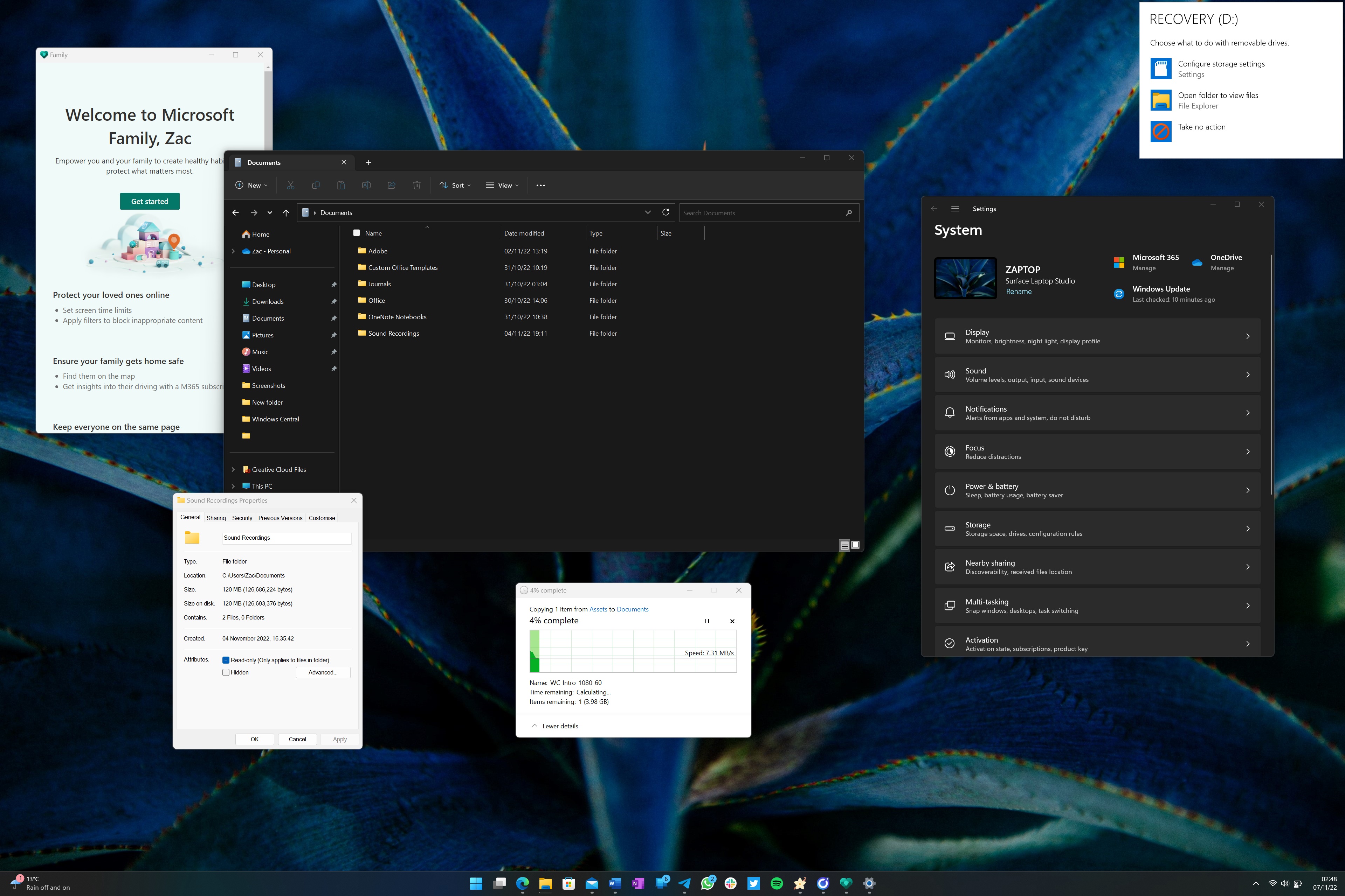
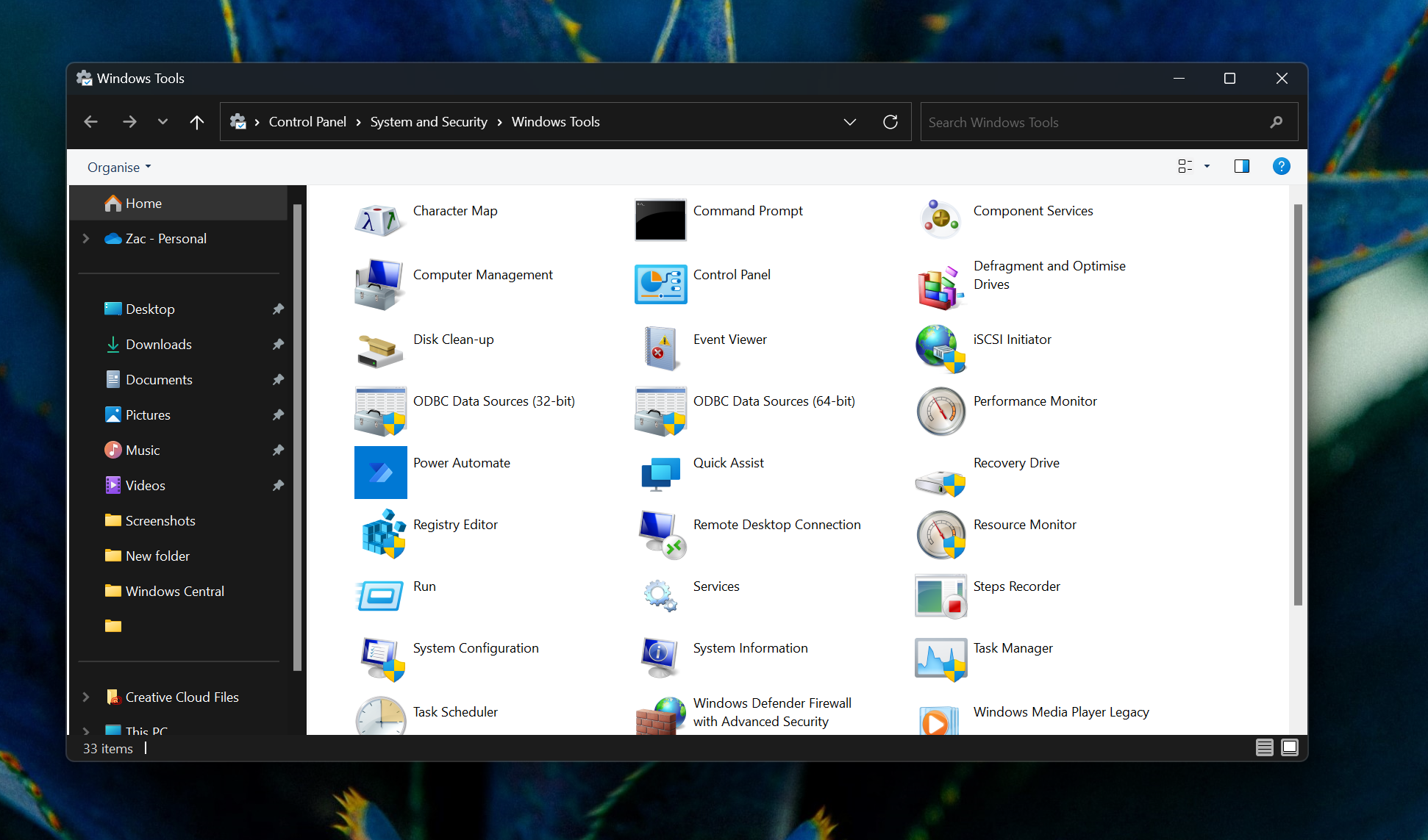
Over time, the dark mode experience on Windows has gotten better, but not by much. With the launch of Windows 11, Microsoft’s version of dark mode is the best it’s ever been… but it’s still frustratingly unfinished. If you open the properties of a folder in File Explorer, you’ll see a white window. If you copy files from one location to another, you’ll see a white window. If you right-click on a legacy Win32 title bar, you’ll see a white menu. If you plug in a new storage drive, you’ll see a white flyout.
These are just some the most common examples of light interfaces you’ll see throughout the day when using Windows in dark mode, and it’s interfaces you see all too often. I tried to replicate this on macOS, and I couldn’t find a single light interface when dark mode was on. Everything is dark when dark mode is enabled on macOS.
In fact, macOS seems to be handling the entire light/dark mode thing better than Windows as a whole. Windows had a dark mode years before macOS did, but macOS came along and did it better on the first try. macOS even has an automatic scheduling feature for switching between light and dark modes throughout the day. Fantastic stuff, all missing on Windows.

Curiously, most of the dark mode issues on Windows are of Microsoft’s own doing. A lot of third-party apps actually support dark mode, including Telegram, Slack, Newton, Spotify, and a wide breadth of Adobe apps. In fact, most of Microsoft’s apps support dark mode too, including Teams, Office, and most of the in-box Windows apps.
The issue relies with Windows and the countless old system areas that just haven’t been updated yet. It’s so frustrating, as dark mode on Windows is almost great. It’s just still not there yet, 7 years on. For why it’s still incomplete is anyone’s guess. I know that Microsoft were working on dark mode support for those legacy control panel applets like file properties and copy dialogs back in 2021, but that work seems to have halted internally for unknown reasons.
Speaking with sources, it sounds like the goal is to replace many of the legacy interfaces that still don’t support dark mode with WinUI/modern designs, which would automatically bring with it support for dark mode. Of course, updating legacy interfaces with modern designs has been a goal for Windows since Windows 8, so who knows when that journey will be officially completed.
Get the Windows Central Newsletter
All the latest news, reviews, and guides for Windows and Xbox diehards.
Luckily, Windows’ light mode is pretty amazing these days. Thanks to the Windows 11 design language, Microsoft’s desktop OS is still the best-looking version of Windows to date. So, here’s to hoping the next version of Windows finally completes Microsoft’s dark mode efforts. I’d love to see the copy dialogs and file property Windows updated with dark mode support.

