I actually hate the new Outlook for Windows
I've been using Microsoft's new Outlook email client for Windows 11 and Windows 10 for the last few months... and it sucks.
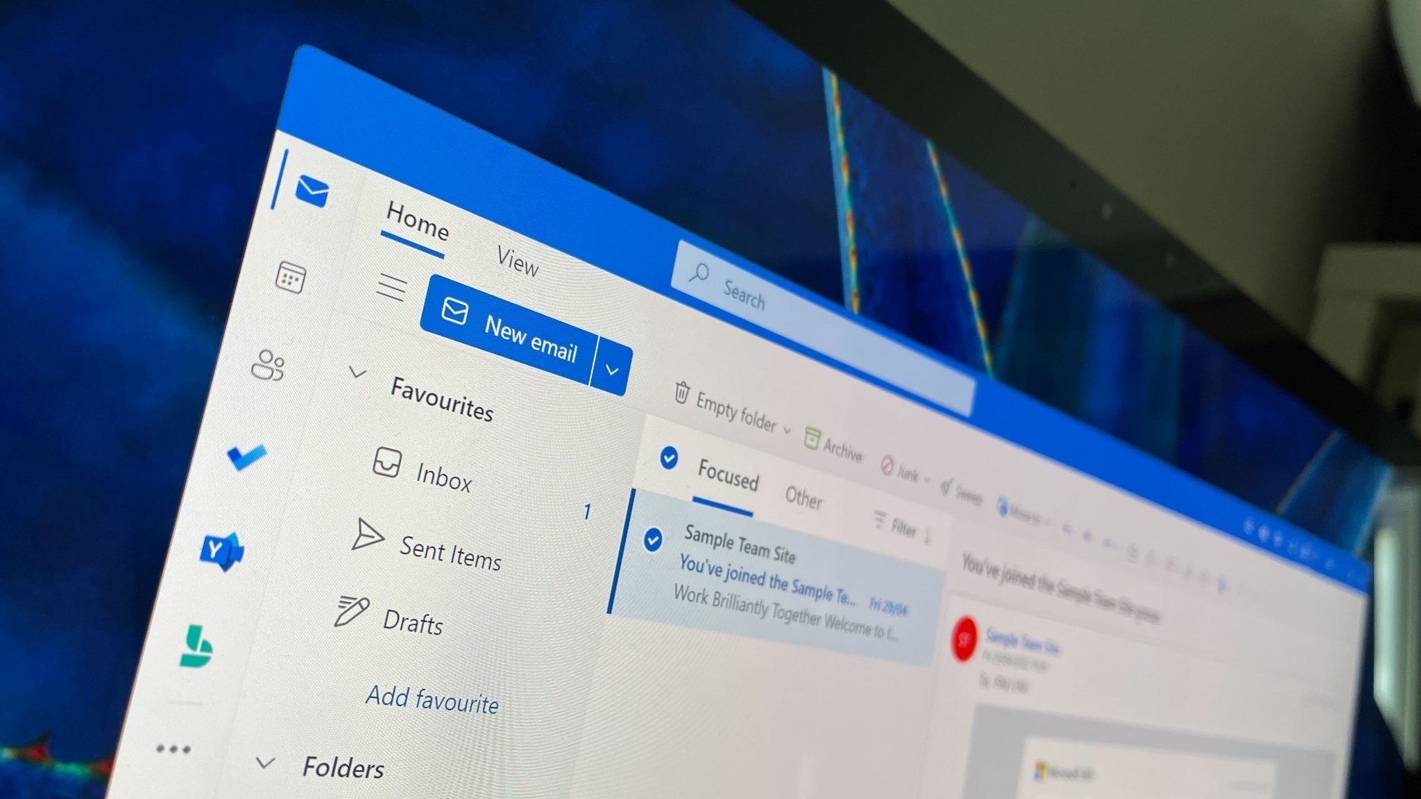
I am one of the few people who genuinely enjoys the current built-in Mail & Calendar apps on Windows 10 and Windows 11. I think they look great, function well enough, and have (historically) been quite reliable. They're lightweight, fast, and compatible with almost any email service you can throw at it.
So when I reported that Microsoft was planning to replace the Mail & Calendar apps with a new, unified web app based on Outlook.com back in 2021, I was a little worried. On one hand, Outlook.com is a functionally great website with lots of features that rival Gmail.com and other popular web-based email services.
On the other hand, replacing a fast and lightweight native client with a web app almost always ends with an overall worse end-user experience, whether that be due to a lack of features, UI consistency issues, performance degradation, and more. With all that in mind, I decided to hold off on any judgment until I could try out the new app for myself. I was hopeful that it would be good.
Bad news, it sucks
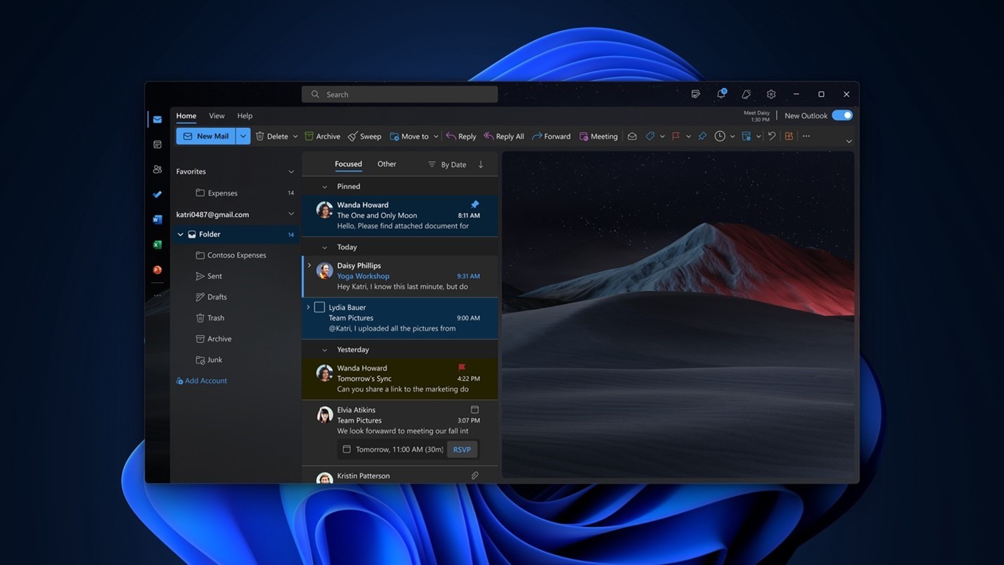
Microsoft launched the new Outlook web app in preview last year, and I have been using it as a daily driver ever since. To be clear, Microsoft says the app is still in preview, but it's already automatically pinning the app on every Windows 11 user's Start menu, and the built-in Mail & Calendar apps are encouraging users to switch to the new client now.
So even though Microsoft is hiding behind a "preview" banner, the company clearly thinks the app is good enough to push to the general population regardless. And because of this, I'm not waiting for a "final build" to share my thoughts on this app. In short, it's terrible. I hate it, and I want the old Mail & Calendar back.
I genuinely think the new Outlook for Windows is the worst built-in OS email client of any OS platform on the market right now. Samsung Email is better than this. Gmail is better than this. Apple Mail is better than this. Why? Because all of those apps are built using native UI frameworks that integrate with the OSs they're built for.
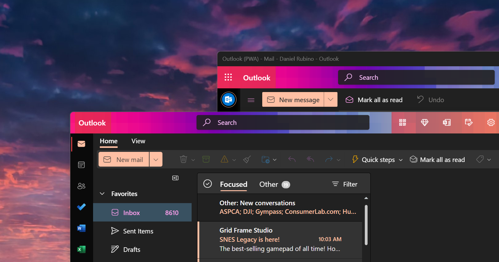
My first big issue with Outlook for Windows is just how much of a Windows app it doesn't look like. It feels like a website because it is. There are pretty much no ties to Windows, and it doesn't even attempt to blend in with Windows 11's design language. The window controls along the top aren't even aligned with the web buttons that are next to them.
Get the Windows Central Newsletter
All the latest news, reviews, and guides for Windows and Xbox diehards.
And it's not just how it looks that grinds my gears, but how it feels too. It just doesn't feel good to use. I can't really explain this problem, but clicking around on things like buttons and emails just doesn't feel responsive. There's a half-second wait between clicking on something and seeing the result of that click. Why?
Not even kidding, running Outlook for Android via the Windows Subsystem for Android feels more responsive than running the Outlook for Windows app. It's a shame too that the web app doesn't work well with touchscreens, both the old Mail app and the Android app running on Windows are easier to use with touch.
I also hate how the app doesn't have a unified inbox for multiple accounts, forcing you to switch between different inbox views to see all your emails if you're using more than one account. Also, having "empty inbox" and "mark all as read" right next to each other in the right-click menu on the Inbox folder is a bold choice.
Reliability is out the window
My second big issue is with performance. The app just takes too long to load. Why am I seeing a splash screen for more than a second? It should be taking me straight to my inbox instead of showing me a logo for long enough that it plays a cute little animation. Why is it taking so long? The old Windows Mail app launches at least a whole second or two faster than the new Outlook for Mail.
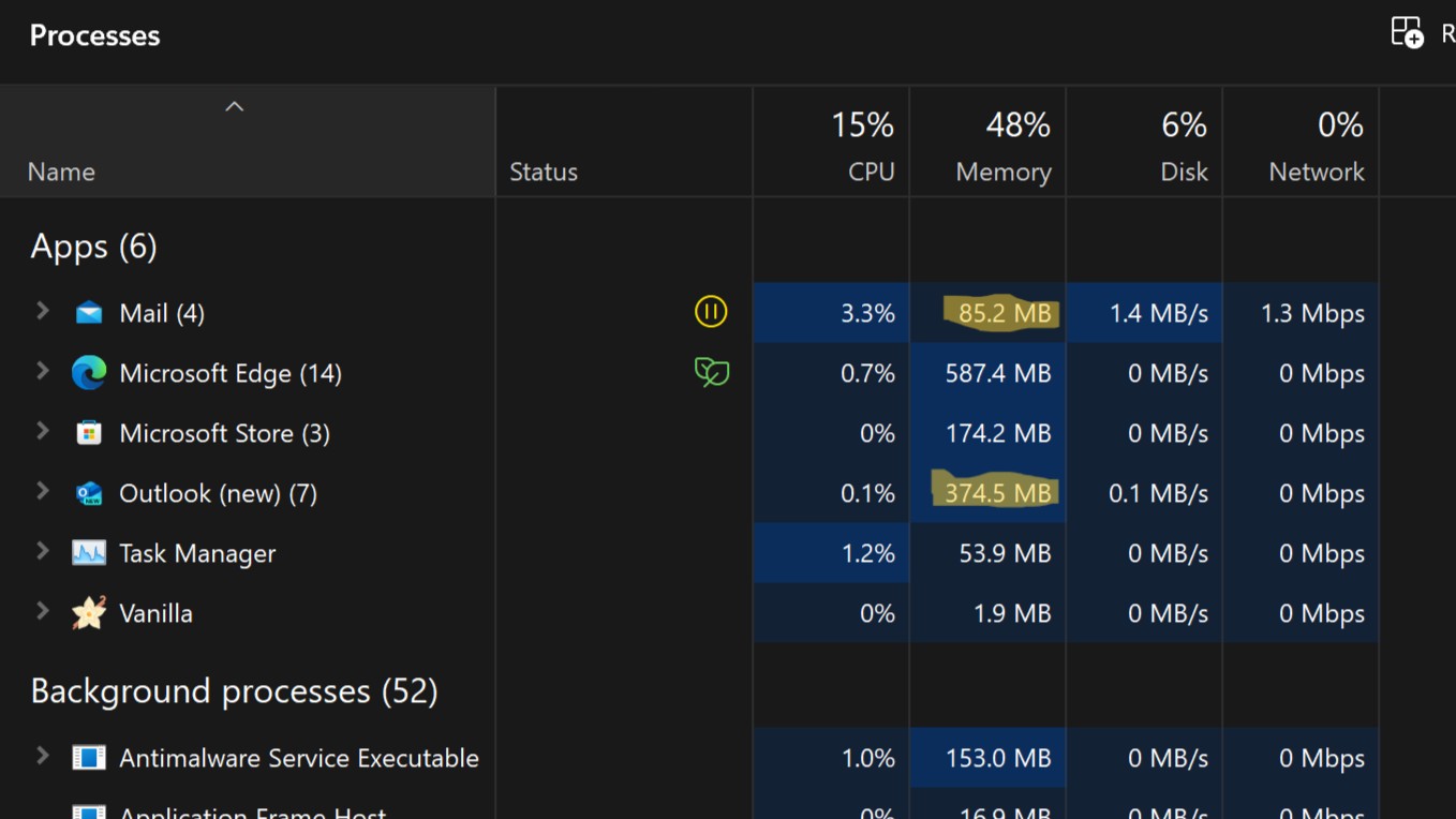
Just because I was curious, running both Outlook for Windows and the old Mail app side by side, Task Manager reports that Outlook for Windows consumes around 373MB of RAM, whereas the old Mail app uses just 100MB of RAM.
Push notifications? Reliability is out the window. Sometimes, the new Outlook will send me a push notification for a recent email; sometimes, it won't. And if it does, it's almost always after the older Mail app has alerted me first. For whatever reason, push notifications are delayed in the new Outlook for Windows, likely because it's not a native Windows app, and when the app is closed, it's not able to constantly check for notifications, unlike the old Mail app.
And even when those push notifications come in, clicking on one results in an experience, I can only describe as frustrating. I'll click the notification, the notification will disappear, and then literally nothing will happen on screen for at least a few seconds before Outlook decides to open and show my inbox... not the email that I clicked the notification for, but my general inbox.
So, I manually clicked into the email that the notification popped for and began reading. After maybe 8 seconds in that email, the Outlook client pops open an additional window with the same email that I clicked on via the notification. So, ultimately, it's taking something like 10-15 seconds to open an email from a notification, and that doesn't even consider the delay between the email arriving in my inbox and the notification popping.
I want the old app back
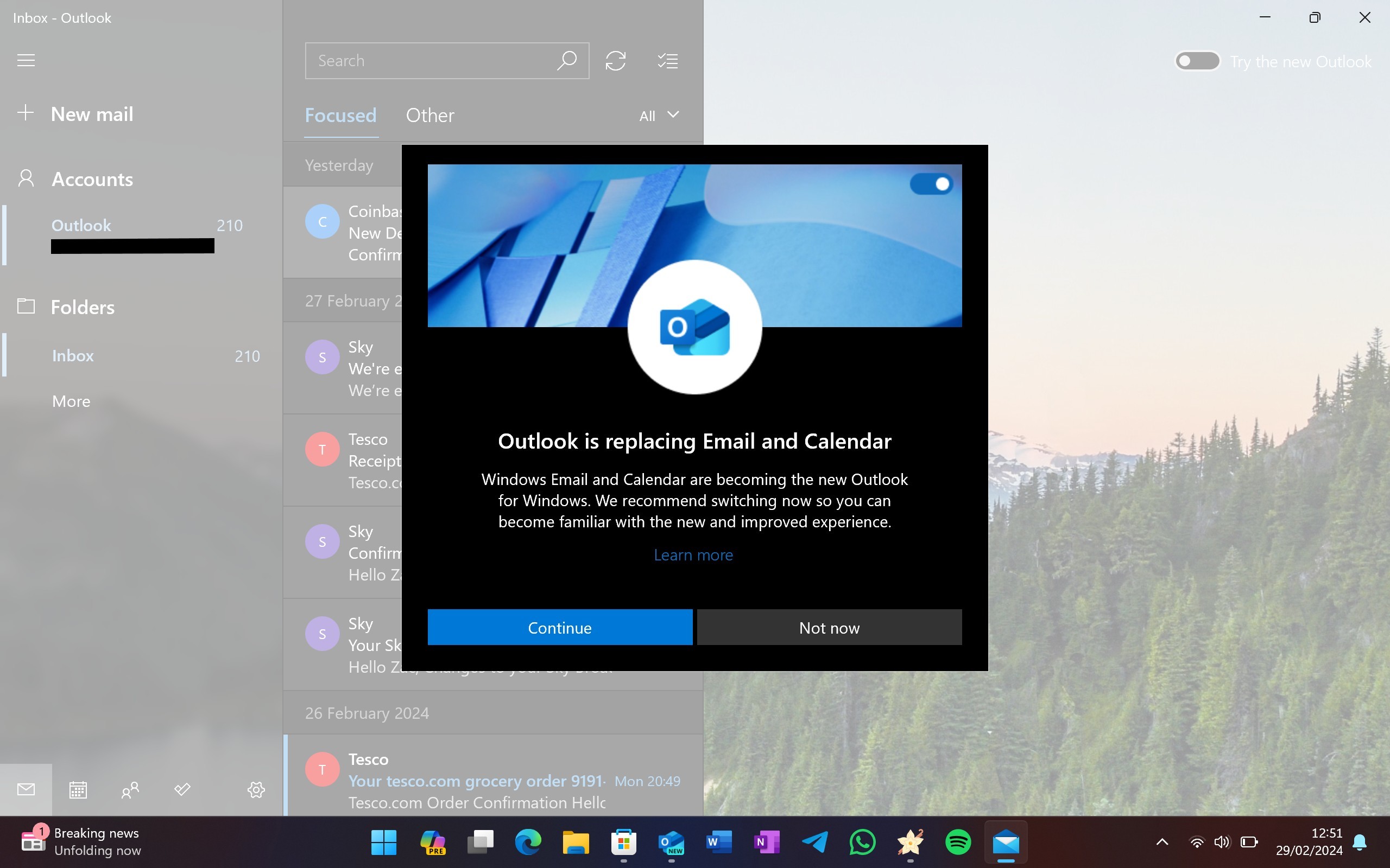
These are just some of the top issues I have with the new Outlook for Windows. I don't enjoy using this app, not even a little bit. I can't imagine how people using classic Outlook for Windows are going to feel about this app when Microsoft ultimately forces it upon them, too.
I know the app is branded as a preview, and Microsoft probably will get around to fixing some of these issues over time. But there's no fixing the fact that it's a web app that doesn't even attempt to make itself feel at home on Windows. It doesn't look or feel like a Windows app, and it's definitely not as fast or as lightweight as the old Windows Mail & Calendar apps.
OK so I've been begrudgingly using the new Outlook for however long it's been out, and I swear it hasn't improved AT ALL over the many months I've been using it.Everything I hated about it on day 1 I still hate about it today. I know it's still in preview, but this app SUCKS.February 20, 2024
So, I'm going back to using Mail & Calendar for as long as they work on Windows. Microsoft intends to remove Mail & Calendar from the Microsoft Store later this year, but I'm hoping sideloading the apps will continue to work thereafter.

-
i-am-andrew Thanks Zac for this excellent article. So glad I'm not the only one that finds new Outlook so bad. Especially the utterly broken email desktop notifications which I actually raised with Microsoft via their feedback in the app, including sending them a video of the delayed opening of the email in a separate window etc making it an incredibly frustrating experience. Essentially their response was this is expected behaviour by 'design' which is ridiculous.Reply -
DontBeEvil10 But but you were so excited about the new "web tech based" outlook, when everyone else was trying to tell you how inferior to Mail it is.Reply -
Ren Jumped in here to add my voice in support for all this. Hated it since I first tried it out, ages ago - and not just this one, but everything else they're replacing with web apps. Now I can't even use the old Mail/Calendar anymore. And have you tried the new Weather app? Even worse, for all the same reasons. MS is trying so hard to make Windows as a pseudo ChromeOS clone, it's kinda insane.Reply
Re: performance btw - the whole shtick is MS pushing its advertising even more on the user. Plastered in both Outlook and Weather, and I imagine it's going to be everywhere else as well. Of course that's gonna bring performance down even more.
Other than that, I've never understood this mania with web apps anyway. From what I've seen, they're the same as the websites... in which case I might as well just open those from the browser, like I've been doing all my life. -
Jay Tee Yeah, the "New Outlook" is absolute ****. Same thing on macOS -- the new version lacks several key features the old one had (most egregious to me is the lack of complete support for local folders, which I absolutely cannot do without).Reply
As far as email goes, Wino Mail is the best replacement I've found -- it's not yet the most full-featured, but it's a native Windows app that looks and acts the way a native Windows app should. The author is aiming to make a replacement that's close to Mail and Calendar and it's under continuous development. It doesn't have calendar functionality yet, but it's planned. -
Jack Pipsam The death of default native offline apps in Windows is depressing. Web apps aren't good replacement. There are times and places where PWA can be great, there is no doubt. But on the whole, many programs (not just Microsoft ones) have become more bloated as a result of being a glorified browser.Reply
As an out of box experience, Windows is just getting worse. You have the forced online/account activation for Windows 11 (workarounds being a thing for those in the know doesn't help the average consumer), the removal of an included Rich Text Editor (WordPad) and default apps becoming clunky Web Apps with a tacked-on Copilot to further drag them down. Edge forcing itself full-screen anytime it wants to tell you about the fact you can pin tabs the sidebar etc etc.
Thankfully there are always many other options out there, such as Thunderbird, which has recently received a visual overhaul and is getting a renewed focus. But there was a straight forward simplicity to the Windows 10 Mail app, as flawed and basic as it was, that will be missed. It's a shame they didn't work on refining that, instead of being lazy.
I am of the belief that default apps are important. Apart from setting the tone of the OS, it is what many consumers will use and won't consider switching to another program. Windows is heading in the wrong direction with this web-app future. Turning Windows into Chrome is just a fall from grace. -
Paul L I wholeheartedly agree with the article; I couldn’t adapt to the interface of this new web email client from Outlook. I am compelled to continue using the Outlook from the Office suíte! 📧👍Reply -
DontBeEvil10 Reply
you basically didn't care to read why anyone objectively is complaining ... try again.simonmann said:"I actually hate the new Outlook for Windows" translation: 'I can't handle change' -
Jeffery L Totally agree Zac. Outlook for Windows is a work in progress. The name that is presented in Windows "Outlook (new)" is dumb. I have to tell my wife, don't click "Outlook", click "Outlook (new)"! Performance is a real drag. The old Mail & Calendar opened in sub-second time with current mail already received. Outlook (new) takes around 5-10 seconds to finally see your latest mail. My biggest complaint is the calendar doesn't work offline and month does not scroll to current week when opened. I will continue to use it. I believe it will get better with time.Reply -
Mallandyrr I have to agree completely with this article. I even go so far as to tell them in the feedback when refusing to use the new app to” LEAVE MY DAMN EMAIL APP ALONE “Reply
