Windows Central Verdict
The Windows 11 2024 Update is packed with OS improvements and new features across the board, with special attention given to those running an ARM-based device this time around.
Pros
- +
File Explorer improvements are welcome
- +
Better performance on ARM-based devices
- +
Windows Recall is genuinely useful
- +
Lots of quality of life improvements
- +
Phone Link integration throughout the OS is nice
Cons
- -
Copilot+ PC features are a mixed-bag
- -
New built-in email and calendar app sucks
- -
Dark mode STILL inconsistent
Why you can trust Windows Central
Microsoft is back with its annual Windows 11 feature update, this time focusing on the underlying platform and surface-level quality-of-life improvements and updates. Version 24H2 (also known as the 2024 Update) includes everything from better performance to UX changes designed to make Windows 11 easier to use.
Version: 24H2
OS Build: 26100
Release Date: June 18 (Copilot+ PCs) / Oct 1 (everyone)
In my opinion, the 2024 Update is a bigger release compared to the 2023 Update, thanks to those underlying platform enhancements alone. We have improvements to Windows Update, a faster x86 emulation layer for Arm PCs, and new AI features that benefit from having a dedicated NPU (neural processing unit.)
This release of Windows 11 is also unique as it's the first version to ship with features that are exclusive to a new type of Windows device: Copilot+ PCs. If you're not using a Copilot+ PC, you will miss out on some features when upgrading to version 24H2, including the controversial "Windows Recall" AI feature.
I've been using Windows 11 version 24H2 since June 18, and this is my full review. Please note that due to the nature of how Microsoft updates Windows these days, you may already have several of the features detailed in this review without updating to version 24H2. Alternatively, you may update to version 24H2 and be missing some of the features outlined in this review. It's potluck, I'm afraid.
Windows 11 version 24H2: What's new?
Not interested in reading thousands of words about new features in a Windows OS? Don't worry; I've got you covered with my quick 20-minute hands-on video showcasing all the notable new features, as well as a bullet-point list of the most notable changes below.
Desktop & Start
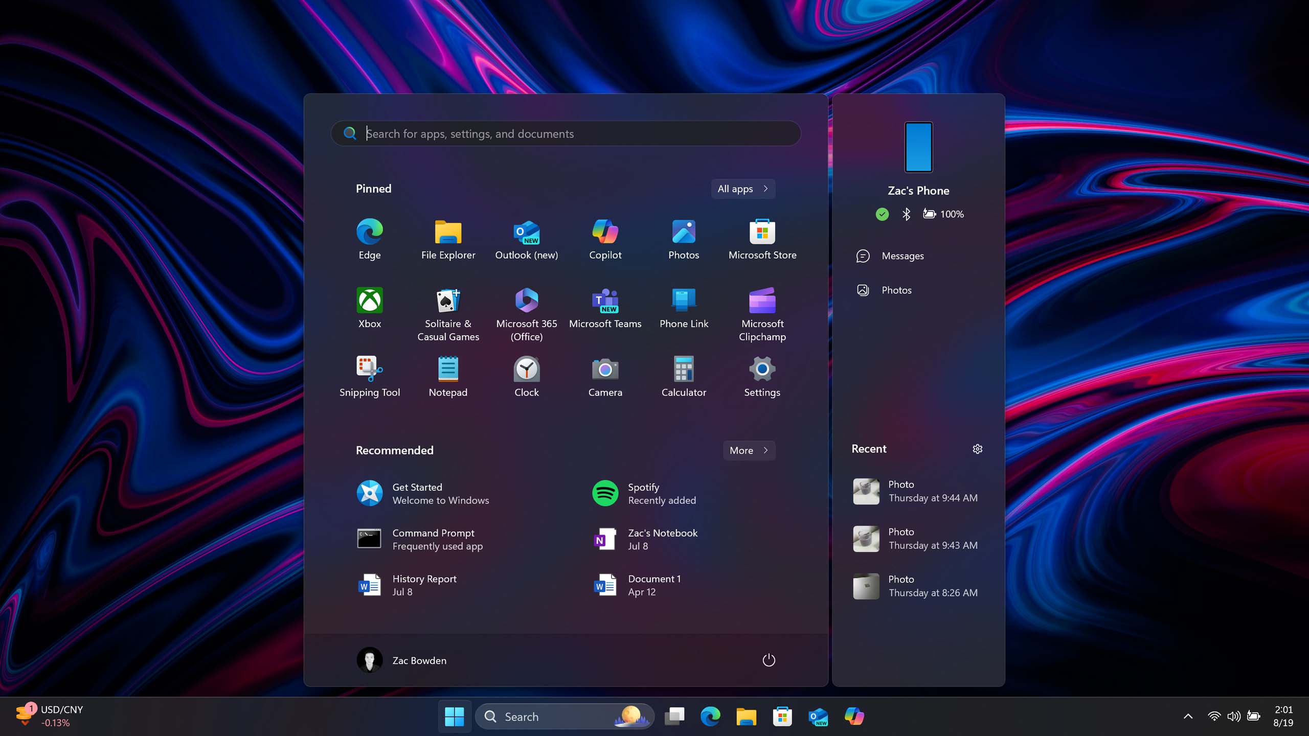
- Phone Link is now integrated with the Start menu
- Taskbar system tray layout has been simplified
- Quick Settings has been rebuilt to be faster and more customizable
- Windows Spotlight image is now the default wallpaper setting
- Taskbar app preview thumbnails now have an animation
- You can now set HDR images as a desktop wallpaper
File Explorer
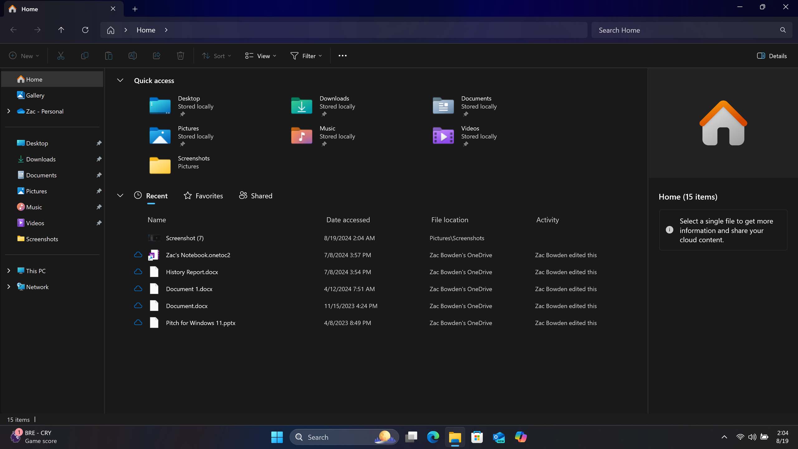
- File Explorer home tab now includes updated layout with shared documents
- You can now duplicate tabs by right-clicking the tab.
- Context Menu layout has been updated with better labelling to be easier to use.
- You can now create .7z and .TAR archive formats.
- You can view your Android phone's file system directly in File Explorer
Apps
- A new Outlook app for email, calendar, and contact is included
- Microsoft has updated Copilot as a standalone web app
- Photos now includes AI-enhanced generative erase and background editing
- Photos can now generate AI images based on user criteria (Copilot+ PC)
- A new Recall app uses AI to capture everything you do and makes finding things easier (Copilot+ PC)
- Paint now has built-in generative AI capabilities based on user drawn sketch (Copilot+ PC)
Settings & Misc
- Windows Update now supports checkpoints and hot patching for faster and less obtrusive updates
- Voice Clarity uses AI to remove background noise picked up by your microphone in supported apps
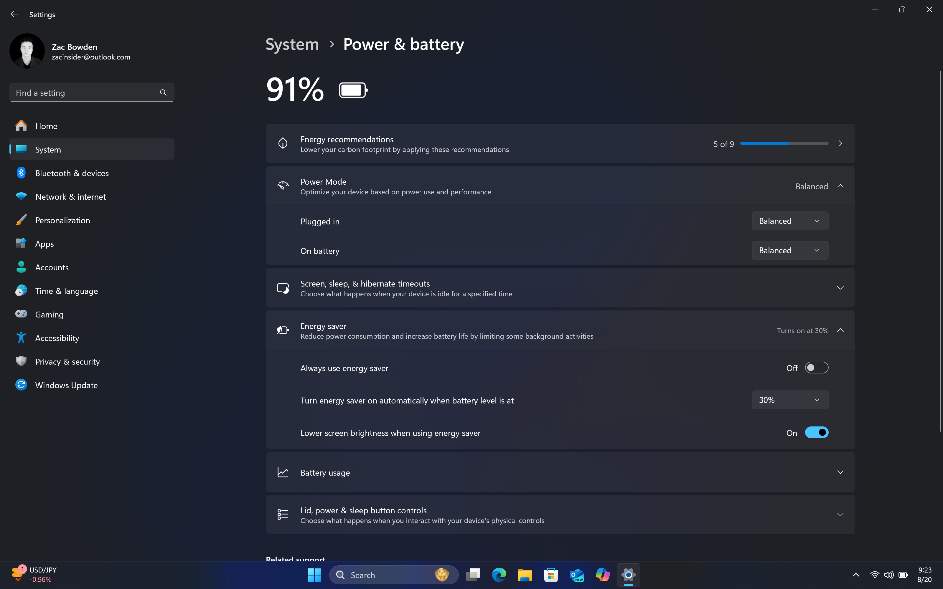
- Power settings for plugged/unplugged state can now be configured simultaneously
- A new Energy Saver mode replaces battery saver and applies to both laptops and desktops
- You can now configure mouse scroll wheel direction in Settings
- Wi-Fi 7 hardware is now supported
- New PRISM emulation layer makes x86 emulated apps run better on Arm
- Arm-based devices should now run smoother
- AutoSR uses AI to enhances the framerate and quality of games (Copilot+ PC)
- Live Captions can now translate languages into English in real-time locally (Copilot+ PC)
- Advanced Windows Studio Effects enhance your webcam with filters (Copilot+ PC)
Windows 11 version 24H2: Release Date & Availability
The Windows 11 2024 Update is rather unique in its rollout and availability. Unlike previous versions of Windows 11, this release is rolling out in two notable waves. The first wave began shipping on June 18, but only on new Copilot+ PCs. If you recently purchased a new Snapdragon X laptop, you are already running version 24H2.
For everybody else, the Windows 11 2024 Update is now rolling out as of October 1, but it's doing so in waves which means you may not see it right away. You can manually download and install version 24H2 now if you don't want to wait.
All the latest news, reviews, and guides for Windows and Xbox diehards.
Windows 11 version 24H2: Start & Taskbar
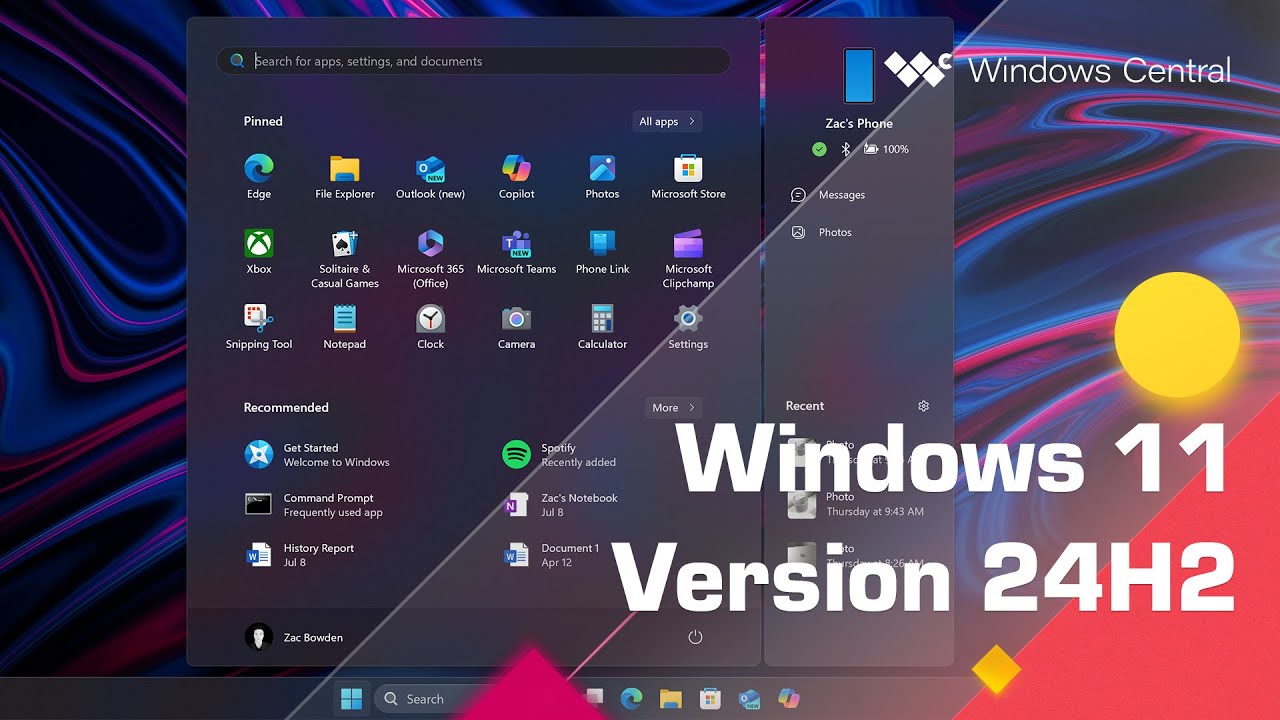
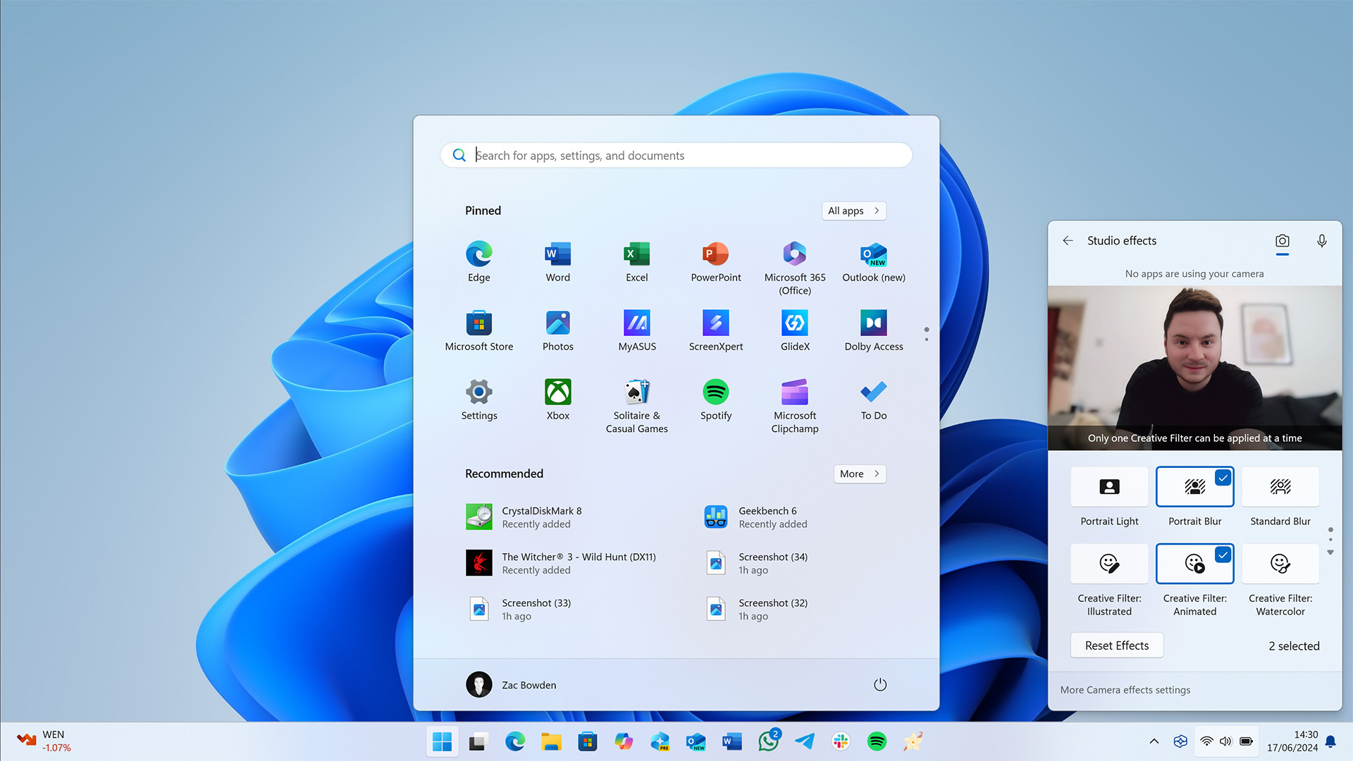
As seems to be the case with every new version of Windows these days, Microsoft has made further improvements and changes to the Start menu and Taskbar on Windows 11 with version 24H2. In this update, Microsoft is adding a new Phone Link companion that floats alongside the usual Start menu interface, showing you a quick overview of your phone's status and recent photos.
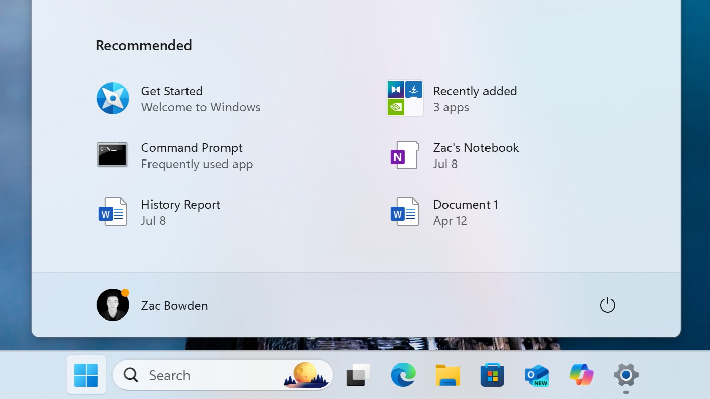
Microsoft has also made some changes to the Recommended area Start, which now groups recently installed apps into a single item that you can click into to see all the recently installed programs. It also now shows "frequently used apps" along with "Recommended" apps and websites Microsoft thinks you might want to try.
I've personally not seen any Recommended apps just yet, but the grouping of recently installed apps along with frequently used apps is a nice addition that I have found myself enjoying.
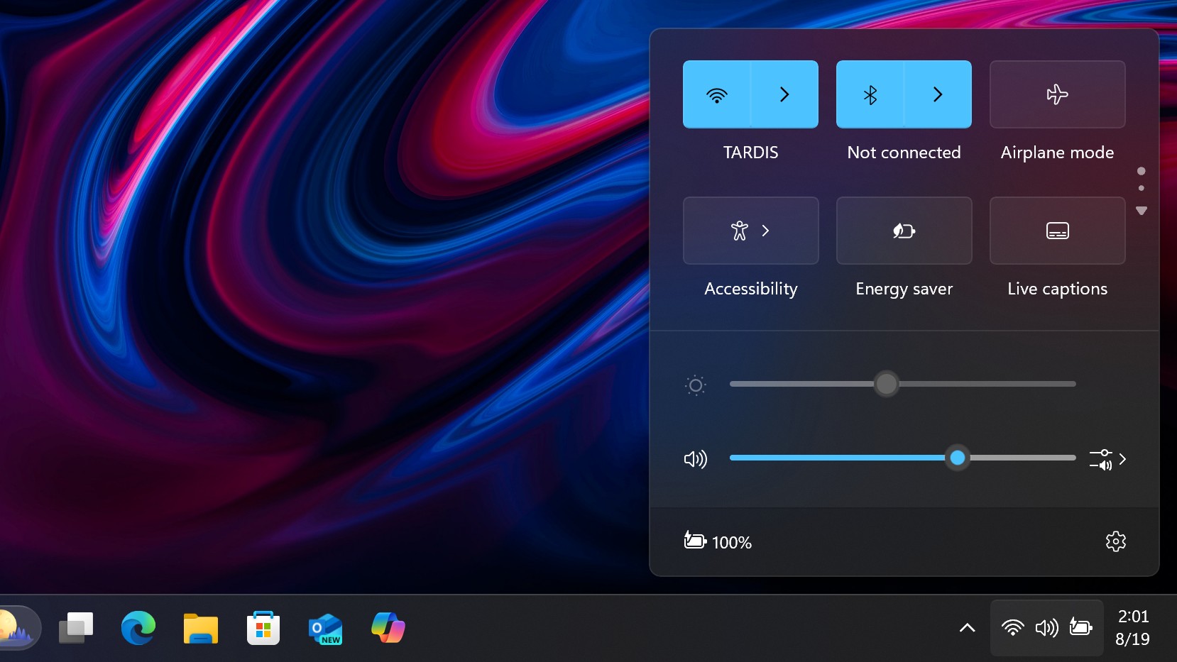
Moving onto the Taskbar, Microsoft is making several changes and improvements in this department, starting with the system tray. Beginning with version 24H2, Microsoft has "simplified" the system tray layout. It no longer shows the full date and time format; instead, it opts for a simplified date/time layout that drops the AM/PM indicator and year. It also now hides the bell icon unless Do Not Disturb is enabled.
As a self-proclaimed minimalist, I really like this change. It makes the system tray feel cleaner and less cluttered, removing unuseful information such as the year. I already know what year it is, so I don't need to see it in the system tray. If you're not like me and dislike these changes, you can revert to the old system tray layout that includes the year and bell icon.
Microsoft has also updated the Quick Settings panel on version 24H2, rebuilding it from the ground up to be faster and easier to customize. Now, the quick settings are paginated, operating much like the quick settings interface on your Android phone. Just click and drag on icons to rearrange them, moving lesser-used icons into overflow pages.
One downside to this change is that you can no longer hide icons you don't intend to use. All available quick settings now exist in the menu, forcing you to manually move down quick setting buttons you don't use to the back of the grid layout. The previous version of Windows 11 had the ability to show and hide specific quick settings, and now that's gone.
Last but not least, in a little detail that I can't help but appreciate; the Wi-Fi icon will now animate when it's attempting to connect to a network. Lovely.
Windows 11 version 24H2: File Explorer
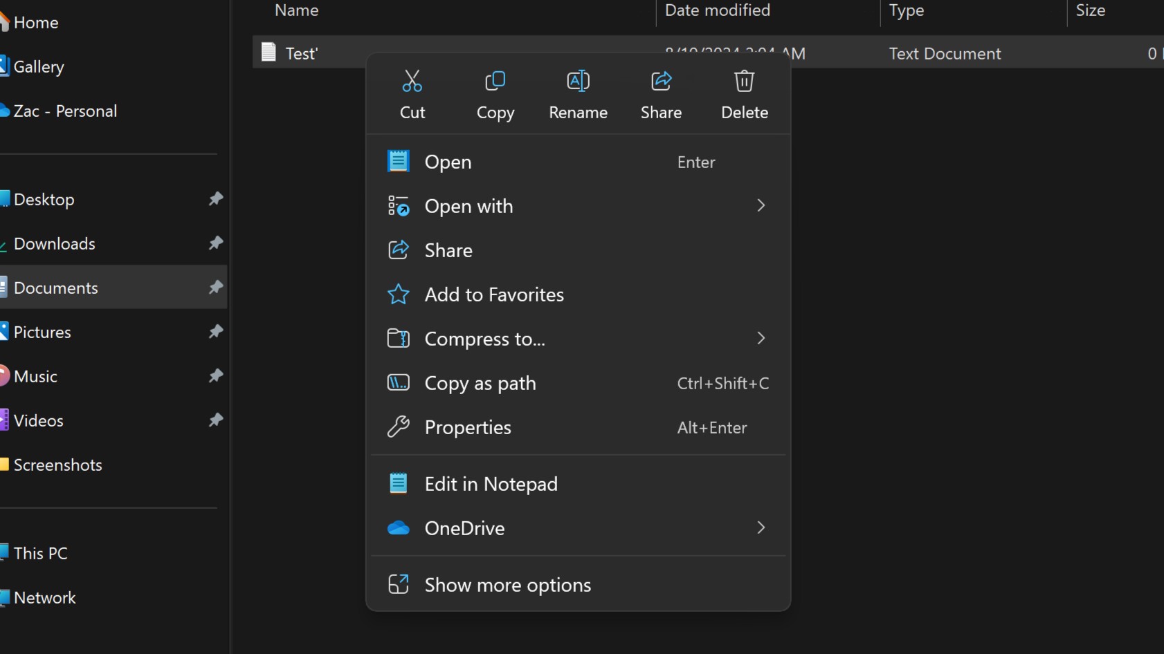
Microsoft has made several quality-of-life updates to the File Explorer on Windows 11 with version 24H2. Starting with context menus, Microsoft has finally fixed them. When Windows 11 first debuted, it introduced a new modern context menu that hid legacy options and reorganized the layout. While the effort was commendable, some of the design changes they made were also rather questionable.
Specifically, common actions such as cut, copy, paste, and rename were placed in a row of small icons without labels. All the other options were placed vertically with labels, and this layout made things very confusing and difficult to find as it's not immediately clear which non-labeled icon does what.
Microsoft clearly heard the feedback here, as with version 24H2, it has finally "fixed" the modern context menus. Now, those common actions show up at the very top of the context menu, still in a horizontal row might I add, but in a much bigger size and with labels. It's now easy and quick to select the action you're likely looking for.
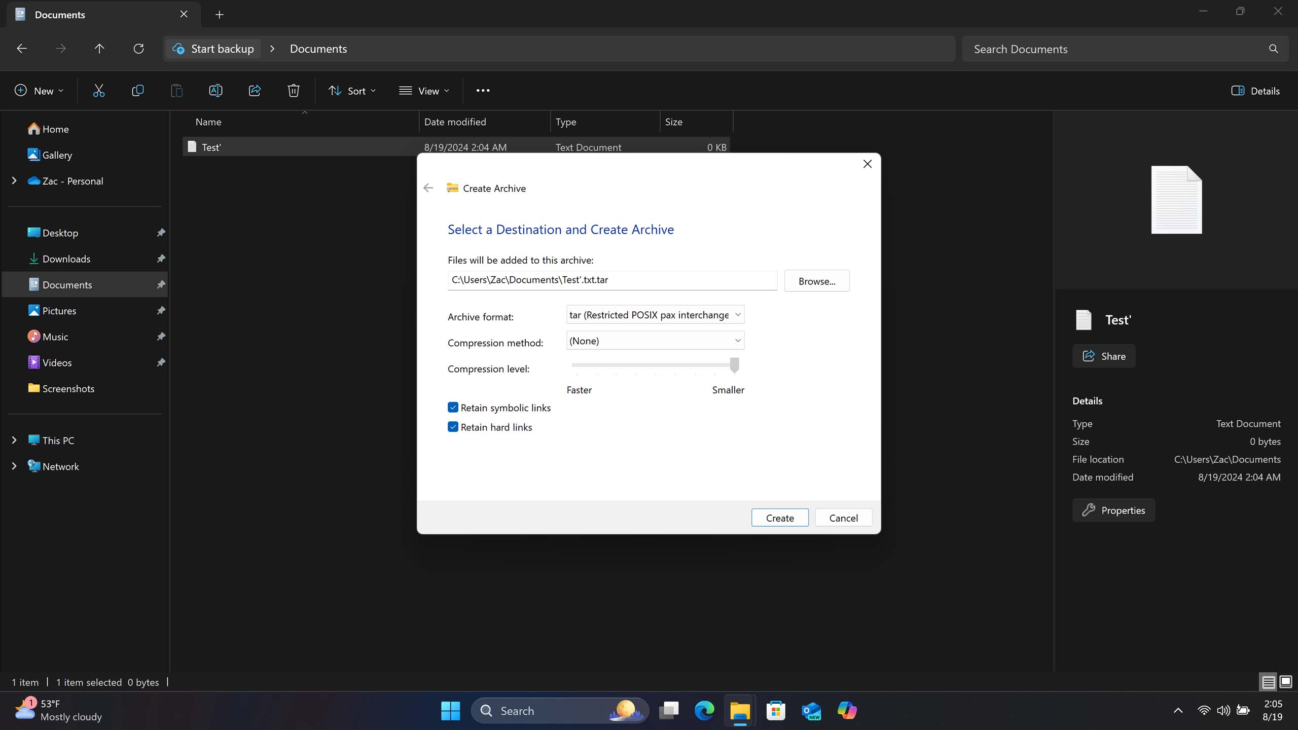
Moving onto the File Explorer itself, version 24H2 finally adds the ability to create additional archive format types. With version 23H2, Microsoft added the ability to extract 7-zip and TAR files natively within File Explorer, but it didn't add the ability to create them. Now, File Explorer supports creating .7z and .TAR files just like .ZIP files.
There's even a more advanced interface that lets you customize the type of compression you wish to use when selecting .7z or .TAR, but annoyingly, this throws you into a legacy Windows interface that doesn't adhere to dark mode at all. Why Microsoft didn't put in the extra effort to build a modern interface for this, I don't know, but I wish they had.
Another little improvement that Microsoft has added to the File Explorer is the ability to drag files between directories using the breadcrumbs in the address bar. This functionality existed before Windows 11's new File Explorer landed, and Microsoft is now adding it back.
Lastly, Microsoft has also updated the homepage of File Explorer with a new shared view, which gives an overview of all the activity ongoing in files that you've shared with colleagues, friends, or family. This is an interface you'll most likely see on your work PC.
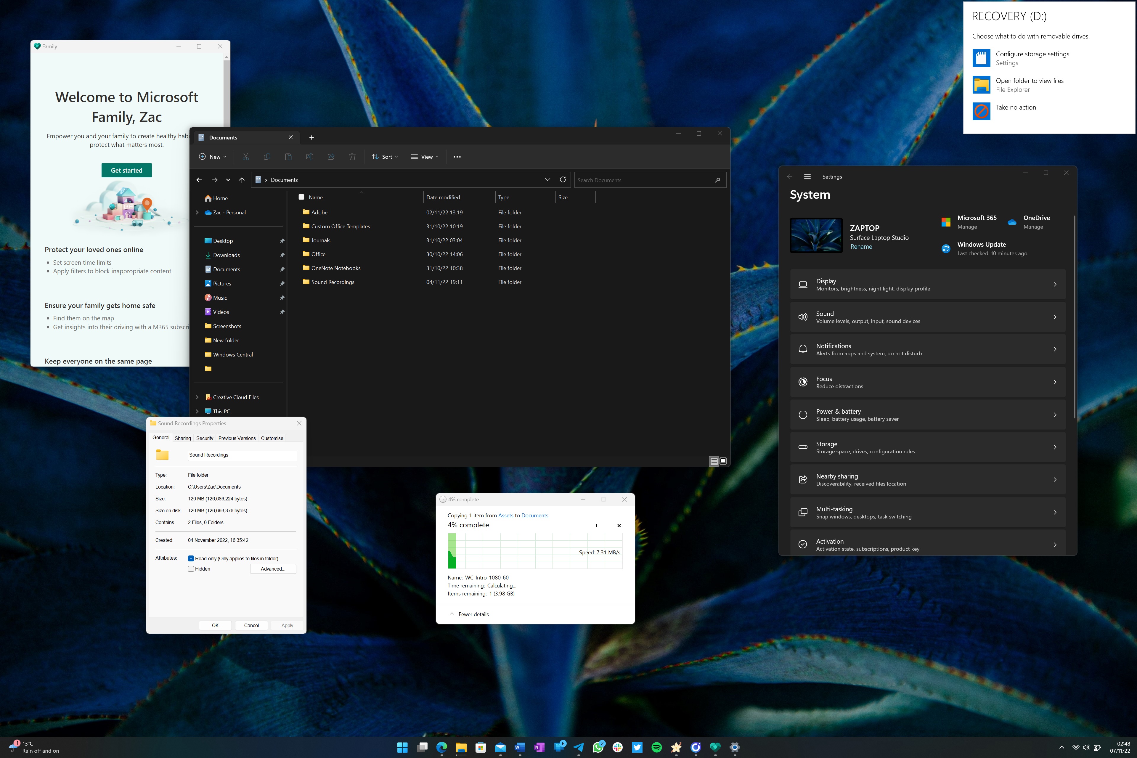
Now, it wouldn't be a Windows 11 review if I didn't provide an update on the state of dark mode. Microsoft introduced dark mode in Windows with the Windows 10 November 2015 update almost ten years ago. To this day, it's still incomplete, and version 24H2 does nothing to improve this.
File properties, the Run dialog, the Registry, the copy file dialog, and many more interfaces still do not support dark mode. It's almost as if Microsoft isn't actually working to improve this, and that's a shame.
Windows 11 version 24H2: Copilot
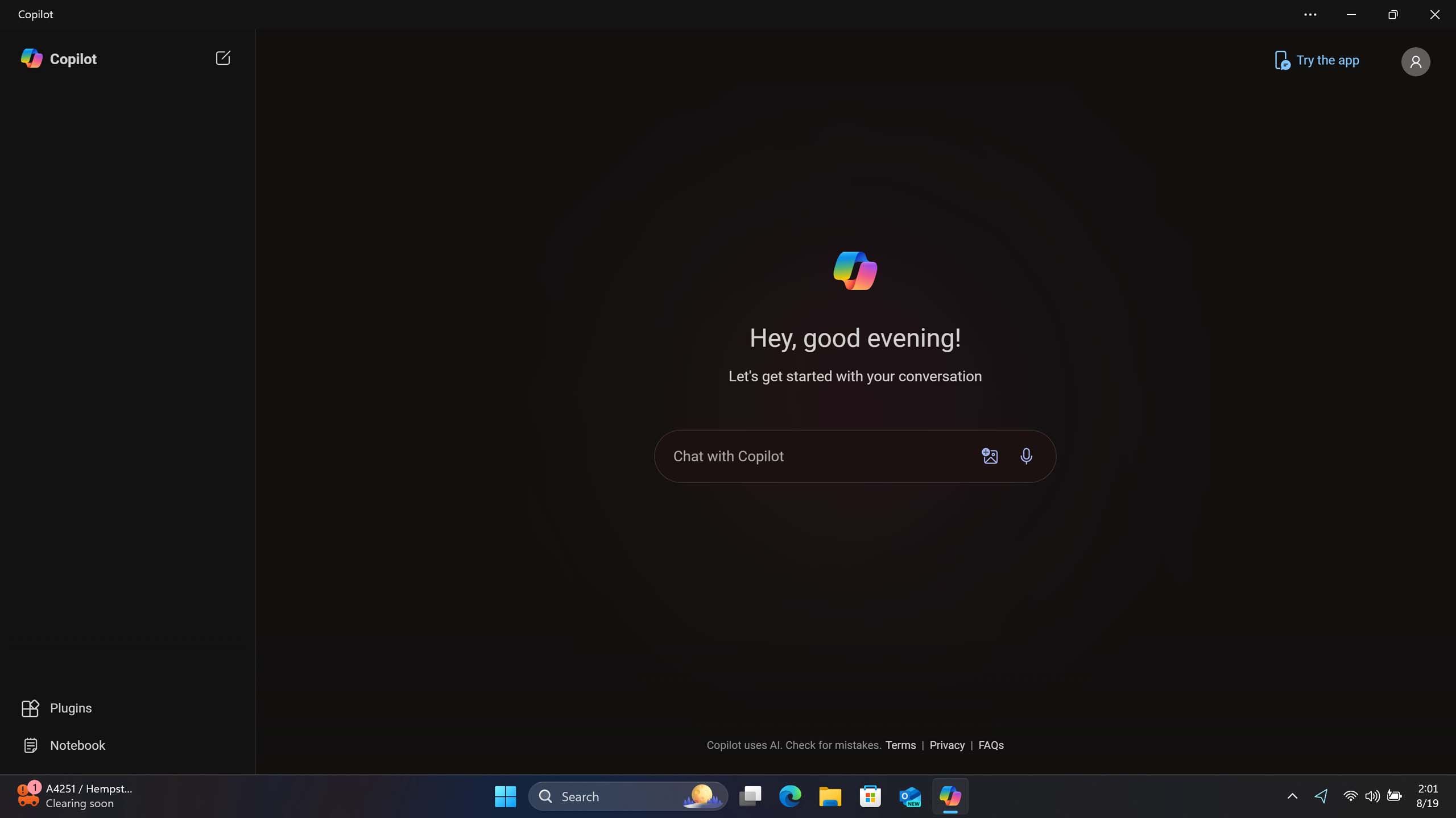
Windows 11 version 24H2 brings with it some questionable changes to the Windows Copilot experience. In previous versions of Windows, this experience operated as a sidebar that popped out from the right of the screen, pushing over open apps to make room. According to Microsoft, many people didn't like this behavior and would have preferred being able to treat it like any other app window. So, it listened.
Now, the Windows Copilot app is a standalone app, no longer operating in a sidebar interface. It's pinned to the Taskbar like a normal app, meaning it can now be unpinned just by right-clicking it, repositioned on the Taskbar anywhere you like, and can even be uninstalled. When opening the app, you'll notice it appears in a floating window just like any other app, and you can resize it and move it around wherever you like.
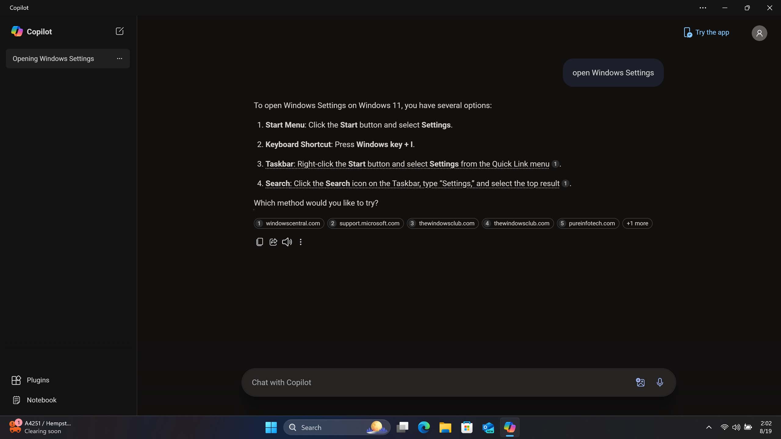
On paper, these changes make a lot of sense, but in practice, it makes the assistant feel very disconnected from the Windows experience. The new Copilot app is just a web app hosted by Microsoft Edge (not that the sidebar wasn't also, but at least that felt more integrated with the OS.) In fact, it's even lost the ability to control certain Windows settings. It no longer understands any Windows commands.
In my eyes, this new Windows Copilot is a big downgrade as a Windows assistant. It's back to simply being an online chatbot, which I personally have very little use for. I would have liked to have seen Microsoft actually integrate Copilot more closely with Windows, such as adding offline support and local commands so that it relies less upon the internet. Sadly, that hasn't happened.
It's not all bad news, however. The new app comes with an updated interface, which I really like. It's clean, concise, and easy to understand. It's quite unlike any other Microsoft service out there, with an immersive use of color, fonts and animations that make it stand out from the crowd. Top marks for UI.
Windows 11 version 24H2: Apps
Microsoft has made some major changes to the selection of in-box apps that ship in the default Windows 11 image with version 24H2. With this release, the following apps have been removed:
- Windows Mail
- Windows Calendar
- Cortana
- Maps
- People
- Movies & TV
- WordPad
While most of these apps are being deprecated, two of them will still be available to download via the Microsoft Store: Movies & TV and Maps. The rest of them are being put to rest, as Microsoft has "modern" replacements for them that are now shipping in their place starting with this release.
For Cortana, that's obviously Windows Copilot, even though Windows Copilot is much less capable than Cortana was as a "Windows" assistant. For WordPad, Microsoft recommends using either Notepad for basic text files or Word for more complex text documents.
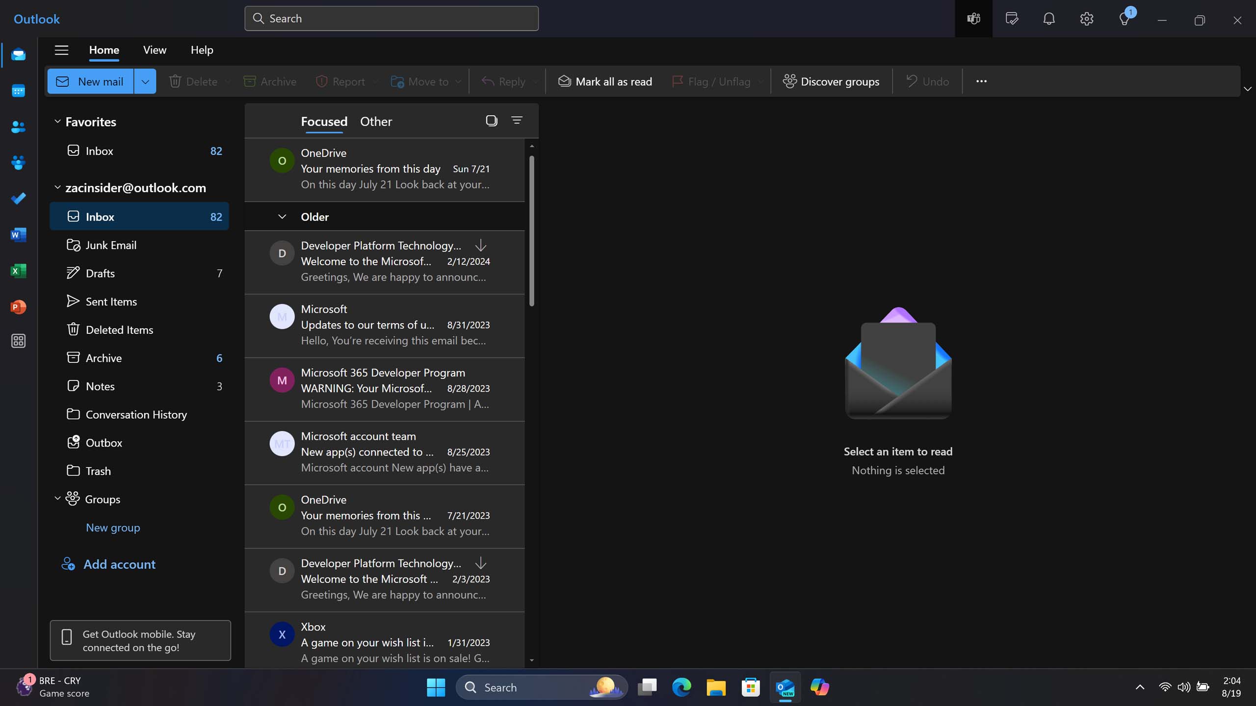
Then there's Windows Mail, Calendar, and People. The three core pillars of any modern OS platform that handles email, events, and contacts. Microsoft has replaced these apps with a single app called Outlook, built from the ground up as a new client that will also eventually replace the old classic Outlook.
Unfortunately, the new Outlook sucks. It's a glorified web app that's much slower and heavier than the modern in-box apps it's replacing. Notifications take longer to pop up, the app itself takes at least a few seconds more to load, and it's basically impossible to use with a touchscreen.
In my opinion, the new Outlook is not a good replacement for Windows 11's default Mail, Calendar, and People apps. It doesn't look or feel like a native Windows app, and it's not easy or enjoyable to use either. Essential apps like email and calendar should showcase the best of the native Windows app platform, not be a web app.
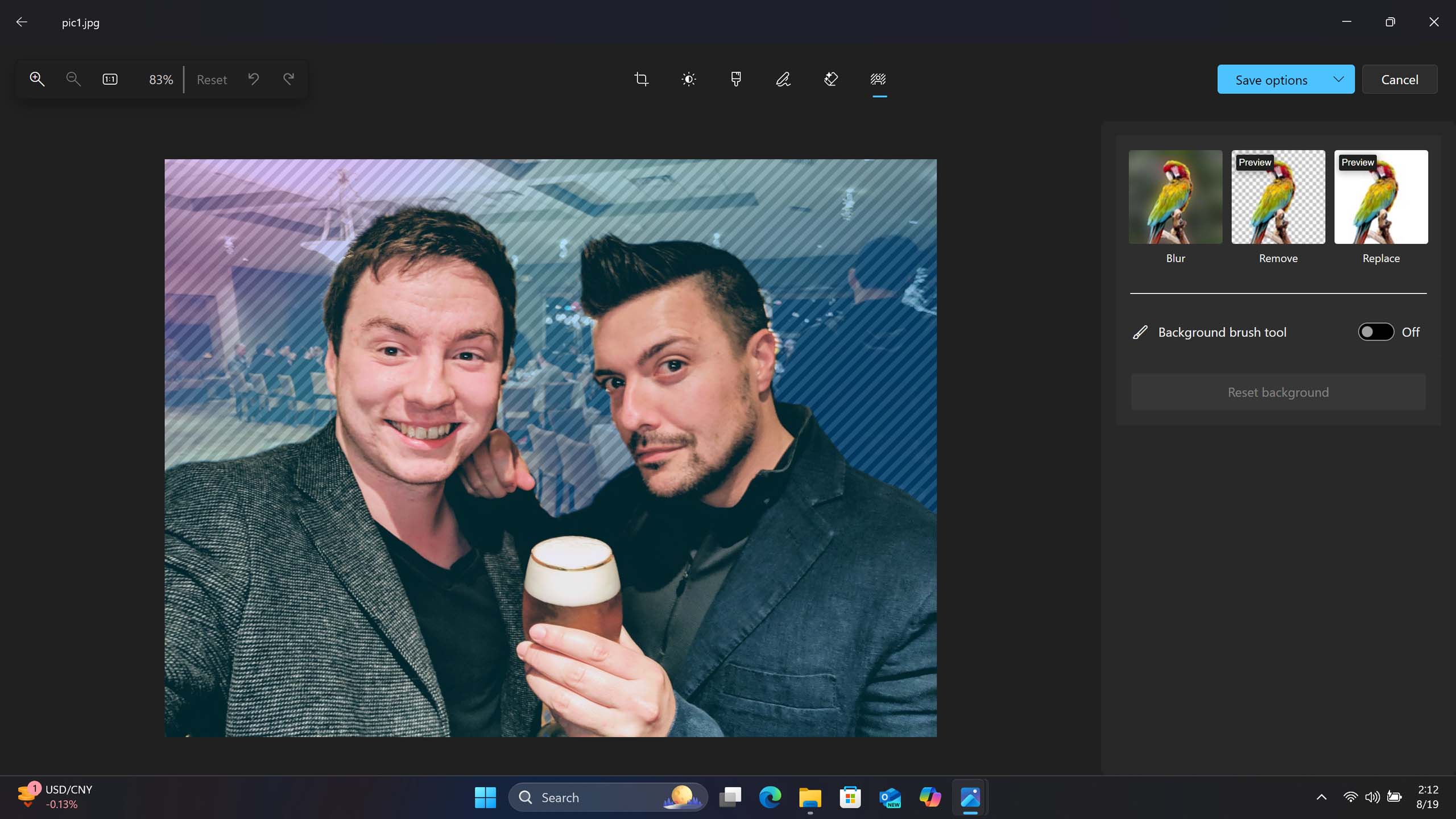
Elsewhere, the Photos app has gained a number of generative AI features that exist outside the exclusivity realm of Copilot+ PCs. There's a new generative erase feature that uses AI to remove blemishes and other small things from images. There are also AI-powered background replacement tools that let you add blur effects or remove the background entirely from an image in just a couple of clicks. All of these new features are super useful, and I use them all the time.
The Photos app now also displays quick shortcuts to other Microsoft-made creativity tools such as Designer and Clipchamp, letting you bring an image into a new project on either service.
Microsoft has made several improvements to the Microsoft Store app, which now separates your app library from app updates and downloads. This makes it easier to see apps you have available to install and apps that are already installed and need an update.
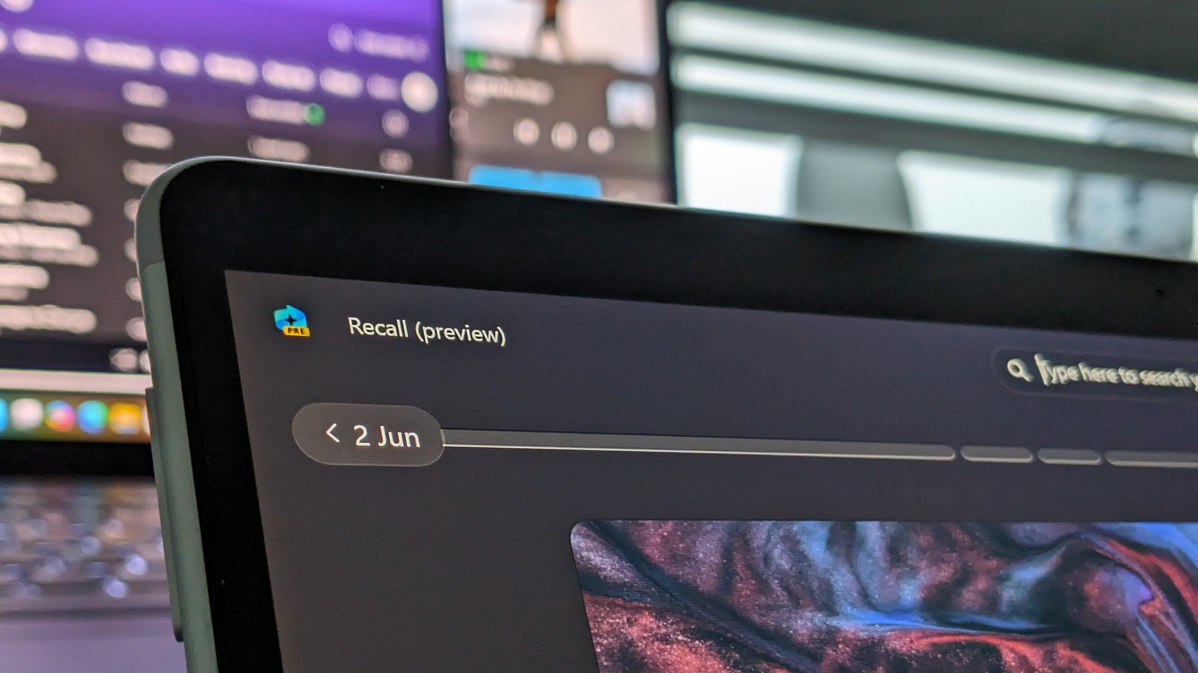
Windows 11 version 24H2: Recall
Windows Recall is not yet available as Microsoft has delayed its release due to recent controversy. This portion of the review is based on a preview build of the feature, and so we will revisit this section once Windows Recall is officially available in the coming months.
Before we begin this section, it's important to understand that Windows Recall is a feature that is exclusive to Copilot+ PCs. These are PCs that have a minimum of 16GB RAM, 256GB storage, and an NPU that can output at least 40 TOPS of power. Any PC purchased before June 18 does not meet these requirements, so you will not be able to use Windows Recall.
If you have a PC that meets these requirements, you will be prompted to enable Windows Recall during setup (once available). The feature is entirely optional, meaning you can choose not to enable it if you're uncomfortable with the concept for whatever reason.
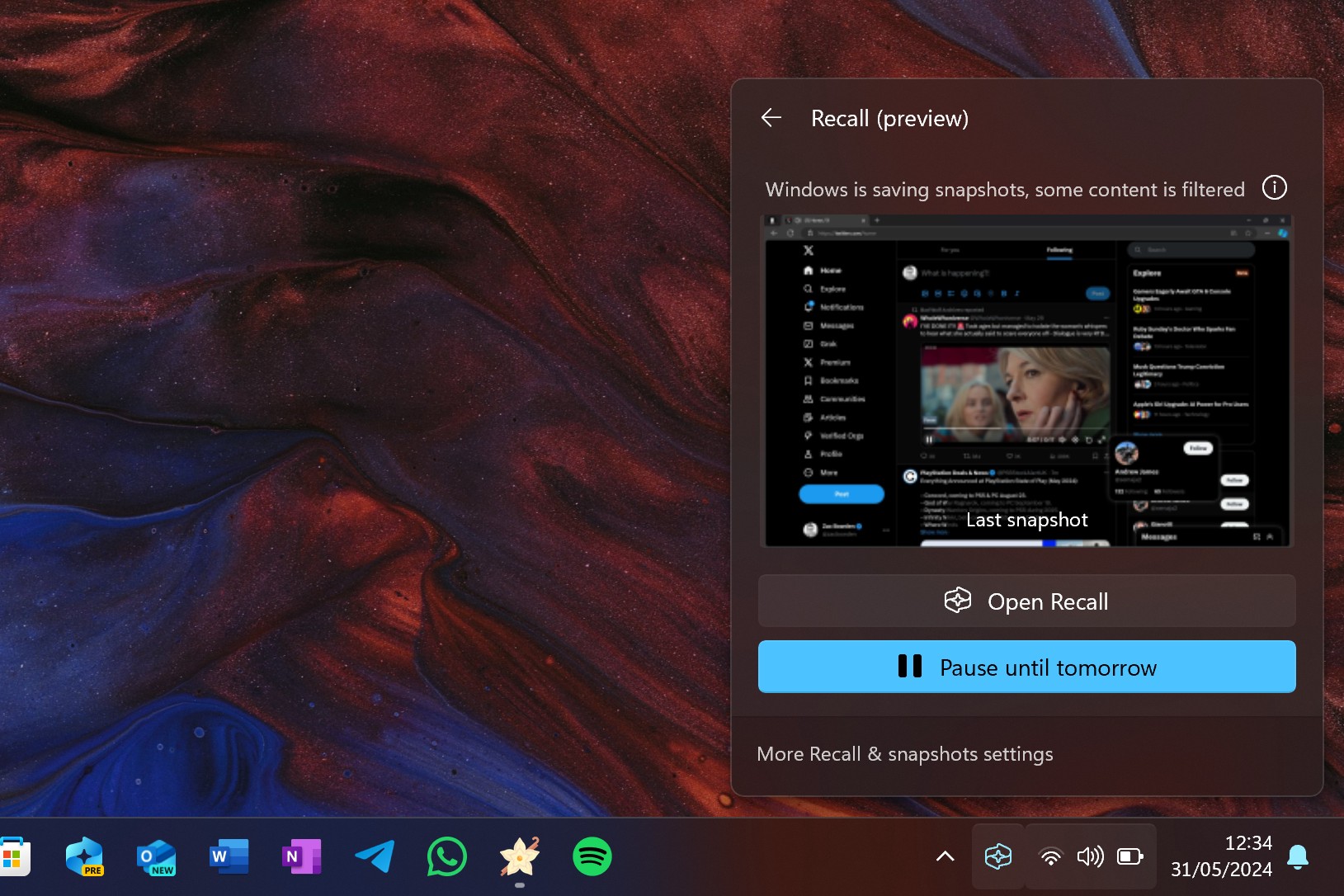
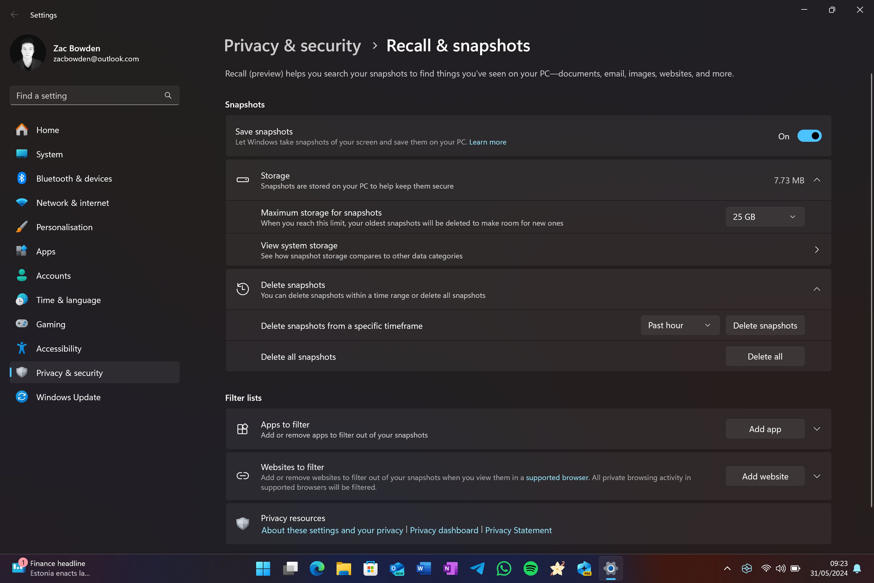
If you choose to enable it, Microsoft has put several safeguards in place to ensure the feature is as safe to use as possible. First, when Windows Recall is collecting data, it will display a permanent icon in the System Tray on the Taskbar. This icon cannot be hidden or removed as it's designed to let you know that Recall is collecting data, and clicking it will open a flyout that lets you quickly pause Recall data collection.
Windows Recall has clearly been designed from the ground up, with privacy at the very forefront of the experience. Users have lots of control over what Windows Recall can see and for how long. Out of the box, Windows Recall cannot see any content in private web browsing sessions, and you can even blacklist your own apps and websites from being visible by Windows Recall, so if you don't want Telegram or WhatsApp to be captured, you can tell Windows Recall to ignore it.
You can also configure how long Windows Recall data remains on-device, ranging from a few days to months. There's also a button to delete all Windows Recall data collected. I found Windows Recall to be most useful if it's collecting data over a longer period of time. Being able to refer back to things I did weeks ago was really helpful during my time with Windows Recall.
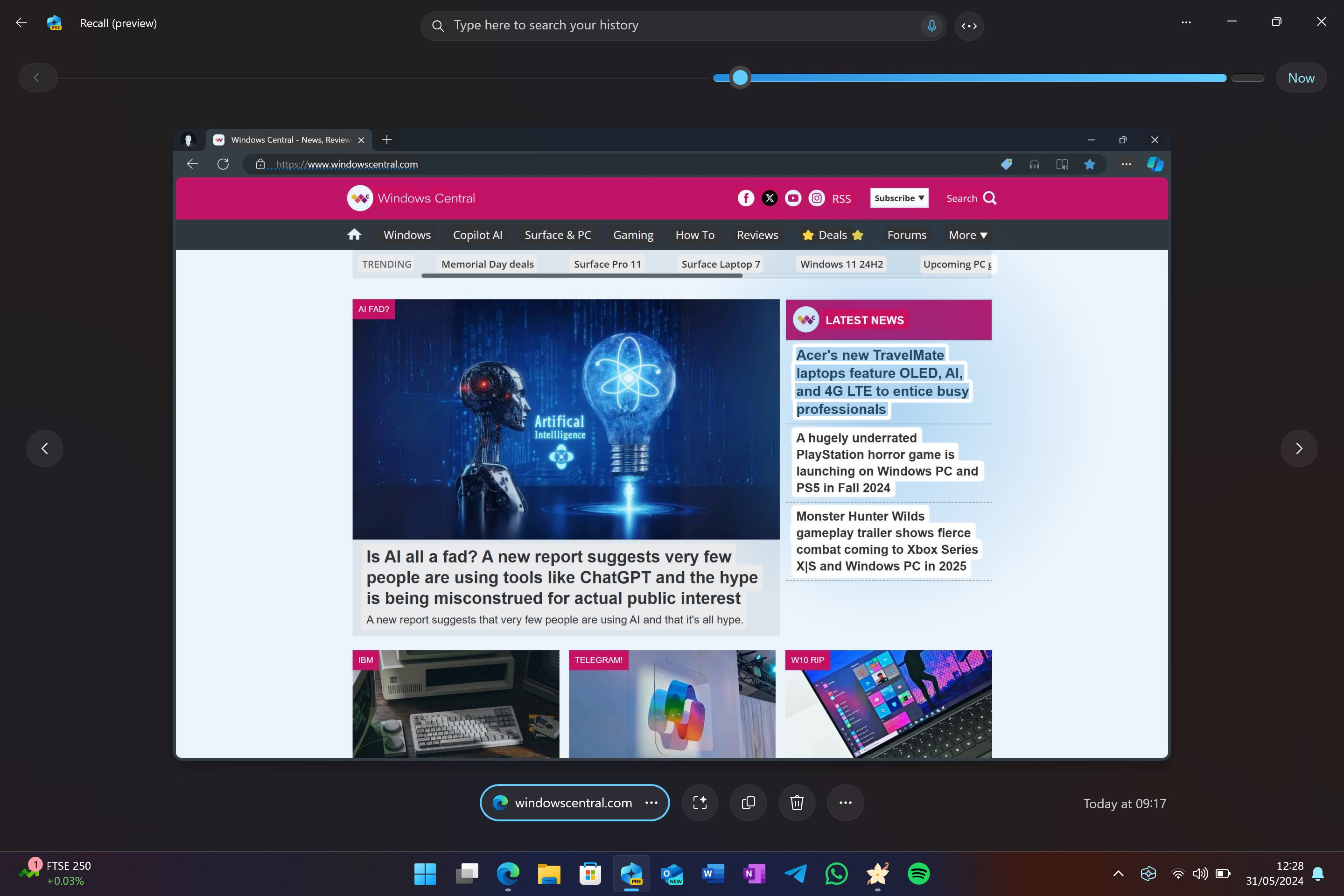
On that subject, how was the Windows Recall experience? In short, incredible. I personally found it game-changing; being able to essentially go back in time to see what I was looking at days or weeks ago was a productivity booster I didn't know I needed. This is the sort of feature that is hard to see as being useful until you're actively using it.
For example, one time during my time with Windows Recall, I was writing an article directly in the CMS and discarded a paragraph that I thought was no longer relevant to the story, only to realize later that I could have used that perfectly crafted paragraph later in the story. Thanks to Windows Recall, I was able to go back and find the point in time where I wrote that paragraph, copy it directly from the Recall app, and paste it back into the CMS.
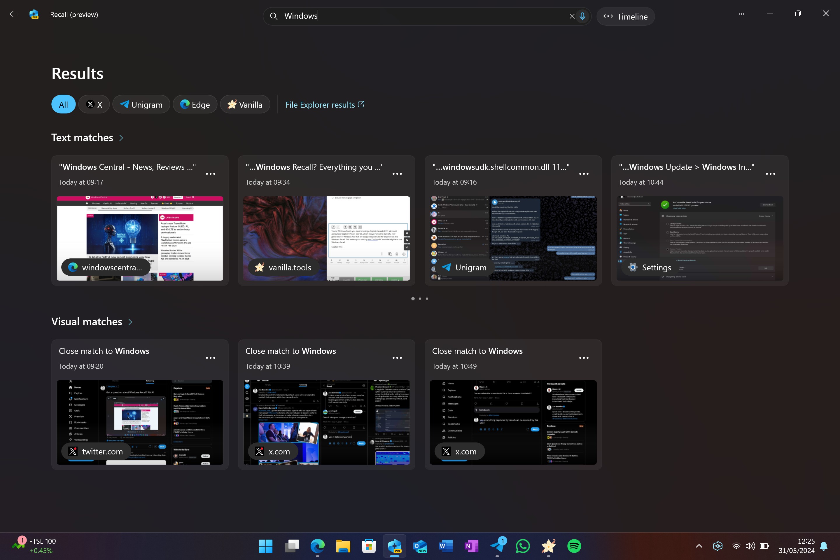
The semantic search aspect of Windows Recall is also really cool. Windows uses AI to identify not just text but images and color in the snapshots it captures, so you can use descriptive language to search for things you remember seeing, even if your search criteria aren't specific.
This means you can type "red dress with yellow handbag," and every instance where a red dress with a yellow handbag was on your screen will be shown to you. Once you find the specific red dress in question, you'll be able to reopen that webpage directly from the Windows Recall app with a single click.
In my testing of the feature, I wasn't able to find a word or phrase it didn't understand. It even understood "Lumia," Microsoft's long-dead Windows Phone hardware line.
Microsoft has already promised further improvements to Windows Recall, including more security features such as locking the Windows Recall app down unless you authenticate with Windows Hello bio authentication first. The company is also working on more features, such as topics, which will automatically group similar things Recall has spotted into easy-to-access groups of snapshots.
Overall, I really, genuinely like Windows Recall. I think it's a really useful tool and one of the first "AI" features I've encountered that enhanced my productivity. Even with the controversy surrounding this feature, I can't wait for it to begin properly shipping. Microsoft says the feature does not upload snapshots to the cloud, and any data it collects will be encrypted locally on the device by the time Recall begins shipping.
Windows 11 version 24H2: Copilot+ PC
Windows Recall isn't the only feature exclusive to Copilot+ PCs. In fact, there's a whole bunch of them that are exclusive to these new NPU-equipped machines. Unfortunately, I'd describe only half of these features as actually useful, with the other half falling under the gimmicky umbrella.
We'll start with the gimmicks, which mostly involve on-device image generation in the Windows 11 Paint and Photos app. You've already been able to generate images using Copilot for over a year now, but with Copilot+ PCs, you can finally do it locally without the need for Copilot.
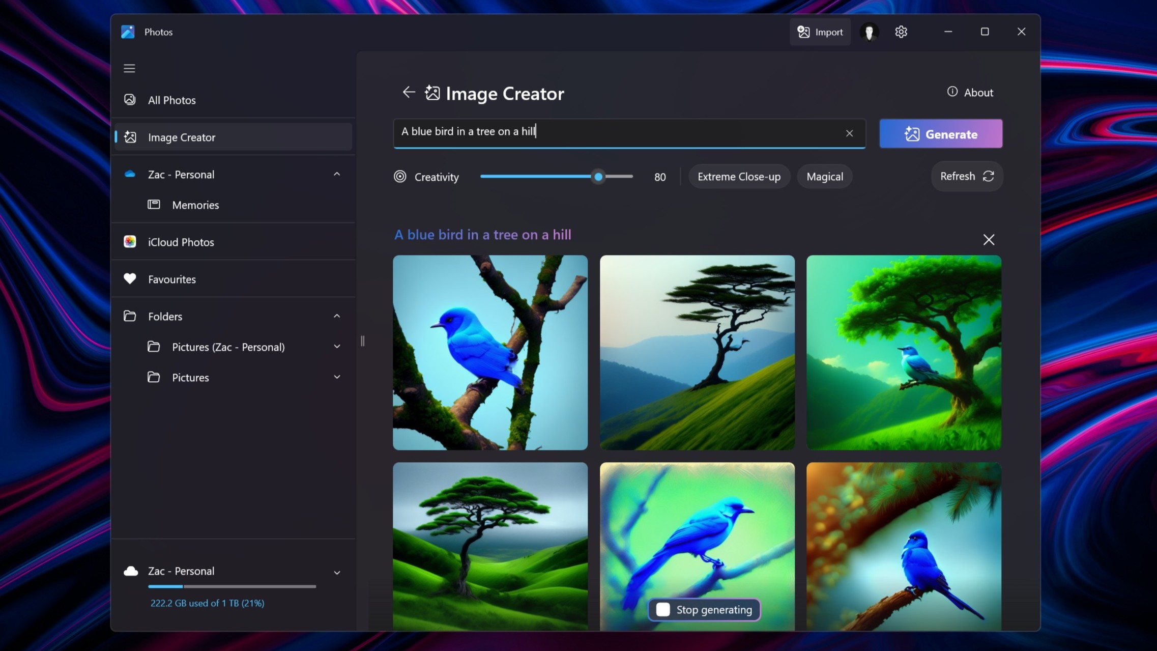
The Photos app has been updated with a built-in image generator, which lets you type a query and have the Photos app use the power of the on-device NPU to generate multiple images based on the query provided. The results are... fine. They're definitely not as good or as realistic as some of the online image generators you can find, but for a locally rendered effort, they're not bad. I just don't have much of a use for them.
What's annoying is that even though the point of an NPU is to enable the ability to generate images offline, you actually can't generate anything offline. Microsoft requires an internet connection to ensure you're not generating anything illegal. For whatever reason, there isn't a local blacklist that the Photos app is able to look at. It needs to remain connected to the web. So, your local NPU is basically useless when disconnected from the internet in this scenario.
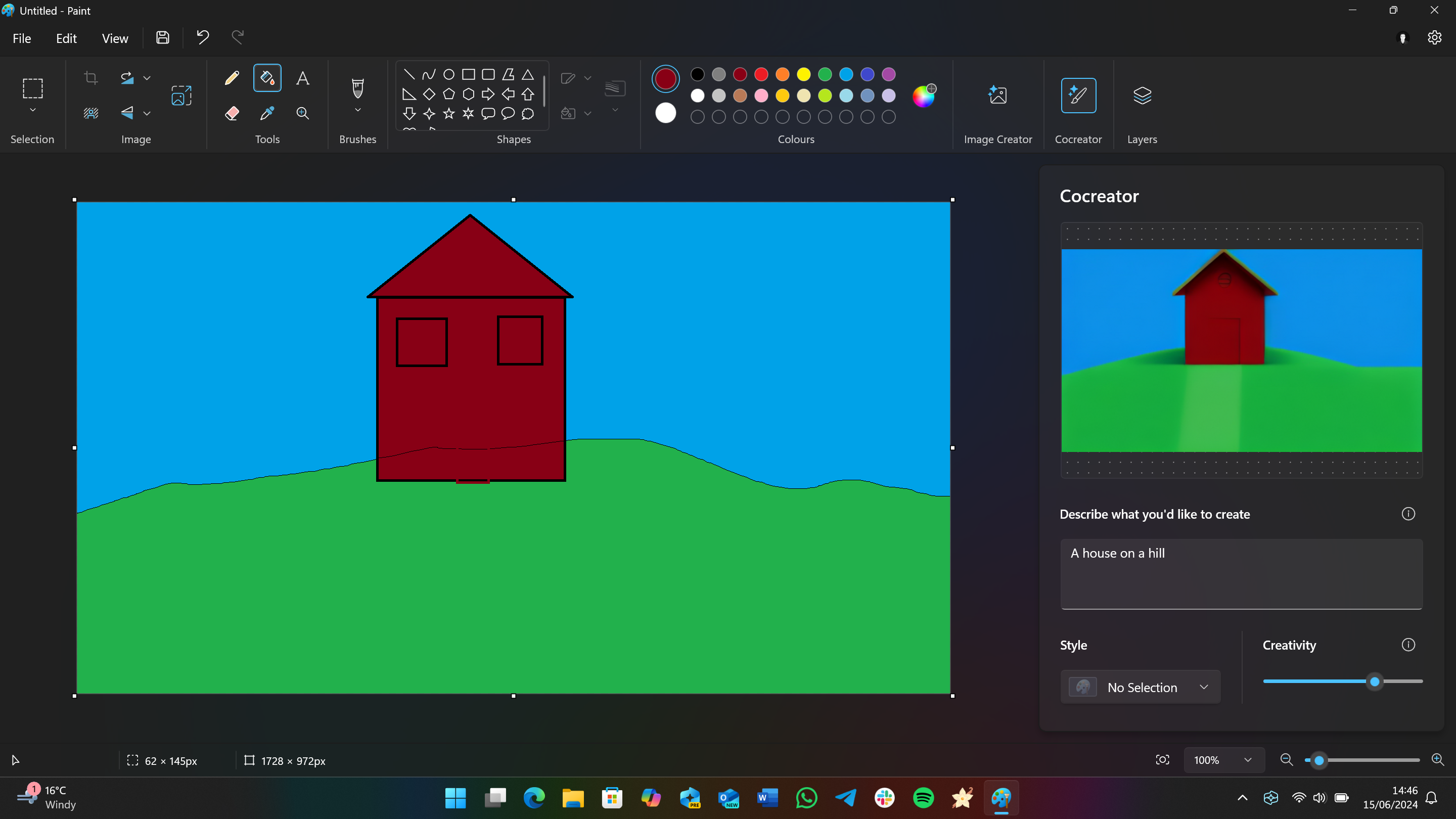
These criticisms pretty much extend to Paint as well, the other app that has gained local generative capabilities with Windows 11 version 24H2. I found the quality of the images generated here vary significantly, and it requires an internet connection to function anyway.
Unlike Photos, which takes a user-entered query and generates images from scratch, the Paint app actually takes queues from sketches drawn by the user. Microsoft calls this Cocreator, and it lets Paint draw a more advanced version of whatever it is you've painted. It's a cool tech demo, but nothing more than that. I can see this being popular with young children, but that's probably about it.
Moving on to the more useful Copilot+ PC features, we'll start with Live Captions. Windows has had a built-in captions tool for some time, but it requires the internet to utilize. With Copilot+ PCs, this is no longer the case. Live Captions now utilizes the on-device NPU to transcribe audio into English directly on the device. In my testing, it works rather well.
Microsoft has also added new Studio Effects to Windows 11 with version 24H2, which also utilize the NPU. These effects consist of new creative filters that smooth your skin and apply an artistic visual style to your live video feed. There's also a new portrait light feature that attempts to brighten your face in dark environments.
My favorite feature is automatic framing, which keeps you in the center of the shot, along with portrait background blur, which gives your video feed a soft, natural-looking blurred backdrop. There are also two eye contact modes: Teleprompter and Standard. Both don't look particularly realistic, so I don't use them.
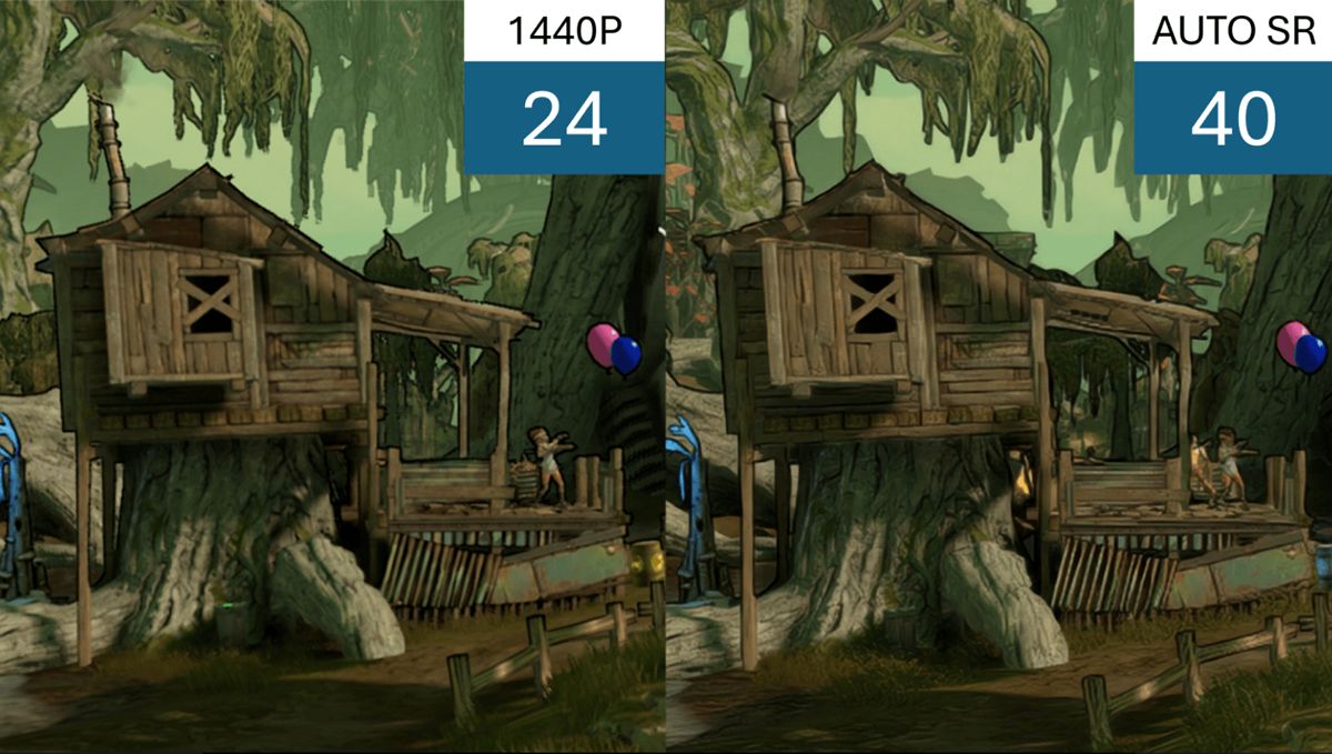
Lastly, we have AutoSR, a new feature that's designed to enhance older Windows games with better visuals. It adds additional frames to make games run smoother and upscale lower-resolution textures without much of a hit on performance. It essentially lets older games look and run better on modern hardware.
In our testing, we found AutoSR works pretty well. It's automatically enabled on a small list of games, but you can manually turn it on for any game you like via the Windows Settings app. In the game Control, we found the visuals looked sharper with well-preserved detail at 720p, also increasing frames per second from 45 to 60.
You can read more about our AutoSR experience in our dedicated hands-on with the feature.
Overall, "Copilot+ PC" features are a bit of a mixed bag. Windows Recall, Live Captions, Advanced Studio Effects, and AutoSR are all great additions. However, on-device image generation in Paint and Photos is more of a gimmick at this point. I'd like to see more Windows features utilize the NPU in the future, as not much actually takes advantage of it right now.
Windows 11 version 24H2: Settings & Miscellaneous
Windows 11 version 24H2 is the first feature update in two years that brings with it notable platform changes and enhancements, which means under-the-hood changes designed to make Windows overall better to use. This time, these changes are most notable on PCs running an Arm-based processor, basically anything ranging from a Snapdragon 850 up to the latest Snapdragon X chips.
Microsoft says it rearchitected Windows 11 for Arm, and that results in faster overall performance on Arm PCs. I can confirm that older devices like the Surface Pro X do benefit from a slight performance boost when upgrading to version 24H2. It's most noticeable when nipping around in the OS, opening things like apps and flyouts.
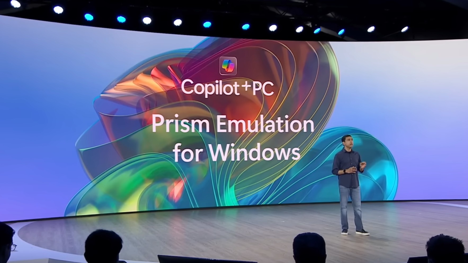
The company has also rebuilt the x86 app-emulation layer for Arm PCs, too. Now called PRISM, this improved emulation runs some apps up to 10% faster, which is great to see. Now, apps will still feel emulated on older Windows on Arm PCs, but they will no longer feel as slow as they once used to.
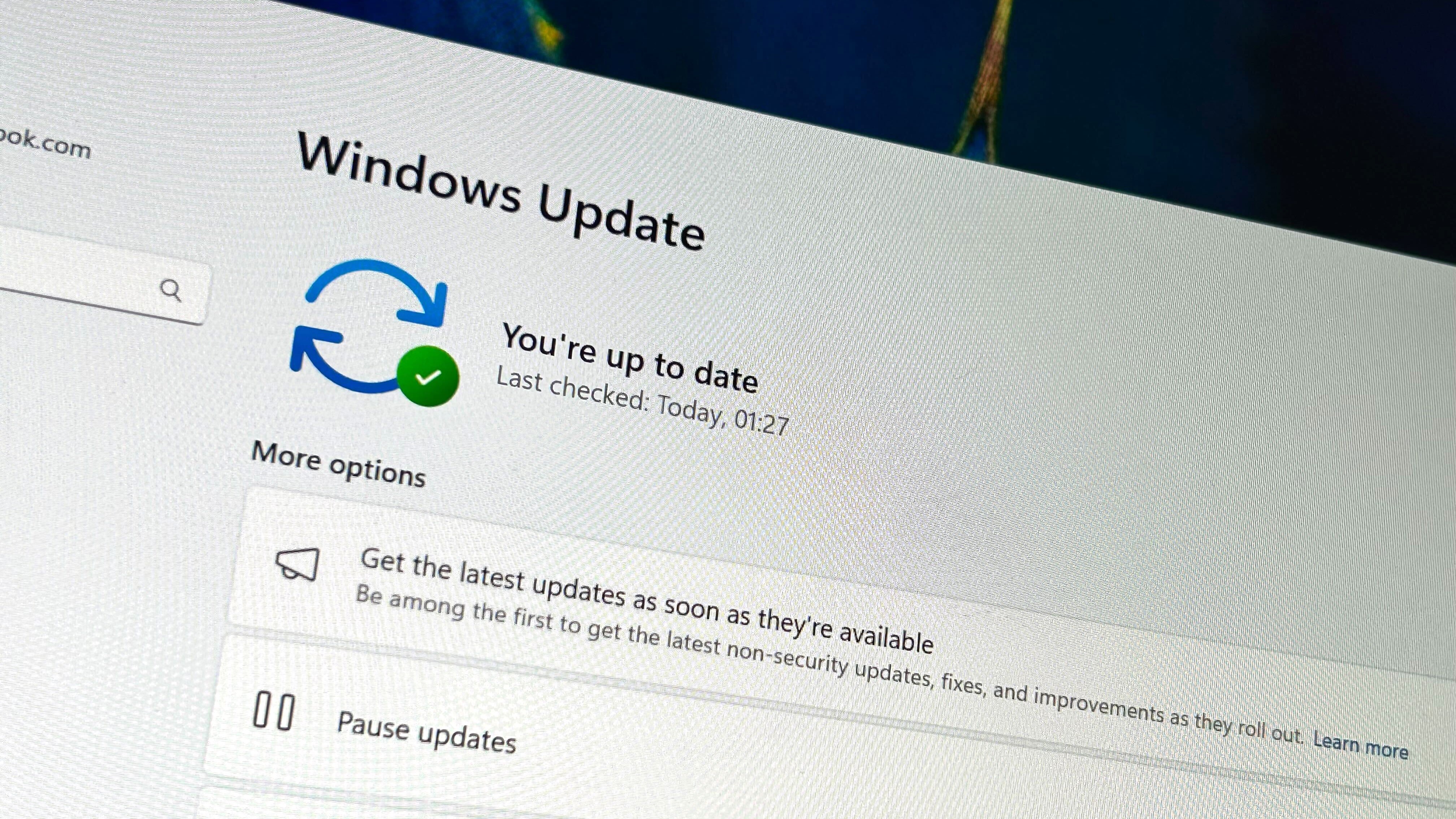
Elsewhere, Microsoft has delivered several updates to the Windows Update system, designed to improve the Windows updating experience and reduce downtime. First, "hotpatching" is now supported in the Windows Client. This is a feature that lets Microsoft deliver security updates and bug fixes to users without requiring a reboot to apply them. I don't expect the company to use this all the time, but it will be useful for any out-of-band security updates that may be needed. You won't even notice it happen.
The Windows Settings app has gained a few new options, too. Now, there are more legacy settings for the mouse present in the modern Mouse area of Windows Settings. You can now configure your scrolling direction behavior, as well as enable or disable enhanced precision directly within the modern Settings app.
Microsoft has also made some improvements to power settings. You can now customize your power plan for being plugged in or unplugged, regardless of your current plugged-in state. So, if you're plugged in and want to change the power plan for when you're unplugged, you can do that now. Previously, you'd have to unplug your laptop first to change the unplugged power plan.
Battery saver has also been renamed to "Energy Saver," and is now available on PCs without a battery. Energy Saver is designed to reduce energy consumption, not just prolong battery life. It does this by reducing background services and activities, and can even reduce overall clock speed. This pulls less energy from the wall hence it now applies to desktop PCs, too.
Conclusion
The Windows 11 2024 Update is a great release that continues to focus on improving day-to-day tasks and activities while also introducing new features and platform enhancements. I really like the updates to the Start menu and File Explorer, introducing even deeper integration with Phone Link to the point where your smartphone is now an extension of Windows.
I also like the improvements to the System Tray and Quick Settings panel; I think both look much cleaner as a result of the changes made in this update, though I'm not a fan of not being able to hide quick actions I don't intend to use. The reintroduction of animations to Taskbar app preview thumbnails is also a welcome addition.
The AI stuff is a mixed bag only because much of it is locked behind Copilot+ PCs. Windows Recall is the first truly useful "AI" feature I've used on a desktop OS, but the controversy surrounding it has cast a huge cloud over Windows' AI efforts. Can users trust Microsoft to build AI features like Recall?
Advanced Windows Studio Effects and AutoSR are great additions, but I don't think these features alone are enough to encourage people to go out and buy a Copilot+ PC. They're nice extras but not the sole reason to upgrade to newer hardware.
I also appreciate many of the under-the-hood improvements coming in this release, including a better Windows Update experience that's designed to be less obtrusive and performance improvements for Windows on Arm devices like the Surface Pro X. Updates that improve the performance of older devices don't come very often, so it's good to see here.
However, the new Windows Copilot and Outlook apps are a step backward, in my opinion. I don't like how Copilot can no longer control Windows Settings or open apps, and I really don't like how the new Outlook is basically just a web app that's heavier and slower than the older apps it's replacing.
And lastly, the continued unfinished state of dark mode is just unprofessional at this point. It's been almost ten years, and Microsoft still hasn't completed it. There are too many areas of the OS that you encounter on a daily basis that don't support dark mode, and it really brings the quality of the OS down, in my opinion.

