Even Microsoft's AI says the new Outlook is worse than Mail & Calendar on Windows 11

New Microsoft Outlook on Windows 11
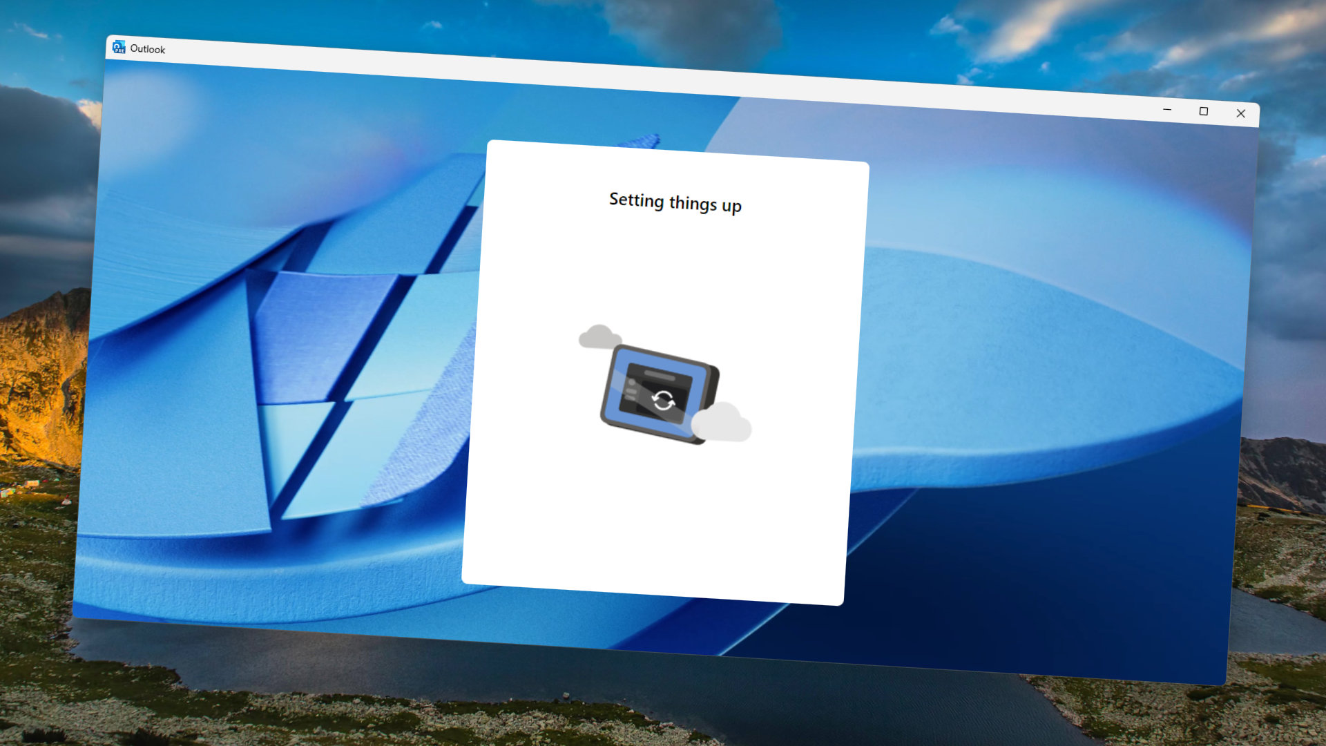
The new Microsoft Outlook has received harsh criticism from many, but it is still set to replace the Mail & Calendar app on Windows 11. (Image credit: Future)

What you need to know

  • The AI-generated summary of the new Outlook in the Microsoft Store criticizes the email app.
  • The Microsoft Store started including AI-generated summaries of app reviews in July 2023.
  • The new Outlook, which is set to replace Mail & Calendar on Windows 11, has received criticism for its design, performance, and feature set.

The Microsoft Store has some criticism for the new Outlook. The store listing for Mail & Calendar, which will be replaced by the new Outlook this year, lists an AI-generated summary criticizing the email app. The text is based on reviews from everyday users and does not paint a pretty picture of the new Outlook.

Microsoft rolled out AI-powered summaries within the Microsoft Store around a year ago. The aim is to make it easier for users to get a gauge of an app without having to scroll through a bunch of reviews. The Microsoft Store looks through the reviews and then uses AI to generate a summary. Of course, that means that an app with a bunch of negative reviews will have a negative summary, which is exactly what's happened with the new Outlook. The Microsoft Store listing for the app states:

"Users highly recommend the Mail and Calendar app over the new Outlook, citing its simplicity, ease of use, and lack of ads. They appreciate the app's ability to handle multiple accounts and create custom background images. Users hope that Microsoft will not discontinue the app and allow offline access."

The AI-generated summary was highlighted on Reddit by ceoadlw. The new Outlook will replace the Mail & Calendar app later this year, so Microsoft still has some time to refine the app.

People hate the new Outlook
Outlook Client Hero

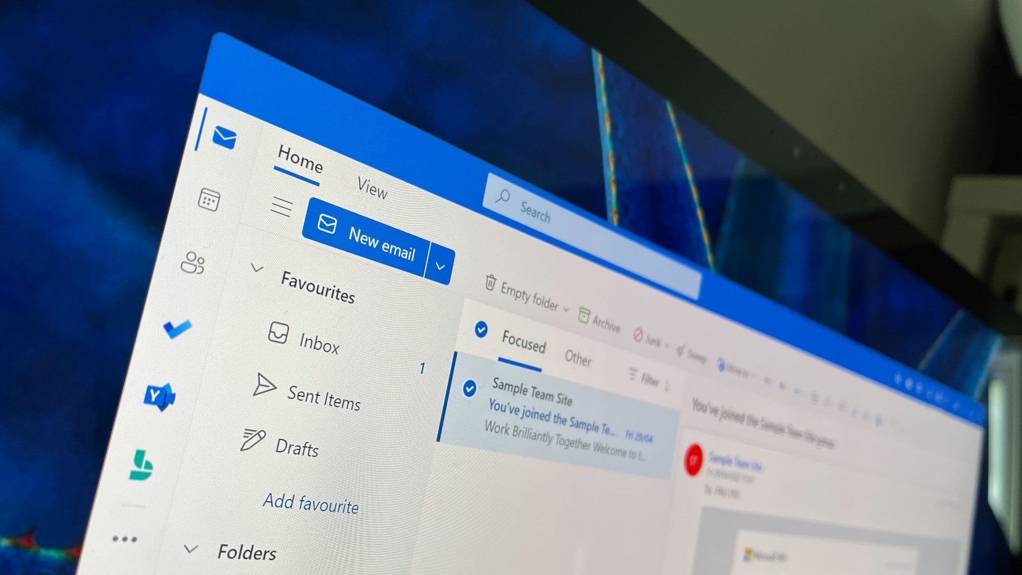
The new Outlook will replace the Mail & Calendar app on Windows 11 before the end of 2024. (Image credit: Future)

The new Outlook has proven controversial since its inception, and it's not just Microsoft Store reviewers that have negative things to say about the app. Our Senior Editor Zac Bowden explained why he hates the new Outlook for Windows earlier this year. Bowden went as far as to say he thinks "the new Outlook for Windows is the worst built-in OS email client of any OS platform on the market right now."

The new Outlook lacks the unified inbox seen in Mail & Calendar. It also performs worse than its predecessor and takes up more RAM when it use. Reliability issues are also common with the new Outlook, though some of that could be related to the app being in preview. But as Bowden points out, Microsoft pushes the new Outlook on users and automatically pins the app to every Windows 11 PC's Start menu. If the app was that far from being finished, Microsoft shouldn't push it so hard.

Before you run the defense of the new Outlook because the app is in preview, much of the app's criticism revolves around facts that are unlikely to change when the app is stable and generally available.

"I know the app is branded as a preview, and Microsoft probably will get around to fixing some of these issues over time," said Bowden. "But there's no fixing the fact that it's a web app that doesn't even attempt to make itself feel at home on Windows. It doesn't look or feel like a Windows app, and it's definitely not as fast or as lightweight as the old Windows Mail & Calendar apps."

Microsoft's shift toward web apps comes with inherent drawbacks, such as apps feeling out of place and being "heavier" than native counterparts. Those problems won't change with bug fixes; they're here to stay.

If the Microsoft Store continues to use AI to summarize app reviews, I doubt things will get much better for the new Outlook. Assuming the summaries are genuine and based on actual reviews from users, there will be more criticism than praise for the AI to sift through.

Sean Endicott
News Writer and apps editor

Sean Endicott is a tech journalist at Windows Central, specializing in Windows, Microsoft software, AI, and PCs. He's covered major launches, from Windows 10 and 11 to the rise of AI tools like ChatGPT. Sean's journey began with the Lumia 740, leading to strong ties with app developers. Outside writing, he coaches American football, utilizing Microsoft services to manage his team. He studied broadcast journalism at Nottingham Trent University and is active on X @SeanEndicott_ and Threads @sean_endicott_. 

  • bradavon
    It's not though. Windows Mail and Calendar are really poor and basic.

    New Outlook is certainly marmite at the moment but Windows Mail and Calendar weren't decent products.
    Reply
  • jasqid
    M&C is good for tablet mode, but doesnt have all the functionality most need. There is something missing from New Outlook that I cant quite put my finger on.
    Reply
  • Cmndr_Bytes
    I recently started trying out the new Outlook and there are features in it I really like. However there are features from the Outlook 365 client that are missing that I need/want. I have been having them both open and using the one I need at the moment. :-)
    I do think though i am probably using the new a bit more.
    Reply
  • Kaymd
    bradavon said:
    It's not though. Windows Mail and Calendar are really poor and basic.

    New Outlook is certainly marmite at the moment but Windows Mail and Calendar weren't decent products.
    The 'new' Outlook is an embarrassing mediocre app compared to the now legacy Mail and Calendar app. Unreliable background syncing, unnecessarily bloated for a simple built-in mail and calendar app. It's not really good in any one direction. Not surprising since it's Microsoft Edge camouflaging as a native mail app. Pinch to zoom does not even work! If I wanted a massive email program, I'd use the real Office Outlook. I most definitely expect more from the 'most valuable' software company in the world.

    Although the legacy Mail and Calendar did have some content rendering issues (which Microsoft stubbornly refused to fix forever), it is a true native app - lightning fast, solid reliable background syncing, super-smooth scrolling, very responsive to touch interfaces, excellent pinch to zoom (as one would expect), a clean interface that focuses on the core of modern email.

    I am strongly rooting for Wino Mail to carry on for the legacy Mail and Calendar. You can check it out in the MS store. The developer of Wino Mail gets it. Amazing what a single individual can do that the massive corporation fails at. Instead, they focus massive resources on gimmicky efforts like 'AI' Recall at the expense of perfecting fundamentally useful tools that billions of people use every minute of the day.
    Reply
  • GraniteStateColin
    I never really use Mail & Calendar, because I need the Exchange and Microsoft 365 features of full Desktop Outlook. Desktop Outlook also tries to steer its users to the New Outlook, but New Outlook is largely USELESS compared to the classic Desktop Outlook. NONE of the power features of Desktop Outlook are included -- rules, macros, the powerful editor, auto-archiving, admin controls, etc. NONE of those work in the New Outlook.

    Worse, at least this was still the case in my last check a couple of months ago, the editor broke with how ALL OTHER WINDOWS AND OFFICE editors work with spellcheck. In everything else, when Word or another program (even text fields in the browser) detect a spelling error, they red-underline. Then, you can right-click on the red-underlined word to select a replacement. Right-click did nothing on misspelled words in New Outlook (at last test). Instead, it wants you to left-click, which should just position the cursor (to be fair, I see Word has recently also started providing alternatives when left-clicking, but it also still supports the right-click for those of us who are used to that from the past 20 years of that being the consistent UI element).

    Also, if you have a long list of folders that is longer than what fits in the window in just about everything else, when you drag over that last it will scroll automatically if you drag the item to the top or bottom, enabling you to reach all folders, including those that are not currently in view. In New Outlook, even this basic drag-and-drop didn't work, with nothing happening when dragging to top or bottom, meaning no way to reach those other folders. Instead, you have to scroll the folder list first, then pick up the item you want to drag, then drop it in the desired folder. WTF!?

    This app seems far, far, far from being ready for general use. It's missing all the features that make Desktop Outlook a powerhouse and it's missing the basic UI features that every Windows app should have, and even lowly Mail & Calendar already does most of these right.

    I generally support Microsoft's efforts, but I would rate New Outlook somewhere between a D- and an F. The only reason it could rise to a D- is because it does work to actually send and receive email, but it does less than all the alternatives.
    Reply
  • Ykion
    Microsoft will simply let it the AI lie (fake the summary, taking only the positive) or remove the summary altogether.
    Both which they did for Samsung Notes app when it was locked behind owning overpriced Galaxy Book PCs and people were (are) complaining to the unlistening void. Not to mention they purged ALL reviews before removing AI summary.
    Make popcorn, sit, watch it happen, again, and then again, and then again etc....

    What users think or feel does not matter at all. Products and services will just keep on getting worse as long as business will be based on capitalism, there is literally no other ending to this. Capitalism is unsustainable if you use human lives as a variable in the concept.
    Reply
  • vladnc
    bradavon said:
    It's not though. Windows Mail and Calendar are really poor and basic.

    New Outlook is certainly marmite at the moment but Windows Mail and Calendar weren't decent products.
    They were poor and basic, but, after their initial teething issues, they worked. They only had a few issues with their rendering, but they were good enough for me. In fact I preferred them to the Google web apps.

    Also, the article is completely wrong when it's saying "the app is in preview". No, it's not in preview, it has not been in preview for months. It forced you to switch from Mail and Calendar to it for a while, and you could only temporarily revert to Mail and Calendar, so you can't say it was still in preview, a preview would be opt-in and you could revert from it. That is until recently, now you can't revert even temporarily. It's New Outlook or nothing.

    And, talking about not working, for the last week I couldn't mark emails as read with New Outlook in either of my 3 email accounts (2 google and one outlook account). I mean, I can mark them, but as soon as I do a sync they are marked as unread again. The latest update didn't fix that either.

    Then there is sending email, where the email remains in the "sending" state for ages, when in fact it has already reached the destination. Then the duplicate drafts it creates for no reason, or the invisible drafts or emails that only show as a counter, but disappear when you click the folder. Then the UI suddenly displaying empty squares instead of icons. Then the crashes. Then the duplicate windows. Then not being able to click links in my calendar entries. Then sending empty squares instead of the pictures I inserted in the emails. It's a horror show.

    Basically now I use the apps on my Android phone and tablet to read my email, since Windows is forcing us to use this abomination.
    Reply
  • Kaymd
    vladnc said:
    They were poor and basic, but, after their initial teething issues, they worked. They only had a few issues with their rendering, but they were good enough for me. In fact I preferred them to the Google web apps.

    Also, the article is completely wrong when it's saying "the app is in preview". No, it's not in preview, it has not been in preview for months. It forced you to switch from Mail and Calendar to it for a while, and you could only temporarily revert to Mail and Calendar, so you can't say it was still in preview, a preview would be opt-in and you could revert from it. That is until recently, now you can't revert even temporarily. It's New Outlook or nothing.

    And, talking about not working, for the last week I couldn't mark emails as read with New Outlook in either of my 3 email accounts (2 google and one outlook account). I mean, I can mark them, but as soon as I do a sync they are marked as unread again. The latest update didn't fix that either.

    Then there is sending email, where the email remains in the "sending" state for ages, when in fact it has already reached the destination. Then the duplicate drafts it creates for no reason, or the invisible drafts or emails that only show as a counter, but disappear when you click the folder. Then the UI suddenly displaying empty squares instead of icons. Then the crashes. Then the duplicate windows. Then not being able to click links in my calendar entries. Then sending empty squares instead of the pictures I inserted in the emails. It's a horror show.

    Basically now I use the apps on my Android phone and tablet to read my email, since Windows is forcing us to use this abomination.
    Very well described. The 'new' Outlook app is simply a mess, even after almost a year in preview.
    I've been using Wino Mail for a while, and it's been such a pleasant surprise in quality for its age and essentially developed by a single individual. I hope it's the eventual successor to Mail and Calendar.
    Reply
  • computerdave911
    Windows Central said:
    The Microsoft Store listing for the Mail & Calendar app includes an AI-generated summary of reviews that criticizes the new Outlook.

    Even Microsoft's AI says the new Outlook is worse than Mail & Calendar on Windows 11 : Read more
    has nothing to do with windows 11 , its in 10 too
    Reply
  • bradavon
    jasqid said:
    M&C is good for tablet mode, but doesnt have all the functionality most need. There is something missing from New Outlook that I cant quite put my finger on.
    Tablet Mode isn't a thing in Windows 11 though and will be totally EOL at the end of next year when Windows 10 is EOL.
    Reply