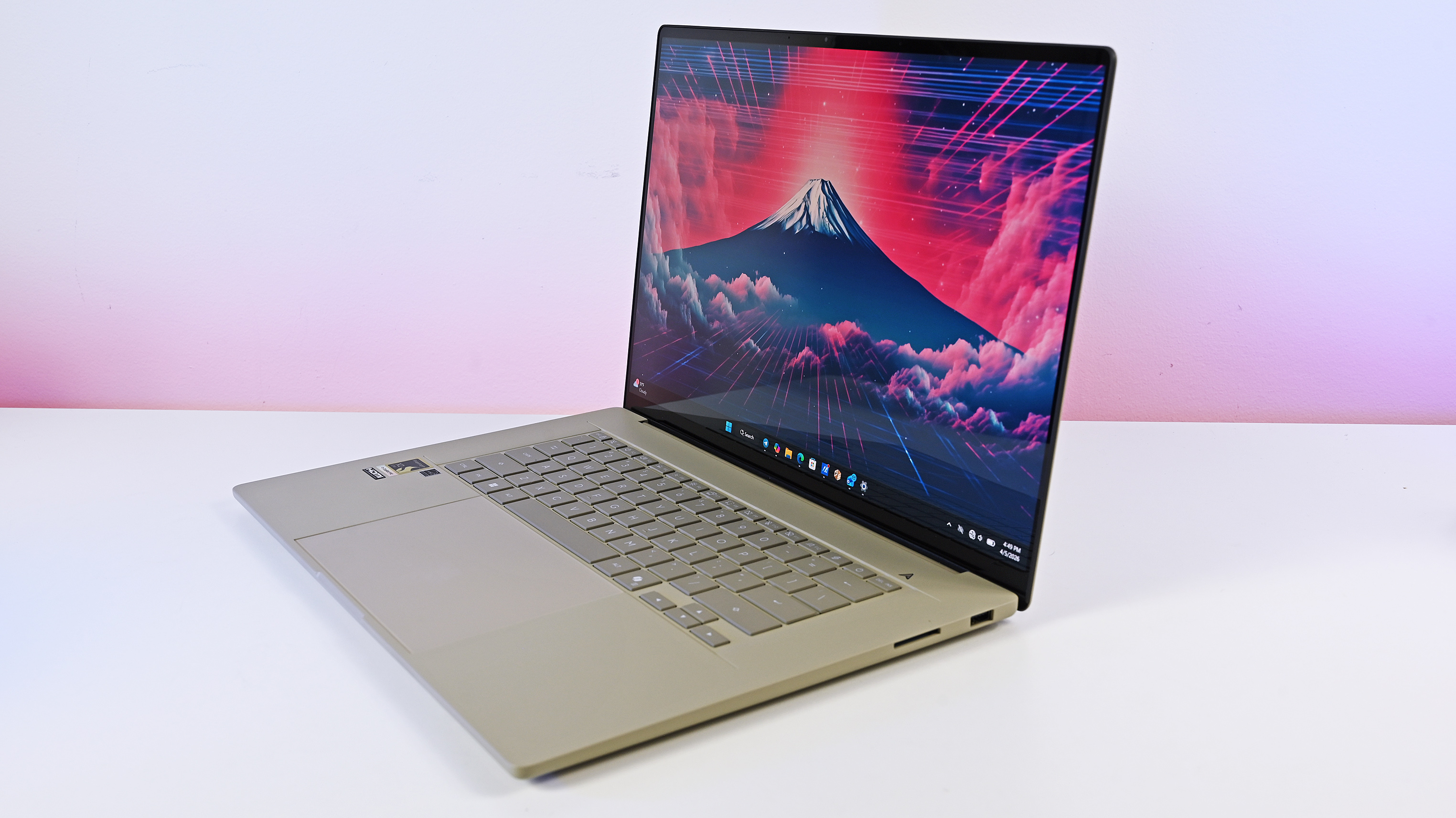
A concept designer presents 'a Windows 13 utopia' packed with Windows 11's wildest dreams but is disrupted with an annoying BSOD only Microsoft can fix with execution
Here's a Windows concept we'd all love to see come to fruition.
All the latest news, reviews, and guides for Windows and Xbox diehards.
You are now subscribed
Your newsletter sign-up was successful
Join the club
Get full access to premium articles, exclusive features and a growing list of member rewards.
What you need to know
- A concept designer recently shared a YouTube video highlighting what 'Windows 13' might look like in the future.
- The Windows 13 concept features some elements from Apple Intelligence, more advanced features for Copilot, and a host of customization options for the operating system.
- Windows 11's market share continues to struggle despite Microsoft's big AI push.
For the better part of last year, most users assumed Microsoft would ship Windows 12 after Windows 11 version 23H2. However, the company seemingly pushed these plans forward, or rather, on the back burner, and decided to release the next major version of Windows, Windows 11 version 24H2.
And while we didn't get Windows 12, most of our expectations for the operating system have manifested as part of the 24H2 release. During Microsoft's special Windows and Surface event, the company announced a host of next-gen AI features shipping with Windows 11 version 24H2, including Live Captions, the controversial Windows Recall feature, Auto Super Resolution, Voice Clarity, and Windows Studio Effects.
Windows 11 has been around for almost three years. However, Windows 10 dominates the market share despite its imminent death, slated on October 14, 2025. This can be attributed to its flawed design, stringent system requirements, etc.
Article continues belowWhile Windows 12's future remains uncertain, concept designer extraordinaire AR 4789 recently shared a video of what Windows 13 might look like in the future. Yes, Windows 13 (via Beta News). It's impossible to tell what plans Microsoft might have for the future or what moniker it'll use for its next major version release for Windows, but this is a great start.
Windows 13 is actually the Windows 11 we want and need
Right off the bat, the user experience for "Windows 13" looks and feels great. This might be the Copilot+ PCs with Qualcomm's sophisticated Snapdragon X Elite chips hype talking, but everything seems clicky and responsive.
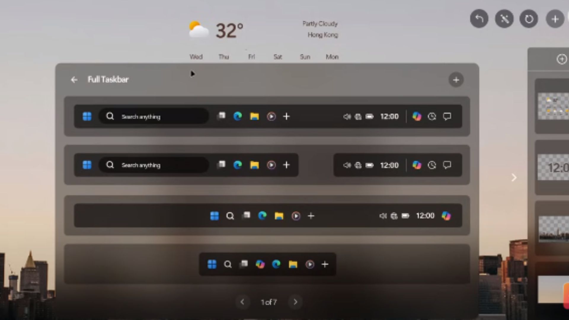
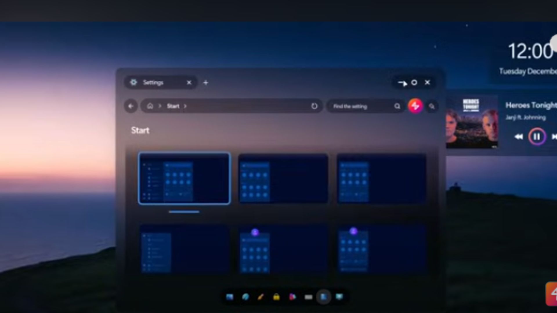
Windows 13 also spots the Fluent design language and principles Windows 11 could only dream of. There's also a host of customization options, allowing users to configure the operating system based on their preference for easy accessibility. Perhaps more interestingly, the taskbar gets more customization options out of the box. It'll no longer take up your entire screen real estate at the bottom. Instead, you can select a format that best suits your needs.
Of course, there are hints of AI-powered capabilities that can be leveraged to spruce up the PC's wallpaper, which is quite similar to Apple's new AI strategy across its ecosystem, Apple Intelligence. You can even use AI to create a folder with your most used apps. Moreover, you can be more specific and categorize them based on themes like productivity or social apps.
All the latest news, reviews, and guides for Windows and Xbox diehards.
Start11 | $6.99 at Stardock
Start11 is a piece of customization software that lets you pick how the Start menu looks on Windows 11 or Windows 10. Its most recent update adds three new styles and several other improvements.
Even the 'comically bad' Start menu gets a much-needed upgrade. Until now, the app remains limited in terms of customization options. As such, users turn to third-party apps like Stardock's Start11 for sophisticated customization needs, like bringing rounded corners to Windows 11's taskbar to make it look like the next version of Windows.
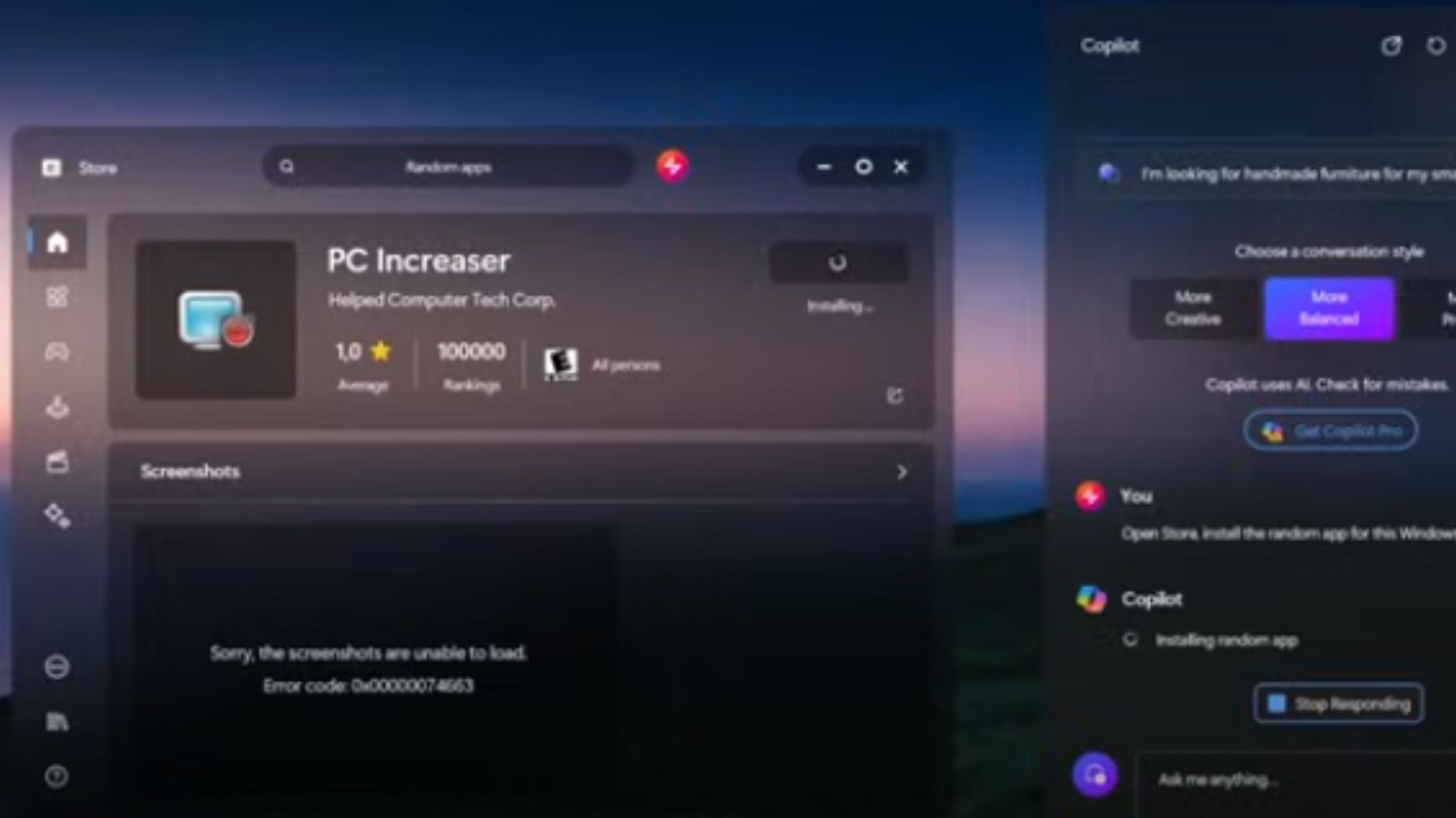
Copilot — Microsoft's big AI project for Windows 11 featured in the video, too. Rather than its usual functions, the video presented the AI chatbot in a new light. It acted more like an AI assistant, like what we have with Siri on the iPhone. A simple prompt would allow the chatbot to perform simple tasks like launching apps.
As you may know, Microsoft announced it's pumping the brakes on Copilot AI advances in Windows 11 to focus on improving and enhancing the existing ones.

Kevin Okemwa is a seasoned tech journalist based in Nairobi, Kenya with lots of experience covering the latest trends and developments in the industry at Windows Central. With a passion for innovation and a keen eye for detail, he has written for leading publications such as OnMSFT, MakeUseOf, and Windows Report, providing insightful analysis and breaking news on everything revolving around the Microsoft ecosystem. While AFK and not busy following the ever-emerging trends in tech, you can find him exploring the world or listening to music.
 Windows Central Insider


