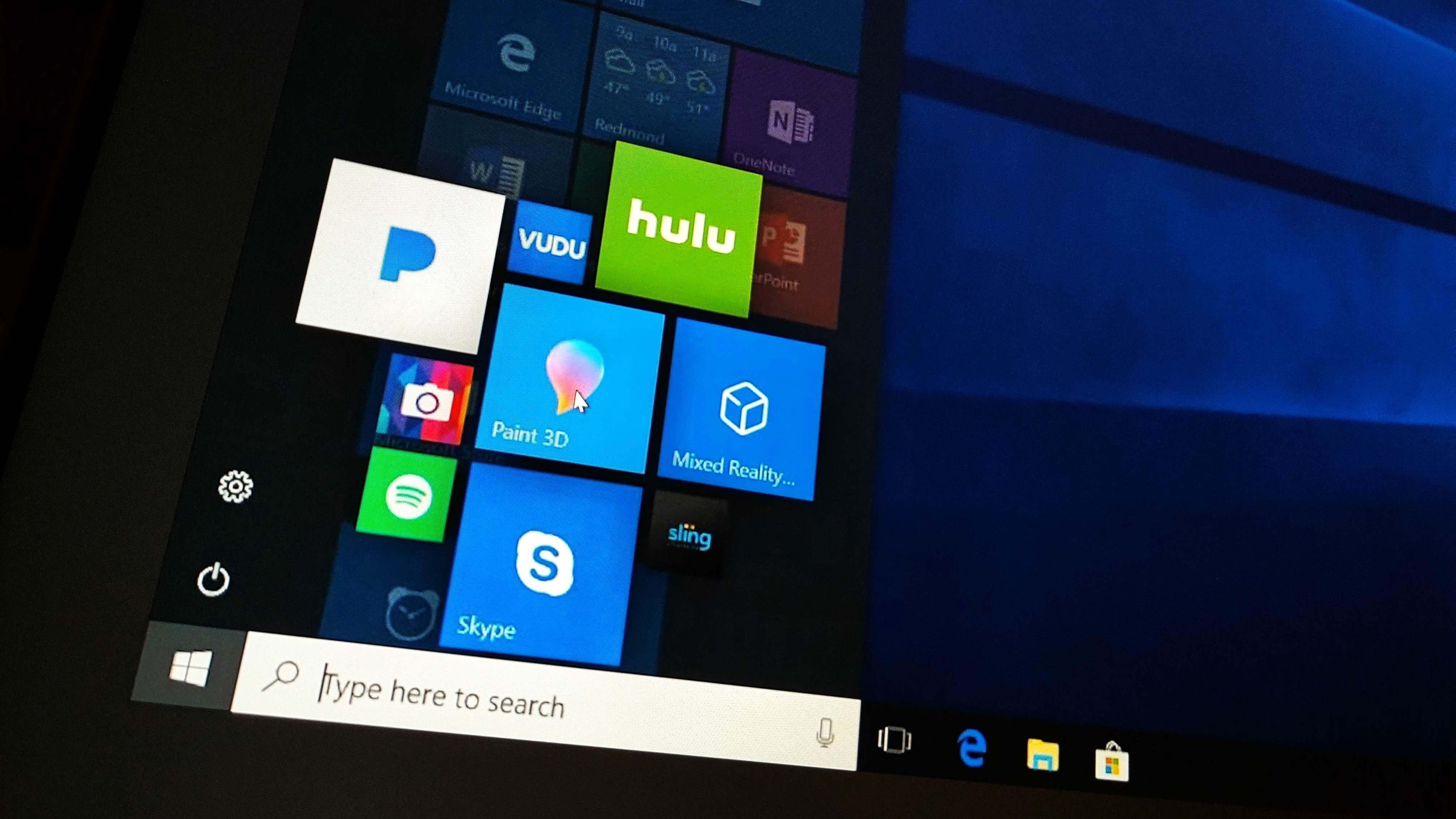
Windows Unshipped: This unreleased version of the Windows 10 Start menu has MixView 3D tiles
Windows Unshipped, Chapter 1.
Today, we're kicking off a new series that will run over the next handful of weeks that we're calling "Windows Unshipped" that will explore Windows OS features and ideas that never saw the light of day, all of which were internally conceptualized (and sometimes even partly developed) throughout the Windows 10 timeframe.
Over the 12 years I’ve been covering Windows, I’ve had the privilege of talking with countless people inside and outside of Microsoft who have at one point been privy to features, concepts, or ideas that sadly never shipped. Unshipped features have always been fascinating to me because it often represents a directive or vision that isn’t always publicly told.
Of course, the most famous example of this in recent memory is Windows Sets, a feature that aimed to bring tabs to every app on Windows. But that isn't the only feature that never shipped. In fact, there are possibly hundreds of features that were conceptualized during the Windows 10 era between 2015 and 2020 that never fully got off the ground.
While we won't be diving into that many unshipped ideas, this series will be highlighting a handful that I've seen or heard about for Windows 10 back in the day that really stood out to me. That's what Windows Unshipped is all about: Documenting features that never shipped (and are long since rested) for Windows 10.
Chapter 1 is about some interesting features I had heard about for the Windows 10 Start menu back in 2017-2018, designed to make it more useful and easier to customize. Let's dive in!
Chapter 1: Start Menu

The Windows 10 Start menu was a welcome sight in 2015, merging the concept of live tiles first introduced on Windows 8 with the traditional “menu” UI popularized by Windows 7. It came as a reaction to the negative response that the Windows 8 Start Screen had generated, but while users and critics were responding positively to its return, Microsoft had another problem on its hands.
According to many contacts familiar with this era of Windows 10 development, not long after Windows 10 launched, it became apparent that a lot of users weren’t taking the time to customize or use the Start menu outside of pinning new apps to the Taskbar. Users found the menu to be redundant since most preferred accessing their apps from the Taskbar or via search.
Get the Windows Central Newsletter
All the latest news, reviews, and guides for Windows and Xbox diehards.
Microsoft also had data that suggested users found the actual process of customizing the Start menu cumbersome, having to manually pin and unpin apps one at a time, and having to find those apps by going back and forth between the apps list and tile area. Then there was the process of figuring out which tile sizes and positions your favorite apps would fit in to make your menu actually look nice.
Microsoft wanted to combat this problem and conjured up several concepts and ideas designed to help make customizing the Start menu easier, as well as making it less redundant so that users would feel more inclined to use it. Sadly, none of the ideas detailed here made it past the early development stages.
To start, let’s take a look at a concept idea called "Pin in place" that was designed to help make customizing the Start menu easier.
Pin In Place
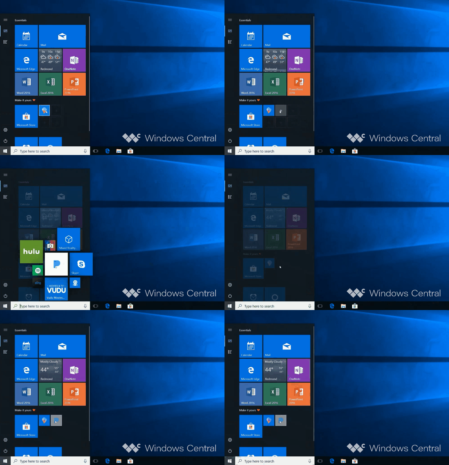
A big focus point for improving Start menu customization was reducing the distance your mouse needed to travel to add new things to the Start menu. Instead of going back and forth between the apps list or Settings app to pin app tiles or folders to the Start menu, Microsoft thought about using Fluent Design ‘reveal’ effects to hide “+” buttons in the tile and hamburger menu, which would appear when you moused over empty spaces.
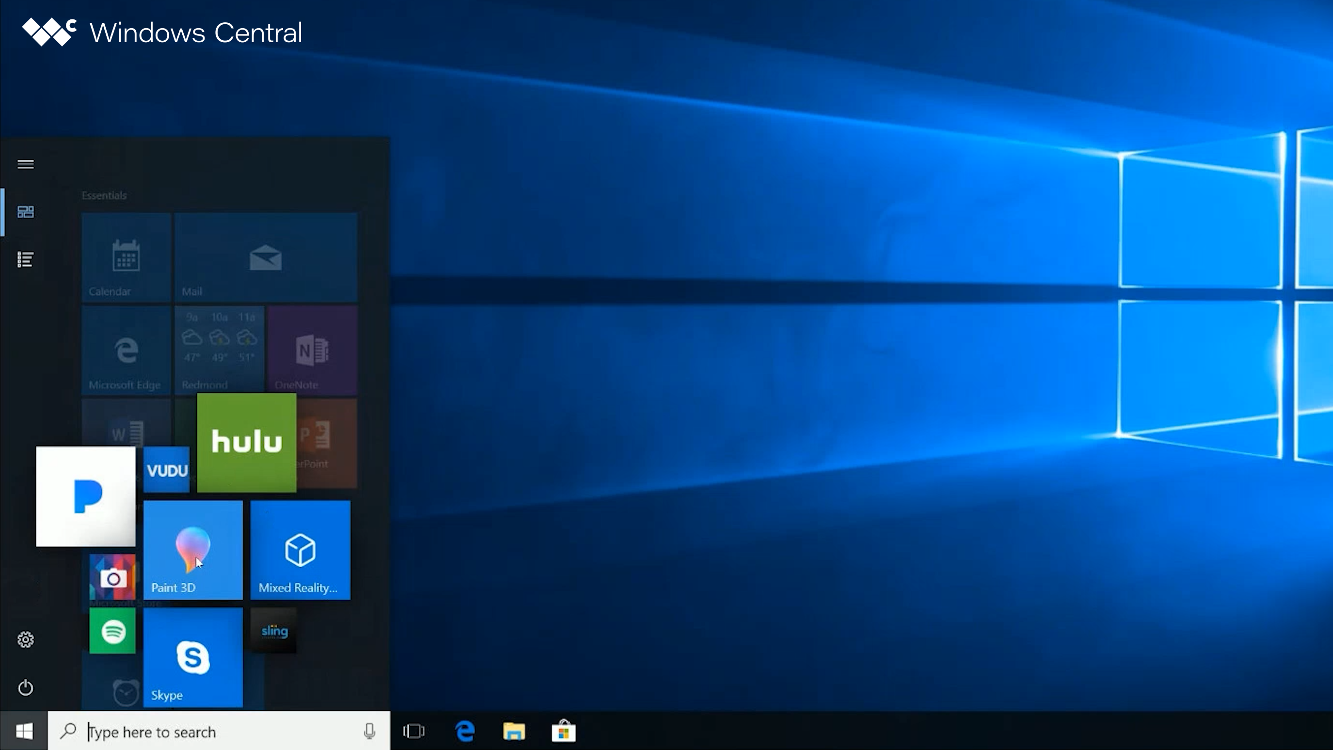
For the tile interface, Microsoft toyed with recycling an old UI paradigm it called “MixView” which would present a number of additional tiles in an exploded view once the + button was clicked. From there, users could choose any of the tiles in the exploded view to pin to Start, reducing cursor travel distance significantly.
MixView is a phrase that Windows Phone diehards will be familiar with. It was the name of the interface that was enabled when using 3D Touch on the unreleased Lumia McLaren. Hovering your finger over a live tile on the Windows Phone Start Screen would pop up a number of smaller live tiles that users could tap to jump into specific areas of an app.
It was an excellent idea, but it never shipped because the hardware that it required was canceled. The UI was a fun, natural evolution of how live tiles could work, so it’s no surprise that the company was thinking about recycling it for Windows 10 a number of years later.
On Windows 10, this UI would use machine learning and cloud-based recommendations to show both locally installed apps that it thinks you might want to pin, as well as webpage or Microsoft Store app recommendations it thinks you might want to try.
The same + button reveal method was also experimented with in the Start menu’s hamburger menu, which would make it much easier to pin folders like Documents and Downloads to Start without having to go into the Windows Settings app first.
Start Places
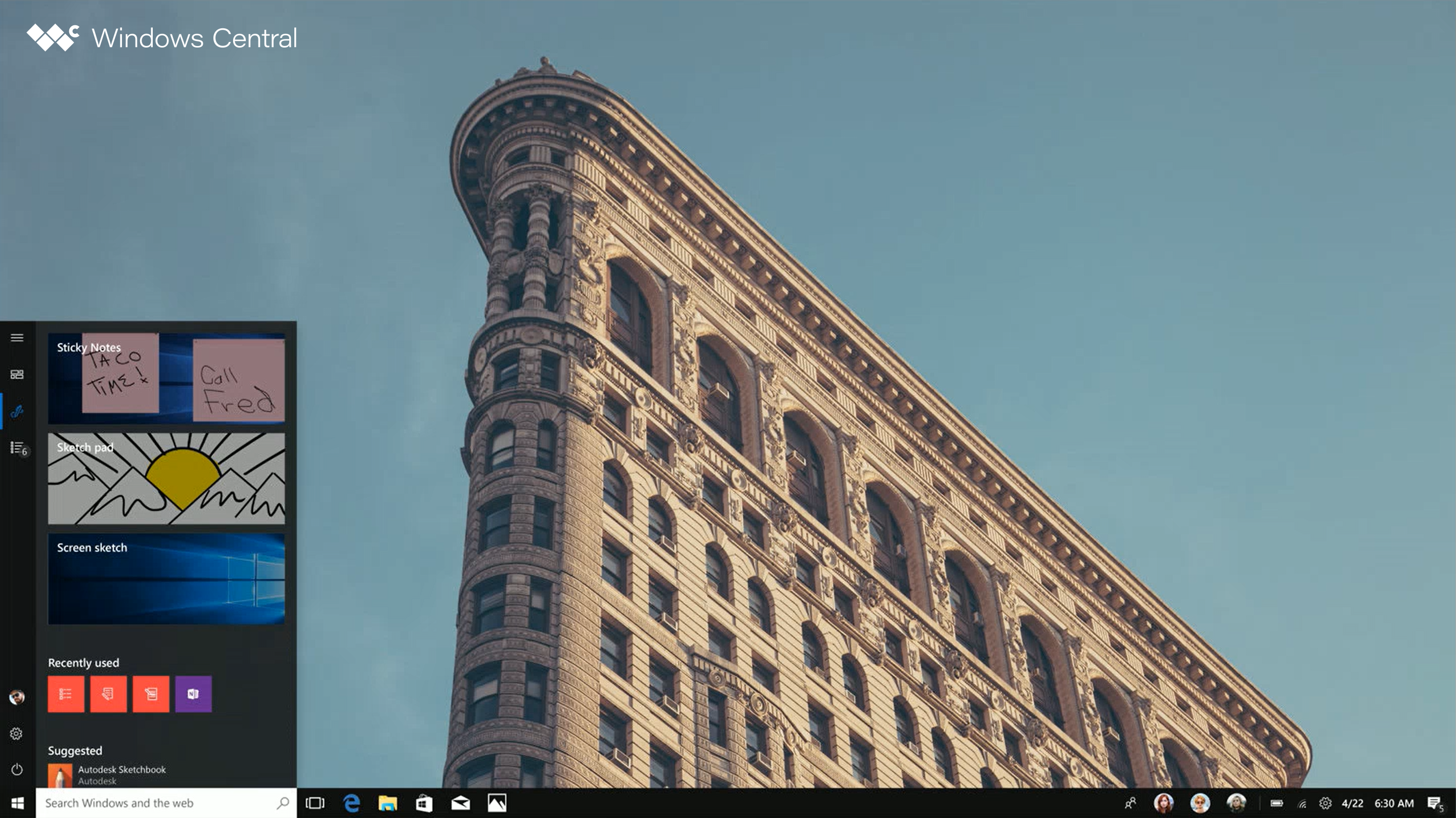
Up next, I want to share another conceptual idea that never saw the light of day, which was designed to increase the usefulness of the Start menu by adding other Windows features to it and turning it into a launchpad for more than just installed apps.
This idea was rooted in an effort focused on decluttering the Taskbar, which was becoming quite convoluted with many buttons and features throughout the 2017-2018 releases of Windows 10. In fact, we'll be talking more about this effort in the next installment of Windows Unshipped next week.
For now, one idea Microsoft had was to move the Windows Ink Workspace and My People interfaces into the Start menu and turn the Start menu itself into an area for different "places" of Windows. You'd be able to access everything from Documents to Timeline straight from the hamburger menu (now called Places menu) within Start.
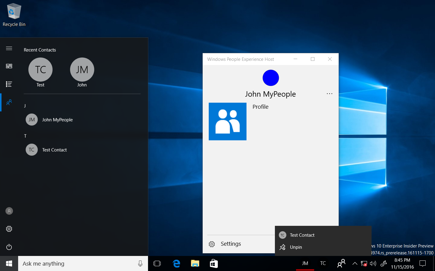
Thanks to reverse engineer Albacore who helped us out with this project, we can even take a look at working code from old Windows 10 builds which showcase an early implementation of My People in Start. It includes a list of contacts, plus your most recently accessed contacts at the top, and the entire interface is accessible via the hamburger menu in Start.
I'm told Microsoft had even envisioned being able to drag different places from the hamburger menu back onto the Taskbar if the user wanted quicker access. Here's a very rough mockup of the Places menu from a program manager that I was shown:
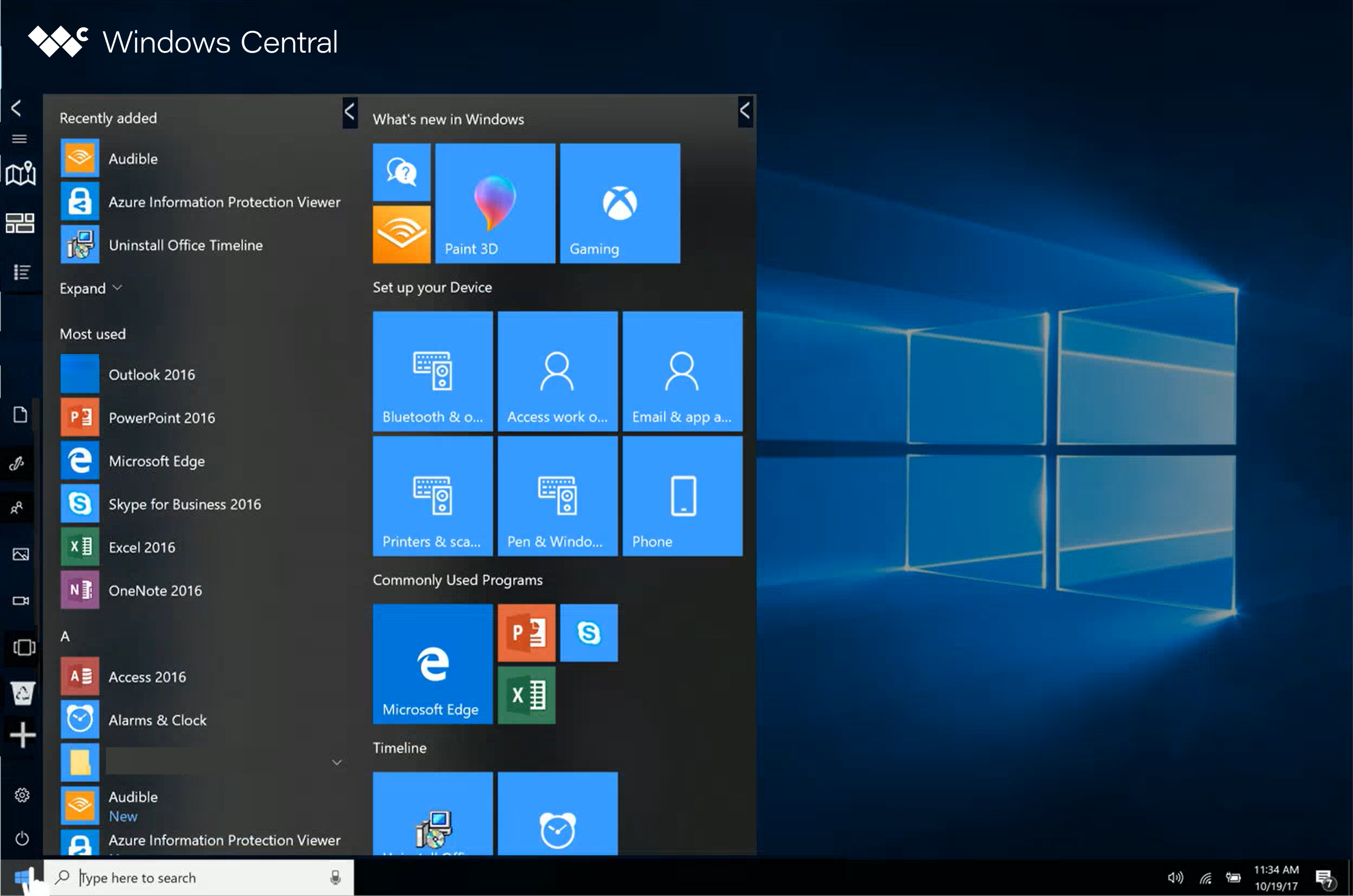
Other minor changes Microsoft had thought about for the Start menu that never shipped included an accented hamburger menu to make it stand out a little more. There was also briefly a “My Stuff” area at the top of the apps list that Microsoft had toyed around with, which listed the most frequently accessed folders from within the File Explorer.
Unfortunately, I was never able to figure out why Microsoft canned these concepts, as they really would have helped make customizing the Start menu easier. Perhaps internal customer research suggested these ideas wouldn't have done much to increase usage, and therefore the overhead of delivering such features wasn't worth the resources. We'll never know, though that would explain why the Windows 11 Start menu is so bare of customization features.
Anyway, that was chapter 1 of Windows Unshipped! Next week, I'll be taking a look at a few features and ideas I was hearing about for the Windows 10 Taskbar and Action Center in 2018, which includes a flyout called Control Center and Cortana in the Action Center. You won't want to miss it!

