PowerToys could soon sport a new and modern-looking homepage
The main page of PowerToys may be getting a redesign, and Microsoft is looking for input.

What you need to know
- PowerToys' homepage might soon get a refreshed look.
- The redesign will help provide users with a "more upfront system" while launching the platform after an update or first-time run.
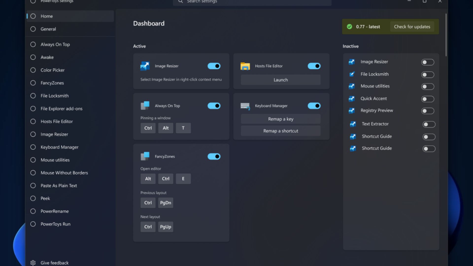
- The new homepage will provide a better overview of what's enabled, including the capability of launching modules accompanied by activation shortcuts.
PowerToys is arguably one of the best apps on Windows 10 and Windows 11. This is mainly because it ships with many neat utilities designed to enhance productivity.
Microsoft often ships new updates for the standalone app to enhance its user experience, as is the case with its latest update, which saw the platform shrink in size and added a value generator designed to create hashes and GUID values.
And as it now seems, PowerToy's homepage might soon get a refreshed and modern look. As Niels Laute on X (formerly Twitter) highlighted, the redesign is geared toward providing users with an improved view highlighting all the enabled features. Additionally, users will also have the capability to launch modules from the new homepage as well as the capability to view activation shortcuts.
Hey #PowerToys users! @crutkas is looking for feedback on a new homepage experience to give users 1) a better overview of what's currently activated, 2) ability to launch modules, 3) see activation shortcuts.See the issue on GitHub here: https://t.co/f8lHmfKogd pic.twitter.com/fQN13Ye9XRAugust 14, 2023
The goal behind this new touch, as described at GitHub, is to give users more control over how PowerToys works, as the new homepage promotes more visibility while launching it. Essentially, when new features hip to the platform, they are either enabled or disabled by default. This may sometimes cause issues when trying to perform a specific task, such as invoking find my mouse.

New PowerToys appeal
A collection of utilities aimed at power users on Windows, PowerToys continues to integrate new features that improve your experience with the OS.
And while this is simply a rough design of what the redesigned homepage might look like, the change will add a nice touch to the platform if implemented. Being able to enable or disable modules directly from the homepage seems like a great idea, especially since it will also provide a detailed account of main activation shortcuts and the ability to launch the module.
Users have already started providing feedback regarding the concept, which seems to be a hit (at least for most). However, a specific user has highlighted her preference for a list view for the active modules.
Get the Windows Central Newsletter
All the latest news, reviews, and guides for Windows and Xbox diehards.

Kevin Okemwa is a seasoned tech journalist based in Nairobi, Kenya with lots of experience covering the latest trends and developments in the industry at Windows Central. With a passion for innovation and a keen eye for detail, he has written for leading publications such as OnMSFT, MakeUseOf, and Windows Report, providing insightful analysis and breaking news on everything revolving around the Microsoft ecosystem. While AFK and not busy following the ever-emerging trends in tech, you can find him exploring the world or listening to music.

