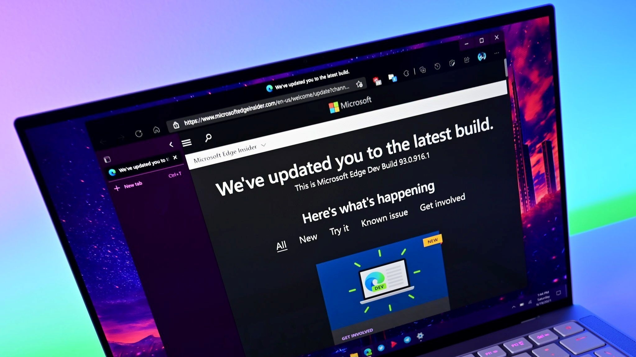
Microsoft Edge is about to go dark, but not in the same way as Reddit
Dark mode could soon become even darker on Microsoft Edge.

What you need to know
- Microsoft is testing a darker user interface in its Edge browser.
- The refreshed dark mode has a full black background for the favorites bar, toolbar, sidebar, and other parts of Edge.
- Since the darker dark mode is part of a controlled rollout, you may not see it yet, even if you are a Canary Channel Insider.
Reddit went dark recently as part of a large protest by site moderators. Microsoft Edge may now go dark, but in a very different way. Rather than shutting down communities, Microsoft may give Edge a palette swap. The tech giant is testing a new shade of gray for Edge's dark mode. The refreshed look is currently in a controlled rollout among Canary Channel Insiders.
Edge enthusiast Leo Varela spotted the change and shared screenshots of it on Reddit and Twitter.
The visual changes replace the dark gray elements of Edge with black backgrounds. The color swap is reflected in the tab strip, toolbar, favorites bar, vertical tabs, and sidebar, as highlighted by Varela.
And here is a comparison between the Beta and Canary versions: pic.twitter.com/2zlNfep7pzJune 21, 2023
The screenshots from Varela show the new dark mode with and without the Mica effect enabled.
There's a chance that the black backgrounds could appear in other parts of Edge, like its Settings pages and other internal pages. Varela shared screenshots of that as well, though he noted that the darker UI "*could also make its way to Edge's internal pages."
The change to dark mode is subtle, but it is a requested feature from many. Microsoft often plays around with how Edge looks in the Canary Channel. Last year, Microsoft started testing rounded corners in its browser. Those have since made their way as an option to the stable version of Edge.
Since the refreshed dark mode is part of a controlled rollout, you may not see it right away, even if you're a Canary Channel Insider. Microsoft tries these types of changes with subsets of users within Insider channels as a form of A/B testing.
Get the Windows Central Newsletter
All the latest news, reviews, and guides for Windows and Xbox diehards.
Microsoft has several versions of its Edge browser for testing new and experimental features. The latest version of Edge Canary lets you pause all extensions with a single click.

Sean Endicott is a tech journalist at Windows Central, specializing in Windows, Microsoft software, AI, and PCs. He's covered major launches, from Windows 10 and 11 to the rise of AI tools like ChatGPT. Sean's journey began with the Lumia 740, leading to strong ties with app developers. Outside writing, he coaches American football, utilizing Microsoft services to manage his team. He studied broadcast journalism at Nottingham Trent University and is active on X @SeanEndicott_ and Threads @sean_endicott_.
-
GraniteStateColin Personally, as a big dark mode user (one of my two biggest complaints about Excel is lack of Dark Mode in the worksheet window), I don't necessarily want the dark part to go jet black. That might be OK, but different shades of dark gray can create visual zones, which I think are better than forcing everything to full black, which would remove the grouping/zone visibility.Reply -
Hanley Gibbons It would be great if Microsoft eventually rolls this out to the stable version. In addition to looking better in general, it will look even better on OLED and Mini LED panels, not to mention the power savings associated with true blacks on those.Reply

