Google Chrome's design revamp is a total miss for some users — Here's how to revert to the old style
Google Chrome now ships with a 'Material You' redesign, adding many new features. However, some users still prefer the old style.

What you need to know
- Google Chrome has been revamped with a Material You redesign.
- The redesign adds rounded corners, a better search experience, a revamped Chrome Web Store, and more.
- It also features new safety features that make it easier to identify malicious ploys and extensions that have been unpublished and violate Google's policies.
- Users have openly expressed that they prefer the old design to the new one and can revert to the old design by following a few steps.
Last year in September, Google announced a host of changes coming to its desktop browser, Google Chrome, to commemorate its 15th birthday. The company refers to the changes as a Material You redesign. In hindsight, this is the first time the browser is getting a visual revamp since 2018, and admittedly, the changes are a bit hard to ignore.
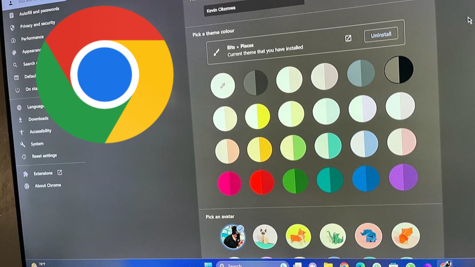
Google Chrome's new look features refreshed icons designed to enhance legibility and new color palettes that complement your tabs and toolbar.
According to Google Chrome's VP, Parisa Tabriz,"these new themes and distinct colors can help you distinguish between profiles, like your work and personal accounts, at a glance.We'vee also better integrated with operating systems so your Chrome preferences can easily adapt to OS-level settings, like dark and light modes."

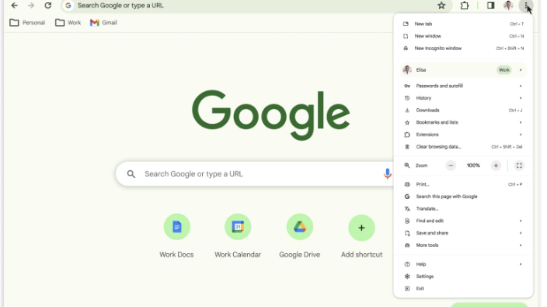
The new update also prioritizes enhanced browser usability since it now features a comprehensive menu, allowing users to quickly access Chrome extensions, Google Translate, and Google Password Manager.
You'll also notice that the corners of the browser's window are now rounded, reminiscent of Windows 11's Fluent design. Additionally, the Omnibox on the browser no longer features the lock icon (usually located on the left). The Omnibox is the section on your browser's window where you enter URLs or search. The lock icon has since been replaced with a new icon, which presents you with an array of site controls when clicked on.
The Material You redesign adds flavor to the new Chrome Web Store

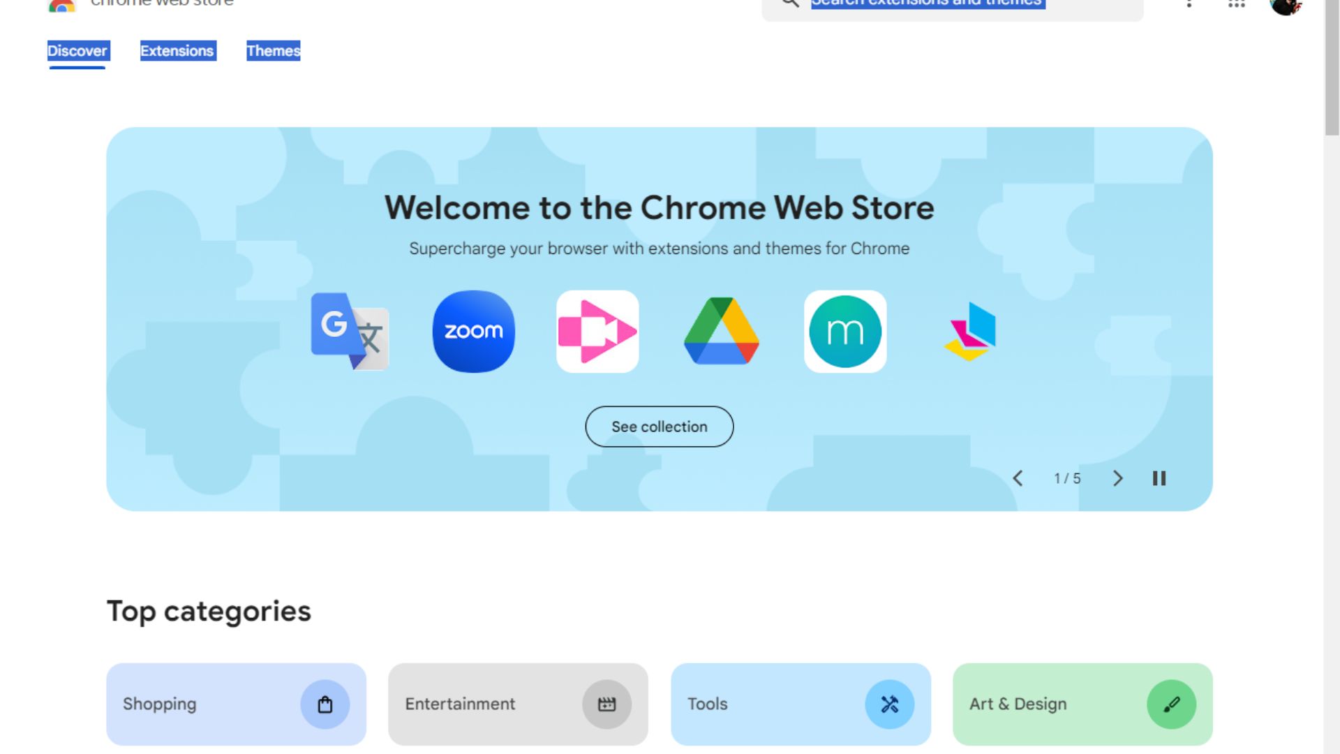
Aside from giving the browser a refreshed look, Google also revamped Chrome Web Store's interface with the Material You design. The changes first shipped in public preview, but they have seemingly rolled out to everyone.
The redesign is neat and presents you with everything you might need directly from the Discover page, reducing unnecessary navigation to other windows. You can also quickly shift to the Extensions or Themes page by clicking on the option you prefer.
Get the Windows Central Newsletter
All the latest news, reviews, and guides for Windows and Xbox diehards.
Elsewhere, Google has also beefed up security by expanding Safety Check to extensions. This way, it's easier to identify extensions with violations or those that were recently unpublished due to breaching Google's policies.
Better search experience
The company boasts that the new update enhances the search experience on Google Chrome. The company detailed that the new capabilities will help users get quick access to information and search tools while browsing.
The company further highlighted:
"When you're on a webpage, select the "Search this page with Google" option from the three-dot menu. That will open the Google Search side panel, where you can find related searches, learn more about a page's source, or start another search altogether. You can even pin the Google Search side panel to your toolbar."
And finally, the company also shipped more security features to its Google Safe Browsing feature in Chrome. With attackers employing more sophisticated ploys to unsuspecting users, the feature's Standard protection mode now checks sites against Google's known bad sites. What's more, your browsing history remains confidential. Google expects a 25% improved protection from attacks due to this change.
How to switch back to the old Google Chrome design
If the sentiments and comments shared across social media platforms are anything to go by, then the Material You redesign has been received with a cocktail of emotions, as reiterated by Tom Hardware's Avram Piltch.
The larger majority are less than pleased with the change in design and have blatantly expressed their preference for the previous Google Chrome design over the Material You redesign. Luckily, you can revert to the old design by following the listed steps below:
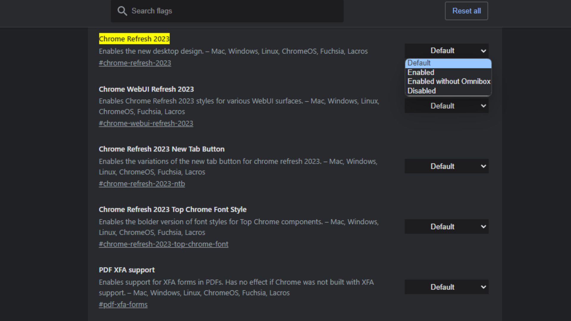
- First, head to the Flags menu by navigating to chrome://flags/#chrome-refresh-2023.
- You'll be redirected to the Chrome Refresh 2023 option.
- Click on the dropdown menu on the left and select Disabled.
- Next, click on the Relaunch button to close and reopen the browser.

Voila, Google Chrome is now back to the old design you're used to. You can switch back to Chrome Refresh 2023 at any time by following the steps highlighted above, but you'll need to select the Enabled option in the dropdown menu.
Do you like Google Chrome's Material You redesign? Share your thoughts with us in the comments below.

Kevin Okemwa is a seasoned tech journalist based in Nairobi, Kenya with lots of experience covering the latest trends and developments in the industry at Windows Central. With a passion for innovation and a keen eye for detail, he has written for leading publications such as OnMSFT, MakeUseOf, and Windows Report, providing insightful analysis and breaking news on everything revolving around the Microsoft ecosystem. While AFK and not busy following the ever-emerging trends in tech, you can find him exploring the world or listening to music.
-
GraniteStateColin Or for some users, if you don't like the changes and you have to take some action anyway, this is a good time to try out Edge.Reply
