Smartphone Round Robin: BlackBerry 8310, Ciao!

Well, my time with the BlackBerry 8310 is over now, so it's time to wrap up my feeling about the little red wonder. Yes - a wonder. I used to think that RIM “just got lucky” with the BlackBerry. They were the first with a real push email solution and managed to “lock in” a whole slew of businesses early on. I thought that this was pretty much the source of the BlackBerry's success: just a whole lot of people who were resistant to change.
Having actually, you know, used one for a week and a half has changed my mind about that analysis. While it's true that a lot of people are sticking with BlackBerries because it's what they know, it turns out that just as many are finding that the BlackBerry is easy to get to know.
(Quick Smartphone Round Robin note: The contest to win a smartphone of your choice by commenting on any Round Robin post has been extended - now any post made by December 7th qualifies! Yes, that also means that our “coming home” articles will likely be pushed back a week as well. You try switching phones once a week - it's tough! ;))
More after the break!
(This is part two of a Windows Mobile Guy's look at the BlackBerry 8310, find the (slightly more comprehensive) Part One here.)
Old School
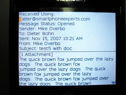
Despite a sleek and great-feeling form factor, something about the BlackBerry 8310 feels, well, old. It's something about the text-rendering that feels somehow bare-bones. I can't quite put my finger on it.

What I can put my finger on (not literally, since this isn't a touch-screen) is the cursor. A big, orange, square cursor on darn near every screen with text on it - whether I'm actually able to enter text or not. It screams “command line” but I love it anyway. It's useful, of course, allowing you to select text for copying (take that, iPhone, you're the only one who can't do that) or for other purposes.
Get the Windows Central Newsletter
All the latest news, reviews, and guides for Windows and Xbox diehards.
The cursor, the lack of a touchscreen, the text, and my own preconceptions of BlackBerries as “evolved email pagers” all combine to make me think of the BlackBerry as more of an “email appliance” than a smartphone. I fully admit that's neither fair nor exactly accurate, but there it is.
...Which sounds like I'm knocking the BlackBerry, but I'm not, really. I appreciate that it's eschewed fancy gradients and graphical whiz-bangery for straight-up black-on-white text for most things. I like that when you open up an email all you see is plain-jane text instead of a menu bar at the top and bottom of the screen. However, it does feel a little bare-bones sometimes. Even old-schoolers want just a smidgen of whiz-bang every now and then.
Media
Browser

The BlackBerry 8310's default music player is about on par with the Treo 680 and with Windows Mobile. I'm not in love with it, but it'll do.
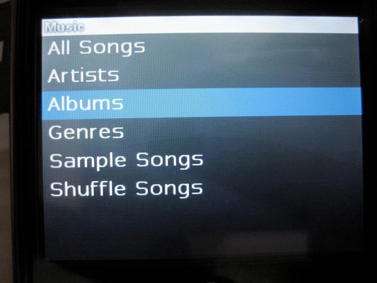
Basically, I'm plenty happy with the default library browser, which you can access directly with “Music Player” or via the “Media” app. The library browser automagically sorts music via ID3 tags - this sort of thing is standard now - but it's a step up on Windows Mobile in that it assumes (rightly) that you want all of your music in one big list. With Windows Mobile, you occasionally have to specify that you want the library to grab from your memory card, which is silly and annoying.
Also nice is that the browser's text is big and easy to read. I mention this because that's how text should be when you're browsing music (to make life easier for runners and drivers). I also mention it because, frankly, it was a welcome change from the text rendering elsewhere on the BlackBerry. Try as I might, I still can't seem to find a font setting anywhere that doesn't feel antiquated and slightly hard to read.
Player

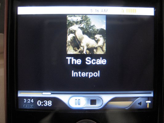
Anyhow, once you're actually into the music player proper, you will often be greeted with album art. Windows Mobile also does this - but for some reason I can only get album art to show on WM intermittently. On the other hand, Windows Mobile's player doesn't require you to go into a freaking menu for next and previous song buttons - they're right there on the screen. Yes, I know, the “n” button on the keyboard is a shortcut to next. Still, a button on the keyboard is weird and not nearly as intuitive as the “right” button on a 5-way.
Video
I managed to get video working as well - though only after I admitted defeat and used RIM's desktop-based converter. I don't really count this as a knock, though, as the 8310 supports a decent array of video formats. There's just a whole somewhere in its MPEG-4 support that my movies kept falling into when I created them on my Mac. Video standards are still the wild wild west, so I can't really be sure where the problem lies.
Camera
The camera is nice - the flash is great. Somebody tell me how much that little LED flash costs. If it's less than $2 per device, and I'm sure it is, then I will begin writing letters to every smartphone manufacturer that isn't including a flash on their phones. That's most of them, by the way.
I know that these cameraphones aren't designed to be serious cameras and that a flash isn't going to make them that much better - but it's often the difference between a “dang, won't work” moment and a “sweet, I got the pic!” moment.
The Must-Dos
- Editors must use their assigned smartphone as their “main brain” and may not use any other smartphone OR music device (such as an iPod) for one full week.
Done and done - although certain functions that I used to be able to do on my main brain ended up getting shifted to my desktop. Mainly email shuffling, since I never managed to fully get IMAP working properly on the BlackBerry. However, I have seen that this can be done, so I should leaven my previous “just one mailbox” issue from the earlier article a little. But just a little. ;) - Editors must attempt to sync their phone to their computer, syncing all PIM data.
This worked out just fine - though I do wish there were an easier, consumer-level, “cloud-based” PIM sync. I'm sure there are options, but this is dead-simple to do with Windows Mobile and any hosted Exchange server. - Editors must attempt to set up their email on the smartphone
Done. See my First Look for a not-so-brief overview of what I think of the email on the BlackBerry. - Editors must attempt to use their smartphone to get directions at least once.
TeleNav is great, though (as usual) I wish it were a little more configurable. It's also surprisingly easy on the battery, which I didn't really expect to be the case. - Editors must attempt to use their smartphone with a bluetooth headset.
Done. Not too shabby, certainly better reception than the Treo 680's bluetooth setup. - Editors must attempt to install at least 2 3rd-party apps (if possible) on their smartphone.
Opera Mini (swoon), the CrackBerry.com shortcut (of course!), and JiveTalk (double-swoon). Installing apps is fairly easy, though somehow it still feels unfamiliar to me. - Editors must attempt to play a game
Yeppers. BrickBreaker is good stuff. - Editors must attempt to browse the internet
Yeppers again. You would have seen an extended series of increasingly unhinged paragraphs in this space about the default web browser on the 8310, how I never thought I'd find a browser worse than Blazer, and how RIM just doesn't “get” that the web is just as important, if not more important, than email to a lot of people these days. Luckily, I installed Opera Mini and saved us all that hassle. - Editors must attempt to add music to their smartphone and use it as their music device.
No worries there, well, no worries worth mentioning again, let's say. - Editors must attempt to watch a video on their device.
Done and done - after I let RIM's desktop app do the converting for me.
Wrapping Up

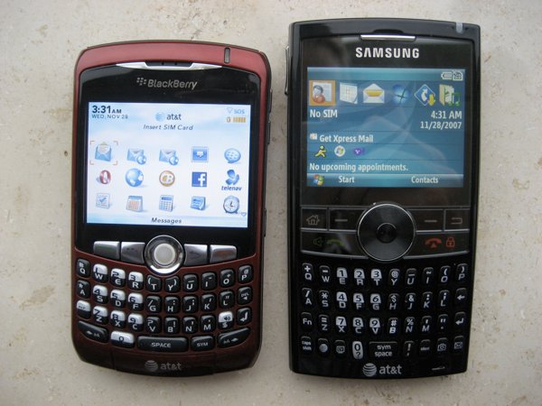
...And now I'll be going from a non-touchscreen, front-facing QWERTY keyboard device with GPS built-in to a ....non-touchscreen, front-facing QWERTY keyboard device with GPS built-in (with 3G). The Blackberry 8310 and the BlackJack II are crazy different to me despite their outward similarities and functionalities.
At the end of the day, both do virtually identical things, yet I do have to admit that I am able to wring more functionality out of Windows Mobile than I can out of a BlackBerry. By “functionality” I don't just mean “able to get GPS on Google Maps while I do my taxes and check email” (but I do mean that too), but also I can tweak the BlackJack to be more usable and user-friendly.
Saying BlackBerry isn't the pinnacle is user-friendliness is sort of hitting BlackBerry where it's strongest (just like my earlier thoughts on email). I really do prefer the default Windows Mobule user interface to Blackberry's. I like the today screen, I like Pocket Outlook. Most of all, though, Windows Mobile has a wider variety of interfaces that you can install and tweak away at if you don't prefer the default. These different options in both interface (and form factor) are what make me love Windows Mobile.
If you want a device that “just works,” then the BlackBerry 8310 is probably for you. But make sure that you want “just works” in both senses of the word “just.” As in
- just: without having to futz around too much with settings.
- just: without being able to futz around too much with settings.
The reason I prefer Windows Mobile to BlackBerry is that latter bit. As for the former, well, I think that WM is really close, just not quite there yet. (I'll discuss this point much more next week in my “coming home” article - because I don't want WM to be pigeonholed as the “tweaker and power user” OS.)
So, yes, the BlackBerry “just works.” That's a great thing for people who don't care about the 2nd definition of “just.” I'll even grant that there are people who do care about the 2nd definition who are happy with the BlackBerry OS - I just think they'd be happier with Windows Mobile. ;)
Don't forget - every day you post a comment you are entered to win in the Smartphone Round Robin Contest!
Home to the most invested and passionate Microsoft fans, Windows Central is the next generation destination for news, reviews, advice and buying recommendations on the Windows, PC and Xbox ecosystems, following all products, apps, software, AI advancements, and accessories. We've been around for more than decade, and we take our jobs seriously. Windows Central writers and editors value accuracy and editorial independence in everything we do, never receiving compensation for coverage and never pulling punches.

