Smartphone OS shapes

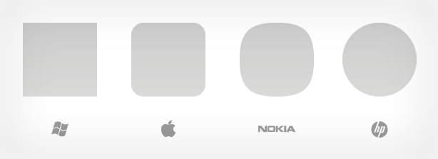
This is an extremely interesting observation. Many would ignore shapes used on smartphone handsets, simply because those shapes would be tied to app launchers or tiles which all contain either images or information. As one can see in the image above, Clayton Miller, a graphic and interaction designer (creater of 10/GUI), has aligned the different shapes adopted by the smartphone market.
From one perspective, you could assume that the shapes shown above is an illustration of the transformation from a square to a circle. Microsoft use the simple four-sided approach with the Metro UI, Apple keep things aesthetically pleasing with a roundrect, Nokia use a squircle and HP have a full circle to play with. Clayton states that Android doesn't have a unified shape, a possible symptom of fragmentation?
It's worth noting that smaller competitors use same shapes as the big players, Bada from Samsung makes use of squares but can't come close to Microsoft's tile implementation and RIM use roundrects throughout but are no match for Apple's iconic design.
Source: Clayton Miller
Get the Windows Central Newsletter
All the latest news, reviews, and guides for Windows and Xbox diehards.

Rich Edmonds was formerly a Senior Editor of PC hardware at Windows Central, covering everything related to PC components and NAS. He's been involved in technology for more than a decade and knows a thing or two about the magic inside a PC chassis. You can follow him on Twitter at @RichEdmonds.