Skype's universal Windows 10 app desperately needs some love
Skype for Windows 10 currently sits in my book of terrible Windows 10 apps. Skype seriously needs some love from Microsoft, and soon.

Hating on Skype is so in vogue in 2017. Whether you're a technology enthusiast, general consumer or both, hating on Skype is something we've all done at some point. Microsoft's decisions have made that too easy.
If you're a user of the Skype app for Windows 10, you'll be annoyed to hear Microsoft just released a brand new preview build of Skype for desktop that introduces a brand new, polished UI and features. Meanwhile, the Skype UWP app is still slow, buggy and ugly in every conceivable way. Microsoft wants developers to adopt UWP, but why should they if Microsoft won't take UWP seriously themselves?
Let it be clear that the preview update today is NOT for the Windows 10 app. It's for the older, desktop Skype that works on Windows 7, Windows 8 and legacy versions of Windows 10. We're seriously not making this up.
Messaging Everywhere
I hate Skype for a few reasons, but mostly because it took away my beloved Messaging Everywhere feature from the Messaging app on Windows 10 PC and Mobile, butchering the ability to send SMS messages from your desktop by implementing the feature into the Skype app for Windows 10.
The problem with this move, for me, is that the Skype app for Windows 10 is rubbish in every conceivable way. It took the concept of being able to send SMS messages from your desktop and, to put it lightly, butchered it. Ever since Messaging Everywhere was renamed to SMS Relay and moved into Skype, the feature has sucked majorly. It made me stop using SMS Relay altogether.
Messaging Everywhere was, to me, one of the best things about using a Windows phone and a Windows PC together. It made my devices feel connected, as if they were part of the same platform, and Skype took that away from me. I would've been okay with it if Skype for Windows 10 was good, but it just isn't, and not just because of the SMS Relay stuff. For starters, I think the Skype for Windows 10 UI looks incredibly poor and "pre-release."
A poor UI

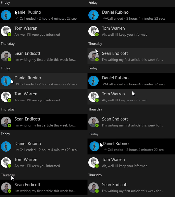
At first, I assumed the reasoning for the UI being so poor was because the app was still in preview, but then Microsoft dropped the preview tag, and the app's interface hasn't improved in the slightest. It still looks like it is in an early alpha stage, with odd design choices that make the overall experience seem unfinished. Why is there this big gap at the bottom of chat window above the text input field? Why does the text that categorizes chats by day move and open the top chat when selected? It makes no sense.
Get the Windows Central Newsletter
All the latest news, reviews, and guides for Windows and Xbox diehards.
What's more, a recent update to the app made things worse. It doesn't have a hamburger menu anymore, which while I understand some people didn't like to begin with, made sense. Now, there's a left hand column that doesn't collapse, it just disappears when the window is small enough, and some areas now show up in fake windows that can't be moved around. What is going on?
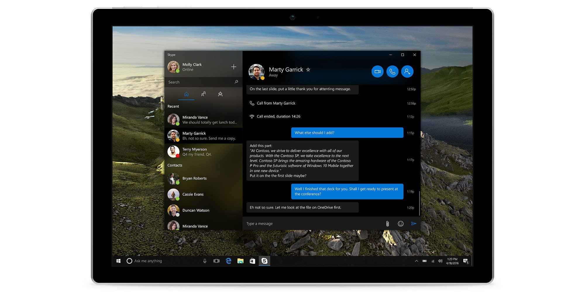
I do admit, the light mode version of the Skype app for Windows 10 looks a bit better than the dark mode one, but both overall still look terrible. The Skype app for Windows 10 needs some serious improvements especially considering it's an app that's shipping in Windows 10 today. All 500 million Windows 10 users have this Skype app preinstalled on their device, and it looks awful. The Skype app should look like what's seen in the concept image below by concept designer Michael West:

This is what I expect from an inbuilt app on Windows 10, not the app that we currently have. The design sucks, it's slow to launch on phones, and the unreliable and sluggish SMS Relay all play a factor into why I still use the Skype Win32 program and the Messaging app on Windows phone. I'd rather not use SMS Relay at all than suffer through it with the still unfinished and poorly built Skype for Windows 10.
The Skype app for Windows 10 needs some love from Microsoft. Right now, it's a total mess, and I wouldn't blame anyone if they took one look at it and thought it was some kind of unfinished beta app. Microsoft needs to stop focusing on the dumb Win32 app and start focusing on its UWP version. Bring that same UI to the UWP version, with all the features, and make it stable, and you'll be on the right track.

