Skype for Windows 10 adds bits of Fluent Design and more
Microsoft is bringing some extra Fluent Design flair to the Skype app on Windows 10.

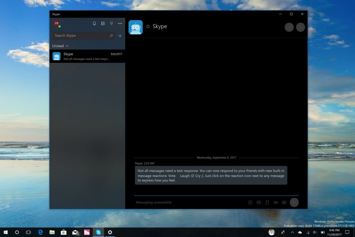
Microsoft recently began testing some bits of Fluent Design in the Skype app for Fast ring Insiders, and now they're headed out to everyone. The latest production update for the Skype app on Windows 10 includes an acrylic blur effect, along with a few other new and notable features.
Curiously, a blog post from the Skype team includes no mention of Fluent design, but it's immediately apparent upon updating. The left portion of the windows now features a bit of transparency, which is a signature aspect of Fluent Design. Additionally, you'll see the new "Reveal" lighting effect when you hover your mouse over a contact's name.
Microsoft also lists several other changes in this update, but it's worth noting that we've already seen some of them arrive in previous recent updates. Among the highlights are a new Gallery for each contact, giving you a quick list of media, links, and other content you've shared. A notification panel will keep you up to date on mentions and reactions in conversations, and the search function has now been improved. Microsoft has also highlighted that more granular presence controls are back for everyone.
Given that some of these features have been available in other recent updates, most are likely already familiar with them. However, the additional Fluent Design flair is certainly welcome. For more, you can grab the latest Skype update, version 12.10.572.0, now on the Microsoft Store.
Get the Windows Central Newsletter
All the latest news, reviews, and guides for Windows and Xbox diehards.
Dan Thorp-Lancaster is the former Editor-in-Chief of Windows Central. He began working with Windows Central, Android Central, and iMore as a news writer in 2014 and is obsessed with tech of all sorts. You can follow Dan on Twitter @DthorpL and Instagram @heyitsdtl.
