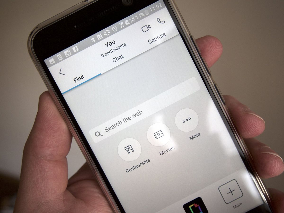
Skype Preview app for iOS gets some polish but is still far from perfect
Skype has received criticism because of its ever-changing nature, with services such as Skype Qik coming and going. The Skype Preview app combines all of the company's recent experiments into the regular Skype app.

Those who own an Android phone or who were accepted into the private preview of Skype for iOS may already know that the app has been completely rewritten from scratch. Again. It brings many features we've seen before in services like Skype Qik, and even competing services such as Snapchat and iMessage. This isn't necessarily a bad thing, though. Here's why.
Sign up for the private preview for iOS
What's new in Skype Preview?
Most major social media services have started to implement features like "snaps" or "stories," obviously inspired Snapchat, which led to a lot of people poking fun at companies that want a piece of the cake, too.
Microsoft implementing "snap" features into Skype led to some controversial reactions from the Windows community, as many consider the "Snapchat copying" an annoying thing that is hard to escape nowadays. I agreed and didn't like these new features at first, but after using them for a while, they are actually very useful. When I'm in a call without a camera and I want to easily share something I can see in front of me, I only have to tap the screen three times. On paper, it sounds like something one would rarely use, but I was surprised by how frequently I use this feature.
Another thing that I've noticed in the new Skype are the new "reactions." This is a bar at the bottom right of your screen that displays a heart by default and a few other reactions when you swipe the panel out. Pressing on one makes it show up on the screen of both you and the person you are currently talking to. This reminds me of the way iMessage handles reacting to messages. And it could save you some time compared to typing out something like "OK" or "I love you, too."

So far, I haven't really used these reactions for anything else than testing what they do, and I don't think that they are necessary for a video chat. Typing messages takes some time, but speaking is basically instant, which makes the quick reactions obsolete and not that useful. These would be more suited in the Skype text chat, but they are not available there.
What changed and what hasn't
The Skype app has been updated with not only a fresh coat of paint but a completely rewritten core. It's quick, smooth and looks good. The new design matches the redesigned Skype icons we've seen in the Windows 10 version of the app for a few months now. Microsoft has been very poor at keeping a consistent design across platforms, or even different services, but it seems like the company finally nailed this part with Skype.
Get the Windows Central Newsletter
All the latest news, reviews, and guides for Windows and Xbox diehards.
The new main page of the app showcases your conversations, which are combined with your call history, just like it has been for a long time. However, now conversations remind me more of a chat app than a video conferencing one, which is a good thing. The new focus towards not only being a good calling app but also a solid texting one is something I greatly appreciate.
As before, there is no SMS function for the iOS version of Skype. iOS doesn't allow third-party SMS apps. This also means there is no SMS Relay function and you won't be able to send SMS messages from your PC. This is unfortunate and probably won't be changing anytime soon. We have seen Apple change its mind on rules like this one in a few areas, like third-party keyboards, so there may be a possibility for SMS relay at some point.

The 'Preview' part
As this version of Skype is still in beta testing, there are some missing features. The most annoying one is that you can't remove or hide conversations. There are situations where I speak with people I will maybe never message again, and the fact that I can't remove these threads from the list is a big issue for me, because I want to be able to quickly glance at the screen and see my most used contacts directly.
Another odd thing is editing your profile. When you go to the settings panel and press on the "Edit Profile" link, it opens up a web page viewer with the Skype website instead of a native panel that hooks up to the service. This may not seem like a big problem, but the viewer that Skype used seems to be a proprietary instead of Apple's Safari view, and it's extremely buggy. Constant reloading of the page has been the most common problem. But this isn't the only issue with the implementation. The website itself is not modified or optimized for the app at all. It displays the full website, with links to other sections like "Download Skype" or other unrelated things that shouldn't be there. The general experience feels extremely unpolished.
Conclusion
Skype Preview is a solid communication app that combines former experiments and the current Skype experience into something very practical. It has its shortcomings, mostly related to the development stage of the app, that will probably get fixed before it is released to the general public. The design is nice and consistent across iOS and Android with a few aspects that sync across Windows 10, as well, which is something you rarely see from Microsoft.
Some of the newly-introduced features are pointless, but most of them are welcome additions and have proven to be quite useful. Microsoft did a great job with this evolution of Skype, and the future finally looks bright for the service.
Dennis Bednarz is a former writer for Windows Central and the guy behind ModMy. He has been a recognised member of the Microsoft community for years and owns everything from Lumia phones to Surface PCs. He occasionally likes to rant about Windows Phone and drink tea. You can go ahead and follow him on Twitter at @DennisBednarz
