Simplified ribbon design begins rolling out to Office Online
The ribbon UI is getting a new look on Office Online.

All the latest news, reviews, and guides for Windows and Xbox diehards.
You are now subscribed
Your newsletter sign-up was successful
Join the club
Get full access to premium articles, exclusive features and a growing list of member rewards.
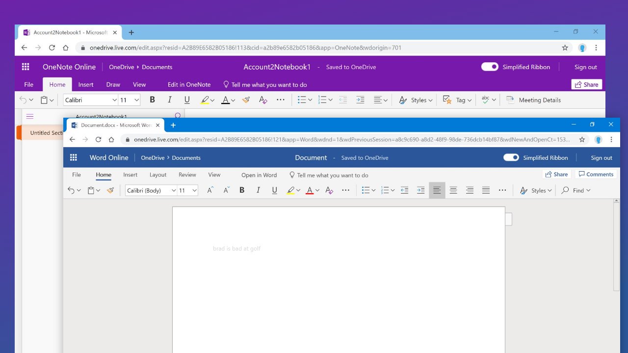
In June, Microsoft revealed a pretty big makeover coming to Office 365. Now, as spotted by Thurrott.com), some of those design elements are making their way to Office Online, courtesy of a "simplified" ribbon UI.
Office Online apps like Word, OneNote, and PowerPoint, are beginning to show a "Simplified Ribbon" toggle for some users. Toggling the option on will show the new look, but you can return to the older three-line look by toggling it off.
If toggled on, you'll see a cleaner design that replaces the bulkier design that has dominated Office apps for years. According to Microsoft when it announced the changes, the change is "designed to help users focus on their work and collaborate naturally with others."
Article continues belowThe design is still very much in the testing phases, so you may see differences as Microsoft iterates across the apps. And it's worth noting that this appears to be a part of a measured rollout, so not everyone will see the new look right away. However, it's a good sign that things appear to be moving along as Microsoft prepares to expand a modern look to its Office apps more broadly.
All the latest news, reviews, and guides for Windows and Xbox diehards.

Dan Thorp-Lancaster is the former Editor-in-Chief of Windows Central. He began working with Windows Central, Android Central, and iMore as a news writer in 2014 and is obsessed with tech of all sorts. You can follow Dan on Twitter @DthorpL and Instagram @heyitsdtl.
 Join The Club


