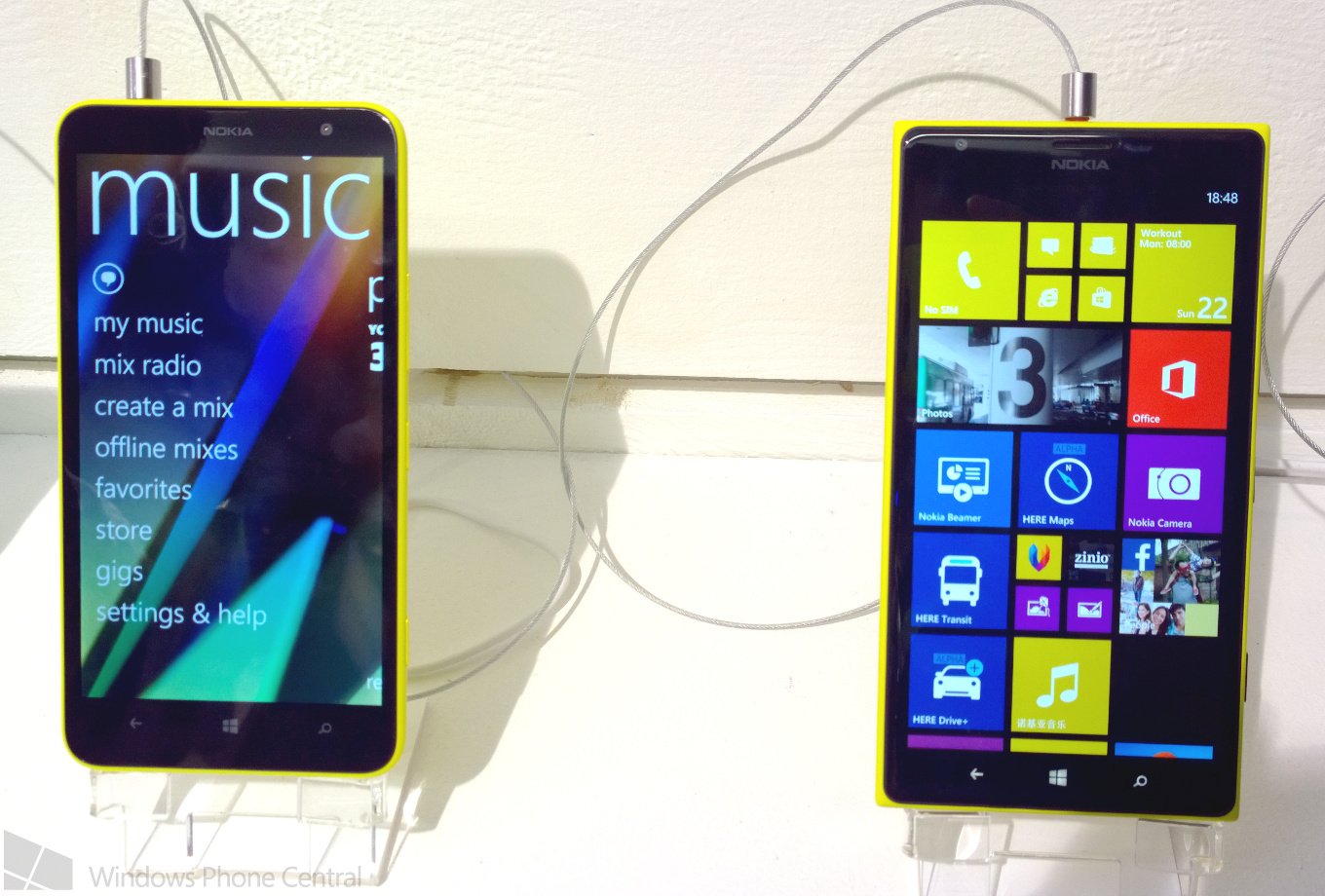
Side by side: The Nokia Lumia 1320 and Lumia 1520

Nokia World 2013 may be over, but since I've just found this (totally forgotten about) shot from the event in Abu Dhabi, I figured it's worth showing. Sat side by side, and tethered to a wall, is the new Nokia Lumia 1320 and the Lumia 1520. And, from the front, it's tough to believe that one of these costs around $400 less than the other one. Both have 6-inch displays, and even with the lower resolution on the 1320, it isn't disappointing to look at.
It also shows off the relative differences in shape between the two new supersized phones. The Lumia 1520 has a more squared off appearance, akin to the Lumia 1020, while the 1320 shares the rounded form factor of the much smaller Lumia 620. On feel alone I prefer holding the 1320, with the rounded corners proving more comfortable to hold than the more angular form of the 1520. But feel of course, is far from everything.
I think it's fantastic that Nokia has released a large device at two price points, and buyers of either aren't going to be disappointed. For more be sure to check out our hands-on looks at both new devices. Which one takes your fancy?
Get the Windows Central Newsletter
All the latest news, reviews, and guides for Windows and Xbox diehards.

Richard Devine is a Managing Editor at Windows Central with over a decade of experience. A former Project Manager and long-term tech addict, he joined Mobile Nations in 2011 and has been found on Android Central and iMore as well as Windows Central. Currently, you'll find him steering the site's coverage of all manner of PC hardware and reviews. Find him on Mastodon at mstdn.social/@richdevine
