Should Microsoft scrap hamburgers for waffles? Why menus in Windows 10 matter
We take on the hamburger menu debate in Windows 10 on phone, discuss alternatives and then give you a poll to vote on!
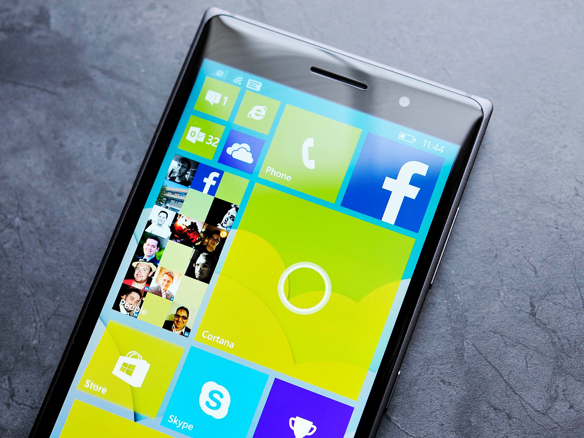
One of the most controversial aspects of the design language of Windows 10 has been the near ubiquitous adoption of so-called hamburger-style menus. Microsoft has used the three-lined button design in apps before without much notice e.g. SmartGlass, but it was not until the OneDrive app makeover, and eventual Windows 10 integration did people take notice.
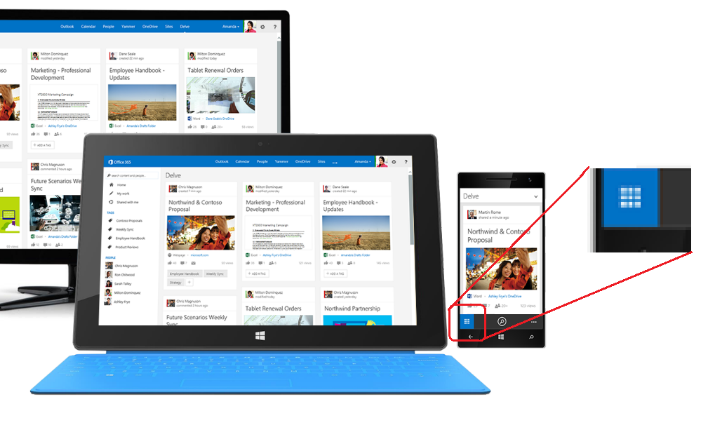
Now, new mockups of Microsoft's Delve app is stirring up debate about whether Microsoft should use the hamburger style button, opt for the waffle type design or something altogether different.
The Controversy
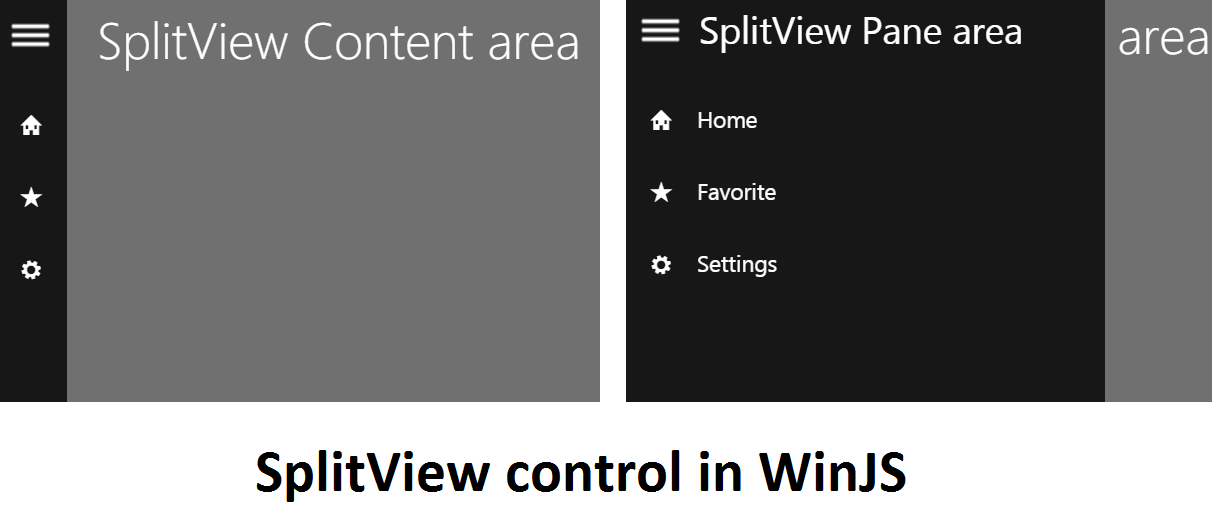
Hamburger menus aka 'SplitView controls' are found widely across many apps on iOS, Android and even on Windows Phone (often from ports of apps from other platforms). The button, represented by three, short horizontal lines stacked upon each other are often referred to as 'hamburger' due to their ASCII-like visual representation.
The purpose of them is to hide menu information under a simple 'button'. The functions that go within these style buttons are often not used and more adept to settings or account information for that app or service.

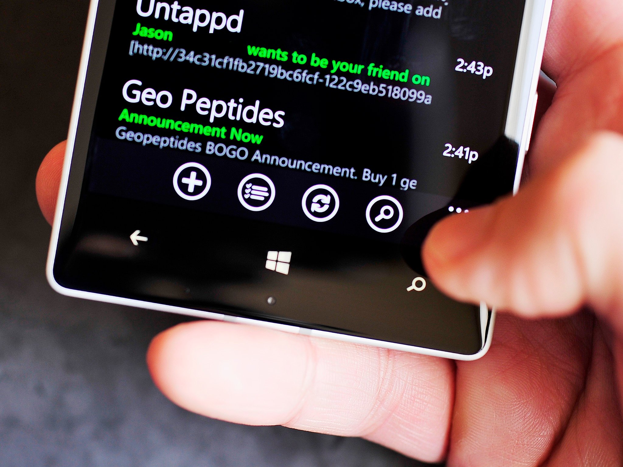
The problem is, for most of Windows Phone's history, such buttons had no role in its design language (which was formerly called Metro and later Modern). Instead, Windows Phone opted for an ellipsis ('…') near the bottom of the lower app bar to service as an indicator for more settings.
Besides the design, what people like about the Windows Phone version is the proximity to your thumb when holding the phone. Unlike hamburger buttons, which are found near the upper left, the Windows Phone ellipsis lets users access a larger, hidden menu without needing to stretch their thumb across the display.
Putting the above usability concerns aside, many ardent Windows Phone fans feel like the OS is also losing its identity by going the hamburger route. Indeed, Windows 10 is littered with many examples in apps of this new style of design.
Get the Windows Central Newsletter
All the latest news, reviews, and guides for Windows and Xbox diehards.
For hamburger menus
The argument for the triple line style menus is two-fold:
- Familiarity – The design is used on websites and competing operating systems, making them more obvious to people transitioning to Windows 10 for the first time
- Universal apps – The strong selling point in Windows 10 – universal apps – is also its weak point. Microsoft needs to try and keep app design between desktop, tablet, and phone relatively all the same. Having one style menu on the desktop, with a different for phone decreases consistency and may increase user confusion

Alternatives
- Wedge and gesture – In the recently released newsreader app for Windows and Windows Phone, Fedora Reader brings an unusual menu choice through the use of a sliver design. Users can tap/swipe from the left side to bring up the menu. Still, usability is not obvious as even that app has a brief tutorial to let users know how it works. This tutorial is no different than how Windows 8.1 teaches users gestures when the operating system is first installed. However, good design dictates that discoverability should be natural to the user.
- Waffle button (Delve) – In the new Microsoft Delve app mockups, we can see the use of a 'waffle button' represented as a square with smaller squares on the inside. Google uses such a design for its Chrome apps launcher and Microsoft takes advantage of its design in Office 365 online to bring up other Office tools.
Interestingly, in the Delve mockup, we can see the waffle button integrated into the lower app bar. Presumably it behaves in a similar manner, as tapping it likely brings up another menu for tools.
The problem here is waffle buttons look better suited for mini-app launchers, tool boxes, and non-dialog situations. This usage is different from Microsoft's current ellipsis '…' menu button or the hamburger design found in Windows 10. In that regard, we do not see a strong argument for its usage over the current hamburger button.
The best solution?
As a compromise, Microsoft should reconsider using the hamburger style button for hidden menus. We can name a few compromises to make this happen, at least for the Phone UI, which is what most people seemed concerned about when making complaints.
- Lower-Hamburger button into the App Bar – At the very least, Microsoft should consider a way just to keep the current hamburger button, but let it reside in the lower app bar. This move at once ensures familiarity to the user and design consistency for desktop apps. The placement may be different, but the look is the same. Such a design choice also goes a long way in answering user concerns about having to reach up and across the display to pull open a hidden menu. Instead, it is near the bottom, better suited for one-handed usage
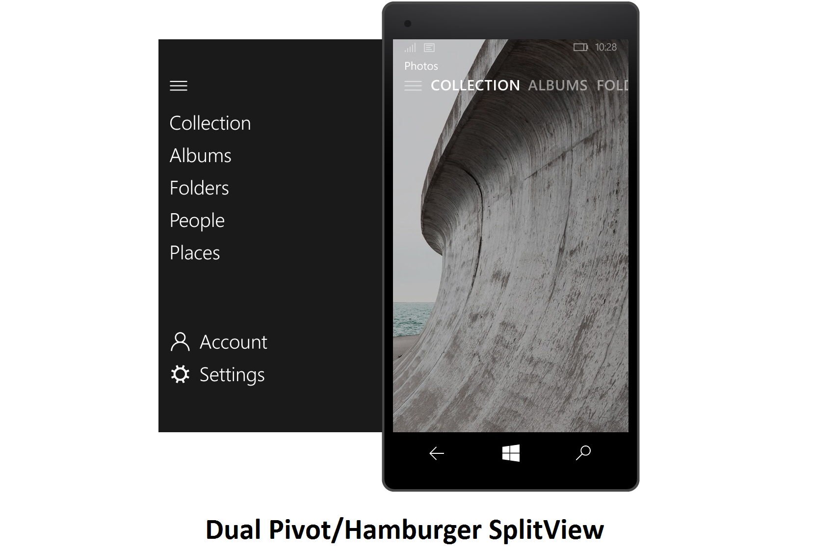
- Combine SplitView/Hamburger button with Pivot – This solution is proposed on the Windows Phone UserVoice page (and seen above), and it currently has nearly 1700 votes. The idea is to make the design on the phone (and tablet) a dual hamburger/pivot control. Users could tap the hamburger button to reveal the SplitView, or, swipe from the left to show the same page. This is both fluid, keeps discoverability the same, and it makes Windows Phone users happy.
- Come up with something different – We are not designers by any means, so our task is not to come up with solutions for Microsoft. However, if they want to keep the Phone OS more phone-friendly for smaller displays, they need to take a page from Palm's book about UI design. Address bars in browsers should be near the bottom, as should menus and frequently accessed tools, which is what makes the back button and app bar so useful on Windows Phone.
For us at Windows Central, the SplitView control for displaying more information is less about the icon design and more about the placement. Personally, we are fine with so-called hamburger buttons, but we would much rather see them kept near the bottom of apps for easy access instead of the upper left corner. If we could pick one choice, it would be the Hamburger/Pivot combo proposed on UserVoice.
The challenge for Microsoft is finding the right balance between design consistency in apps across desktop and phone and usability in the real world. The Windows 10 team should at least take into consideration user concern over this matter.
Poll
You know the drill. Take our user poll to let your voice be heard (and go to the Windows Phone UserVoice page too). If you are using our app, make sure you go to m.windowscentral.com to cast your vote.
We know many of feel strongly about this topic, so sound off in comments. Even better, give us your proposals on how Microsoft can solve this with links to mockups. You never know what could happen.

Daniel Rubino is the Editor-in-chief of Windows Central. He is also the head reviewer, podcast co-host, and analyst. He has been covering Microsoft since 2007 when this site was called WMExperts (and later Windows Phone Central). His interests include Windows, laptops, next-gen computing, and wearable tech. He has reviewed laptops for over 10 years and is particularly fond of 2-in-1 convertibles, Arm64 processors, new form factors, and thin-and-light PCs. Before all this tech stuff, he worked on a Ph.D. in linguistics, performed polysomnographs in NYC, and was a motion-picture operator for 17 years.
