Seven things we hate about Windows 11
Windows 11 is here and it's not perfect. Here's what we don't care for so far.
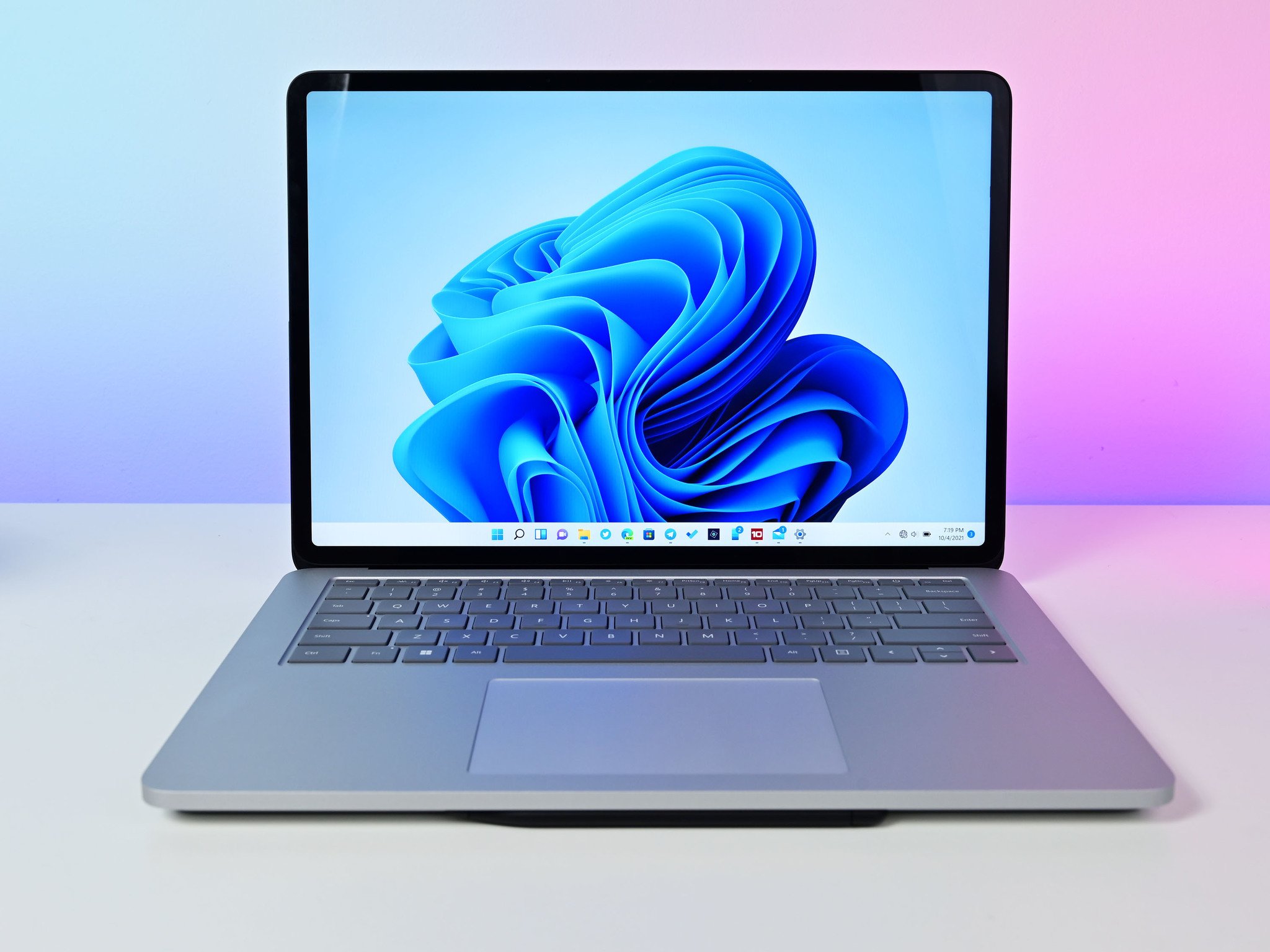
The big Windows 11 launch has finally arrived and millions around the globe can begin to see what Insiders have been talking about these past few months. We've obviously been using it collectively as a team since the very first builds, and naturally, the overall reaction is pretty good.
That said, Windows 11 is far from perfect. There are things we're not fond of, and things we flat out just hate and want to change. Highlighting the not-so-good is every bit as important as talking about all the new shiny things that bring us joy.
So, here's a roundup of some of the things the Windows Central team doesn't like about Windows 11.
The Start menu
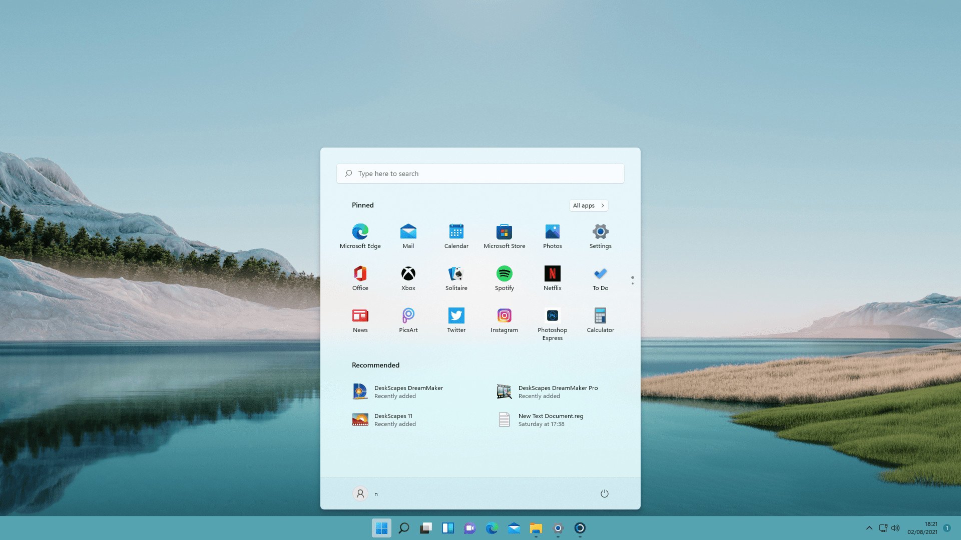
We've already discussed this through the words of our own Jez Corden, who wrote that the Windows 11 Start menu sucks. And it does. Is it pretty? Absolutely. Is it a good user experience? No. It is not.
The Windows 10 Start menu also had its critics, but it also didn't feel like it was forcing itself upon you. If you didn't want to use Live Tiles, all you had to do was remove them and shrink the Start Menu to just be a list of apps. Simple.
Definitely read Jez's post because it goes into more detail, but with Windows 11 it feels like Microsoft has made it less user-friendly and is forcing a design on its users over and above practicality. And it shouldn't be down to third-party tools to fix it, either.
The taskbar
What's wrong with the taskbar I can hear you shout? The biggest issue is you can't move it. It's rooted to the bottom of the screen and while you can move the icons from the middle to the left, that's it. If you want to move the Taskbar, you can't.
Get the Windows Central Newsletter
All the latest news, reviews, and guides for Windows and Xbox diehards.
That might not bother you. But if you're a heathen like me who prefers to run the taskbar along the top of the display, you can't. Again, not without using a third-party tool to customize the look of Windows 11. It's such a basic feature, and Windows 10 would let you put it on the top or along the edges of the display. Why take it away?
This has similar annoyances to the Start menu. Microsoft has removed options in Windows 11 and with it user choice. Simplifying the experience for some is fine, but it shouldn't come at the expense of those who like more control, especially when they've had it before.
Widgets panel is pretty uninspiring
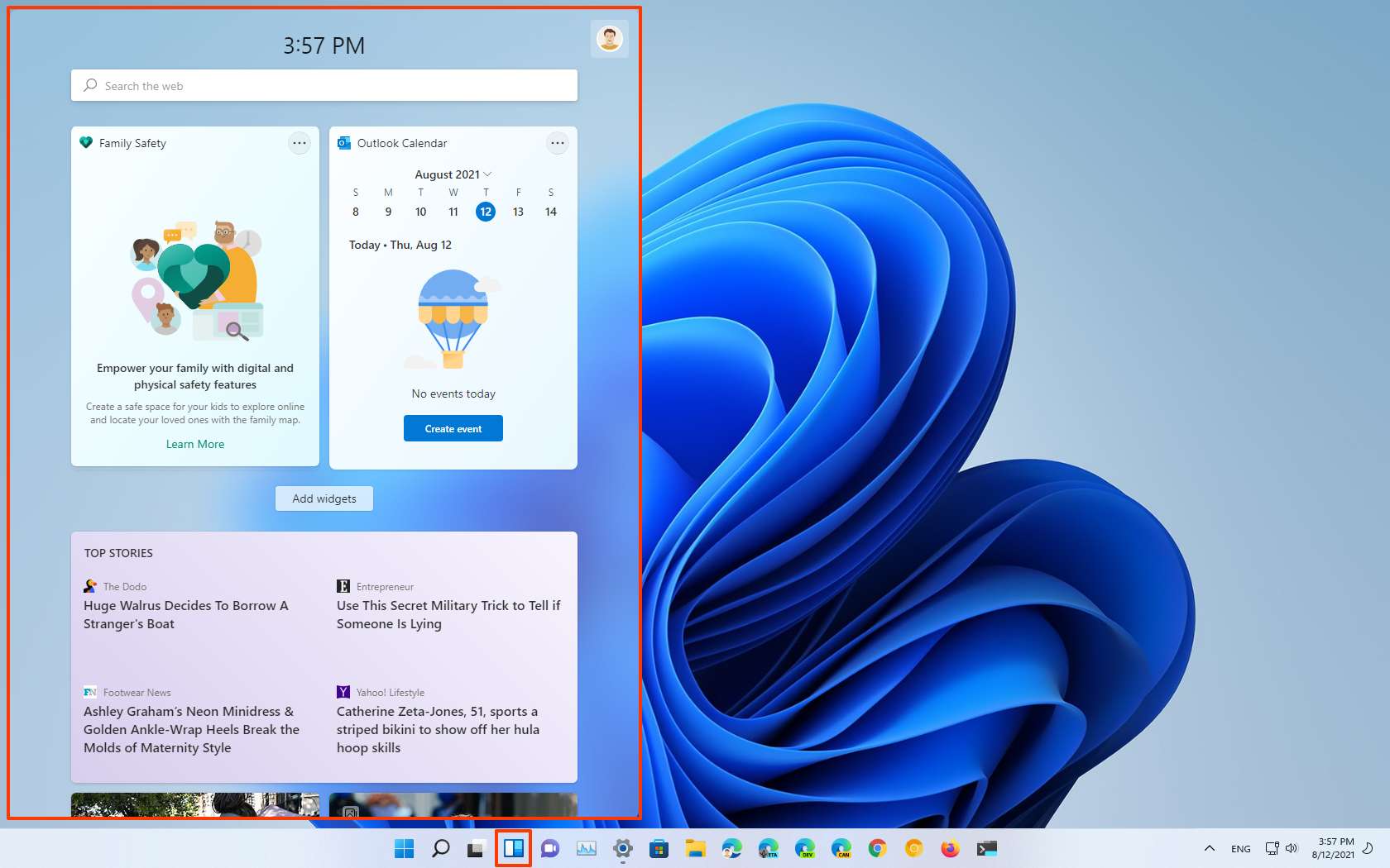
The widgets panel could have been so much more. Those lamenting the loss of Live Tiles could have found solace within its warm embrace, but it's actually just a cold, uninspiring feature that isn't really worth using.
Some of this may be location-based, so cue ranting from the Brits on the team, but there aren't many useful widgets, and the news headlines are mostly garbage. This could all quickly and easily improve, and if it does, it'll become a tool most of us are happy to use. But for now, that button is getting removed from the taskbar. It doesn't add anything to the experience.
All the crapware
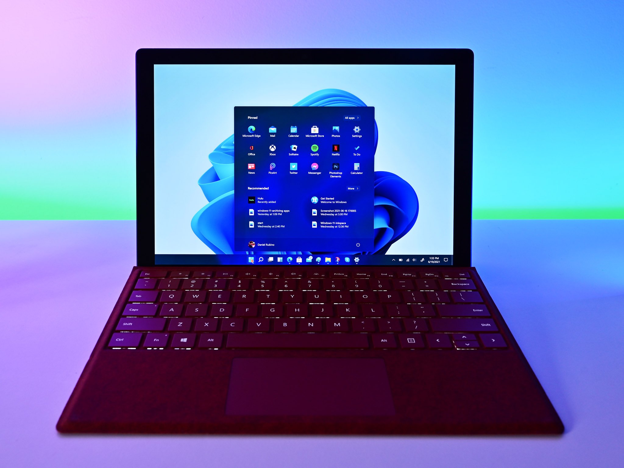
If I do a fresh install of Windows 11 or even buy a new Windows 11 laptop, and the first time I open my Start Menu I find Facebook Messenger pinned and ready for action, we're going to have a problem. It's been a bit of a running joke for years, with such hot titles as Candy Crush coming pre-loaded with a clean install of Windows on a gaming laptop. But come on, Microsoft. Please.
If it's about money, maybe let us pay for a version that just doesn't have all this crap? Not one single thing that was pinned in the Start Menu out of the box is anything I'm interested in, which essentially makes it feel like an ad. And I don't want ads in my operating system, thanks.
Please, for the love of God, stop it.
TPM will never not be confusing
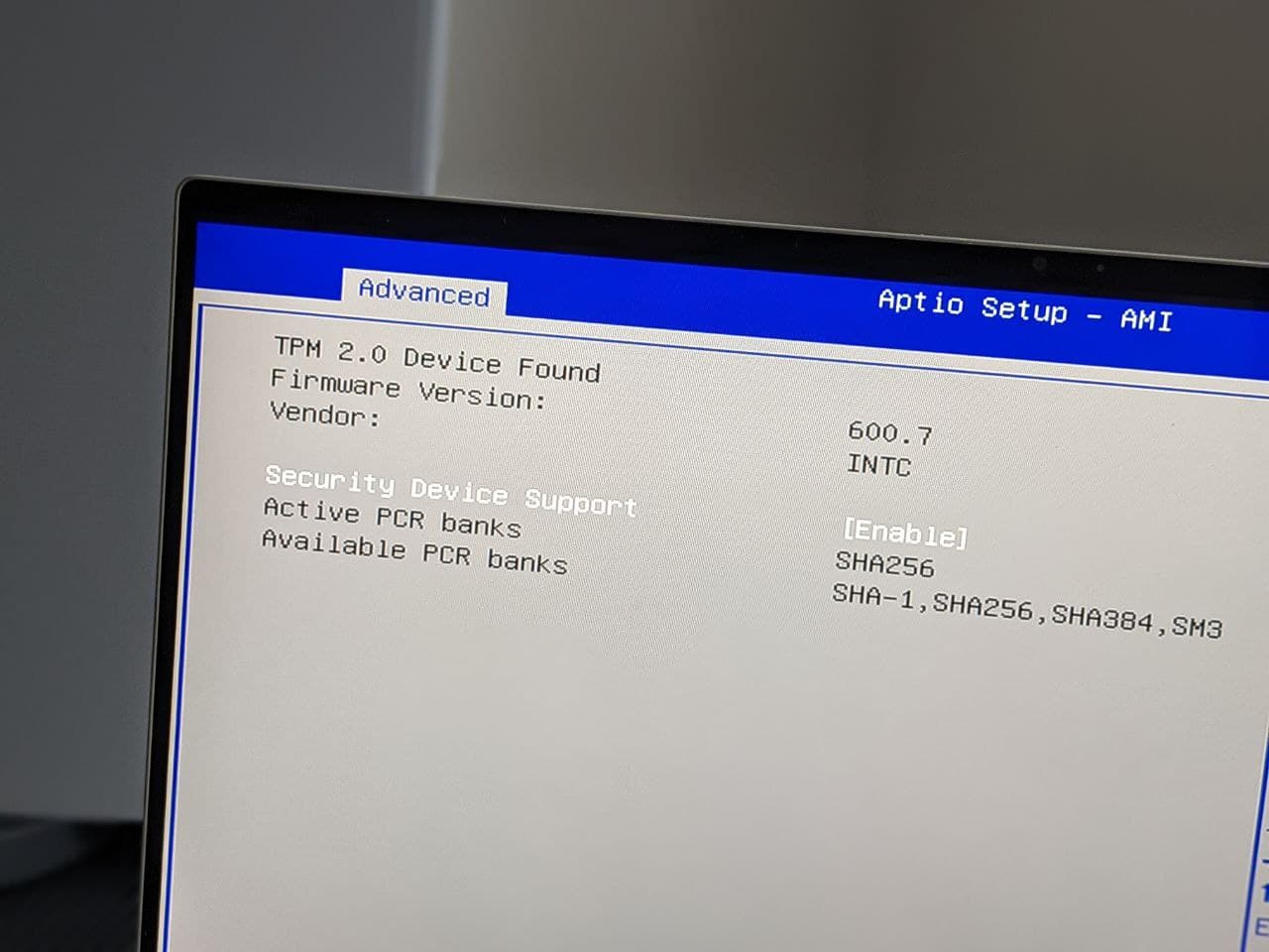
We've all been battling this since the first reveal of Windows 11. We've written a number of posts on the topic, trying to help and inform readers and get them through the process of upgrading to Windows 11 and handling the dreaded TPM.
Is TPM a good thing? Yeah, sure. Is it overly complicated for an average user? Absolutely. This quote from our editor-in-chief, Dan-Thorp Lancaster, sums it up.
"I built a new PC over the weekend and the PC Health Check app greeted me with a dreaded 'sorry, your PC isn't compatible' message despite the motherboard being less than a year old. Fortunately, ASUS had already released updated BIOS that allowed me to turn TPM on. However, most people are not going to know that this is an option, let alone how to go about doing it."
The issue with the TPM requirement is that it's buried within areas of the PC that many people will never even look at. And since it was never mandatory for it to be enabled in Windows 10, despite its existence being, it'll most likely be turned off.
Legacy menus and design choices from forever ago
Inconsistent design choices were a thing all through the life of Windows 10 and guess what? They're still here. Make no mistake, Windows 11 is a huge change for the better when it comes to design as a whole, but when you start digging a little deeper you'll still find menus that belong back in the Windows Vista age.
Our colleagues over at PC Gamer had a good take on this:
"But I had to laugh when, within five minutes of booting Windows 11 for the first time, I came face-to-face with a menu that's barely changed since 2007. Windows 11 may look nice, but it still has the same maddening problem as Windows 10, which is that the new menus are competing with ancient ones for basic functionality."
It's all true. We're getting there, but how many years has it been now? It's almost as though Microsoft is scared to pull off the Band-Aid. Even though it's long overdue.
Windows 11 doesn't feel like a must-have upgrade
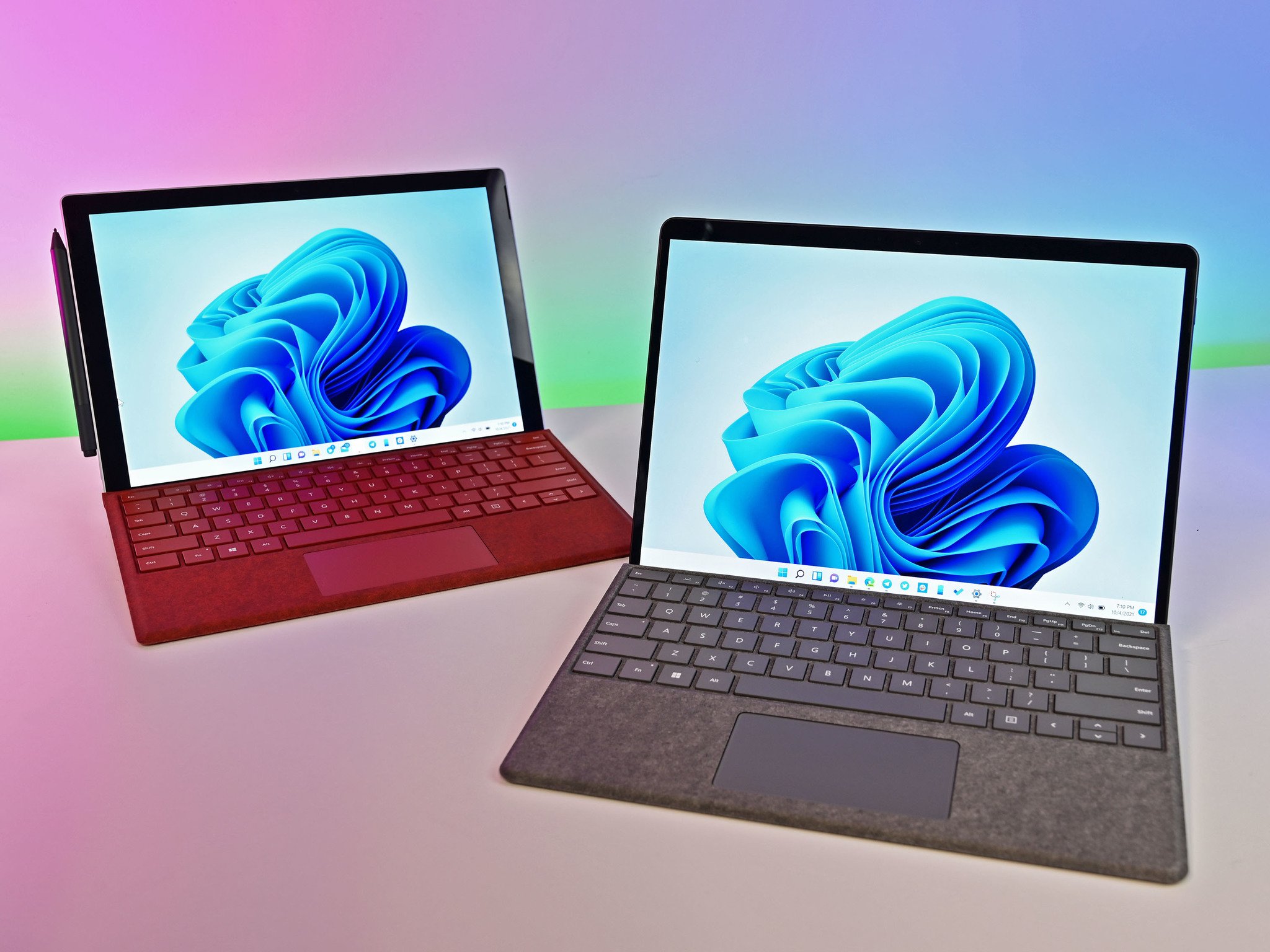
Windows 11 is very good on the whole, but it also doesn't feel like a must-have upgrade. Microsoft has struggled in the past to get people onto newer versions of Windows, particularly in enterprise, and there's nothing about Windows 11 that just screams you have to have it.
That doesn't mean it isn't a worthwhile upgrade, but it does pose the question of how quickly it'll be adopted. It's no secret how long Windows 7 stuck around in the Steam hardware surveys as gamers were reluctant to go to Windows 10, for example. And with the whole TPM confusion alone it's enough to put the more casual users off.
It's still the early days, and there's a good chance that all of these annoyances will become much better over time. But what about you? What do you not like about Windows 11?

Richard Devine is a Managing Editor at Windows Central with over a decade of experience. A former Project Manager and long-term tech addict, he joined Mobile Nations in 2011 and has been found on Android Central and iMore as well as Windows Central. Currently, you'll find him steering the site's coverage of all manner of PC hardware and reviews. Find him on Mastodon at mstdn.social/@richdevine
