Round Robin Review: T-Mobile G1

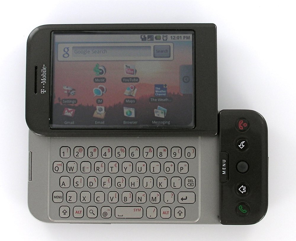
As I mentioned in my full review of Android on the G1, Android pretty much seems custom designed to fit me as a user (more on that in a bit). So of all the devices in the Round Robin, the G1 seems most-suited to cause me to stray a bit from Windows Mobile, but will it? You know the drill: read on!
(To enter to win the HTC Fuze and Celio Redfly, comment on this post before January 10th)
Pick The Smartphone That Fits You

Although I still very much stand by the dictum that I put down a year and a half ago: choose your carrier before you choose your phone, I have to say, the G1 really really seems to be aimed a target market of yours-truly. Let's review why:
- It's the latest and newest thing. I can't deny it, the G1 is the newest OS out there and it's not a bad one, there's a lot of growth potential here and I'm also the sort that likes having what's new.
- It's Google-centric. More on this later, but for now know that after several false starts my main hub for email, contacts, and calendar is now Google. I get it working pretty well on Windows Mobile, but the G1 is designed from the get-go for this.
- The OS is open, hackable, and fairly powerful. Again, more on this whole 'open' and 'powerful' thing in just a bit, but whether it's hating on SMS and PIN or decrying closed GPS systems, I prefer open to not. Android is Open source all the way down.
As long as we're repeating points made previously in the Smartphone Round Robin, I'll repeat Casey's point from the 2nd Smartphone Round Robin Roundtable, namely that Android as an OS seems to have a little bit of familiarity for everybody: touchscreen, menu button, full keyboard, trackball, back button, and more. (Check out this Android Walkthrough to get a feel for the basic User Interface metaphors).
As the sort of guy who appreciates multiple input methods and doesn't mind figuring out which is best in a given situation, well, no complaints there either. Heck, I even like the G1's hardware, chin and all.
In short, except for the fact that the G1 runs on T-Mobile and doesn't have 3G in my area, on paper it seems pretty much custom-designed to fit my needs.
Gmail, Google, and Buy-In
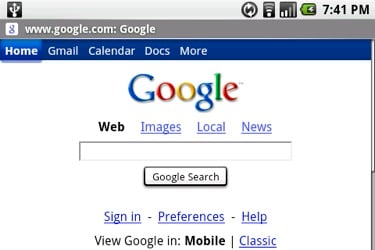
The short version is this: if you're not a Gmail/Google Contacts/Google Calendar user and you're not interested in converting, move along, there is nothing to see here for you. Although Exchange integration is coming (and right quick), this is a Google-Phone first. In fact, when you first boot the device up, it will literally do nothing until you enter your Google credentials and it successfully talks to the Google home base (this makes using an unlocked T-Mobile G1 a chore, btw, as you need a T-Mo SIM card to get it going).
Get the Windows Central Newsletter
All the latest news, reviews, and guides for Windows and Xbox diehards.
If you are a Google-holic, then there is a lot to like here. Well, there's a lot to like about the Gmail client and the Calendar, both of which are darn good on the web and not too shabby as client apps here.
What I most appreciate is the email app, which allows me to archive/label messages exactly as I do on the desktop and keeps me from having to fiddle with IMAP workarounds. It's push, too, and although Kevin noted that it's not as instant as the BlackBerry, it's still plenty fast enough for me.
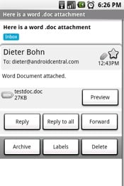
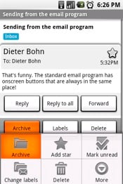
My main gripe -- and it's not a small one -- is that the buttons you want to use to interact with email are wicked-hard to find quickly on emails of any length. Three are located at the very bottom of your email thread and three more at the bottom of the email message -- the distinction there becomes important because Gmail aggressively threads email messages. You can also find some (but not all!) of the functions underneath the “Menu” key, but all in all it's a very annoying and inconsistent way of doing things. If I hadn't discovered the Android Gmail shortcuts (entirely by accident, I might add), this would be a deal-breaker.
As it is, it's still annoying but for me it's generally worth the hassle to have my mobile email match my preferred desktop experience so closely with no sync/setup/work at all.
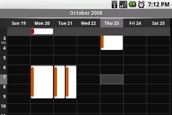
I also mentioned the calendar above because you get the same sort of experience: a good mobile version of what you get on the web, complete with push sync, separate calendars/colors, and the like.
Not mentioned in these warm fuzzies: the Contacts app. Now, contacts on the G1 is still leaps-and-bounds better than what you'll find on the iPhone. It starts with home-screen typing to find contacts (good, except when you accidentally have the Google Search Widget selected), continues with the now-standard-stolen-from-Palm 4-tabbed Dialer/Contacts app, and finishes with speedy auto-filtering. All of this is fine, though I would add that it would be nice to be able to search via the standard keypad so I don't have to open the keyboard to make a call.

What's not fine: Google Contacts. I've ended up making it my main Contacts app mainly by default, but I'm not happy about it. Google seems to add everybody I've ever emailed and I'm not one of the chosen few who are able to turn this “feature” off. It's a very mysterious feature at that, as when Google adds these email addresses to my contacts list it's only about 25% likely to actually place the email address under the right contact. The upshot is that unless you are willing to devote a very real amount of time to managing your contacts, they'll quickly turn into an unwieldy mess.
At this point I've pretty much thrown up my hands and given up: Google doesn't seem to delete any contacts, thank the lord, so I've just accepted that my contacts list is going to be a mess, full of duplicates and unnecessary emails/contacts.
Google: fix this. As long as the Android platform depends on Google Contacts, it's going to be mired in contact confusion. Heck, Google, while you're fixing things, finish up that ToDo app you just released on your Gmail client and let us sync it up. Notes, too, we need those.
Seriously, people. Palm got the Four Pillars of PIM right over 10 years ago. Compared to push email, calendar and contacts, ToDo and Notes should be a snap. TANJIT, of our four Round Robin Operating Systems, only half get this right.
Yeesh. Sorry. Moving on.
Navigating Android on the G1
So how is using the G1 day to day? It's not too shabby, actually, so long as you don't mind using it two-handed. Since there is no way to enter text except the physical keyboard, you'll find that you need to have it open the majority of the time. In fact, I find myself opening it to turn it on rather than hitting a button and then hitting the menu/keyguard button.
With it open, the two-handed-ness continues. On the Fuze, I find that I am able to do minor navigation and even a little text entry with my right hand. On the G1, no such luck. While you can get a bit done simply with the trackball under your right thumb, it's much faster and easier to reach up to the touchscreen most of the time. It's a pretty long reach, too, as the G1 isn't exactly small.
The UI metaphors are decidedly mixed, but coming from Windows Mobile and having experience with the BlackBerry OS I don't find them difficult to navigate at all -- just remember to hit that Menu button to find extra options that don't appear on screen. I'll join the chorus and say that I'm a huge fan of the “alerts window shade.”
The biggest hassle for me is the “Back” button, whose functionality is inconsistent at best and at times seems downright capricious. On Windows Mobile (and BlackBerry), the back button usually defaults to a more 'careful' mode, erring on the side of caution.
A use case is a bit more helpful. Say I get an email alert, I hit the alert and go directly to the email. Read it, done, time to hit the back button. On Windows Mobile, the back button will always take me back to the inbox so I can move on to other messages that might be there. On Android, the back button, well, sometimes it does that. Other times it just takes me back to the previous screen. Say I get an alert for a text message, I go look at it, then hit back, realize I'm on some random screen, hit the home button, swipe to messages, tap that, and then (hopefully) I'll get to my SMS inbox.
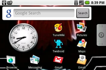
The homescreen is a mix of Windows Mobile's Today screen and a more traditional application shortcut list ala BlackBerry. In theory, it's a very nice mix of functionality. You can slide the drawer out to get access to all of your apps, have your most important apps available quickly, and have widgets that offer useful information and utilities.
In practice, it's not quite there yet. Although I do like the window shade alert system, I'd also like to see number badges on the icons on the home screen (so-called 'Active Home Screen' icons). Additionally, the only widgets that are available right now are pretty weak sauce: a Clock, a picture frame, and a Google search box. Hopefully this will change quickly with some 3rd party software.
3rd Party Software and Power
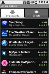
Aha, speaking of third party software, it's not quite there yet either. While there are some diamonds -- specifically ShopSavvy and Twitroid, the rest are pretty mediocre. Part of that is likely due to the fact that there's no method for actually purchasing Android apps yet. Part of it, though, is frankly that this is a new platform with very unclear standards for memory management, user interface, and the like. Or if there are standards, they don't seem to be coming through to the end user very clearly.
I've experienced some troubling pauses and instability with some third party apps, but in the main it's not too bad.
Android is a multi-tasking OS, but again it's not entirely clear to me how it all works. Do apps in the background truly keep running and taking up RAM, slowing everything else down. If the device feels slow, can I quit applications? Should I need to? The default answer seems to be “don't worry about it,” but I worry about [it], Bevvie, I worry a lot. I probably shouldn't, but when the device seems to slow down on me, it's hard not to.
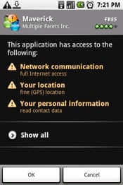
I will say this: the App Market is grand. It's cluttered with poor user reviews, useless apps, and the like, but I don't much care. Having a single interface for installing apps that also tells me what parts of Android are going to get accessed by the App is the “way it should be.”
Built-in Apps
I've already covered all the built-in apps over at the Android Central Review, so I'll just hit on a couple high points here.
Browsing is great, but it's still annoying that multitouch isn't included on this build of Android -- the hardware and the OS are certainly capable of it. I don't know who to blame for this, but I have a hunch and it rhymes with “mapple datent.”
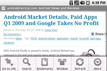
Anyhow, best browsing experience after the iPhone, edging out even the higher-end Windows Mobile browsers for speed and rendering (though it can't do nearly as much as Skyfire, multi-media-wise). It's occasionally slower than I'd prefer, but I'll be darned if Webkit doesn't make a great mobile rendering engine.
SMS is threaded, as it ought to be. IM seems to depend on T-Mobile's network, Google Maps is a joy, voice dialing is decent, pictures and video is sub-par, etc etc. All of the 'must-haves' are here, but only a handful inspire. Of particular note is the music app, which apparently set the bar at Windows Mobile's Windows Media Player and just barely managed to clear it. It's no wonder they didn't include a 3.5mm headset jack on the device. On the other hand, when you have music playing it places an entry in the notification window shade for quick access.
Hackability and Customization
Android is Open Source and more hackable down to the deep, deep guts of the device than any other platform. That's the good news -- the bad news is that the learning curve to do it is, well, it's not necessarily steep but it's a long, long plod. I'm no developer, so the idea of learning how to code in Linux, Java, and the like doesn't really appeal to me. So while Android is open and hackable, it's not really either to the likes of me. It's great for the serious hacker, but the hobby hacker need not apply.
This stands in stark contract to Windows Mobile, which except for the closed source code is almost as 'open' as Android is. Even minor lock-downs send us into fits and lead us to write open letters. There's almost no limitation without a workaround. More to the point, the learning curve for hacking Windows Mobile as a hobbyist is moderately steep but very short. Once you get over the hump of modifying your first registry entry, you're pretty much golden to hunt around for hacks and a short jaunt away from installing custom ROMS. Hobby Hacker's Delight.
Still, with Android it may most be a matter of timing -- it simply hasn't been out on the market that long. I do wonder, though, if this is the place where we ought to be praising the registry on Windows Mobile. I think a registry as a centralized location for settings and preferences is a great fit for Mobile, but I should probably stay off that topic for the time being.
Anyway, there are a few hack-y apps on the Android Market that let you create shortcuts or give you fine-grained control over power settings, but they too are fairly inelegant.
Wrapping Up
So my bottom line as a Windows Mobile user moonlighting in Android Land: big potential, not there yet. The fact of the matter is that Android needs more baking before it's going to be truly ready to take on the other Smartphone platforms on their own terms. Email's not as fast as BlackBerry, Enterprise support is nonexistent compared to Windows Mobile, and the UI isn't as consistent as the iPhone. On its own terms, however, Android certainly gets the job done and does a few things better than anybody else does (Gmail, obviously).
So there's no call for Windows Mobile users to flock to Android, but there is a call to Microsoft to open up their OS more (to end users, anyway). More importantly, it looks right now like Android was developed quickly and continues to develop quickly. I don't know how long Android was in the works before it was unveiled, but I know it wasn't very long. I also know it won't be very long before many of the complaints enumerated above are addressed.
As a Windows Mobile user, seeing WM seem to stagnate while Android is rushing headlong into the future is not fun. Right now, Windows Mobile is slightly ahead, but take heed, Microsoft. In a year or two you may find Windows Mobile in the same position on the track compared to Android -- but WM will have been lapped.

