Review: Winterface Version 1.3
Vito Technologies recently announced the release of an updated version of their popular Windows Mobile interface, Winterface. The updated version, v1.3, reportedly has fixed bugs associated with SMS notifications and the weather icon. It also adds a brighter skin with "stylish" icons (Vito's words, not mine). We've downloaded the updated version of Winterface and loaded it on to the HTC Fuze to see how it performs. Follow the break to see what lasting impression Winterface has made.
First Impressions
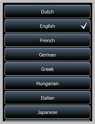
We reviewed the previous version of Winterface, which received high marks, but this is my first experience with the application. When I first loaded the application on to the Fuze, I could help but think of the iPhone. You have a similar screen layout with icons/buttons that launches applications, "favorites" from your web browser, displays system information, or pulls up contacts for two-step dialing. Winterface loads set to the black screen which is more "professional", "conservative", "borderline boring" of a style. For those who want a little more flair for their Windows Mobile phone, you have a white skin that is brighter and does have (dare I say) more stylish icons. Winterface is bi-lingual supporting a wide range of languages.
Performance
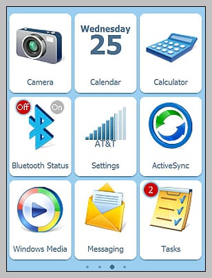
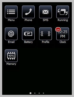
Cosmetics isn't the only thing Winterface brings to your Windows Mobile phone. The layout is customizable to allow you to add, delete, and re-arrange the buttons. The "menu" button pulls up your options which cover the screen lock, screen size, add button, and skin options. The screen lock enables a slider lock that appears when your device wakes up (very similar to the iPhone). The Full Screen option extends the Winterface screen fully, hiding the Windows Mobile header bar. Skin options allows you to choose between black (black/white layout) and white (color layout) skins. There are some "unofficial" skins surfacing over at XDA Developer's forum and it is my understanding that Vito does have plans to offer additional skins in the future.
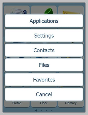
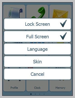
Buttons can be added to include launching applications, settings or contacts. If you set a button to a contact, it pulls up the contact information which can be dialed from. Re-arranging the buttons requires a simple press and hold of the screen which causes the icons to shake (sound familiar). When they are shaking you can delete them by tapping the red "x" or move them about the screen. Once things are arranged to your satisfaction, press the center d-pad button to stop the shaking. The re-arrangement appears to be limited to the page you are viewing and I couldn't find a way to drag a button from one screen to another. It is my understanding from Vito Technologies is that you should be able to shift icons from screen to screen and this may simply be a bug in the system that needs to be ironed out.
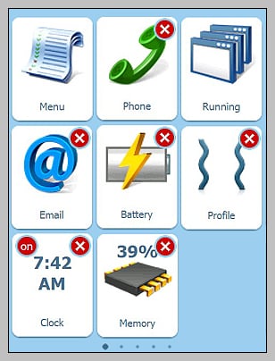
I was impressed on how many buttons Winterface would allow, which offers a lot of "one touch" functionality. Winterface allows for nine buttons per screen with the white skin (larger buttons) and sixteen buttons per screen with the black skin. Each skin can utilize up to five screens of buttons. Navigation between the screen is done by finger swipes and movement between pages was smooth. Every so often a swipe would be mistakened for a tap/hold sending the buttons into a shake. I didn't have any false starts of applications.
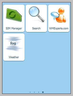
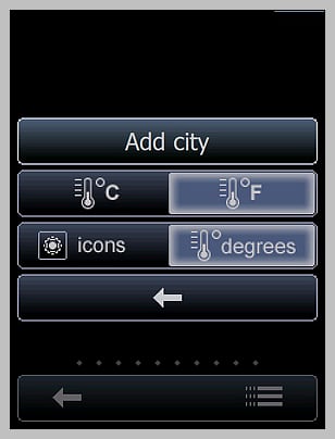
The weather button is a separate, free download from Vito that has to be added to Winterface. Why Vito didn't include this in Winterface to begin with is unknown. The weather button can be customized for specific cities with a good range of cities to choose from. The weather application will display the current temperature or a symbol of current weather condition on the button and if tapped, will launch an brief, two day forecast for the city. There is no setting to regulate the update frequency (updates every 90 minutes) so if you are on a limited data plan, roaming where additional charges will be imposed, or have battery issues this may be of concern. I did notice that my battery life shortened while I had the weather button installed.
Could it be better?
Of course it could be better but as is, Winterface is an application that grows on you. It's not pefect but has a lot to offer the Windows Mobile community. It has the potential to put a considerable amount of functionality at your fingertips without the need to drill down through various screens. If you're constantly turning on/off your Bluetooth, you have a one-touch button available to do just that eliminating the need to go into the Communications Manager. You can set up a page dedicated to contacts that can serve as a speed dialing page. One tap pulls up the contact, a second selects the number to dial. While I like many of the features and functionality of Winterface (slide lock is really nice) I feel that there some areas that if improved, would make Winterface more competitive with other shells.
Get the Windows Central Newsletter
All the latest news, reviews, and guides for Windows and Xbox diehards.
The one thing Winterface will not do is replace your Today Screen completely. There's a button to launch the application available for your home screen and a screen swipe can also launch the app. If you hit the "home" key, you return to the traditional Today Screen and have to relaunch/return to application. By default, during installation, a Winterface launcher is placed in your Startup Menu to have it launch when you turn your device or reset it. I wonder if it could be put into place similar to the way Touchflo is installed Winterface would be better? You could map the "home" key to return you to the first page avoiding the need to return to the button shell.
I like the memory and battery level buttons but wish the battery icon would display a percentage of power remaining. The slowly decaying color bar on the icon is nice but a percentage readout is better. Having used the weather button, I now understand why it's a separate install. Without the capability of regulating update frequencies, the weather application weighed heavy on my phones resources. While there are several settings associated with the weather button, how often it updates needs to be one of them. If that happens then by all means, eliminate the need for a separate download and include it as standard with Winterface.
The navigation involved in changing the settings on Winterface is cumbersome in that each adjustment closes the settings menu. It would be better if you could tweak multiple settings then exit the Settings Menu.
The email button on Winterface launches you into the main email screen (the one that shows you all your accounts). Winterface doesn't show you any indication that you have unread email or provides the ability to isolate specific email accounts (e.g. one button for gmail email). If seperate buttons for individual accounts isn't possible, you really need a little red circle showing the collective number of unread emails. The Task button has a similar indicator for the number of pending tasks. It would also be nice to see some indication of the number of pending appointments are present for the day on your Calendar button (that might be too much to ask for).
Overall Impression
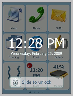
While there are some "wouldn't it be nice if..." aspects about Winterface, it does add a bit of style and functionality to your Windows Mobile phone with the larger, more "stylish" buttons on the white skin. Even if the more conservative black skin suits your style better, you still have a good bit of functionality added to your phone. It took a little getting used to but Winterface version 1.3 is something to consider if you're looking for an alternative to the traditional Today Screen or if you simply like the iPhone look. I like the straight-forward, direct interface Winterface offers. The sliding lock bar is an added bonus to prevent accidentally launching applications when your Windows Mobile phone bumps against something just right. If you're not sure about it, a trial download is available over at the software store.
George is the Reviews Editor at Windows Central, concentrating on Windows 10 PC and Mobile apps. He's been a supporter of the platform since the days of Windows CE and uses his current Windows 10 Mobile phone daily to keep up with life and enjoy a game during down time.

