Review: Windows Phone 7
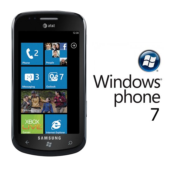
About 24 months ago, Microsoft began to re-build it's mobile operating system and while there may be signs of Windows Mobile under the hood, you can barely see any resemblance from the working end of Windows Phone 7. With Windows Phone 7, you need to forget everything you know about Windows Phones.
After using Windows Phones based on Windows Mobile for years, it's tough to let go of the old while learning the new. For those familiar with Windows Mobile, I'm inclined to describe Windows Phone 7 as a peppier, streamlined version of Windows Mobile Standard. The OS is straight forward with minimal settings to tweak. It's a very fast OS and while there is a lot to Windows Phone 7, it doesn't take long to learn your way around it.
I've spent several days using the new mobile OS and ease on past the break to read my observations on Windows Phone 7.
Consistency in design
With Windows Phone 7, Microsoft placed a lot of control over the functionality, appearance, and design of Windows Phone 7. Unlike Windows Mobile, custom User Interfaces from widgets to panels are a thing of the past. Trackballs, directional pads, PTT buttons are also off the drawing table. The uniformity and consistency of Windows Phone 7 not only flows through the operating system but also the design of the phone. The changes to the design go hand in hand with the changes in software.
The design uniformity starts six buttons. Gone are the answer/end buttons, track balls, directional pads, PTT button, and other buttons that were found with Windows Mobile. Every phone running Windows Phone 7 will have these six buttons;
- Start button: When you hit the Start button, you are taken to the Windows Phone 7 Start screen from anywhere on the device.
- Back button: You can use the back button to go back within an application or between applications. The back button also lets you navigate to a previous screen or web page, exit a search operation, or close an on-screen keyboard, menu, or dialog box.
- Search button: If you need to find something quickly, just tap the search button. To search within an app such as email, tap it once to find messages. Tap the button a second time to conduct a Bing Search. If your application isn't search-able, tapping this button will pull up Bing's search screen.
- Camera button: The Windows Phone 7 camera button is dual-action, supporting both full-press and half-press modes. A full press launches the camera application, after which a half-press activates the auto-focus feature and a full press takes the picture.
- Volume buttons: The volume buttons adjust the volume of an active audio stream, such as a phone call, music audio, radio audio, or an in-progress movie. Pressing one of the volume buttons when you receive an incoming call will silence the ring-tone.
- Power button: If your Windows Phone is off, a brief press on the power button turns it on. When the phone is on, a brief press of the power button will turn off the display and lock the phone. Pressing and holding the power button will power the phone off.
I have to admit I miss the answer/end keys. While tapping the on-screen "answer" or "end call" buttons isn't difficult, with answer/end buttons, I could answer or end a call without looking at my phone. As far as phone operations, this may be the one change that will be the hardest to get used to. We may see additional buttons/controls work their way back into the design but for now, Microsoft's keeping it to six.
Aside from the uniformity of buttons, each Windows Phone 7 will have a multi-touch capacitive touch screen, voice recognition capability, on-screen keyboard, along with various under-the-hood specs (minimum 1ghz processor, aGPS, magnetometer/compass, bluetooth, Wi-Fi, accelerometer).
All the latest news, reviews, and guides for Windows and Xbox diehards.
I like the uniformity that Microsoft has put into place. It will help with solving technical issues, transitioning from phone to phone when it's time to upgrade, and with respect to software development in that everyone will be on the same page.
Getting Started
When you first power up your Windows Phone 7 device you will be guided through a set-up wizard. The most important step of this process is entering your Windows Live ID. While Windows Phone 7 can function without a Live ID, to make the most of your Windows Phone the Live ID is key. This will give you access to features such as the Marketplace, Xbox Live, and Zune. In establishing a Windows Live ID, You will still be able to access alternative services such as those provided by Google, Yahoo or Exchange Servers. A Windows Live ID simply gives you access to the complete feature set of Windows Phone 7.
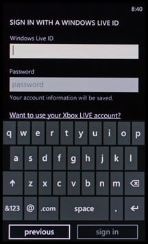
Signing in with your Windows Live ID also provides a convenient means to back up your data. When you sign in with your Windows Live ID, contacts that are saved on your phone are backed up to the web, so you won’t have to worry about losing them. Your calendar is also backed up, and you can choose to back up your photos as well. If you don’t have a Windows Live ID, Windows Phone 7 will guide you through the account-creation process during the initial setup.
During setup you will also have the opportunity to add other accounts such as Facebook, Google, Yahoo, Outlook, or other POP/IMAP accounts. If you choose not to set up these accounts during the initial set-up, you can always go back and create them later from the Settings Menu.
"..."
We touched on consistency of design and need to touch base on some consistencies with the software. The most notable is the "..." symbol. If you see this in the lower right corner of the screen it will pull up either additional menu options or text descriptions of the icons or both.
You have other consistent icons throughout Windows Phone 7 include the "X" which means to cancel, a 3.5" floppy disk which means to save, the "+" which means to add or create, and the spyglass represents the search.
Keyboard
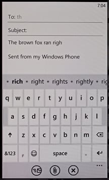
The on-screen keyboard is one of the nicest keyboards I've used. It far exceeds the on-screen keyboards of Windows Mobile and I would add that it makes my wife's iPhone keyboard look bad. The keyboard has predictive text, auto correct and will learn from your test suggestions. The only problem I see with the keyboard layout is that it doesn't have any directional arrows for your cursor. While you can tap the screen to move the cursor, sometimes you need a little help with directional arrows to move the cursor to the exact spot.
Lock Screen
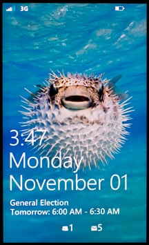
When Windows Phone 7 goes to sleep, when it first wakes up you are greeted by a wallpaper lock screen. The lock screen will display the date, time, your next appointment, any missed calls, voice mail and new messages that has arrived. The lock screen is removed by swiping upwards. In the Settings Menu you can change how quickly the screen turns off, the wallpaper (preset options or personal photo), and set a password to help protect your phone.
Battery Meter/Signal Indicator/Volume Meter
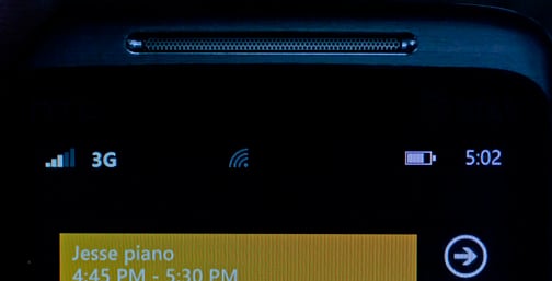
Microsoft has done away with the task bar that typical sat on top of the Home Screen. With Windows Phone 7, you have the time displayed in the upper right corner and in tapping the time, the battery icon, signal meter, and Wi-Fi/Bluetooth indicators will drop down. Having the icons hidden cleans up the Start Screen nicely.
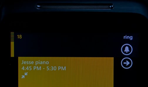
Another change in display comes with the volume meter. In pressing the volume key a bar meter appears in the upper left hand corner of the screen and an icon to "ring" or "vibrate" will appear in the upper right corner. As you adjust the volume a corresponding number appears. If you prefer to mute the ringer and set the phone to vibrate, just tap the "ring" icon and the "vibrate" icon will appear. If you want to silence the phone completely, you'll have to go into the Settings Menu under Ringtones and Sounds. If you dial the volume all the way to zero, the phone goes into vibrate mode. I would have preferred to have a third icon, "mute", to make things easier.
Start Screen
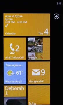
Where Windows Mobile had everything from widgets to quick-links to panels on their home page, Windows Phone 7 has a Start Screen that incorporates tiles. Each tile represents an application, contact or function of the phone. Some are "live" tiles in that they are updated with regularity and display information. For example, the Weatherbug Tile is "live" in that it updates itself with current weather conditions and displays that information on the tile.
Your Start Screen will already be populated with tiles but you can customize it's appearance by adding, deleting or re-arranging tiles.
You can add tiles for programs, email accounts, and contacts. To add a tile for an application, you'll need to shift over to the Apps List Screen (either swipe to the right or tap the arrow button at the upper right of the Start Screen). Your App List is just that, a listing of all the apps on your Windows Phone (plus Settings). To create a tile on your Start Screen for an item on your App List, tap and hold on the item to pull up the options menu. Choose "pin to Start" and you've created a tile for that particular application.
To add a tile for a contact, launch the "People" app (from your App List or Start Screen Tile) to see your contact list. Tap on the contact you want to add to the Start Screen and at the bottom of the screen you'll see three icons; one to pin the contact, one to link the contact, and the other to edit the contact (we'll cover the latter two in a bit). Just tap the pin icon and your in business.
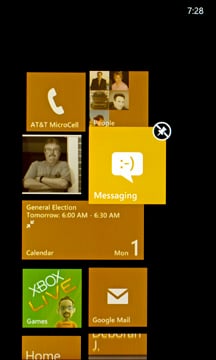
To re-arrange the tiles, you simply press and hold the tile you want to move. The tile will pop-up from the other tiles and a un-pin icon will appear in the right corner. If you want to remove the tile, tap that icon. If you want to move the tile, simply touch and drag the tile to it's new location. When it gets there, tap the icon to set it in place.
App List
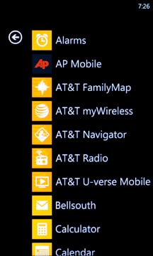
Where Windows Mobile listed it's applications in the Start Menu, Windows Phone 7 keeps them listed in the Apps List Screen. You will find a vertical scrolling listing of every application you have installed on your Windows Phone 7 device. From Marketplace Apps to email accounts to native applications, they will all be here. You will also find your Settings Menu at the bottom of the Apps List. Apps are listed in alphabetical order and can not be re-arranged.
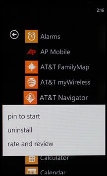
As mentioned, when you tap and hold an individual app, you pull up the settings or options menu for that particular application. Every app will have the option to be pinned to the Start Screen. Some apps will have additional options to uninstall the application or rate/review the application in the Marketplace.
I have to admit I like the simplicity of both the Start Screen and App List. The biggest challenge so far with regards to the Start Screen is to decide how to arrange things. Do you go with contacts first, apps first, calendar up top, Xbox Live up top or just have the tiles fall where they land?
Hubs
Windows Phone 7 utilizes hubs for several of it's applications both native and third party. The hub sets information up on a horizontal plane allowing you to swipe left or right to access different areas or information specific to that application. I like the hub concept. It elminates the drilling down we had with Windows Mobile that relied more on the vertical design (closing one page to drill down to the next) and puts more information on the same plane.
For example, the Marketplace Hub has three pages. The main lists the primary categories of content (apps, games, music), the next covers featured apps, and the third featured artists or developers. The featured pages changes daily and keeps the appearance of the Marketplace from becoming stagnant.
I like the horizontal layout of the hubs which makes navigating through an application a bit more efficient. We'll touch on the email, people and calendar hubs shortly but other hubs included with Windows Phone 7 are:
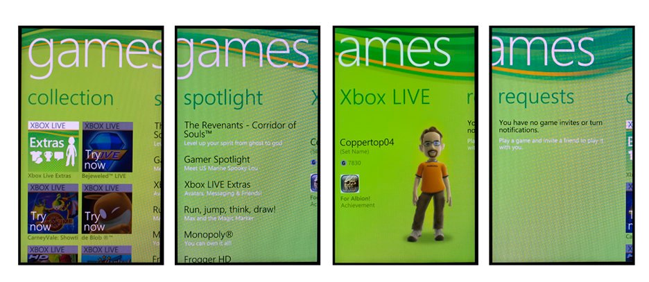
Xbox Live: With your Windows Live ID, you have access to the Xbox Live gaming community. The Xbox Live Hub is your portal for downloadable games, your Xbox Live account as well as online gaming. The hub consists of featured gaming apps, spotlights online gaming, your Xbox Live Avatar, and any Xbox Live gaming requests.
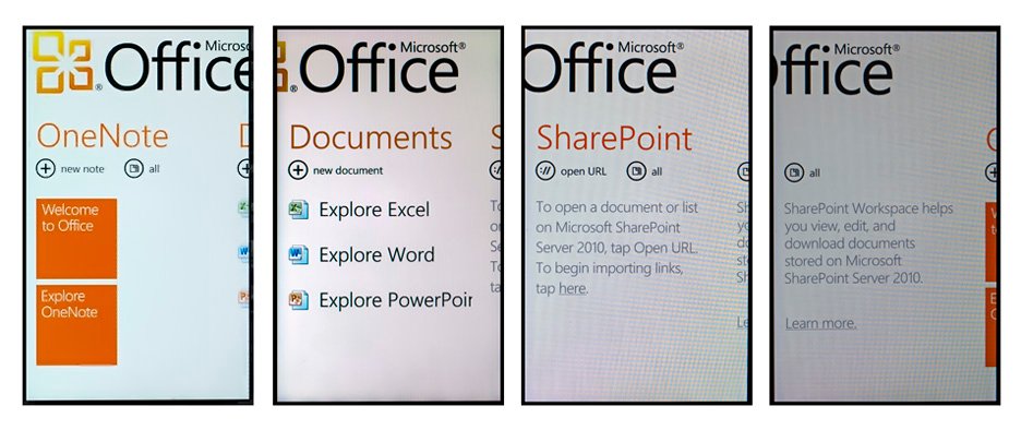
Office: The Microsoft Office Hub contains your Word, Excel and Powerpoint apps. It also holds your Sharepoint and OneNote apps. You can create and edit Word and Excel Documents but only edit/view Powerpoint Documents.
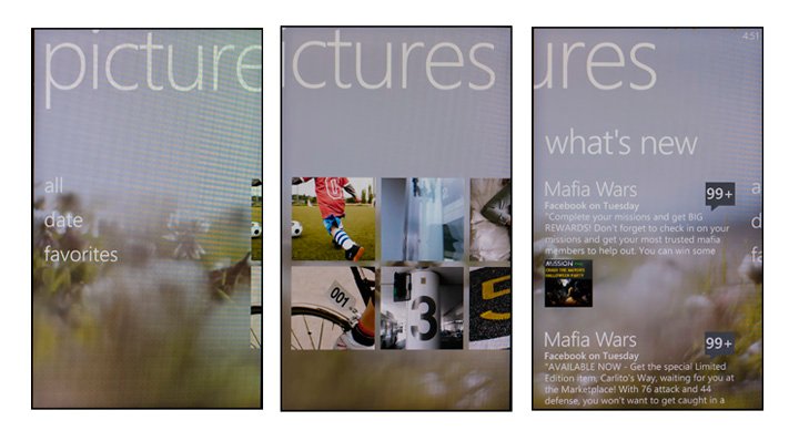
Pictures Hub: This is not only your photo gallery but also your portal to photo galleries stored on your Windows Live Skydrive and Facebook. You can upload photos taken by your Windows Phone to your Skydrive account, email them, or upload them to Facebook. For photos stored on your phone, you can directly access any photo enhancement apps such as HTC's Photo Enhancer or Flickr Manager directly from the Pictures Hub.
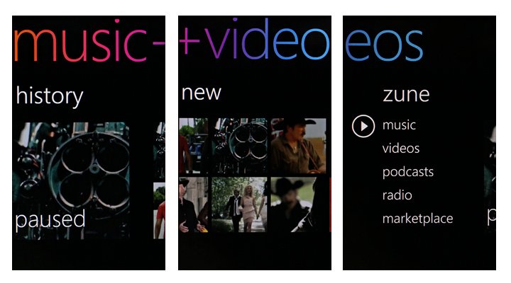
Zune Hub: Gone are the days of Windows Media Player. This is the day of Zune. Zune has stepped up and will be the media player for Windows Phone 7. Its hub is laid out much like you'd find on a stand-alone Zune player. The first panel presents the main categories of media (music, videos, podcasts, radio) as well as a link to the Marketplace where you can shop for additional music and videos. The next panel shows your player's history, and then you move to a display of your new items. The Zune Hub is tremendously easier to navigate around than the Media Player was.
This just scratches the surface on these hubs included in Windows Phone 7. We will get a more en-depth review up on each in the coming days.
Calendar
As with most of the Windows Phone 7 content, the calendar resembles little of Windows Mobile. Launching the Calendar takes you into the Day view. Side swiping takes you to the Agenda view.
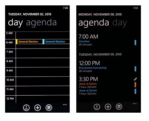
The Day view is a vertical scrolling, hourly listing of dates. To go from one day to another, simply scroll up or down. The Agenda View lays out your daily appointments and, like the Day view, to move from one day to another, simply scroll up or down. There is a monthly view which is accessed by tapping the calendar icon at the bottom of the screen. To view a specific date.
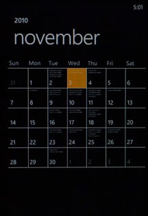
If you've connected your Windows Phone 7 device to Windows Live, this will be your primary calendar. If you've connected to other calendar services (e.g. Google) these calendars will be secondary. You can tap the "..." and turn on or off each calendar and give it a unique color.
To view a individual appointment, simply tap on it from either the Day or Agenda Views. When you pull up the appointment you'll see all the information entered for the event as well as which calendar it came from.
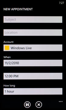
Additionally, when you create an appointment from your Windows Phone, you can choose which account to associate the event with. This way, when you sync your phone it will be reflected appropriately.
Calendar Live Tile

The calendar tile that is available for the Start Screen will display you next upcoming appointment. You do not have the option to increase the number of appointments appearing in the calendar tile. Not too sure if that's a good thing or bad.
For the first time, Windows Phones are able to pull from multiple sources for email, contacts and calendars. When you establish and connect your Windows Phone to a Windows Live account, your Hotmail account is automatically set-up and a tile placed on your Start Screen. You do have the option to set up additional email accounts during the initial setup of your Windows Phone but if for some reason you need to add an account on down the road, the process is easy.
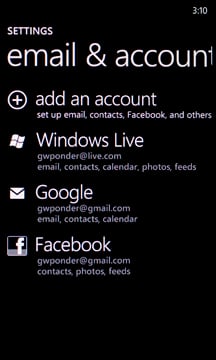
If you have an Exchange Server, POP/IMAP, Google, Yahoo or Facebook Account you want to set up, you can do that as well. You can get to the Account Setup screen two ways. First, go to your App List, choose settings and then email and accounts. The other way is when you are viewing your Hotmail Inbox, tap the "..." and choose "add email account".
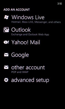
From there it's simply a matter of following the set-up steps to start receiving email from the other accounts. Most email accounts will only require you to enter in the email address and password. Windows Phone 7 will search for the rest. In some instances, if Windows Phone 7 can't find the account settings, you'll have to do it the old fashion way and enter everything by hand.
There isn't a consolidated inbox for email. Each account will have it's own inbox and can be pinned to the Start Screen. Along with your account information, email settings include; how you want your signature to appear, bcc yourself on outgoing email, how often you want the phone to download new content, how far back you want to keep email, and if the account has a calendar or contacts whether or not you wish to sync that content as well.
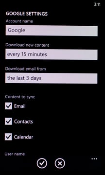
The settings for email are well laid out but the shortest duration for email storage is 3 days. I would have liked to seen the option to download messages for that day only. How often you download email ranges from as the items arrive to hourly. Manual download is also an option.
The Inbox itself looks nice and clean. You have a screen for All email, unread email, flagged email and urgent email. Navigation, as with any other hub in Windows Phone 7, is done by swiping the screen left or right.

To the bottom you have several icons plus the "..." icon. Next to the "+" icon (which is used to generate or add a new email message) you'll find the "Select" Icon. You will use this to mark multiple items as read/unread or delete multiple items. The "Folder" icon gives you access to your email folders (sent, deleted, drafts, etc.) and the "Sync" button is where you can manually check for new messages.
Additional icons found in the Inbox include a trash can to delete a message and various envelope styles to send and reply to messages. Remember, if you aren't certain what an icon means, tap the "..." symbol to pull up the text description.
Another way to access email options is to press and hold over the message you want to deal with. In doing so, you'll pull up a menu to allow you to delete, mark as read, move or set a flag with.
Email folders are searchable. Just tap the Search Button on the phone's face and start typing the sender's name or subject. The Windows Phone will begin to narrow down your results as you type.
Email Tiles
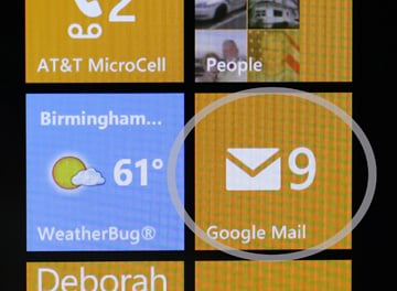
For each email account, you can pin a tile for that account to your Start Screen. As new messages are downloaded, a number will appear on the tile representing how many new messages are present.
Contacts
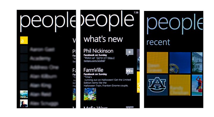
As with calendars and email, Windows Phone 7 allows you to pull contacts from various sources. They are all thrown into the same contact list that is accessible under the "People" Hub. The People Hub consists of your contact listing, any Facebook status updates on your contacts, and those recently called. You can access your People Hub by tapping the People Tile on your Start Screen or from your App List.
The Contact list is searchable by pressing either the Search Button or the Search Icon (which is located towards the top of the screen). To view the details of a contact, simply tap on the name.

When you pull up an individual contact, you will see three icons at the bottom of the screen. The first pins the contact to your Start Screen, the second links contacts, and the third edits the contact.
Unlike the calendar, with contacts you have the ability to reduce multiple occurring contacts. For example, you have your spouse's contact information in your Google account, Windows Live account and work server. To avoid having three entries for such contacts, you can link them together. Essentially pulling all the information under one listing.
To link contacts, tap the Link Button and a listing of suggested contacts will appear. Simply tap on the contacts to link together and when your done, hit the back button to view the consolidated information.
In viewing the contact's details, beneath the name you will see which accounts the information comes from. When you sync your contacts, only the information pulled from that account will be synced.
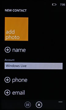
To add a contact, you'll need to go to your People screen and choose the "+" symbol at the top of the list. You choose only the fields you want to populate and you have to choose which account to associate the contact with.
Contact management is laid out really well in a straight forward manner. I was worried at first that I needed to import and merge all my Google Contacts to Windows Live (which is still an option) but by linking duplicate contacts, I can keep the number of contacts on my phone more manageable.
Marketplace Hub
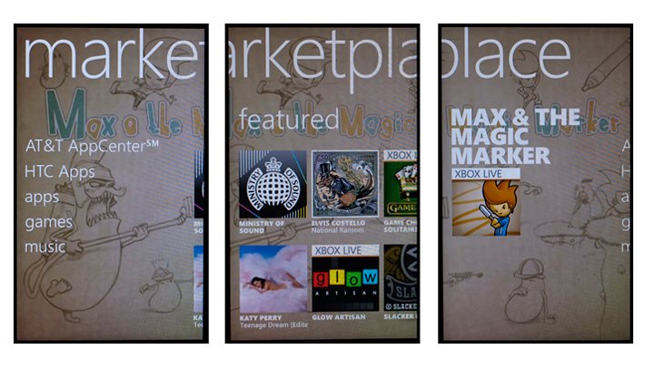
Along with the design and operating system, Microsoft has tightened up the guidelines on apps running on Windows Phone 7. All roads for apps to land on a Windows Phone now go through the Marketplace. You'll need a Windows Live ID to access the Marketplace and the number of apps increase daily. You have gaming apps, travel apps, news apps, lifestyle apps, sports apps, finance apps, and a lot more.
When you first enter the Marketplace Hub, on the front page you will see a directory for apps, games, and music. Additional pages on the Marketplace include a Featured App page and a Spotlight App page. When you tap one of the three directories you launch hubs for each (the music directory launches the Zune Hub). Each are laid out in a similar fashion with a category listing, featured applications, top downloads, new arrivals, and other spotlight oriented pages.
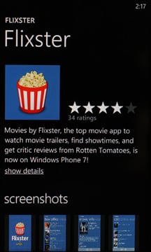
When you find an app that you are interested in, tap on the icon and you will have access to detailed information along with user reviews. When you choose an app to purchase, you'll be presented with payment options. You can have the cost applied to your wireless bill (some providers may not allow this) or have the app charged to the credit card on file with your Windows Live ID.
Oh... and if any of your apps get updated, you will see a number appear in the Marketplace Tile (on the Start Screen) indicating the number of apps can be updated. When you go into the Marketplace Hub you will then see "Update Apps" listed at the bottom of the front page. Tap it and you will then see a listing of the apps eligible for update. There will be a button at the bottom to tap and your apps will be updated.
While it will take some time not being able to install applications to a Windows Phone without going through the Marketplace, I like the controls Microsoft has put in place with regards to applications. Some may say it stifles creative development but I'm more inclined to say it supports stability. While my experience with Windows Phone 7 has been brief, I have yet to have an application crash or be buggy.
Internet Explorer Mobile

Windows Phone 7 utilizes Microsoft's Internet Explorer Mobile as its web browser. Not unlike Explorer Mobile on Windows Mobile, the browser is fairly straight forward. At the bottom of your page view, you have three icons; add, favorites and tabs plus the "..." that will pull up more options.
The additional options include the forward command, sharing the webpage via email or text messaging, search the page, pin the page to the Start Screen and browser settings.
The browser speed was nice on a strong signal. When your wireless signal weakened, as with any other browser, things slowed down a bit.
Settings
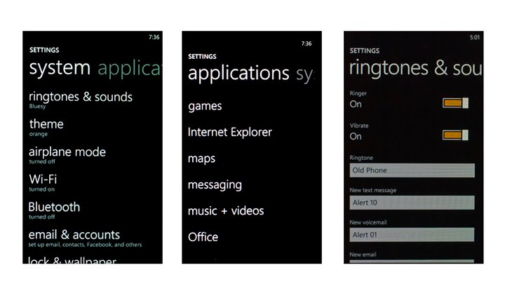
Remember the Setting screen on Windows Mobile? Where you had System, Personal, and Connections folders, Windows Phone 7 pulls all the main settings under one roof and breaks them down into 19 topics. You have:
- Ringtones and Sounds
- Theme (changes the color of the tiles)
- Airplane Mode
- Wi-Fi
- Bluetooth
- Email and Accounts
- Lock and Wallpaper
- Location
- Cellular
- Date&Time
- Brightness
- Keyboard
- Region/Language
- Ease of Access (TTY/TDD on or off)
- Speech
- Find my phone
- Phone update (for over the air updates to your phone)
- About
- Feedback
All are very self-explanatory and very user friendly. For example, Bluetooth Settings are on/off. When you turn the Bluetooth on, the phone automatically begins to search for new devices or previously paired devices.
The same is present with the Wifi settings. When you turn the Wi-Fi on, the Windows Phone automatically searches for available networks. You simply choose which network you want to connect to and follow the connection steps (entering passwords, etc.) If you are on the Start Screen or enter Explorer Mobile and wifi networks are available, a banner will appear at the top of the screen alerting you to that fact.
Brightness can be managed automatically or manually at three levels (low, medium, high). The Cellular option allows you to turn on/off your data connection and options for data while roaming.
Ringtones and sounds allows you to set the ringtones not only for the phone but also new email, SMS messages, and voicemail. You do not have the option for vibrate or LED notification on these items. You have to choose an audible tone or none. Hopefully updates to the OS will include vibrate notifications for incoming messages. You can also turn on/off sounds for appointment reminders, key presses, screen locks, and "all other notifications".
I like the simplicity of Windows Phone 7 settings. It reminds me a lot of Windows Mobile Standard that gave the user just enough options to manage content but let the OS handle the heavy lifting. If you found the settings on Windows Mobile to be intimidating, you will enjoy the settings on Windows Phone 7.
As a phone
While Windows Phone 7 offers you access to email, calendars, contacts, Xbox Live, Office documents, the Marketplace, Zune, the internet, and a ton of other services.... it's also a phone.
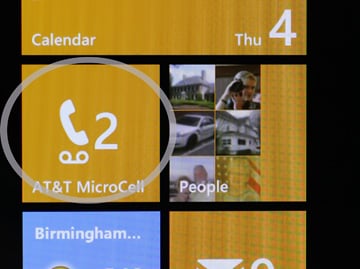
With Windows Mobile, you accessed the phone dialer by pressing the answer button or you could find a link on the Start Menu to send you to the dialer. With Windows Phone 7, you tap the Phone Tile on your Start Screen. When you do, you will be sent to your dialing history that will list your most recent incoming and outgoing calls.
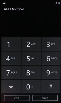
At the bottom of the screen you will see three icons and the ever present "..." symbol. The icons will connect you to voicemail, pull up the keypad and send you to the People Hub. The keypad has nice, large keys and two buttons; call and save. Save starts the process of creating a new contact or you can add the number to an existing contact.
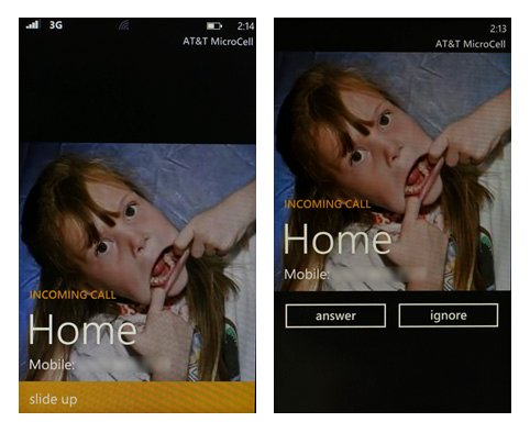
For incoming calls, caller id appears on the lock wallpaper. You swipe the lock screen up and you have two screen buttons; answer and ignore.
While on a call you will see three buttons under the number you're dialing; end call, the keypad icon, and double arrows. The first two are self-explanatory but the double arrows pull up your speaker phone, mute, hold and add call (conference call) buttons.
If you need to access your Start Screen or another area of your Windows Phone while on a call, your call display will be pulled up to the top of your screen (minimized in a way) to allow you access to other areas of your Windows Phone. If you need to access the call display simply tap on the banner.
Voice dialing is available with Windows Phone 7 and it is vastly improved over the voice dialing found on Windows Mobile. To initiate voice commands, simply press and hold the Start Button. Voice commands range from voice dialing to launching some applications to initiating searches. The accuracy of Windows Phone 7 voice commands is impressive and I have yet to have any of my commands misinterpreted.
While I miss the answer/end hardware buttons, as a phone, Windows Phone 7 is a solid performer.
Summary
All in all, I really like Windows Phone 7. There's a lot to the new mobile OS but it's easily understood. It has a level of consistency that Windows Phone users haven't seen and it's simplified, much like Windows Mobile Standard. While there is always room for improvement, what Microsoft has presented is very good as is.
Here is what stood out to me that makes the new OS attractive:
- Multiple Accounts for Email, Calendar and Contacts
- The ability to link contacts that occur in multiple accounts
- Simplified settings
- The speed is really nice. From boot-up times at or below thirty seconds to apps launching without delay, Windows Phone 7 has some zip.
- Keyboard: The on-screen keyboard doesn't make you miss a physical keyboard one bit.
- Stability: I have yet to experience any crashes, dings, or lockups with Windows Phone 7.
- Voice Commands: So far, I'm batting 100% in dialing contacts, launching applications and searching on Bing.
- Live Updates: It will be so nice to have over the air updates.
Windows Phone 7 is a work in progress with the first update expected early next year. While the update is certain to improve things, if I could bend the ear of the developers here is what I would suggest that I think would improve Windows Phone 7:
- A centralize speed dial hub for your favorite contacts. While you can add tiles to act as speed dial buttons, some may end up with an enormous amount of tiles on the Start Screen.
- While I like the email set-up, two things need to be added. Add the option for only today's email to be on the phone and add a "select all" or "mark all as read" option. Some may not care to have three days worth of emails on their Windows Phone and having to check each box to delete multiple emails is time consuming.
- Could we get separate tiles to turn on/off the Wi-fi and Bluetooth?
- Add the option for a vibrate setting for new email, voice-mail and sms messages.
I also wouldn't mind seeing the answer/end key brought back. However, if that's the price to pay for a consistent operating system and device, I will learn to live without.
While part of me will miss Windows Mobile, I'm looking forward to seeing Windows Phone 7 develop. For the short time Microsoft has been working on Windows Phone 7, they have done an outstanding job of it. They have created a mobile operating system that has power, functionality and will appeal to a wide range of demographics. From gaming to social networking to email management to time management, Windows Phone 7 brings something to the table for everyone.
Windows Phone 7 is also an easy system to maintain. Settings are straight forward, simple to understand. You uninstall unwanted apps from the Apps List without the need to drill down into the settings to find the "Remove Programs" application. And that might be what is so appealing to Windows Phone 7. There is a lot less drilling down to find things.
If Microsoft can maintain the consistency and ease of use with Windows Phone 7, it will become a major contender in the smart phone industry. It's worth going to your local wireless provider and spending ten minutes with a Windows Phone to see for yourself. I think you'll like what you see.

George is a former Reviews Editor at Windows Central, concentrating on Windows 10 PC and Mobile apps. He's been a supporter of the platform since the days of Windows CE and uses his current Windows 10 Mobile phone daily to keep up with life and enjoy a game during downtime.
