Review: T-Mobile Wing
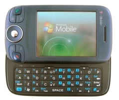
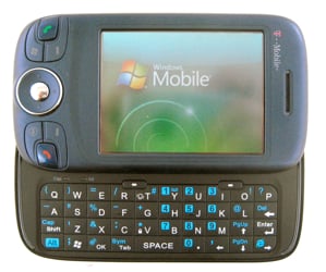
Read on for our full review of the T-Mobile Wing. If you’re on T-Mobile, this is your best bet for a PocketPC device, but is it good enough to draw people over to the carrier?
(I’ll spend a bit of time here comparing the Wing to the T-Mobile MDA - there’s a fuller Smackdown here, though. Check it out.)
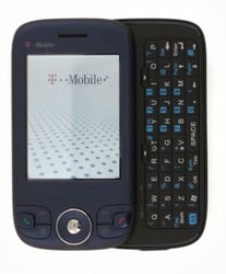
The T-Mobile Wing (codenamed T-Mobile Atlas, henceforth just “Wing”) is another slider from HTC, meaning that it has a standard 240x320 screen, a few buttons beneath it, and a sliding keyboard. It’s a Windows Mobile 6 Professional-edition device, meaning it has a touchscreen and generally more power than the standard edition WM6 devices. It replaces the old, ugly, and underpowered T-Mobile MDA. I call the old MDA “underpowered” with a bit of chagrin, because spec-wise, the two are actually not all that dissimilar.
Specs
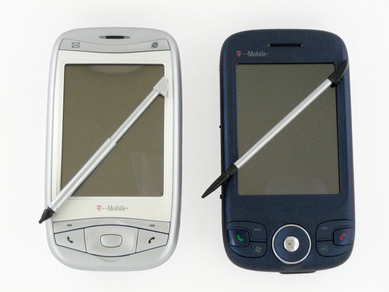
Both devices have the same Texas Instruments OMAP 850 processor, although the Wing’s is clocked just a stitch higher (201MHz vs 195). For a PocketPC/Pro WM device, that’s relatively lackluster. I often found the device lagging. Normally I’m not one to complain about a slow processor - these days even the OMAP 850 is enough to handle most tasks with minimal wait and shouldn’t get in your way. It becomes especially noticeable in the slider form-factor, though, taking on average 2 seconds to switch from portrait to landscape when you slide out the keyboard - sometimes as many as 5 in my testing. It really hampers the overall experience of the device and makes it feel much worse than, honestly, it really is.
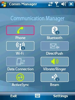
Datawise, both the Wing and the MDA are also the same: EDGE and WiFi. This is also disappointing, but expected, as both are designed for T-Mobile’s network. T-Mobile has purchased the necessary bandwidth the move to 3G, but when they actually plan to roll it out is still up in the air. Bluetooth 2.0 is there as well, so you will be able to transfer files relatively quickly and also use A2DP stereo headsets. Rounding out the standard specs on the Wing are USB 1.1 (disappointing), no IR (fine), and an 1130mAh battery - which is smaller than the MDA’s but still good enough for my usage. MicroSD for storage. 2 Megapixel camera. Indicator lights for WiFi, Bluetooth, and the radio are nicely hidden inside the speaker grille.
Also standard/disappointing: the RAM. After a fresh reset, you’re looking at abut 39.44MB of storage memory (less, though, because of the built-in programs, see below). There is also a total of 43.87MB of program memory. There’s a huge problem there, though, because fresh out of the box the Wing comes with several pre-loaded apps (MyFaves, T-Zones, the home-screen music player) that make a significant dent in your usable space for running programs.
As a phone, there’s not a whole lot to report. Sound quality is average, not great. Volume is fine on both regular calls and speakerphone. Battery life is also fine - it gets me though an average day of an hour of WiFi, a hour of calls, and interacting with everything else all day.
Get the Windows Central Newsletter
All the latest news, reviews, and guides for Windows and Xbox diehards.
Form Factor

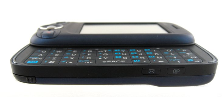
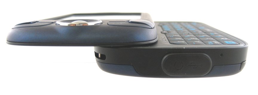
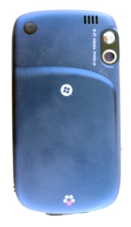
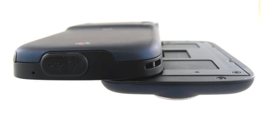
The look of the Wing is heads and shoulders above that of the MDA. It is a dark shade of blue that looks almost iridescent in the proper light. The Wing also sport the now-ubiquitous “soft-touch” paint. Although I wouldn’t go so far as to call the casing a “fingerprint magnet,” it definitely does pick up smudges from your fingers here and there.
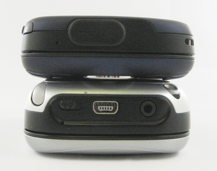
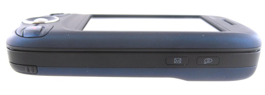
The Wing definitely has the best slider form factor of any of the slider’s I’ve used. It’s very thin (2.3 x 4.3 x .7 inches) and rounded nicely on the corner. My favorite part about the overall shape and feel of the Wing is the swoop (aw, heck, we’ll call it the “wing, little w”) on the back. It’s a curved ridge that subtly gives you something to rest your fingers on and just makes the device feel “teh awesome.” The ridge is also replicated, less prominently, on the front, for aesthetics.
The Wing cuts down on the number of physical buttons compared to the MDA, but that’s not the worst thing in the word. You have your standard 5-way, send, end, soft buttons, Windows, and OK on the front. All have fine tactile feedback. I especially like the 5-way pad, which has the soft-touch paint on it and also is very “cone-like,” which helps in a way I can’t fully explain.
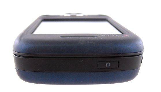
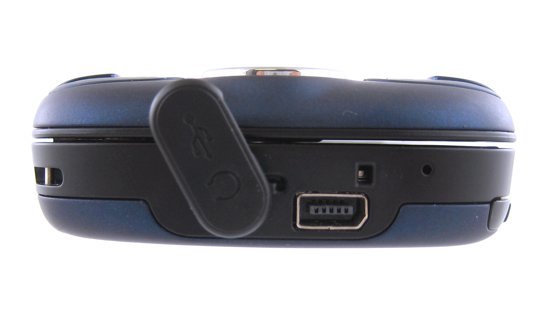
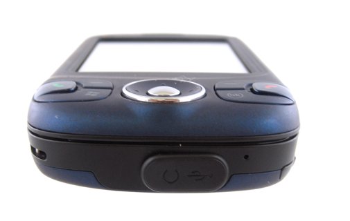
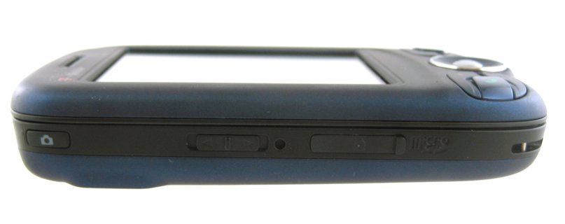
Other buttons include a voice-command and mail button on the right, a camera button on the left along with a standard (though oddly placed) volume slider, and finally a power button on the top. I gotta say, though, I’m not a fan of the power button these days. I much prefer using the any button to turn on the device and then the End button to activate the keyguard/turn off the screen. If you must have a power button up there, have it bring up a quick-list. It’s just aggravating to have to hit an out-of-the way button every time you want to interact with the device. Most of the buttons are customizable, though. Not the power button. arg.
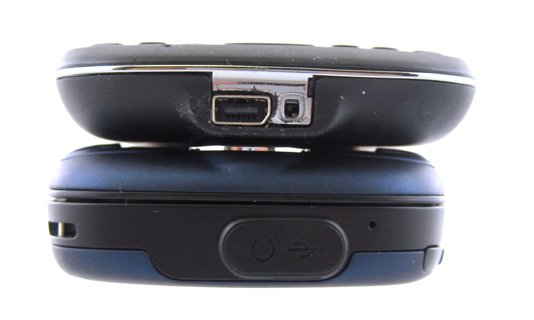
The slider mechanism on the Wing is great. It’s spring-loaded, natch, and feels very sturdy. Somehow, though, HTC screwed up with their tried-and-true slider design this time, though. When the device is closed there’s a small gap between the two halves of the device, meaning that there’s a little wiggle room there. You can feel and hear the device clacking on itself a bit when it’s closed. It’s possible I just got a bum unit. On the other hand, that extra little space does allow for you to more easily fit a case that needs to have some plastic in there.
There’s a lanyard loop if that’s how you roll and - hooray! - a full-length stylus. There’s also a little rubber grommet over the USB port - boo. Also, no 2.5 or 3.5 headset jack - you have to use the HTC-usb-to-headphone kludge, boo again.
Keyboard
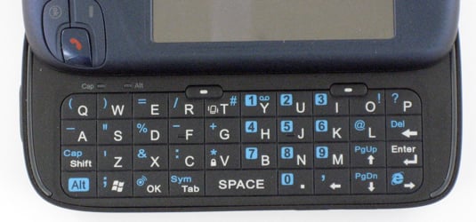
The keyboard on the Wing is darn near perfect. Although the buttons on the MDA have always felt a little “chicklety” to me, the new style of keyboard that HTC has put on the Wing (and other new sliders) is wonderful. The keys also are “soft-touch,” so their feel is much improved. The travel / click feel is good. Also nice is that the soft-keys on the keyboard have been put in their proper locations - underneath the actual soft-key area on the screen.
It’s just very well thought-out - little ridges on your home keys, the numbers are on the right where you could hit them with one-hand (if you’re dialing). Windows and OK buttons on the lower-left where you’d expect them (i.e. where you’d find Alt and Ctrl buttons on a full keyboard).
I’m pro-Wing-keyboard — as far as sliders go. I’m not generally a fan of the slider-form factor specifically because the keyboards are too big to use one-handed. On the Wing, though, I’ve been able to manage it — barely. Different strokes for different folks.
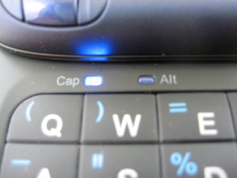
Also - LED Caps and Alt indicators are classy.
Software
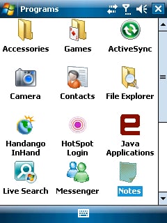
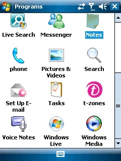
The Wing comes preloaded with quite a bit more than the standard Windows Mobile 6 Software, it adds:
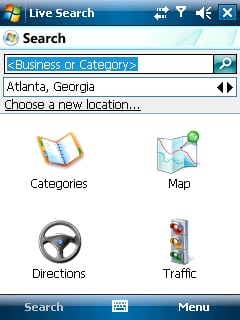
- Windows Live Search (though you’ll want to upgrade to the newer version that has Movies added)
- T-Mobile Email Wizard
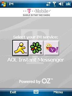
- OZ Communications IM (for IM with AIM, Yahoo, and ICQ)
- T-Mobile HotSpot Login Utility
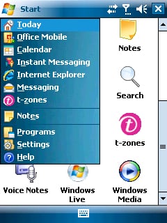
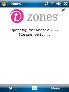
- Winwap Technologies T-Zones
- T-Mobile’s MyFaves App
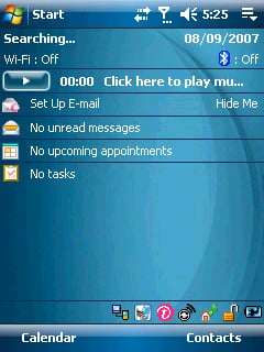
That’s the good news. Here’s the bad: After a fresh reset, with nothing running, the T-Zones and MyFaves appear to be running in the background all the time. What’s worse, after a hard reset, my baseline available program memory was a measly 12.05MB. That’s barely acceptable.
Fortunately, you can uninstall most of those programs via the standard “Remove Programs” app in settings. Still, even clearing as much out as I could, I found I generally hovered around 14MB free tops.
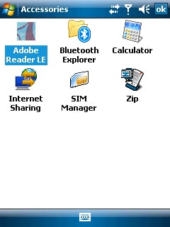
In any case, the added software is very nice. I’m especially happy that the OZ IM client is in there, because I’ve yet to find a 3rd party IM app that is both easy to use and appropriately priced. Also included are most the standard WM6 apps that we’ve come to know and love - including my personal favorite: Internet Sharing, which makes DUN over Bluetooth simple. Not included, strangely, is the new Windows Live app, which means you won’t be able to get the Live Search field on your today screen without some hunting around on the web. Bummer.
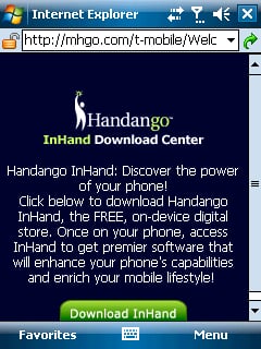
There’s also a link to download Handango InHand, but it’s not a freebie. InHand is also not very gentle on your program memory, so my vote is to give that one a pass.
Rather than Voice Command, the Wing uses HTC’s speed dial app. That’s 6 of one, half dozen of the other in my opinion. Voice Command still feels pretty wonky to me, so I don’t mind manually setting up voice shortcuts that I know will be more reliable.
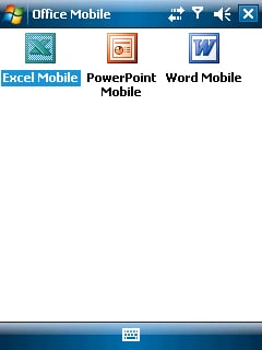
As with any Windows Mobile 6 device, you get the great email app with html email, type-to-filter, and easy-to-setup email accounts. The Office Apps are also much improved in WM6, Pocket Internet Explorer is marginally better, and speed overall is better on the Wing than on the MDA. It won’t knock your socks off (see all the complaints above), but it’ll do.
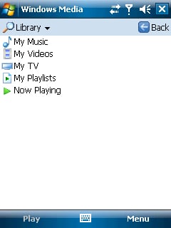
Finally, I’m fond of the music plugin for the today screen, but not as fond as I would be if HTC had included their Audio Manager application. Still, any way to interact with the Windows Media Player that doesn’t require me to directly interact with the Media Player’s interface is welcome.
Comparisons
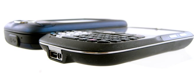
If you’re on T-Mobile and looking at Windows Mobile, you are basically looking at two choices today (or rather, you’re looking at two choices that I would feel good about recommending): the T-Mobile Dash and the Wing.
Here’s the surprise: the basic hardware specs on the Wing and the Dash are nearly identical. On the Wing you get the following benefits: a slightly larger screen (but same resolution), a touchscreen, Windows Mobile 6 Pro instead of Standard, a slightly better camera, and a larger keyboard. The drawbacks: a bulkier device overall and, well, a larger keyboard that’s hard to use one-handed.
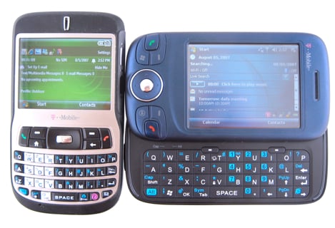
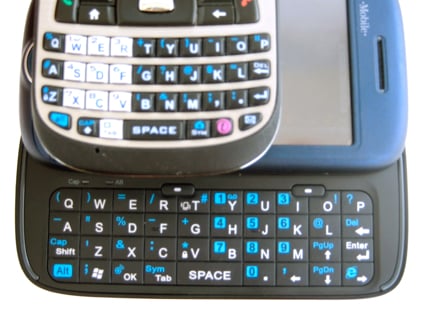
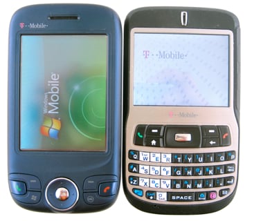

So: which should you get. My vote is the Dash. Since you’re not getting significantly more power out of the Wing, the added benefits of the touchscreen and Windows Mobile 6 Pro don’t really justify the larger size in my book. The Dash, especially now that it has an official Windows Mobile 6 upgrade available, is a wonderful little machine.
Conclusion
So the final verdict on the Wing is this: Great form factor, bad specs. If you’re on T-Mobile and looking for a PocketPC, it’s your best option mainly because it’s your only viable option. But if you’re thinking of switching carriers to use the Wing, don’t. The 8525 on AT&T will have Windows Mobile 6 soon, the Mogul on Sprint makes the Wing look like a tinker toy, and Verizon will soon have the XV6800.
I don’t want to badmouth the Wing too much - it is a respectable device… for T-Mobile. T-Mobile has the best customer service but the worst data support. Until that gets fixed, the Wing will do you fine if a slider PPC is what you want.
| Ratings (out of 5)Form Factor: 5Keyboard: 5Software: 3Battery life: 3Connectivity: 3Overall: 3 | ProsGreat look and feelWindows Mobile 6Nice keyboardThinner than the MDAConsProcessor and MemoryEDGE only |
Home to the most invested and passionate Microsoft fans, Windows Central is the next generation destination for news, reviews, advice and buying recommendations on the Windows, PC and Xbox ecosystems, following all products, apps, software, AI advancements, and accessories. We've been around for more than decade, and we take our jobs seriously. Windows Central writers and editors value accuracy and editorial independence in everything we do, never receiving compensation for coverage and never pulling punches.

