Review: T-Mobile Touch Pro 2
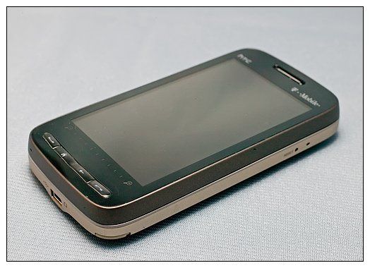
Is it safe to say that the HTC Touch Pro 2 is the most anticipated Windows Mobile phone of 2009? Maybe "one of the most" anticipated WM phones of 2009? Regardless, you have to tip your hat to T-Mobile for beating Sprint, AT&T and Verizon to the punch by bringing the Touch Pro 2 to the U.S. market first.
We played with the T-Mobile Touch Pro 2 in the store, but that's hardly a proper review, is it? T-Mobile has done an impressive job at presenting the Touch Pro 2 to the U.S. market. To find out how good, you'll have to follow the break.
Unboxing
The T-Mobile Touch Pro 2 (henceforth referred to as the Touch Pro 2) is modestly boxed with the necessary user manuals, warranty information and other obligatory documentation. The Touch Pro 2 comes with a wall charger, USB cable (used for charging and sync), ear buds, headphone adapter (yes, no 3.5mm jack for T-Mobile), and a pouch case.
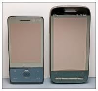

The Touch Pro 2 is 4.59 inches x 2.36 inches x .68 inches in size and weighs 6.61 ounces. It is a hefty phone that is noticeably larger than it's little brother, the Touch Pro.
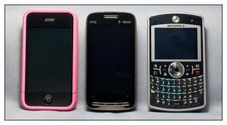
Despite the larger size, the Touch Pro 2 feels good in the hand. It's well-balanced and in many respects reminds me of the iPhone (minus the sliding keyboard of course). In comparing it to my wife's iPhone it was very close in size and feel. It was also very similar in size to the Motorola Q9h (again minus the thickness).
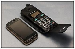
Despite the increase in size it still remains small compared to the cell phones of the past.
Get the Windows Central Newsletter
All the latest news, reviews, and guides for Windows and Xbox diehards.
Appearance and Design
I will have to tip my hat again at T-Mobile for their customization of the Touch Pro 2 design. The brushed copperish/brown back looks sharp and does not attract fingerprints the way the glossy finish of the Touch Pro does. The 3.6-inch 480-by-800 screen dominates the front of the phone (more on this in a bit) and is highlighted well with the dark accents.
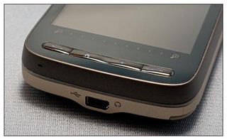
A narrow row of buttons runs along the bottom of the Touch Pro 2's face and includes the answer and end keys, the back key and home key. The keys are backlit when touched or when the phone rings.
A touch zoom bar rests above the keys. The zoom bar works nicely, but if you're not careful, you'll activate one of the menu/commands that are at the bottom of the screen. In sliding to zoom bar with Google Maps, I would often hit the "menu" button accidentally. I found the zoom bar to work best in moderation, only swiping a quarter to half of the bar at a time.
The one design feature change between the Touch Pro/Diamond and Touch Pro 2/Diamond 2 phones is the elimination of the directional pad. At first I missed the D-pad, but that faded with use. As resistive (sigh) touchscreens become more responsive, one has to wonder how long the directional pad will stick around. Plus, I gladly will give up the real estate the D-pad takes up for a larger screen.
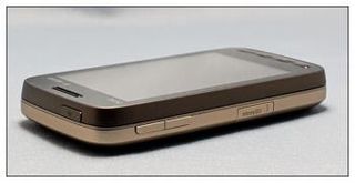
The volume keys and microSD card slot are on the left side of the phone; the reset button is found on the right. There is no oversized push-to-talk button like on the AT&T Fuze (hooray!), and your stylus remains on the right side as well. Unlike the Touch Pro/Fuze, the stylus is no longer magnetized but will turn on the screen when removed.
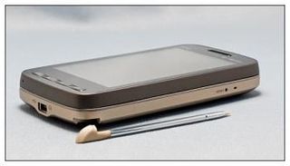
To the top of the phone is the power button, and the mini-USB port is at the bottom. It's nice to see the expansion slot being placed out from beneath the battery cover. But the way the expansion slot is designed, you have to take off the cover to get to it. You can leave the battery cover on and pry it open, but I'd be afraid of damaging it.
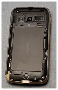
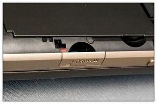
Speaking of the battery cover, beneath it rests the SIM card slot and a 1500mAh battery. The cover sits closer to the body of the phone than the original Touch Pro's cover, and the back speakers are huge in comparison to the Touch Pro/Fuze. Remember Dieter's helpful tip on removing the Treo Pro's battery cover? It's also a helpful tip for removing the Touch Pro 2's battery cover for the first time.
Out of the box, the battery cover is a little on the tight side. If you hold the Touch Pro 2 much like Dieter's holding the Treo Pro, it makes it a little easier to pop the cover off for that first time. Fortunately, the cover loosens up a bit with use and becomes easier to remove.
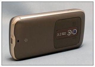
You have a mute button located in the back of the phone as well as the 3.2 megapixel camera. At first I wasn't sure about the mute button location, but it's only active when the speaker is turned on. And if you remember back to the announcement of the phone at Mobile World Congress in Barcelona, HTC's design goes like this: You flip the phone over on its face to turn on the speaker phone, as if you're at an office table in a meeting. So it makes a little more sense.
HTC is reporting the 1500mAh battery will get approximately 510 minutes of talk time and 500 hours on standby. It did perform better than the 1350mah battery of the Fuze. I easily made it through the day with moderate to heavy use with 30 percent to 40 percent of the battery life remaining.
Touch Pro 2's Screen
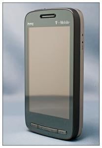
As mentioned earlier, the 3.6-inch, 480x800 screen dominates the face of the Touch Pro 2 and makes the Fuze/Touch Pro's 2.8-inch screen look puny. The screen's color, clarity and resolution were nice, but not "knock your socks off" nice. It's not enough to make you run screaming from the showroom floor, but I expected something more along the lines of how the European Touch Diamond 2's screen (which was fantastic).
The screen was responsive to the touch but seemed to need to warm up first. Hey, it's a resistive screen. The phone is packaged with a screen protector, and it's possible that a little residue was left on the screen, slowing down the responsiveness. After a little use, the touchscreen zipped along nicely. I did find that things worked a little better when you turned off the haptic feedback setting (phone vibrates with each screen touch).
The Keyboard and Tilting Screen
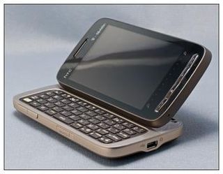
The sliding keyboard on the Touch Pro 2 is really nice. The keyboard slides open smoothly, but the spring assist seemed a little tight on the review unit. In using the showroom model, I remember the keyboard slide open a lot more smoothly. Then again, the showroom model has likely been handled by hundreds of customers while I'm the first to handle this review unit, so things are likely to loosen up over time.
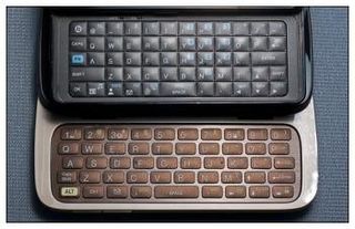
The design of the Touch Pro 2's keyboard is an improvement over the Touch Pro/Fuze's keyboard. (If you need help, that's the Fuze at top.) Keys are larger and spaced out to make it noticeably easier to type on. I do like the top row of numbers better than the keypad style the Fuze has. It's a lot easier to directly type a number instead of relying on the "Alt" key.
You do have multifunction keys on the keyboard that will launch your Internet browser, task manager, voicemail, phone lock, and switch between ring and vibrate modes. The phone can be dialed from the keyboard and will predict a contact's identity when you start typing out the name.
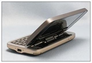
I'm still on the fence about the tilting screen. It's nice for watching videos with the Touch Pro 2 sitting on a table top, but I found it just as easy (if not easier) to keep the screen flat when typing. I'll fall back on the old saying, "it's better to have it and not need it than need it and not have it" with respect to the tilt feature.
One of the earlier concerns with the Touch Pro was the lag time between extending the keyboard and the screen rotating from portrait to landscape. With the Touch Pro 2, the screen rotation is almost instantaneous. I experienced no lag time when extending or retracting the keyboard.
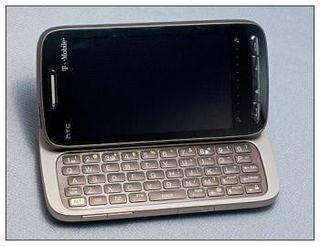
The only gripe I can find with the keyboard is that the sides of the Touch Pro 2 are a little on the slick side. (Again, could be cause it's a new unit.) This made extending the keyboard challenging at times, but not impossible. I'm sure with use, the spring assist will weaken a little, but it would have been nice to have seen a little texture to the finish on the sides of the Touch Pro 2, giving your fingers a little more traction.
Software
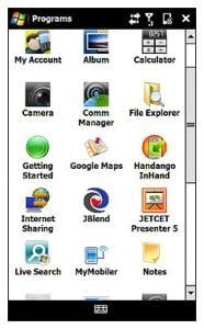
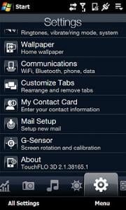
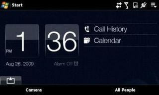
While upgradeable to Windows Mobile 6.5, the T-Mobile Touch Pro 2 comes loaded with Windows Mobile 6.1 and TouchFLO 3D version 2.1, which has the calender and stock tabs along with the ability to customize the order of the tabs.
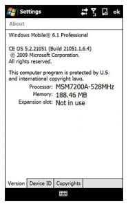
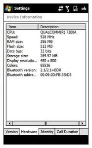
Under the hood, the Touch Pro 2 has a 528MHz processor that has noticeable zip to it. Everything from Office Mobile to Google Maps to SPB TV seemed to have a little spark compared to the Fuze's performance. I don't know if there are internal performance tweaks with the WM 6.1 build the phone is using (build 21051.1.6.4) that's makes the difference, but the Touch Pro 2 moves along nicely.
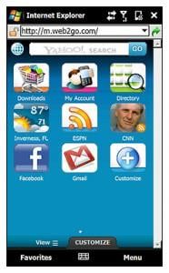
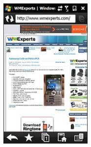
T-Mobile has put the obligatory bloatware on the Touch Pro 2 ranging from Telenav to Handango InHand. As mentioned, it does come pre-loaded with Google Maps (you need to update it to the latest version) as well as Opera Mobile and Office Mobile. Pocket Internet Explorer is the default browser, so you'll need to change that if you prefer Opera. T-Mobile gets another tip o' the hat for not making the Touch Pro 2 too heavy with bloatware.
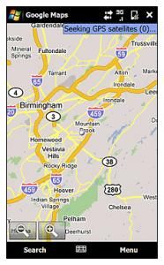
The Touch Pro 2 is fitted with Bluetooth, GPS and WiFi. There were issues with lag time and satellite acquisition with the Touch Pro, and these issues don't seam present with the Touch Pro 2. In using Google Maps, the GPS acquired a satellite fix in under a minute from a cold start. The positioning was easily within 10-15 yards and did not appear to have any lag time while being used in the car.
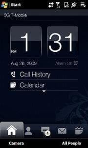

TouchFLO 3D is one of those "like it or hate it" user interfaces with very few sitting on the fence. Regardless of what light you cast on TouchFLO, it's hard to ignore the graphical pop of HTC's user interface. TouchFLO 3D puts a certain amount of "wow" into the visual aspects of any device.
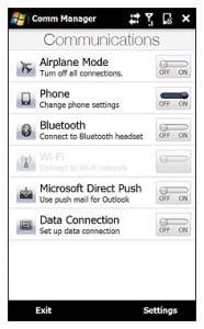
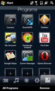
I like what HTC has done with TouchFLO in version 2.1. It put's more functionality into the interface with the ability to manage the tabs and with the addition of the calendar tab. If you are so inclined to follow the stock market, the Stock Tab will come in handy but otherwise it's just another box to un-check in the tab customization menu.
Phone performance
The core function of the Touch Pro 2 is the phone and while everything else about the Touch Pro 2 is impressive, it will all be wasted if the phone sucks wind. The Touch Pro 2 has dual noise-canceling microphones that really do an impressive job. In testing this feature, I drove down the interstate with the car stereo playing at normal levels. Neither the car noise or stereo sound was picked up by the microphone and my voice came through loud and clear.
Callers came in loud and clear as well through the ear speaker, but the speakerphone was a little disappointing. Callers came in clear, but volume levels were a little on the weak side.
One welcome addition to the Touch Pro's phone performance is the proximity sensor. When you're on a call and hold the phone to your ear, the screen turns off. Pull the phone away and the screen turns on. No more hunting for the power button to turn the screen on so you can access the keypad.
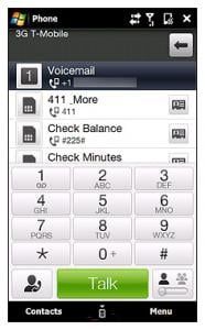
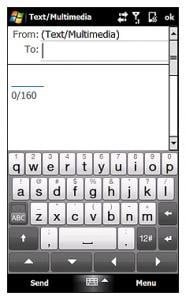
The dial pad has a conference call setting (little box in the lower right corner) that let's you call multiple numbers. The on-screen QWERTY keyboard is well spaced and if you're not in a position to extend the physical keyboard, it does nicely.
Overall Impressions
Simply put, the T-Mobile Touch Pro 2 is an outstanding Windows Mobile phone. T-Mobile definitely beat AT&T, Sprint, and Verizon to the punch by releasing this phone first and should be applauded for how they have presented this Windows Mobile phone.
From phone performance to style to representing the Windows Mobile line, the T-Mobile Touch Pro 2 receives high marks across the board.
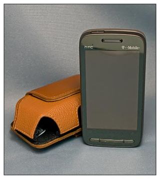
(Oh, if you're looking for a case while we're waiting to get them in at the WMExperts Store, I found the Smartphone Experts Side Case for the Motorola Q9h to work really well with the Touch Pro 2. The Touch Pro 2 also fit the Body Glove Landmark case for the AT&T Fuze, but it was a little on the snug side.)
While it sounds like the Touch Pro 2 may be the best thing since sliced bread, this version does have room for improvement. Most noticeably the lack of a 3.5mm headphone jack. The Sprint and Verizon versions have it. Shame T-Mobile missed out, but that's the price for being first, I guess.
I would have also liked to have seen just a little texture to the finish on the sides of the Touch Pro 2 to add some grip to the phone and the speakerphone needs a little boost in volume.
And, no, we didn't forget that we're still dealing with a resistive touchscreen. Can't really fault HTC or T-Mobile for that, and we'll just have to continue to wait for capacitive screens with Windows Mobile 7.
The Touch Pro is still an impressive phone and HTC built upon that framework, as it did with the Diamond series, to make another impressive phone with the Touch Pro 2. The Touch Pro 2's appearance is conservative enough for the business professional but has enough pizzaz to appeal to the more casual user. If I were a T-Mobile customer, there's little doubt that the Touch Pro 2 would be my phone of choice.
Phil is the father of two beautiful girls and is the Dad behind Modern Dad. Before that he spent seven years at the helm of Android Central. Before that he spent a decade in a newsroom of a two-time Pulitzer Prize-finalist newspaper. Before that — well, we don't talk much about those days. Subscribe to the Modern Dad newsletter!
