Review: Sprint Touch Pro 2 aka Confessions of a Black-Slab™ skeptic
All the latest news, reviews, and guides for Windows and Xbox diehards.
You are now subscribed
Your newsletter sign-up was successful
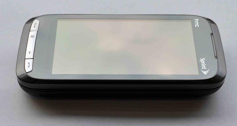
There's been a lot of hype around the latest HTC Touch Pro 2, released just a few weeks ago on Sprint. The Windows Mobile 6.1 device is a significant upgrade from the original Touch Pro and offers quite the bang for the buck.
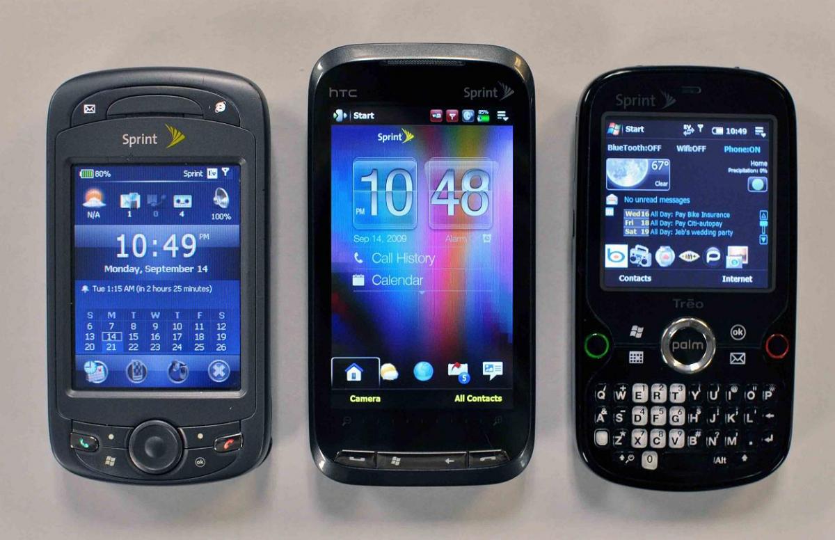
Here's an interesting question though: Is the Sprint Touch Pro 2 now good enough for this Black Slab™ skeptic? It should be no secret that I've been a critic of this style for some time now, instead preferring front-QWERTY types. Yet here I am, compelled enough to go out an buy one.
Lets just say ... I'm impressed.
Article continues belowRead on for my review and judgment of the Sprint Touch Pro 2 from the perspective of a non-believer!
Hardware
The specs on the Sprint Touch Pro 2 are thankfully very similar to just about every other iteration on the other U.S. carriers. However, when compared to the the first Touch Pro, there are quite a few changes e.g. the larger 3.6-inch screen, larger keyboard, "Zoom Bar" (instead of D-pad), larger battery, GSM "World Phone" capability.
Interestingly enough, these changes, along with TouchFLO 3D2, are just enough to make the Touch Pro 2 finally work as envisioned. We'll go through each of them with comments.
Screen
Although in general I'm not a huge fan of man-handling my Windows phones with finger swipes, pokes or smudges, the 3.6-inch screen is the absolute perfect resolution for a touch-orientated operating system. The original Touch Pro, in my opinion, did a lot right. But the screen was just too small for what it looks like HTC intended.
All the latest news, reviews, and guides for Windows and Xbox diehards.
At 3.6-inch inches, touch-typing using HTC's soft-keyboard is a breeze and, yes, you can even bang out quick responses to text messages or IMs using it one-handed. Sure, it feels very similar to the iPhone keyboard, but that's not a bad thing.
Likewise, using TouchFLO 3D2 on such a large screen just plain makes sense now. Tabs are the size of your fingertip, items are easy to read and you don't feel like you are substituting your stylus with your finger anymore.
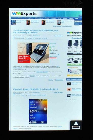
The ambient-light sensor (a technology I'm a huge proponent of) works exceptionally well here. It does a beautiful slow fade up/down according to the current lighting conditions: if in a bright room, the screen will jack up to compensate; in a dim room, the screen will dim down to not overwhelm your eyes (and save on battery). Screen brightness is quite good, though you may still have some trouble in direct sunlight. But that's not a huge deal.
The only way the screen could have been better would be if it were capacitive
There, I said it.
While the screen is large enough to easily interact with and TouchFlo 3D2 does a great job of skinning just about everything, it is the resistive screen that is holding it all back. It is not uncommon to have to tap twice to get a response, or when sliding a gesture to have it skip. It's not terrible. But after using a capacitive screen for a while, you appreciate the accuracy and sensitivity.
Keyboard
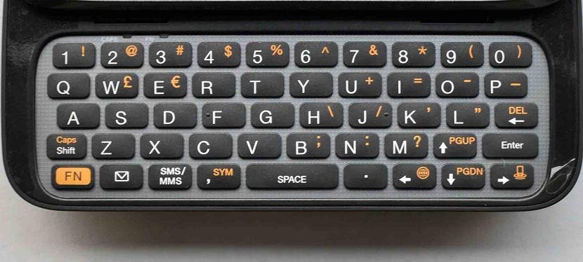
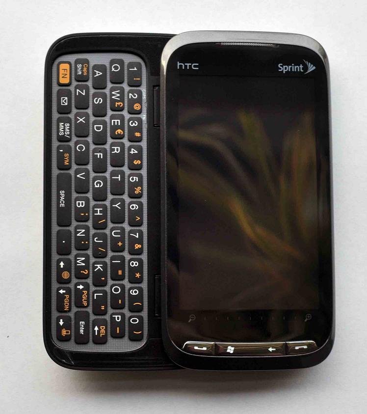
Yeah, it is huge. There is so much room to type that it's almost surreal. The keys themselves are quite soft, and travel is maybe a bit too shallow (but you have cut HTC some slack there due to just pure physics). There is ample spacing between the keys and because it has a traditional QWERTY layout — including the keys being offset — it's quite simple to just pick it up and bang out a response.
Unlike the early AT&T version we've seen, the Sprint version has all the number keys on top and does not require a function (FN) key to type them — likewise with the period and comma keys, all of which translates into one-touch typing for the most common characters — a real joy. The hardware build is also very solid and the little LED lights for CAPs and NUM lock are a cool feature. The keyboard backlight, also controlled by the ambient light sensor, is bright enough and looks very cool in low-light conditions.
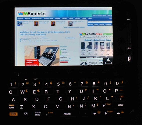
My only complaint here is I wish there were an "OK" button for exiting programs. This is the one thing that I like about the AT&T keyboard layout. Without it, I have to stretch all the way to the top right corner to minimize/switch apps. (That hopefully will change with future versions of Windows Mobile 6.5.)
Zoom Bar
While I understand the need to ditch the D-pad to accommodate the larger screen, the Zoom Bar is quite underwhelming. In fact I barely ever touch it and when I do, it is not that impressive. It doesn't work in most apps. And when it does, it is just not sensitive enough or accurate enough to do what I believe HTC intends. Because of its small footprint, though, and low visibility on the device, it's not a huge deal. It's just something you'll probably forget about.
GSM/World Phone
Not too much to say here. The Touch Pro 2 does come with a Sprint-SIM card for overseas use. And while it won't work on U.S. GSM networks, it certainly is nice to know that if I do go to Europe, my Touch Pro 2 won't be useless.
It does not operate in both CDMA/GSM modes at the same time. Instead it operates in CDMA and when it won't find a signal, prompts to search for GSM (this is in "Global Mode"), switching to the latter network when found.
We do know that currently the Sprint Touch Pro 2 is SIM-unlocked for foreign GSM networks (unlike Verizon & Telus versions, which you have to pay to haggle to unlock) but it cannot register on any U.S. GSM system.
The question of whether it can be hacked to work on U.S. bands is not known at this time: some allege it is a hardware thing, while others suggest it is software and therefore can be defeated. The Verizon and Telus versions can work on U.S. GSM bands (once unlocked) but not UMTS.
We'll keep an eye on what happens on that front.
WiFi
HTC went with Broadcom instead of Texas Instruments for the WiFi/Bluetooth radios. Whatever they did it works very well now. Case in point: You basically can leave WiFi on 24/7 and it will only be "on" when you power on the device, meaning there is no battery drainage when in standby mode. (I've left mine on "just WiFi" for three days and still had 80 percent battery life).
Setting up is a breeze with HTC re-skinning even the WiFi connection window. All I had to do was enter in my WEP key on the giant, easy to read pairing screen and was good to go.
But the magic is when you turn it back on — the automatic re-pairing with your network happens in less than 5 seconds, making it all feel seamless and ... dun dun dun ... actually practical to use. And speaking of the battery...
Battery Life
The Touch Pro 2 now uses a 1500mAh battery, which for such a powerful device still sounds wimpy but in fact is quite good. My experience suggests it performs as well as a Sprint Treo Pro (also 1500mAh). And judging by forum feedback, it is near universal that battery life is quite good, if not leaps and bounds better than the original Touch Pro. Once again this can't be over-stressed: having a realistic battery capacity is essential to successful usage of these devices. For the first time, in my opinion, the Touch Pro 2 meets this threshold for this form-factor.
What is the actual talk time? Sprint pegs it at 4 hours, which is way below my experience. Yet Telus (see review), which has virtually the same device, puts talk time at 6 hours. Finally Verizon states that its Touch Pro 2 gets 5.3 hours' talk time. All are CDMA/GSM world phones with 1500mAh batteries. Yikes.
My experience says much more than 4 hours but less than 6, which in my book is darn good for such a behemouth of a device.
Build Quality
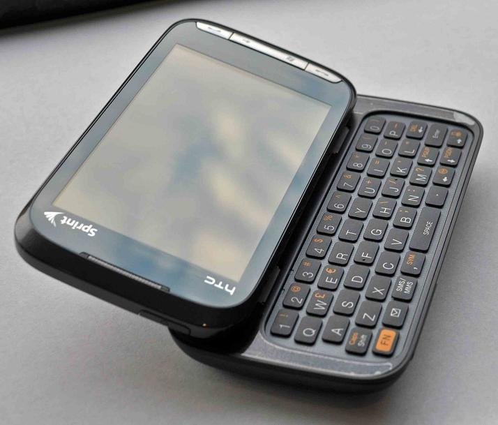
This was another gripe about earlier HTC devices, including the original Touch Pro: their build quality wasn't so hot. In my opinion, the Touch Pro 2 is one of the most solidly built devices I have had the pleasure to use. The top-half almost feels like a marble — it's cool to the touch and feels dense. The bottom half is very light and soft, almost velvet-like. When the keyboard is retracted, the device does not wobble. In fact, it feels like a rather heavy non-keyboard device.
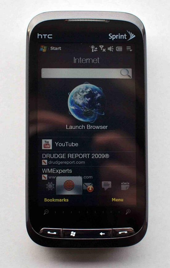
It is too early to tell how the sliding mechanism will hold up in the long run, but the track and springs on the keyboard sure feel nice. The keyboard requires some effort to pull out, but at a certain point it springs into action. Tilting the keyboard up also is solid. The angles are limited but variable, and I have to admit that for watching video or even typing out a long e-mail, it is very convenient.
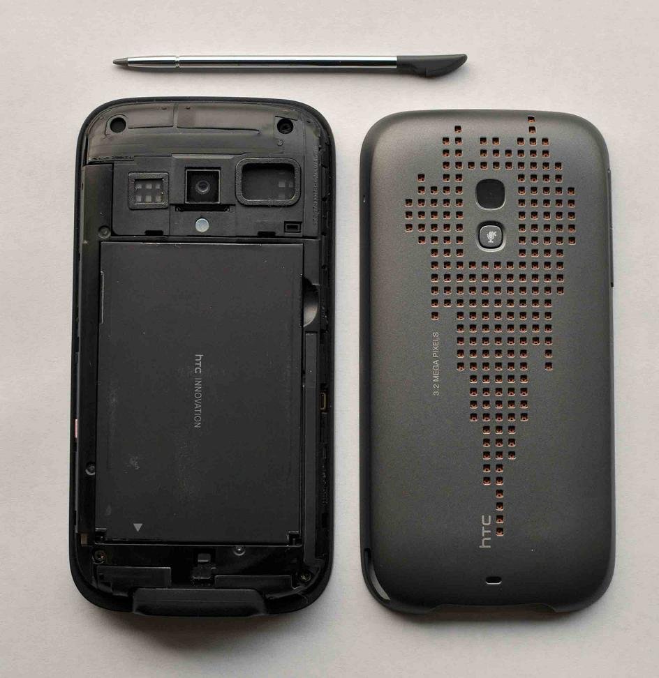
The back cover is a bit of a pain to remove (you have to remove the stylus first) but my need to remove the cover is quite limited, especially if you install a soft-reset application. Reaching the MicroSD slot and the reset button require the removal of the cover. The SIM card slot requires the additional removal of the battery, but that's pretty normal these days.
All of this makes the Touch Pro 2 quite heavy: 6.3 oz, which is a full ounce more than the original Touch Pro. In fact, it is a hair heavier than my Palm Treo Pro with the monster 3500mAh extended battery!
While not the lightest device on the market, the heaviness feels the result of being such a solid and well-built device, not unnecessary additions or poor engineering. You'll feel this when you hold it — it's like the difference between a Sony PSP versus a Nintendo Gameboy.
Heat
A big complaint on the original Touch Pro was that it got hot ... damn hot. This occurred when the device was plugged in and using GPS/pulling data or when talking on the phone and plugged in. No doubt those are taxing conditions on the device, but the complaints suggested that it was a very hot device.
From my experience, the Touch Pro 2 does not suffer from this problem. Be sure, it gets warm if plugged in and in use, mostly near the bottom half. But it did not get "hot to the touch," nor did I notice any charging issues. This isn't to say you couldn't create the conditions to get that result — I'm sure on a 90-plus-degree day, such a possibility exists. But to me, it seems normal, and I can say the "heat problem" is not present with the Touch Pro 2.
Camera
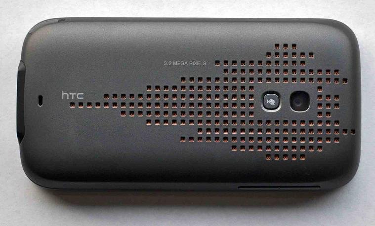
See George's great in-depth look at the Sprint Touch Pro 2 camera including sample photos and video!
As a Phone
Oh yeah, surprisingly, this device can also be used as an actual telephone. It handles the job admirably with the proximity sensor to automatically turn off the screen when placed near your head--very cool, though if you move too fast, it won't register. Ringer, volume and call quality were as good as it gets and signal reception was the highest we've seen--it certainly blows away the Treo Pro and is even significantly better than the Touch Pro 1, you can count on that.
Turning on speaker phone was as easy as placing the phone face down on the table and the custom HTC dial pad certainly presents enough eye-candy to keep people happy.
The conference call feature is not as robust as the GSM version, presumably mostly due to CDMA limitations i.e. you cannot select a "Conference" button before the call, whereby you select multiple contacts. Instead this is the plain vanilla "while on a call, push Talk, dial other party, push Talk again to have 3 way calling" method. You cannot host more than 2 other callers, unlike GSM.
Yes, like all WinMo/HTC phones, this one "wakes up" seemingly on a random basis, though it is usually called by network switching from EvDO to 1x. If that bothers you from previous devices, it does not change here. Sorry.
Once again, these types of devices traditionally are not as good as phones when compared to other WinMo devices (especially Standard) but the Touch Pro 2 seems to break the mold here and can actually be recommended for those of you who use your device to talk to other humans. How old fashioned!
Software
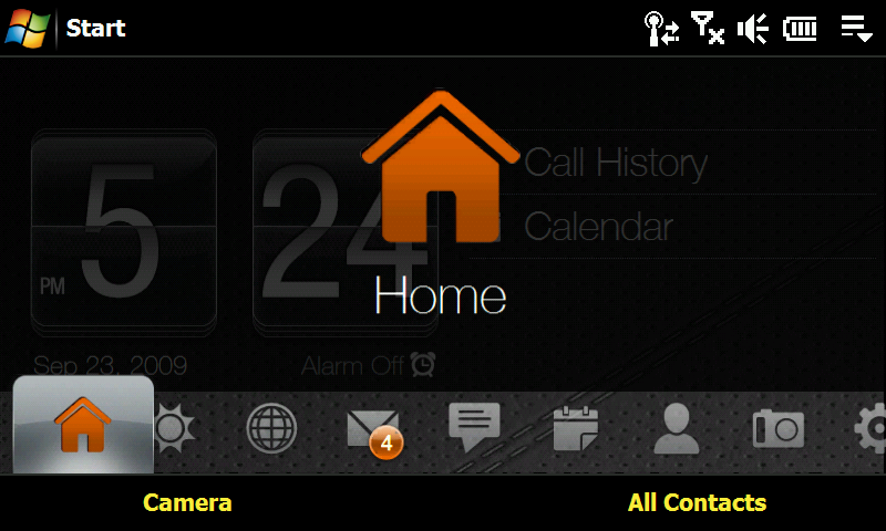
TouchFLO 3D2
TouchFLO 3D2 is quite awesome. The reason for this is that we are finally past just making it a sophisticated plugin. HTC has re-skinned so much in this build of TouchFLO that you barely see the actual Windows Mobile operating system. Even all the menus in all your third-party programs are skinned they are now much larger and sharper looking than the "stock" OS version, which look out of place with the rest of the OS.
While I'm one of the few who are actually "OK" with the Windows Mobile 6.1 user interface, I found on this device that HTC in fact does it better. Once I disabled TouchFLO 3D2, the device became a lot more troublesome to use and not nearly as fun. And with the dearth of hardware buttons, it is easy to see why.
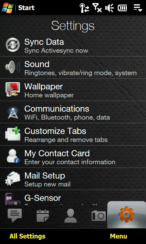
The ability to disable and reorganize tabs within Settings is also a great addition. No extra software is required, and it takes 2 seconds to disable "Stocks" or move to the front the "Sprint Music" tab.
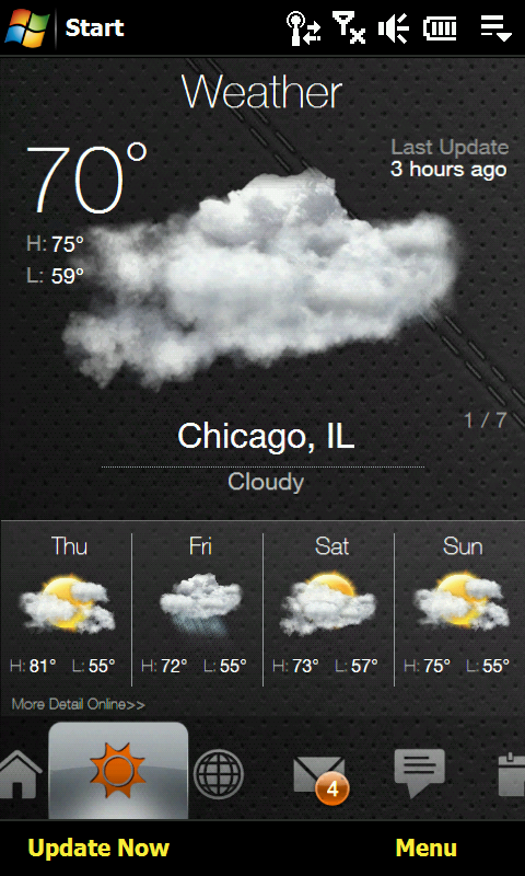
Weather is also much smarter now. It updates when you switch to the tab and is surprisingly fast. The visible week's forecast is convenient as is the ability to switch to different cities (defined under your clocks). Sure, the choices for cities remain limited and you might have to do some software trickery to get your local town to show up. But once you, do it works very well.
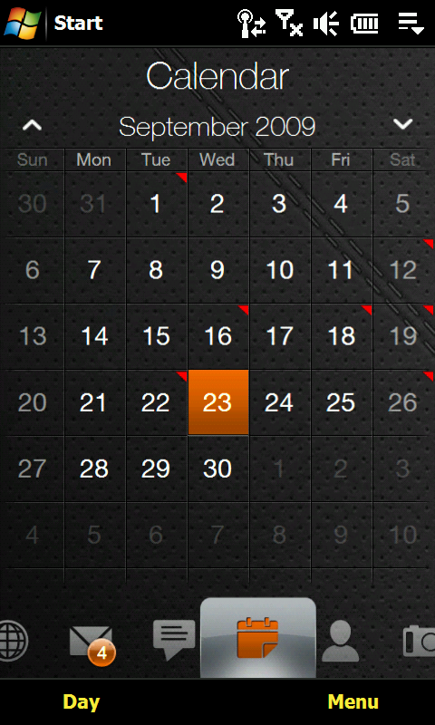
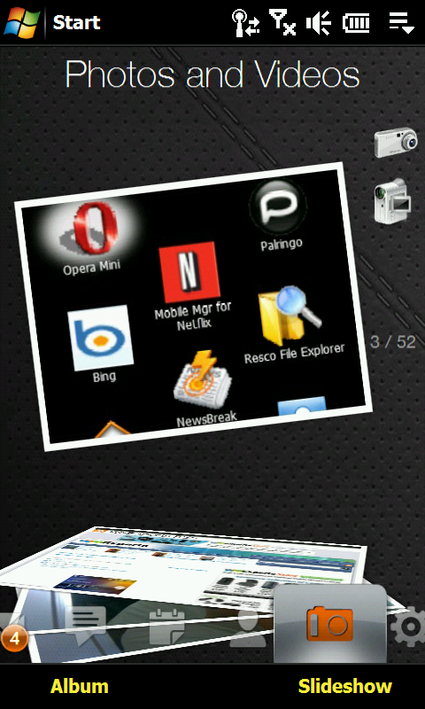
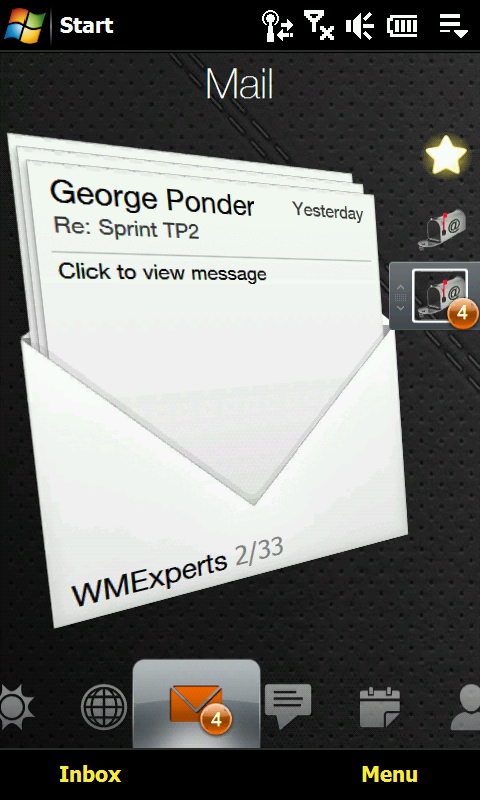
The other tabs, like Internet, E-mail and Text, are really well thought out. Sometimes "flicking" my next e-mail (or photos) would not work, which I chalk up to the non-capacitive screen. But overall it works well enough and, gosh, if it just isn't so pretty to look at!
Conclusion? I was really surprised how much I was OK with TouchFLO 3D2. I have never been a fan of the original TouchFLO, TouchFLO 2D, etc. and was expecting the same here. Instead, I really like the improvements made over the long run by HTC. It is generally quite fast, intuitive and just much more fun.
Color me shocked. I can't wait to hopefully see TouchFlo 3D 2.5 in a future update.
Opera 9.5
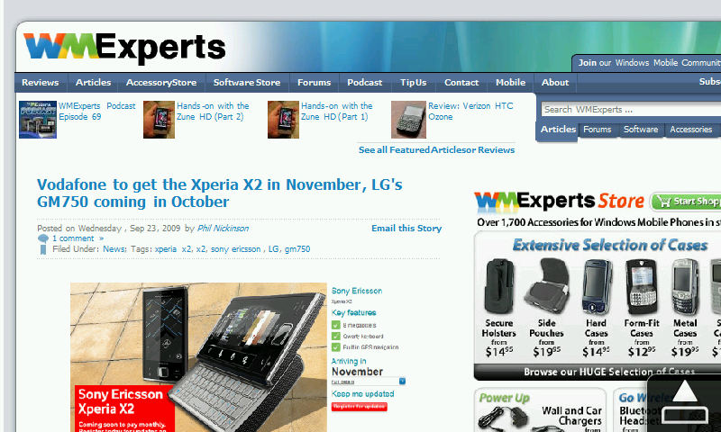
Sure, we all know about Opera 9.7, and I really hope when the Touch Pro 2 gets Windows Mobile 6.5 they bump it to Opera 9.7. But I was quite impressed with the current version already on the device. In fact, between the giant screen, Opera and WiFi, I felt for the first time that this was true browsing. The scrolling is great, the auto-fit for text was like magic and it handled sites quite well. Shoot, throw in the Flash hack and you can even do embedded video like Opera 9.7.
Start Menu
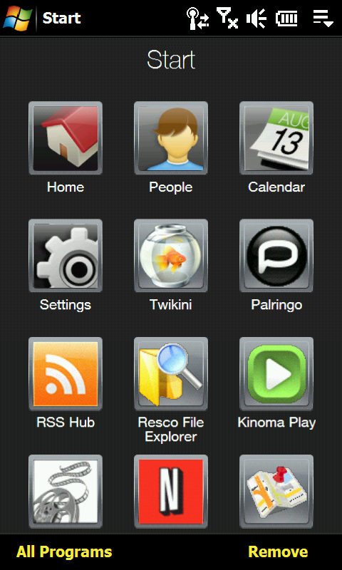
The Start Menu also has been replaced with a kinetic scrolling, large-icon based version by HTC. It's really nice, though the scrolling of the Start Menu by Microsoft for Windows Mobile 6.5 is better because it "stops" on every "page" instead of the spin-the-Rolodexversion we have now (you tend to over-spin with HTCs). Still, it works well enough and easy to use.
Miscellaneous
HTC throws in the usual software suite that we are accustomed to on its devices, including RSS Hub, QuickGPS, Teeter, MP3 Trimmer, etc. Like usual, the software is great and nicely fills in the gaps left by Microsoft.
One complaint: While I love Ilium's RSS Hub (aka Newsbreak), on this device it really feels out of place. That's because RSS Hub is still "old school" and not finger-friendly at all, so it is quite cumbersome to use. It really sticks out like a sore thumb and until Ilium updates its software (seriously guys, it's been 2 years!), you may want to try SPB News or SBSH GoNews Touch, which are a much better-suited RSS readers for this device.
Final Verdict
So here is the shocker: I really, really like the Touch Pro 2.
Does it replace my Treo Pro (especially now with WM6.5?) — no, the devices operate very differently and they each have their Pros and Cons. But the real message here is that I actually prefer the Touch Pro 2 for some things more than the Treo Pro. I won't hesitate to recommend it to others, and I will use it as my "main phone" on certain days without reservation.
A Treo Pro is like a sports car: fast, direct and no-frills. I can get from A to B quickly in a non-exciting but efficient manner. The Touch Pro 2 is a nice, fat Cadillac: slower, more relaxing but oh, what a ride. It takes me a bit longer to do things (swipe tabs versus dedicated hardware key) but doing them is so darn enjoyable and fun. A Treo Pro is 90 percent one-handed whereas the Touch Pro 2 I find mostly two-handed (hold with left, swipe with right). But this isn't too big of a deal.
Basically, the huge screen and keyboard will sell you on this device — they're just so good and easy to use. The Touch Pro 2 is practically a Netbook at this point, yet pocketable.
In conclusion, considering what HTC has to work with for an operating system (Windows Mobile 6.1) and current, affordable technology, they hit it out of the park with the Touch Pro 2. This is the first Black Slab™ where I found the hardware not only compelling, well built and exciting but practical, smart and efficient.
That the battery life is ample enough to last the whole day speaks volumes about this device.
The audio quality is great, screen is immaculate, keyboard is roomy and the build quality is high — sure it would have been nice for something to scroll with on long pages (swipe, swipe, swipe gets tiring) and there are always little things to improve, but overall I have to highly recommend the Touch Pro 2, even for the handful of skeptics left out there.
The Sprint Touch Pro 2 from HTC is a game changer for this genre, make no mistake.

Daniel Rubino is the Editor-in-Chief of Windows Central. He is also the head reviewer, podcast co-host, and lead analyst. He has been covering Microsoft since 2007, when this site was called WMExperts (and later Windows Phone Central). His interests include Windows, laptops, next-gen computing, and wearable tech. He has reviewed laptops for over 10 years and is particularly fond of Qualcomm processors, new form factors, and thin-and-light PCs. Before all this tech stuff, he worked on a Ph.D. in linguistics studying brain and syntax, performed polysomnographs in NYC, and was a motion-picture operator for 17 years.
