Review: SPB Mobile Shell
(Editor note: Malatesta checks in with a review of SPB Mobile Shell, easily in the top 5 pieces of software amongst us here at WMExperts. It made HobbesIsReal's list of Must Have Windows Mobile Software for a reason. It's my default "first install" suggestion for any Windows Mobile user - especially someone who is new to the OS.)
Way back in early 2007, I had given up on the Treo 700wx (and touchscreen WM devices in general) to head to the lofty and intriguing world of WM smartphones, notably the Motorola Q. Part of this was the allure of a thin device the other I wanted to try the smartphone (non-touchscreen) version of Windows Mobile.
But I switched back around March of this year and one of the reasons has to do with SPB Mobile Shell ($29.95). In short, it sort of redefined the user interface (UI) for Windows Mobile and vastly improved how I use my Treo 700wx. Indeed, every time I think about switching to a WM smartphone device, I pause and remember I’d be giving up on Mobile Shell too. So why all the fuss? I hope to explain below…
Read on for the full review!
SPB Mobile Shell has three main components to it:
- Virtual tabs for the Today screen
- A Now Screen (when you turn the device on, it displays valuable info)
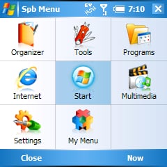
- Program Launcher
In addition, you also get a mini-weather program, photo speed dial, world-time clock, contact search and most importantly configurability. There’s a whole lot of stuff in here. All the icons and design of the program is meant to be finger-friendly (I found myself using my thumb more than the soft keys on the HTC 6800).
Virtual Tabs

Virtual tabs allow you to expand your today screen by, well, having tabs. Each tab can hold one Today plugin, which can take up a large percent of the screen. The benefit here is that they are hidden when not being used. Let me give you an example of how this benefits you, the end-user: On your Today screen, you can throw as many plugins as you want, but you are limited by space (and most people do not like the idea of having scroll bars). So organizing what to display becomes a contest between how much you want on there and the space available. You may want to display 10 days on your calendar but can only show three.
Using Virtual tabs, you can allot each plugin a much larger percent of screen real estate, resulting in much more information and yet a cleaner look, since it is not all jammed on one screen. Navigating the tabs is done via the D-pad with a swift, fluid motion—there are no delays, which impressed me.
Get the Windows Central Newsletter
All the latest news, reviews, and guides for Windows and Xbox diehards.
Now Screen
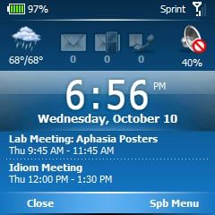
This is a simple idea: imagine powering on your device and at a glance, seeing your calendar, time, weather and new emails, voicemail or missed calls. That’s what the Now Screen allows and it works quite well. There are two versions: Classic & Professional, each with slightly different design and layout. It’s pretty basic and self explanatory.
Program Launcher

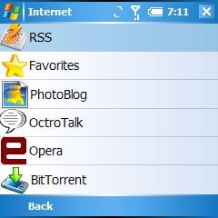
I detest the typical Start Menu of Windows Mobile. It’s a poor carry over from the desktop OS. The program launcher of Mobile Shell though has some great advantages over the default system:
- It’s dynamic: Under each category, you can choose to have Mobile Shell display the programs in order most used, keeping the frequently used programs near the top and less frequent below. This allows much quicker access to your favorite apps. (You can also disable this for each sub-menu and just have them ordered to your preference).
- Large icons, clearly identified. No more squinting at those tiny default icons. In Mobile Shell you can use each program’s default icon or choose from an installed list of SPB icons (which often are nicer looking than the default).
- Organization. Launching programs is so much easier when you can organize them into categories and have the least amount of taps and movement to do so.
In general, I found I spend much less time looking for that one program to launch than with the default system. This is especially true on WM non-touch screen devices where you just have a long list, often going on for pages of programs. Cognitively, you have to know what program you want its exact name and then scroll alphabetically till you get there. With the Program Launcher in Mobile Shell, you organize by category, programs are listed dynamically by usage and there are far less steps for using your most frequent programs. The “Start” icon shows your most recent run programs and there is even a “My Menu” where you can put anything you want.
All in all, a real joy. It’s even better than using zLauncher on Palm OS.
Extras
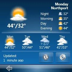
The included weather program is quite simple but it works for a free general weather program. The weather auto updates although you cannot set a schedule and I’m not really sure how often it does so. What it displays is the day’s high and low temperature, conditions and the week’s temperatures. Nothing fancy (personally I always recommend Weatherpanel with StoryR’s amazing themes). There is an included World Clock which can display alarms and a time for three cities
One really interesting feature: the weather, clock and home tab’s icon are dynamic; meaning if it is cloudy out, the icon for the weather tab reflects that via the icon. Gimmicky? Maybe. But it’s a real neat feature and it’s that extra touch that makes this a stand out program.
For the Treo users, a Photo Speed dial plugin is not a huge addition, but for every other WM device it’s a very welcomed addition. You can have up to 3 tabs with photo dial enabled, but sadly only one row with 5 contacts. Using the virtual tab function is great for this feature because you don’t have to worry about “accidentally” dialing a contact. Furthermore, it expands upon the Treo’s plugin by adding a click-n-hold feature which brings up all of that contact’s phone information, including the ability to send an SMS to them.
Finally, there is a nice assortment of Today Themes, based on color hue, which will change the entire device color scheme and background image, giving a svelte uniform appearance.
Usage and Setup
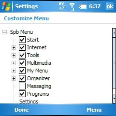
Listing all of these features may sound a bit overwhelming for the novice, but that is one of the remarkable aspects of this program: it’s clear and easy to setup, offering just the right amount of customization in clear English, but without swamping you with dozens of sub-menus and options. Power users may be a bit frustrated that they cannot change every aspect or re-skin every piece, but I think for the general user they will find a nice balance for options.
One might be inclined to think that adding a new Program Launcher, Now Screen and having those tabs run with all your plugins would greatly reduce both your RAM and speed of the device. But this was probably the biggest surprise: I have noticed no negative effects in speed and responsiveness on my Treo 700wx or HTC 6800. On average I found it consumes about 1.5-2.0mb of system memory (RAM) and about 1.7mb of system storage (ROM), which considering all that this program contains and replaces it remarkably small. Also, I have not noticed any effect on battery consumption—if it’s there, it is negligible.
Criticisms
There aren’t too many here as a lot of the issues people had with the program were addressed with the recent 1.5 update: stability, speed and battery issues appear to have all be resolved; having said that, most of the critiques could be centered on the lack of customization that some WM users are habituated too. For instance, if you want to replace the icons for the Tabs or the Program Launcher, you are stuck with SPB’s limited selection with no current way to add or modify those. The ability to only use one plugin per Tab is also annoying, especially if the plugin you are using is only takes up one line of space, likewise not all 3rd party plugins will work (but most do).
The same issue of customizability goes with the Program Launcher where you are limited to nine categories. All of these are optional and you can add / remove programs from them, but the categories themselves are permanent. Some could also lament the price at $29.95 and while this does make it one of the more expensive software purchases, I think it is actually priced fairly(especially since you can use it indefinitely on all your future WM Professional devices).
Conclusion
Despite some little issues, which I think only a tiny subset of power-users will be concerned with, SPB Mobile Shell ($29.95) is a great investment and one of my top software picks of 2007. If you are new to the Windows Mobile platform, frustrated with the current UI/Start menu or just want to fit all of those plugins on one screen, giving your device a nice facelift, consider giving a SPB Mobile Shell a 15-day trial run, I’m sure you’ll be impressed.
| Ratings (out of 5)Interface: 5Today Screen Plugin: 5Compatibility: 5Usefulness: 5Overall: | ProsGreat for Novices and ProsDrastically improves WM User InterfaceGet the most out of your pluginsSimplicityConsPrice?Can't customize every aspect |
Home to the most invested and passionate Microsoft fans, Windows Central is the next generation destination for news, reviews, advice and buying recommendations on the Windows, PC and Xbox ecosystems, following all products, apps, software, AI advancements, and accessories. We've been around for more than decade, and we take our jobs seriously. Windows Central writers and editors value accuracy and editorial independence in everything we do, never receiving compensation for coverage and never pulling punches.
