Review: SHBT MyHome 2.0

MyHome is one of the many Home Screen replacements that developers have come up with to make Windows Mobile more user friendly. (Read my original review here.) While the software doesn’t get the face time of things like the various flavors of HTC's TouchFLO or even SPB Mobile Shell, it did have some very cool features like haptic feedback. There were however, some areas where MyHome fell way short of the mark. The biggest downfall was the complete failure to support landscape devices. This is particularly hard to swallow with the popularity of HTC’s Touch Pro devices and others that have a similar form factor.
To see what steps SHBT has made from version 1 to 2, follow the break.

Interface
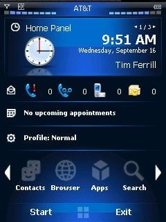
MyHome takes some design cues from some of the Windows Mobile 7 concepts/leaks that we’ve seen floating around in the past. The navigation however, is similar to the sliding panels that are available in Windows Mobile 6.1 Standard or 6.5 Professional.

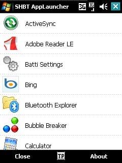
The topmost bar is dominated by signal and battery meters, both of which can be tapped to get to settings for the corresponding item. The Main bar contains a clock, weather, and Media Player panels. SHBT Weather is a separate application, but comes free with MyHome 2; and integrates neatly into this panel. The third row offers you access to all of your messages and missed calls, while row four is for appointments and tasks. Row 5 is all of your settings such as profiles, ring tones and themes. The final row is a launcher that gives you access to a couple core functions like contacts and search as well as giving you quick access to apps, music, and photos.

Use
The haptic feedback as you scroll through the different areas of the screen really adds a lot to the interactive aspect of the application. As with version 1, there is some very minor configuration that has to happen before you can start using this feature. On a side note, all of the heavy duty configuration is buried under Theme Settings, which is a little odd.

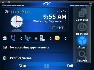
One MAJOR update that you get in MyHome 2 is Landscape support. Basically what happens is the launcher bar gets shoved to the right side of the screen. The one weirdness with this is that if you’re using a d-pad to navigate, you still press the left and right buttons to switch between items on the bar, even though they are arranged vertically.
Get the Windows Central Newsletter
All the latest news, reviews, and guides for Windows and Xbox diehards.
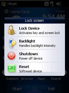
Another interesting update is a popup style menu for selecting your profile and another when you press and hold anywhere on the screen. These are a nice method of adding quite a bit of functionality without monopolizing screen real estate.

Conclusion
MyHome 2 is another step in the right direction. I don’t know if I would consider it a full release worth of updates and changes, but there are some fairly significant additions. Landscape support is obviously the biggest new feature, and will be a deal maker for some people. Haptics are back, one of the cooler features.
SBHT MyHome is priced at €14.95 (around $22.10), upgrades are available for €5.90 ($8.72-ish). Get your copy from SHBT directly (using Paypal).
| Ratings (out of 5)Interface: 4Use: 3.5Overall: 3.5/5 | ProsSleek, Intuitive InterfaceHaptic Feedback is really SlickConsA little rough around the edges |
Phil is the father of two beautiful girls and is the Dad behind Modern Dad. Before that he spent seven years at the helm of Android Central. Before that he spent a decade in a newsroom of a two-time Pulitzer Prize-finalist newspaper. Before that — well, we don't talk much about those days. Subscribe to the Modern Dad newsletter!
