Review: SBSH Calendar Touch v2.1
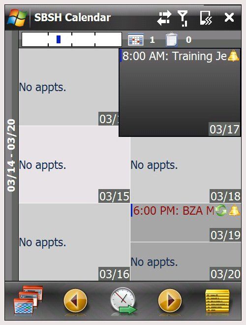
SBSH recently updated it's popular Calendar Touch to version 2.1. We looked at the previous version of Calendar Touch (v2.0) a few months ago and found it to be a feature-rich alternative to the stock calendar application of Windows Mobile. There was little we could find wrong with version 2.0, with the minor nit that returning to the current date was a little cumbersome. Readers reported a few bugs, including not being able to navigate easily with a stylus and that swipe navigation stops when you are on a day where the appointments extend beyond the single screen. Follow the break to see how version 2.1 shakes out.
The overall impression of Calendar Touch v2.0 was summed up with,
"It (Calendar Touch) is graphically pleasing with tons of customization for appearance, functionality and for each appointment. Calendar Touch makes organizing your day, week and month a lot easier. Combine the ability to create/manage tasks from the calendar and you have a pretty good application."
The latest version doesn't stray from the path. SBSH continues to place a lot of functionality and customization into this calendar application.
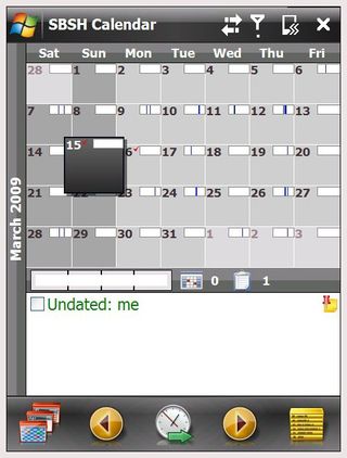
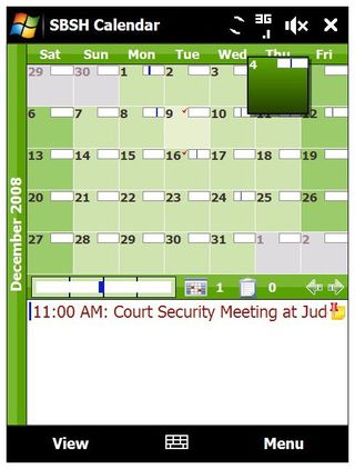
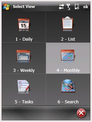
The most noticeable difference in v2.1 is the toolbar appearance. Instead of having the traditional pull up menus, at the bottom of the screen you have navigational icons for viewing style (daily, weekly, tasks, etc.), tap navigation, date selection, and application options. Additional icons appear as you move through the application such as settings, searching and filters.
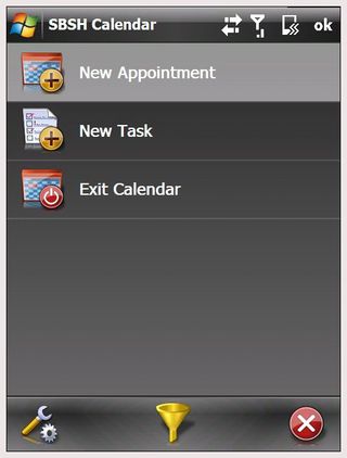
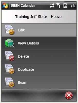
Calendar Touch v2.1 continues to combine task management with appointments, removing the need to use a separate task management application. As the name implies, navigation through the calendar and tasks can be done by touch. If you need to go to another day, simply swipe your screen in the direction you want to move. Navigation can be done by swiping with your hand or stylus. For the most part, screen movement was smooth and responsive. I did experience a little lag time between swiping the screen and seeing things move. It wasn't a consistent problem and could easily be a conflict with another application or a systems resource issue. The sluggishness was enough to notice but not enough to be a concern.
Touch Navigation extends beyond turning the calendar's pages. In the weekly view, if a date has several appointments you can tap to highlight the day then move your finger around to reveal the additional appointments. Double tapping will open that particular date into the daily view. You can also tap and hold the screen, then move your finger to pull up a scroll bar to move across larger ranges of dates. For example: I'd use this method for moving from March 15, 2009 to April 5, 2009 instead of swiping the screen from day to day or going into the monthly view to find the date.
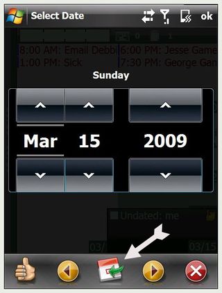

Wherever you may land, should you want to go back to the current date, all you need to do is tap the center "clock" icon which pulls up the "select date" screen. Instead of hunting down the current date on the display, simply tap the calendar icon (where the clock used to be) and you return to today's date. Much simpler than having to drill down through a bunch of pull-up menus.
Get the Windows Central Newsletter
All the latest news, reviews, and guides for Windows and Xbox diehards.
In the short time I've been using version 2.1, it's just as impressive as the previous version. The one thing I didn't like about version 2.1 is the on-screen keyboard. You are limited to the compact QWERTY keyboard which is just too small. In testing Calendar Touch on the AT&T Fuze, I would have preferred to have access to the full QWERTY keyboard. Granted the Fuze has the slider keyboard. But for those with the Touch Diamond or Samsung Omnia, the larger on-screen keyboard is a lot easier to use.
SBSH has done a very good job updating Calendar Touch. Calendar Touch continues to eat away at the traditional look and feel of calendar applications by providing you with a good bit of customization while increasing functionality. If you want more out of your calendar application, it might be worth giving Calendar Touch from SBSH a look.
| Ratings (out of 5)Ease of Use: 5/5Customization: 5/5Installation: 5/5Overall: 5/5 | ProsCustomization options at every levelGesture based navigationRolls appointments and tasks into one packageSearch FeatureConsOn-screen keyboard too smallWon’t do the dishes |
Phil is the father of two beautiful girls and is the Dad behind Modern Dad. Before that he spent seven years at the helm of Android Central. Before that he spent a decade in a newsroom of a two-time Pulitzer Prize-finalist newspaper. Before that — well, we don't talk much about those days. Subscribe to the Modern Dad newsletter!
