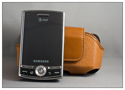
When we first noticed the Samsung Propel it sported a standard feature-phone OS. Several months later, we learned that Samsung had replaced the feature-phone OS with Windows Mobile Standard thus creating the Propel Pro. Along with some cosmetic changes the Samsung Propel Pro joined the AT&T line up this month to with its older brothers, the Samsung Epix and Blackjack II.
WMExperts.com had the opportunity to take the Propel Pro out for a test drive recently. Follow the break to see how well this new Windows Mobile Standard phone handled the road.
Out of the Box
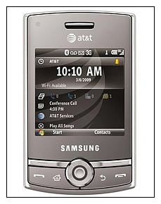
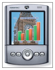
To be honest, when I picked up the Samsung Propel Pro for the first time, it reminded me of my old Palm Pilot; short and stocky. Then add the bottom sliding keyboard and I had flashbacks of my old Palm Tungsten (granted no QWERTY Keypad). The Propel Pro, collapsed, measures 3.9" x 2.4" x .6". Extend the keyboard and the 3.9" grows to roughly 5.5" in length. The phone weighs in at 4.83 ounces. The Propel Pro has a solid feel to it but does feel deceptively thick. At .6" thick, the Pro isn't much thicker than the Samsung Epix (.51") but because of it's shorter length I think the thickness comes across thicker. The heft of the Propel Pro isn't a "deal breaker" but does make an impression.
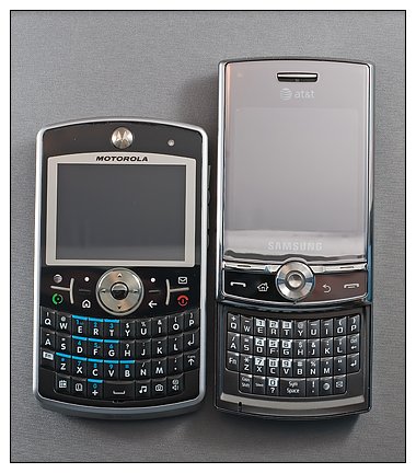
The Propel Pro is thicker than AT&T's leading Windows Mobile Standard Phones, the Motorola Q9h (.46") and Samsung Blackjack II (.4"). But it's narrower than the Motorola and shorter (when collapsed) than the BlackJack II. Extend the keyboard on the Propel Pro and all diminsional comparisons goes out the window.
The Propel Pro comes packaged with a charger, sync cables, owners manual and software CD.
Design
The key feature of the Propel is the bottom sliding keyboard but there are other features that make this an attractive phone as well as others that I could easily live without.
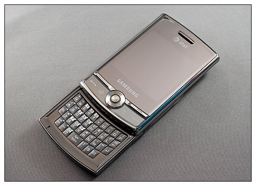
The Propel Pro has a silvery, shiny, fingerprint magnetic finish that I could definitely live without. Why can't manufacturers choose a more durable, less reflective, less grease attractant, fingerprint showing finish? It does have a "showroom" appearance but I found myself spending more time wiping the smudges off the screen than using the phone!
Beneath the fingerprints you'll find a 2.55", 320 x 320 non-touch screen that is rather nice. Under the hood you'll find a 528mhz processor with 128mb of RAM and 256mb of ROM. A micro-SD card slot is to the left side of the phone for expanded memory capabilities. The Propel Pro is fitted with Bluetooth, Wifi and GPS. As mentioned, it runs Windows Mobile Standard 6.1.

The top of the phone slides upwards to reveal a QWERTY keyboard that is very similar to the Motorola Q's but more compact. At first I was concerned that the gap between the top row of keys and the phone would be too narrow for comfortable typing but it wasn't. The keys were responsive but lack the spacing the keyboard on the Samsung BlackJack II and Epix. I found the keyboard to be good but not great. The keyboard is spring assisted and does open smoothly. The only challenge with extending the keyboard is getting a grip on the phone (cover this in a minute).
The keyboard does have three shortcut keys for silent operation and to launch your email application and web browser. There are two spaces at either end of the bottom row that might have accommodated extra short-cut keys (wireless manager, camera?).
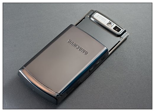
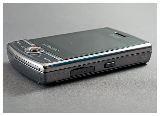
By extending the keyboard, not only do you reveal the keyboard you also expose a 3 megapixel camera. The camera has both still as well as video capabilities. On the right side of the phone is a camera shutter button or the center button can be used to activate the shutter.
Having the camera hidden when the keyboard is collapsed is a nice feature to give the camera a little protection. The one thing I'd like to see changed is if your going to have a side shutter button, the orientation of the camera should be horizontal. It's more comfortable to use the center button as a shutter as designed, making the side button a little unnecessary. While I have my reservations on phone cameras, I will have to admit, the Propel Pro's camera does a decent job.
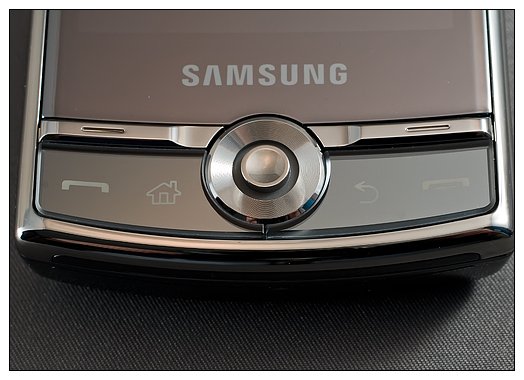
The button panel on the face of the phone includes the obligatory answer/end keys, a home key and a "back" button. Two soft keys are located above the answer/end buttons and a center joystick is the center piece of it all. Samsung didn't go with the optical mouse of the Epix or the five-way D-pad of the Blackjack. Instead you have a joystick that when depressed serves as your center button. The jury is still out on whether or not the joystick is a welcomed addition. If you are accustomed to the five-way controller the joystick will take some getting used to. Personally, I prefer the d-pad but recognize that with time, I could get used to the joystick.
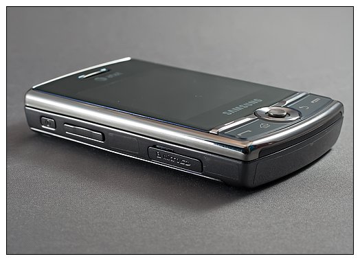
The design of the Propel Pro has the power button, volume button and micro-SD card slot on the left side. The camera button and charge/sync/headphone port is on the right side of the phone. Samsung stuck with the proprietary connection (a.k.a. no 3.5mm headphone jack). One interesting side note to the camera button is that it doubles as a zoom button. Pressing and holding the camera button zooms in on a corner of the screen and with the joystick you can scroll the magnification around the full screen.
Performance
As far as phone performance is concerned, the Propel Pro handles calls no different than any other Samsung phone. Calls came in clear both through the speaker and earpiece. The microphone, located just below the keyboard, picked up my voice with no problems with the keyboard extended or retracted. To dial a call you can extend the keyboard and use the numeric keys or with the keyboard collapsed, press the answer button to pull up your recently called numbers/contacts list. From there you'll use the joystick to highlight the number and then hit the answer/send button. Answering calls can be accomplished by either hitting the answer button or extending the keyboard.
Just like the Pantech Matrix Pro, if you lock the screen on the Propel Pro you have to extend the keyboard to access the asterisk key. I would have preferred to see one of the soft keys utilized to confirm the unlocking of the screen instead of having to extend the keyboard to access the asterisk.
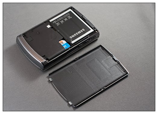
The Propel Pro is powered by a 1440mah battery and it while would have been nice to have seen something similar to the BlackJack II's 1700mah battery, 1440 is still a sight better than many batteries out there. The battery made it through the day with light to moderate use and maybe once conditioned, you could extend performance into day two. Samsung reports battery life to be approximately 6.5 hours of talk time and 12 days of stand-by time. This has to be based on voice calls only because I just don't see these estimates possible when you add data into the mix.
One handed operation of the Propel Pro is possible but not as easy as say the BlackJack II or Treo Pro. The shiny finish is a little on the slick side so it takes practice to open the keyboard one-handed. The keyboard glides smoothly and is a breeze when two hands are available but with one hand, it takes a little time to master. The same can be said of the joystick which definitely requires a little patience.
Software
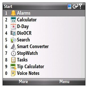
Being an AT&T branded phone, you guessed it, the Propel Pro has its fair share of bloatware. You do have Wikimobile and Office Mobile installed, along with all the AT&T stores, subscription services (My Weather, Mobile Banking, MobiTv). You do have a handy tip calculator, conversion application, business card reader (DioOCR) and voice notes in your Organize Folder. For the most part, the installed software is middle of the road.
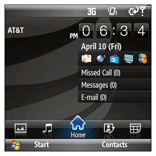
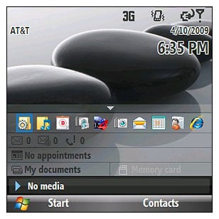
There are two new Home Screens (or at least new to me) to choose from that might spark an interest. WizPro looks an a lot like HTC's Touchflo 3D, absent the touch capabilities. You have scrollable tabs at the bottom of the screen to take you from the Home Screen to contacts, calendar, music and photo screens. Samsung Pop-Up showcases your wallpaper with a pop-up field that includes an application launcher bar as well as message and appointment listings. With Windows Mobile Standard, I think it's hard to beat the sliding panels but the WizPro comes close.
The 528mhz processor, combined with the efficiency of Windows Mobile Standard, lets the Propel Pro move along smoothly. I didn't experience any hiccups, hangups, or stalls while test driving the phone. Windows Mobile Professional has advanced in leaps and bounds with regard to stability and efficiency but Standard still manages things just a hair better.
Overall Impression
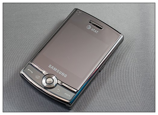
When I first handled the Samsung Propel Pro, it reminded me of the older devices that I've owned. It's short stocky build wasn't far from the thickness of the AT&T Fuze, my primary phone, but the Propel Pro was more compact (until you extended the keyboard). If you can get past the fingerprint prone finish and the odd little joystick, the Samsung Propel Pro represents the Windows Mobile Standard phone family rather well.
Could it be better? Sure. What device out there couldn't see improvements? For the Propel Pro, I think if you returned to the 5-way D-pad, toss in a larger battery, put a soft-touch finish on it, and tweak the screen lock to eliminate the need for the asterisk I think you would have a more competitive, attractive phone.
I found the Propel Pro growing on me for the short time I had the phone. I will be curious to see how well it measures up to the other new Windows Mobile Standard phones. In particularly, the HTC Snap. While the shiny vs. soft finish will be a landslide victory for the Snap, the trackball vs. joystick might be a closer match up. Battery life will also be an interesting comparison. Will the HTC 1500mah out perform the Propel's 1440mah?
Regardless how the Propel Pro matches up with the Snap, it's a solid enough device to warrant a closer look at if your looking for a Windows Mobile Standard phone.
Overall: 4/5


| ProsGood Call QualityCompact form factorResponsive KeyboardConsShiny, fingerprint prone finishJoystick takes getting used toUnlocking Screen Requires KeyboardBattery Life could be better |
