Review: PointUI
All the latest news, reviews, and guides for Windows and Xbox diehards.
You are now subscribed
Your newsletter sign-up was successful
Join the club
Get full access to premium articles, exclusive features and a growing list of member rewards.
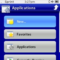
The issue of how good or bad the User Interface (UI) on Windows Mobile devices has raged on in our forums and has frequently been the subject of many stories here at WMExperts but one thing is clear, the market has spoken and UI replacements, add-ons or shells have become the new pet-rock of WM devices.
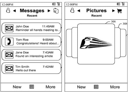
Enter PointUI, a hitherto unknown (except for a mysterious countdown) program this little app almost looks like the designers beat Microsoft to the punch for their future UI as documented in their patent images.
Article continues belowAnyways,what you need to know about PointUI from my 24 hrs of experimenting is after the break, but here's the short version:
- Completely Free
- Quite Stable
- Supports all major resolutions: 240x240, 320x240, etc.
- Low system resources
- Menu animation is great
- Very easy to use
- Includes Weather screen
Essentially you launch the program after the simple installation and it runs through a couple of screens. The program itself does take up a meaty 4.5mb of storage space on your device, so that is something to consider for the space-conscious and it uses about 3mb of RAM, which is not too shabby once you see the graphics. The UI is basically a Today screen replacement, similar to the HTC Plugin, SPB Mobile Shell and others. It shows all your important information with the center area being the “main focus”—from there you can slide left or right and switch from the various menus, which include: Weather, Appointments, Tasks, Digital Clock, Calendar and Analog clock.
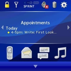
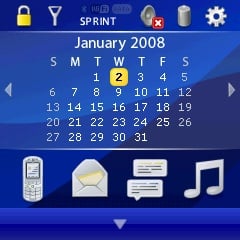
At the bottom, you have a set of four icons, which include your Phone information (missed calls, call log, etc), Email counter, SMS counter and a direct link for Windows Media Player (WMP). At the top of the screen you have a device lock, signal meter, radio, volume and battery status and finally Point UI settings. I imagine this main screen will cover about 80% of daily basic phone operation for most users out there. Navigation of the UI is done via the D-pad, stylus or just your finger (it’s very “touch friendly”). Pushing down on the screen will bring you to the program launcher, which I found a bit odd in comparison to SPB Mobile Shell but maybe that’s just me.
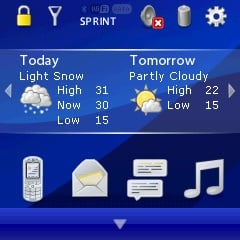
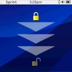
Overall I have to admit I’m quite impressed with PointUI. First, it’s completely free with promises of no spyware or sneaky marketing gimmicks and that is quite amazing since it doesn’t feel like home-brew software but rather a very professional product. For everyday phone use the UI is very functional with no lag on my 700wx, in fact it’s just as speedy as a WM device without it and considering all the flashy animation that is involved, this is no small feat. There were no stability issues on my device and outside of getting used to how it interacts once you go beyond the Home screen, it’s quite ready for everyday use.
All the latest news, reviews, and guides for Windows and Xbox diehards.
For power-users, the lack of customizations at this point may be a turn off. I haven’t found a way to change the color yet and there are really no options to the program—you just run it or not. But considering the program is just 1.0, there is plenty of room for development in this area.
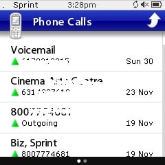
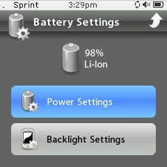
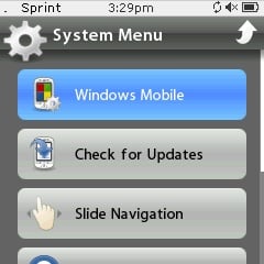
Give PointUI a shot if you’re bored with your current device setup—it is probably the most impressive freeware I’ve come across in a long time. You don’t need to uninstall previous setups as it will run just fine even with SPB Mobile Shell, but you may rethink how you use your device with this app. And hey, did I mention it was free?

Home to the most invested and passionate Microsoft fans, Windows Central is the next generation destination for news, reviews, advice and buying recommendations on the Windows, PC and Xbox ecosystems, following all products, apps, software, AI advancements, and accessories. We've been around for more than decade, and we take our jobs seriously. Windows Central writers and editors value accuracy and editorial independence in everything we do, never receiving compensation for coverage and never pulling punches.
 Join The Club


