Review: Palm Treo Pro
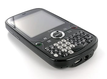
The Treo Pro is the latest Windows Mobile-based Treo from Palm. It is due to be available in Europe in September and available in the US later this Fall in an unlocked, non-carrier-subsidized form for $549. The Treo Pro is loaded with great features, including Tri-Band 3G and Quad-Band EDGE for worldwide, high speed data as well as GPS, WiFi, Bluetooth, a 320x320 Touchscreen, and the Treo's signature front-facing QWERTY keyboard. It is one powerful smartphone, focused primarily on the business user but with plenty of features that will appeal to consumers in the “power user” segment as well.
Read on for the full review! (Cross-posted at TreoCentral)
Previous Treo Pro
coverage at TreoCentral:
Treo Pro Unboxing, Gallery, and Comparisons
Get the Windows Central Newsletter
All the latest news, reviews, and guides for Windows and Xbox diehards.
Which Treos Didn't Make the Cut?
Why No Carrier Partner for Treo Pro?
Will the Treo Pro be too Pricey?
Guess the Release Date“ for Treo Pro Contest Update
The New York Times Talks About Jon Rubinstein
The Treo Pro -- Brought to you by HTC? / WMExperts
CDMA Version of the Treo Pro Coming?
The Treo Pro was officially announced one week ago amid a bit of fanfare (and the usual pre-release leaks). For many Treo-faithful, it represents the culmination of literally years of waiting, asking, and hoping. The Treo Pro makes good on nearly every single ”When will this happen“ that Treo lovers have been asking about, including:
- A flush touch-screen
- Thin
- WiFi built in
- GPS built-in
- A battery large enough for 1 to 2 days of normal use
- a standard, 3.5mm headset jack
- a standard, microUSB connector
Running the latest version of Windows Mobile, version 6.1, the Treo Pro packs more power and more features than any Treo before it (with the possible exception of the Treo 800w) into a package that's not only small by Treo standards, but is small by current smartphone standards, full stop.
Here's the short version of this review: I can chose from an embarrassing variety of smartphones, from the BlackBerry Curve to the Centro to the iPhone 3G to various Windows Mobile smartphones. Since I received the Treo Pro, it's what's been in my pocket and even with the devices I see on the horizon in the next few months, it's the device I expect to keep in my pocket for the foreseeable future.
This review will focus primarily on what's new and interesting on the Treo Pro: hardware, custom design touches, custom software, and the like. We won't be delving too much into Windows Mobile, a powerful operating system with very complete support for enterprise push email and a large body of 3rd party software. If you're new to Windows Mobile, I recommend you check out TreoCentral's reviews of previous Windows Mobile Treos -- you can read about our experiences back when we were first introduced to Windows Mobile ourselves.
- The Treo 700w Review is a great introduction to Windows Mobile, although the OS has progressed quite a bit since then.
- The Treo 700wx Review is a good introduction to memory management issues on Windows Mobile -- though thankfully this isn't much of an issue on the Treo Pro
- In the Treo 750 Review you can see us start to chafe at not having WiFi or GPS on a Treo
- Finally, the Treo 800w Review has some information about what's new in Windows Mobile 6.1
Alright, let's get to the Treo Pro!
Hardware
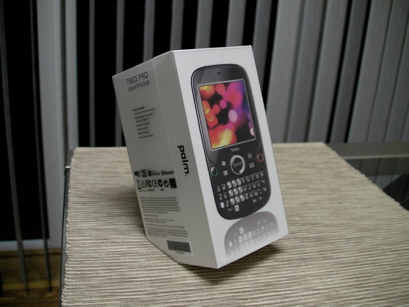
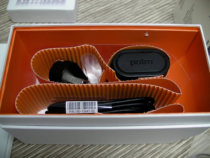
In the Box: The Treo Pro comes in a very professional-looking (and iPhone-reminiscent), small, white box. Inside, besides the Treo Pro itself, you'll find a small power-brick with a USB port for charging, a USB Sync/Charge cable, and a pair of stereo hybrid headphones. The rest of the packaging is fairly light -- less is more with this sort of thing. Palm has also decided to get rid of the standard install CD, instead including an innovative auto-install feature on the Treo Pro itself (more on that later).
Build Quality: The Treo Pro's build quality is fantastic. There's very little ”flex“ to the device and overall it feels solid. The battery door slides on with a solid 'click' and the edges around it are very close to the main device -- it almost feels like a solid, single unit.
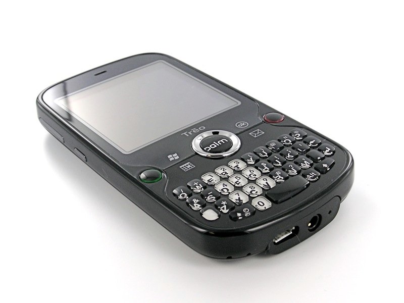
The front face the device is almost completely flush, with just a tiny ridge around the edges. The main buttons have a decent amount of click, although the main front four are of a different type than Treo users are used to. Even the keyboard is more solid than it appears to be -- more on that below.
The flush touchscreen (we've waited so long!) is fairly responsive -- though of course it's no iPhone. There is a little bit of 'give' to it, but not enough to worry. There appears to be an extra layer of film covering the entire top-half of the front face - it definitely has a plastic (as opposed to glass) feel but doesn't appear likely to scratch too easily. Nevertheless, most users will want to invest in a screen protector.
The very (very) welcome additions on the bottom, the 3.5mm headset jack and the microUSB connector are also both solidly built -- it appears from my use thus far that the Treo Pro won't suffer from the broken headset jacks so common on previous Treos.
To call the Treo Pro a fingerprint magnet isn't exactly accurate. Magnets aren't a powerful enough metaphor. The Treo Pro attracts fingerprints as a black hole attracts light -- it sucks them inexorably in and you can see them for a time, but eventually they become invisible as they're replaced with newer fingerprints. Which is another way of saying ”you get used to it.“ Mostly. Hopefully we'll see full body skins soon.
Around the Device
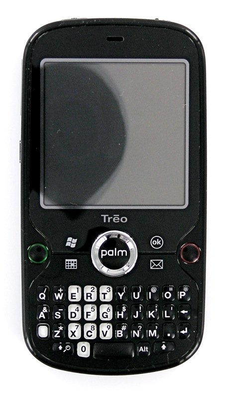
The front of the Treo Pro is where most of the action is. The device is dominated by the square, flush 320x320 touchscreen. It would be nice if the screen were a bit larger and/or stretched just a bit further towards the edges of the device.
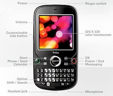
Above the screen is the earpiece and a LED indicator to the left of that. The LED is invisible when it's not lit (a nice touch) and does one thing and one thing only: indicate charging status.
Underneath the screen is our favorite logo and a redesigned main button board. The Send and End keys are rounded and stick out enough to be findable with your fingers. They flank the 4 main application buttons which are flush with the front of the device, though they depress clearly and don't feel mushy in the way buttons of this style can. In the middle, of course, is the traditional 5-way D-Pad. The D-Pad is easy to use -- the ridges are tall enough and differentiated enough from the surrounding buttons to prevent mis-pressed.
The center button has the same semi-rubberized feel as the main keyboard and also lights up when you have waiting voicemail. It's very subtle unless the room is dark and it's also very infrequent. It only works for voicemail, too. Palm told me that, like with the LED, they prefer the KISS philosophy when it comes to alerts. Most users don't like trying to figure out what different blinks might mean, so Palm doesn't have an indicator try to do double duty. I wonder if RIM has some sort of patent on a center button lighting up to let you know you have email waiting, because it would certainly be a welcome feature here.
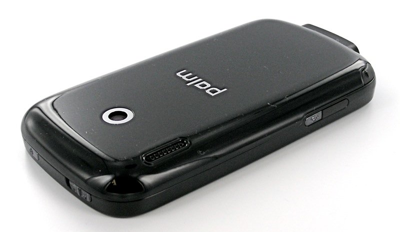
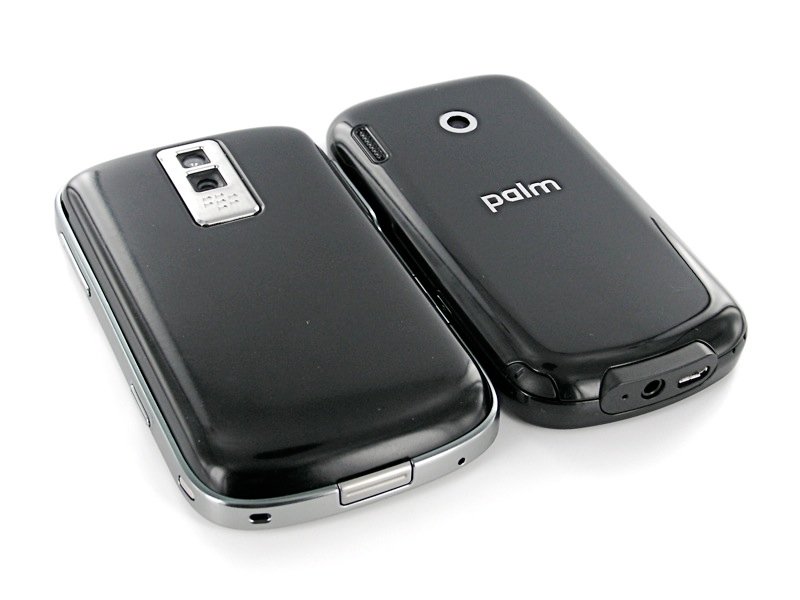
The rear of the Treo Pro is a single piece / battery cover. It's very hard, shiny black plastic and doesn't look like it will scratch very easily, but it does pick up fingerprints like Pauly Shore picks up bad movie scripts: i.e. with reckless abandon.
The 2 megapixel camera sits in the top center, cyclops-style, though the clear lens 'cover' is just recessed enough to prevent it from getting casually scratched.
The best part of about the back of the Treo Pro is the off-set speaker grille. It curves around to the right side of the device just enough so that it's not muffled when sitting on a flat surface.
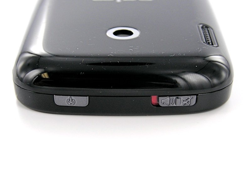
On the top we we have the classic Treo switch, the kind that works the way I believe a ringer-switch ought to work -- it silences everything. Next to it is a button that hasn't made an appearance on the Treo since the Treo 600: a power button. More on this below in the ”Design Touches“ section, for now just know that it's good that it's here.
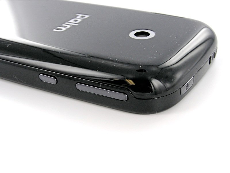
Over on the left we have a single, long 'rocker' button for volume. Like with Windows Mobile Treos past, it defaults to adjusting the ringer volume but pops up a bubble that also lets you adjust the main 'PDA' volume as well.
Beneath that is the 'Side button' that will only invoke an action with a long press. I'm not sure what focus group convinced Palm that the side button should only work after you've held it down for several seconds, but when I find out I'm going to egg their houses.
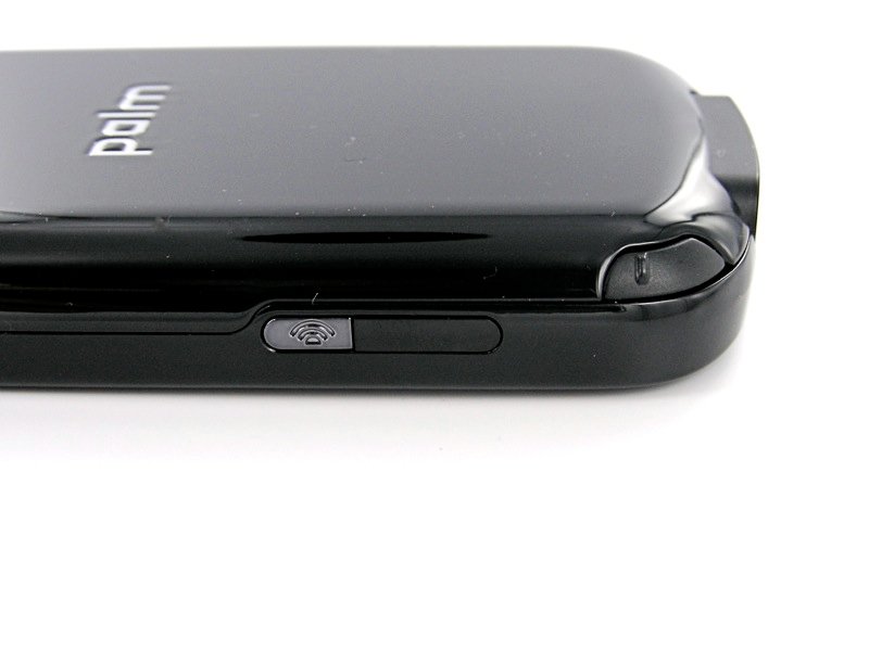
The right side is clean until you get to the bottom, where you'll find the IR Port, WiFi button, and stylus. The WiFi button is difficult to press unless you use a fingernail -- accidental presses are very unlikely. The stylus seems very secure in its silo down here, it shouldn't fall out on anybody. Additionally, the metal stylus makes a comeback (hooray), although it's not especially long at 2.85 inches (boo). Then again, I prefer a stubby stylus to a telescoping stylus.
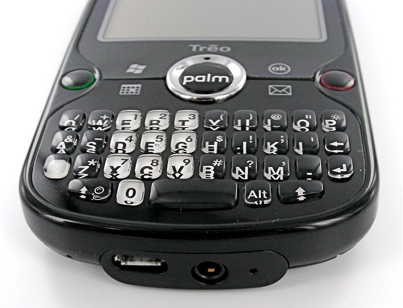
On the bottom of the Treo Pro you'll find the microphone, the 3.5mm headset jack, and the microUSB port. As I mentioned above, the two ports feel very sturdy. The plastic here has a textured finish that looks just a bit out of place. Really, any complaints about this end of the device ring hollow -- there's a standard 3.5mm headset jack down here!
One detail that's easy to miss is that there's also a lanyard/charm anchor at the bottom. You take off the battery door to thread it in. A nice touch.
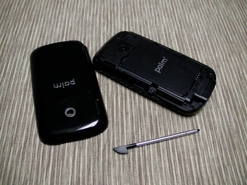
The battery cover takes a bit of doing to slide off -- you need to grip the keyboard with your fingers and push the battery cover up with your thumb. It's fairly easy once you get the hang of it, but still aggravating because it's necessary every time you want to access the memory card.
Once you remove the battery things are actually very clean underneath. There's the large, flat 1500 mAh battery, the microSD slot, and a reset button underneath the stylus that you need to use the stylus to press. Since holding down the power button only puts the phone into Airplane mode and pressing the end key just locks the screen, this is your easiest way to reset the device.
Hardware Design Touches
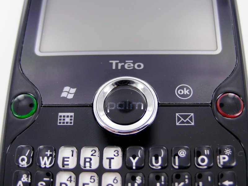
Every smartphone is made up of hundreds of design trade-offs. With the Treo Pro, the biggest change might be the flush touchscreen. It enables the Treo Pro to become very thin. Another advantage of the flush screen is that it's easier to use your thumb to tap elements at the edge of the screen. Most important would be the upper-right ”close“ corner of the screen, though it's also convenient for grabbing the scroll bar as well.
As happy as I am to finally see a thin Treo with a flush touchscreen, there is one design tradeoff I'm not very happy about: Palm excised the traditional Windows Mobile 'soft buttons,' i.e. the two hardware buttons traditionally found at the bottom of the screen that map to the two bottom menus in Windows Mobile.
Instead, Palm has applied the same ”you can easily touch the edges of the screen“ principle to the soft buttons -- they area is actually quite easy to tap with your thumb and Palm also told me that the touch sensitive area at the bottom actually extends a few millimeters underneath the screen proper as well. For 90% of Windows Mobile apps, it's no problem at all.
There are places where having physical soft buttons are more important, however. The most prominent example is Pocket Internet Explorer in full screen mode -- exiting that without soft buttons requires holding your finger down on the screen to pop up a context menu. It would have been nice to have soft buttons on the Treo Pro, but it's not something I think should prevent anybody from purchasing the device.

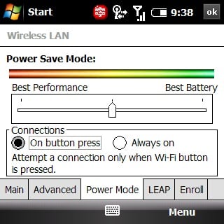
There are other hardware/software elements on the Treo Pro that work quite well, of course. I've already mentioned the voicemail indicator on the D-Pad. Another element that deserves mention is the WiFi button. When WiFi is off, pressing the WiFi button automatically turns WiFi on and sets the Treo looking for a network. Holding it down while WiFi is on turns it off.
Users will want to peruse of the WiFi settings, however, as the Treo Pro is a little over-aggressive in turning WiFi off by default. I understand that's probably for the best to have the default settings err on the side of battery life, but it's still annoying.
I mentioned earlier that the Treo Pro signals the return of a power button separate from the End key, it's a welcome return too. The End key on Treos was getting overloaded with functionality -- ending calls, going back to the Today Screen, turning off and locking the screen, and powering off the phone completely. The hassle was that unless you hit Opt + End at the same time, you'd go back to the Today Screen before you could turn off the screen.
The power button eliminates that by letting you just turn off and lock the screen in whatever app you're in with one press. That that app is then waiting for you when you power the Treo on again. Holding down the power button conveniently turns on Airplane mode, turning off all the radios on the Treo. One odd note: Palm's guide says that holding down the End key should power off the phone completely, but on my Treo it simply locks the screen.
Another old-school Treo feature has finally made its way to Windows Mobile Treos with the Treo Pro: proper Option + Button functionality. On all Treos, you can hit Opt + another main button to access secondary applications. For example, I usually map Opt + Mail to my media player. The hassle with previous Windows Mobile Treos is that you had to hold down Opt and the other button at the same time, requiring two hands.
With the Treo Pro, you can hit Opt and then hit the next button in succession -- matching the behavior of all PalmOS Treos and Centros. It's a small thing, but it helps keep the Treo Pro optimized for one-handed usage.
One last note: the flush screen on the Treo Pro is begging for some ”flick scroll“ action, which is nowhere to be found on the Treo Pro. I'll also complain here that the Treo Pro could really use a proximity sensor, an ambient light sensor for screen brightness, and a flash for the camera.
Specs
Let's run down the specs and comment on them:
Platform: Microsoft® Windows Mobile® 6.1 Professional Edition
Good to see the Treo Pro out of the gate with the latest version of the Windows Mobile OS, including full enterprise support, threaded text, and a slightly improved battery life.
Processor: Qualcomm® MSM7201 400MHz
So far the Treo Pro isn't quite as snappy as the Treo 800w (more on this below), but it has handled even heavy tasks like video and multitasking as well or better than any current-gen Windows Mobile device.
Display: 320x320 transflective color TFT flush touchscreen
Finally we can put the 240x240 screen resolution out to pasture. Of course, 320x320 is going to feel very cramped itself in the near future as more people experience higher resolution devices from HTC, BlackBerry, and Apple.
Radio: HSDPA/UMTS/EDGE/GPRS/GSM radio ; Tri-band UMTS – 850MHz, 1900MHz, 2100MHz ; Quad-band GSM – 850MHz, 900MHz, 1800MHz, 1900MHz
Worldwide 3G and thus far the 3G seems very stable, reliable, and fast. I'm averaging anywhere from 450 kbps to 800 kbps here on our brand-new 3G network. Things might be slower in a bigger city with more 3G traffic.
Wi-Fi: 802.11b/g with WPA, WPA2, and 801.1x authentication
The WiFi is good and it's worth noting again that the Treo Pro has a dedicated button for toggling it on and off.
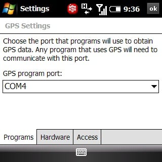
GPS: Built-in GPS
The GPS is a-GPS and fully autonomous, which is to say it will work fine even when there are no towers in range and it will work even better when it can get assistance from cell towers. It's also not locked down in any way, it's fully available to all apps.
Bluetooth® Wireless Technology: Version: 2.0 + Enhanced Data Rate
What can I say: the Bluetooth works, but I haven't had a chance yet to do extensive testing. A2DP / Stereo Bluetooth is here too, as is infrared for those of you who like to kick it old school.
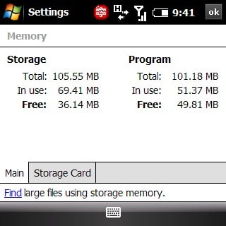
Memory: 256MB (100MB user available), 128MB RAM
It's not the most capacious device out there, but it's well within norms for Windows Mobile these days. I haven't had to do much in the way of memory management, either. The Treo Pro and Windows Mobile 6.1 handle everything pretty well. That said, there are plenty of memory management tools built-into the Treo Pro, including the much-loved ”Tap X to exit program“ option as well as the HTC Today Screen task manager (see below). After a soft reset, with 8 or so apps (some of which are very large) and with a couple pieces of software running, I'm currently working with:
Storage: Total 105.55 MB, 69.79 MB in use, 35.76 MB free
Program: Total 101.18 MB, 35.79 MB in use, 65.39 free
Camera: 2.0 megapixels with up to 8x digital zoom and video capture
It doesn't have a flash, sadly, but it takes decent-enough photos when there's adequate light. More on this below.
Battery: Removable, rechargeable 1500mAh lithium-ion; Up to 5.0 hours talk time and up to 250 hours standby
I'm averaging about two days of moderately heavy usage on this battery. 1500 mAh is on the upper end for Windows Mobile Smartphones these days and I'm finding it to be plenty. This is with 3G too. All but the heaviest of users should be getting a full day's usage off a single charge.
Expansion: microSDHC cards (up to 32GB supported)
Pow. It's a little aggravating that you have to remove the battery cover to access the memory card slot, but at least you don't need to remove the battery. Support for memory cards up to 32GB also helps quite a bit -- let's hope the days of hacking on Treos to find ways to get them to support larger-sized memory cards are behind us.
Connector: MicroUSB™ 2.0 for synchronization and charging Audio: 3.5mm stereo headset jack
Two great standards that taste great together. The 3.5mm headset jack is also 'standard' in how it works with microphones -- headsets made for the BlackBerry or the iPhone are confirmed to work for both music and phone with the Treo Pro.
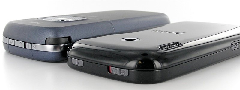
Dimensions: Length: 4.49”, Width: 2.36“, Depth: 0.53”, Weight: 4.69 oz
Thin and with a decent heft, but not too bad. Be sure to check out the many comparison photos from our earlier article, “Treo Pro Unboxing, Gallery, and Comparisons.” Given everything that's been packed in here, it almost feels like a miracle that the device is as tiny as it is.
Keyboard
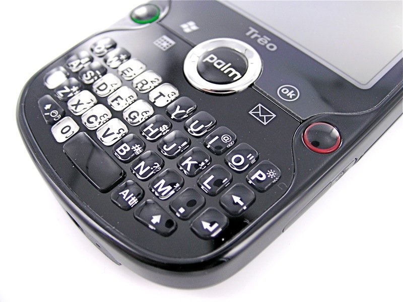
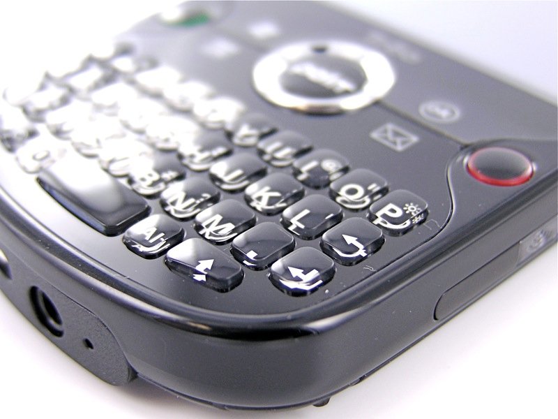
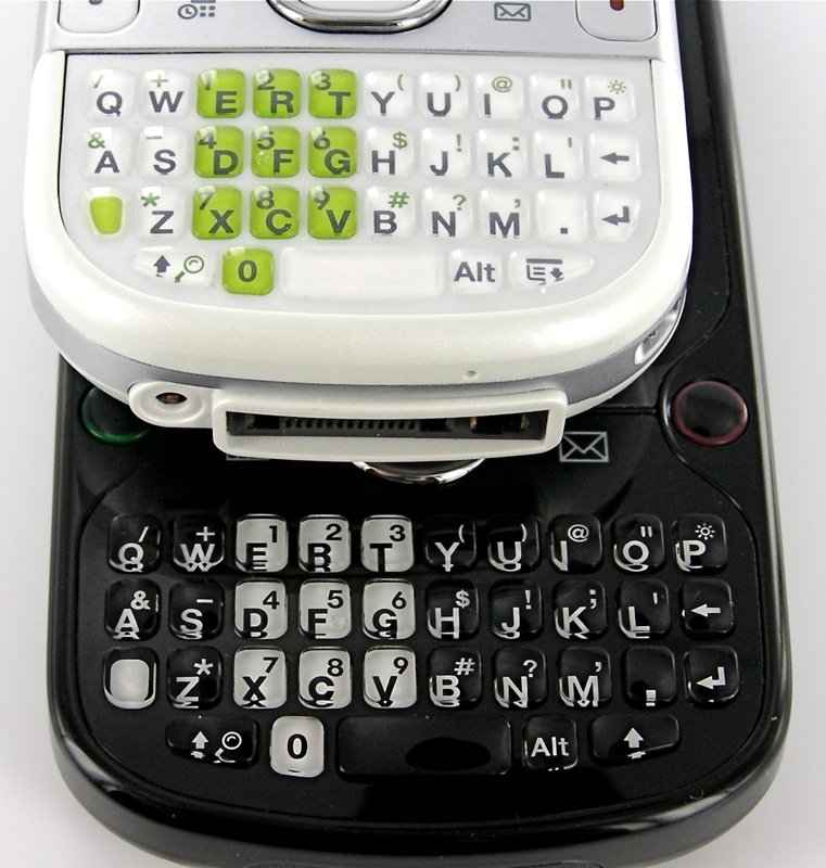
The Treo Pro's keyboard takes its design cues from Palm's Centro. It's not as Centro-esque as it appears at first blush, however. The Treo Pro's keys are slightly more spaced apart, flatter, harder, and almost imperceptibly slightly larger. The net effect is a keyboard that's more usable than the Centro's.
It pains me to say it, though, the Treo Pro's keyboard is the least 'Pro' part of the device. After a week with the device, I'm proficient with it but not great. I find that I'm often typing with my thumbnails instead of the flat of my thumbs. For heavy-duty emailers, it doesn't compare well to the more traditional Treo 800w keyboard, the Motorola Q9h's keyboard, or the BlackBerry Bold's keyboard. The Pro's keyboard simply isn't large enough.
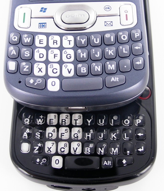
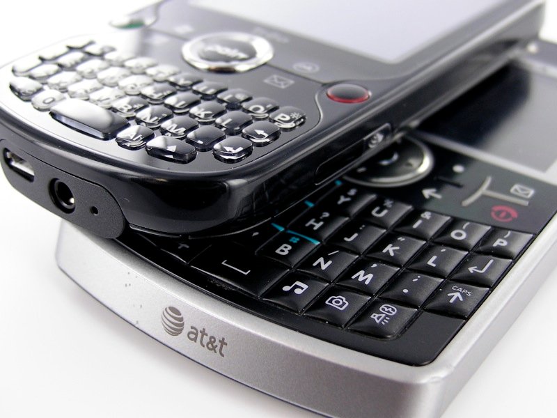
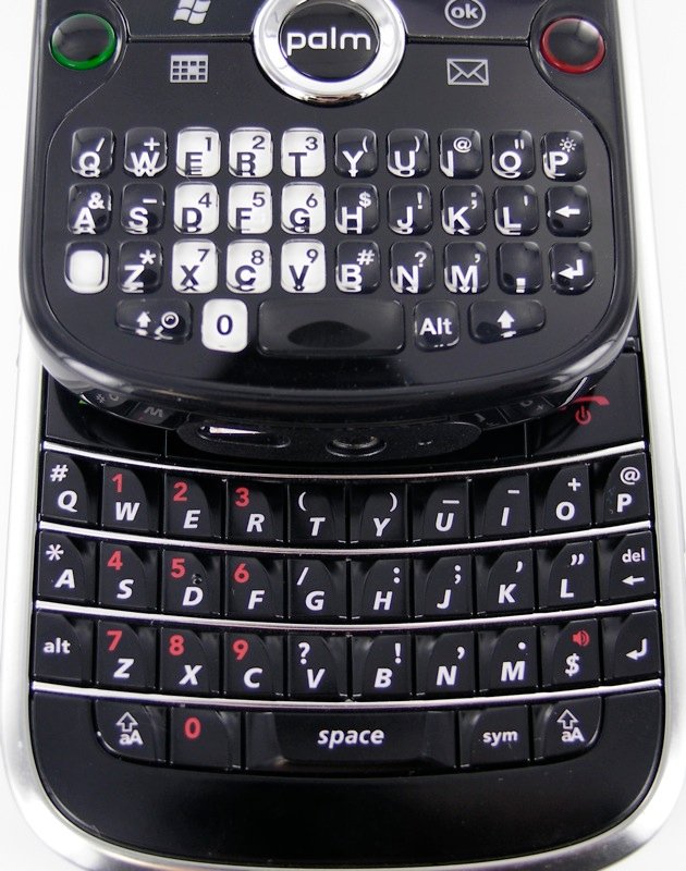
Roughly, I'd say that for speed, accuracy, and quality I'd rate the keyboards thusly:
- Treo 800w: 10/10
- Motorola Q9h: 9/10
- BlackBerry Bold: 8/10
- Treo Pro: 6/10
- iPhone: 5/10
- Centro: 5/10
I'm actually quite good with all of the above and would have no problem making any of them my main device, keyboard-wise, but there's no denying that the Treo Pro's keyboard is closer to “good enough” than it is to “really good.”
Software Touches
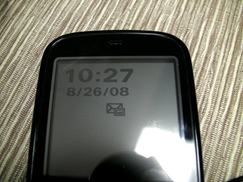
The Treo Pro sports some -- but strangely, not all -- of the Palm's enhancements to Windows Mobile. My favorite new feature made its debut on the Treo 800w: the screensaver. When the screen is off, you can have the Treo Pro display the date, time, and a few alerts. There's no backlight on and it takes very little power. However, like with the D-Pad voicemail indicator, there's weird omissions here. The screen saver only shows missed calls and unread text messages, not voicemail or email.
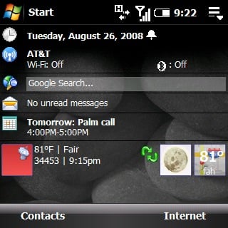
The Treo Pro does have some standard Palm innovations like displaying the time on the screen lock indicator, Google Search on the Today Screen, and also the MyTreo application for people that are new to Windows Mobile. Strangely missing, however, is Today Screen photo speed dial or the Maps application developed for the Treo 800w.
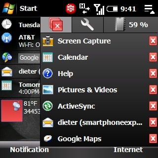
New to the Treo Pro is an improved memory management system they've licensed from HTC called simply “Task Manager.” It consists of two parts. The first is a plugin that allows you to set the “X” button on most apps to quit the application completely instead of just minimize it. The better part, however, is the Today Screen addition shown above. It gives you a drop down menu that displays your current Program Memory usage and a list of all open apps. You can use it to close all applications, close only certain applications, or switch to any open app. Kudos to Palm for licensing this from HTC.
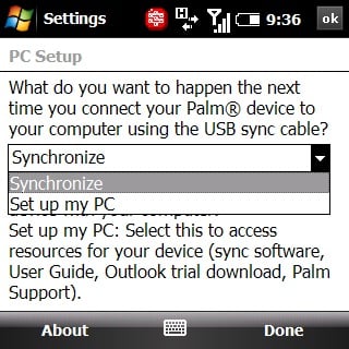
Probably the coolest “software touch” on the Treo Pro is the fact that you don't need to download ActiveSync from Microsoft's site to sync it, nor do you have to install it from a disk. Instead, the Treo Pro defaults to a mass storage mode. When you first plug the Treo in, it asks if you'd like to install ActiveSync and then goes ahead and does it, directly from the device. Afterwards it toggles the Treo Pro back into a standard ActiveSync mode.
If you plug the Treo Pro into a Mac, it shows as a small USB disk with a help file on it letting you know that Windows Mobile doesn't natively sync with Macs, but that there are 3rd party options available.
It would have been great if Palm had extended this functionality to do more -- if I were able to browse the entire file structure of the Treo Pro as though it were a flash drive (on a Mac), I would be in seventh heaven. Instead, the feature is limited pretty much to just the ability to install ActiveSync.
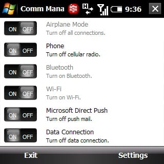
Palm also has a new Communications Manager as well.
Phone Calls
Another Palm innovation that's missing is the VCR-like buttons that appear when you dial into your voicemail (although it's possible my Treo Pro didn't recognize I was calling my voicemail number). On the bright side, Palm has finally gotten with the program and put large, touchable buttons on the in-call screen.
Because the Treo Pro's screen is flush with the front of the phone, Palm decided to automatically lock the screen while you're in calls; you need to use the D-Pad to hit the “unlock” button before you can tap the touchscreen to hit buttons. That's convenient, but the default highlighted button is the Mute button, so most people will just use the D-Pad to interact with the buttons anyway rather than navigate over to unlock, hit that, then lift their thumb up to tap another button.
Frankly, after using the iPhone, which has a proximity sensor to turn off the screen when it's up to your ear, the Treo Pro's method feels like a bit of a hassle. Not much more so than most other Treos, but a hassle by late 2008 standards.
In any case, calls on the Treo Pro were clear on both ends. The speaker on the back works well as a speakerphone -- it's loud enough and the placement of the speaker means you can hear even if the Treo Pro is sitting on your desk.
Camera

The Treo Pro's 2 megapixel camera is not going to win any photo awards, but it does the job. It handles very well in bright to medium light but falls short in low light. Palm's camera app has now-standard features like shooting video, panoramic mode, and sports-mode.
One amusing note: if you look at the metadata for images taken with the Treo Pro, it lists the camera as the “Treo 850.” Like the Centro before it, it looks like the Treo Pro has a 'hidden' model number.
Included Software
Here's a list of all the software that's preinstalled on a standard, unlocked Treo Pro:
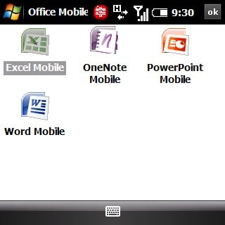
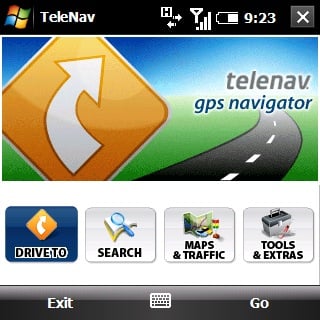
ActiveSync®; Adobe Reader LE; Bluetooth®; Bubble Breaker; Calculator; Calendar; Communications Manager; Contacts; File Explorer; Get WorldMate; GoogleMaps; Internet Explorer® Mobile; Messaging; Microsoft® Office Mobile including Excel® Mobile, OneNote Mobile, PowerPoint® Mobile, and Word Mobile; My Treo; Notes; Pics & Videos; QuickGPS; Quick Tour; SIM Manager; Solitaire; Sprite Backup; Streaming Media; Tasks; Telenav; Voice Command; Windows Live™; Windows Live™ Messenger; Windows Media® Player Mobile
Some thoughts on this list:
- Internet sharing is here and works great for tethering your laptop for 3G speeds. Just make sure you understand the potentially drastic effect this can have on your monthly bill -- most carriers require you sign up for a specific plan to use your Treo as a modem.
- Windows Live is the full version, including MSN Messenger. There is no other IM application included.
- Glad to see Google Maps is included on the base ROM. It works just fine with the Treo Pro's GPS with no extra configuration.
- It would have been nice if Palm has seen fit to include a better 3rd party browser like Opera 8.65 or even Opera 9.5.
- “Streaming Media” is another application licensed from HTC, it allows the Treo to view certain online media formats (like YouTube Mobile) that Windows Mobile doesn't necessarily support by default.
- Sprite Backup is a great addition to Palm's standard stable of Windows Mobile apps. It allows you to create full backups to your expansion card on a regular schedule.
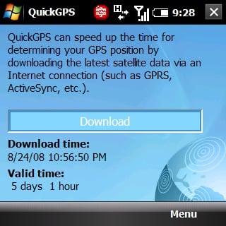
- QuickGPS allows the Treo to download GPS satellite positions for faster GPS fixes.
- Not listed above, but there are also some custom settings like Palm's WiFi settings modifications and the “PC Setup” setting mentioned earlier.
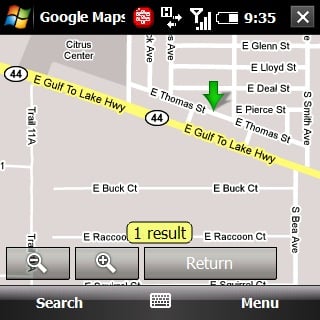
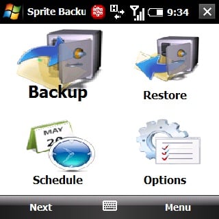

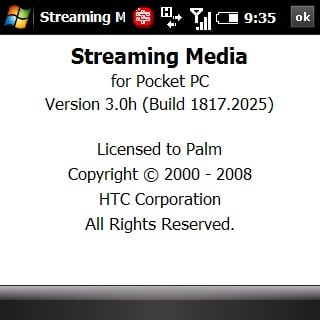
All in all, it's a pretty straight -foward set of default applications, though the lack of a built-in application that supports AOL Instant Messenger or Yahoo Messenger stings just a little. Fortunately, there are plenty of 3rd party companies offering software with that functionality.
One notable exception to the included software is Palm's custom threaded SMS app. The Treo Pro does, of course, have threaded SMS, but Palm has opted to stick with the default threaded SMS on Windows Mobile 6.1. There's plusses and minuses to this decision -- Palm's SMS app does a much better job of using screen real estate; the default is included with Pocket Outlook so it's easier to access it quickly. All in all it's a decision I understand -- maintaining a custom threaded SMS solution when there's already one built into Windows Mobile is probably something I'd eventually give the ax to myself.
Everyday Use
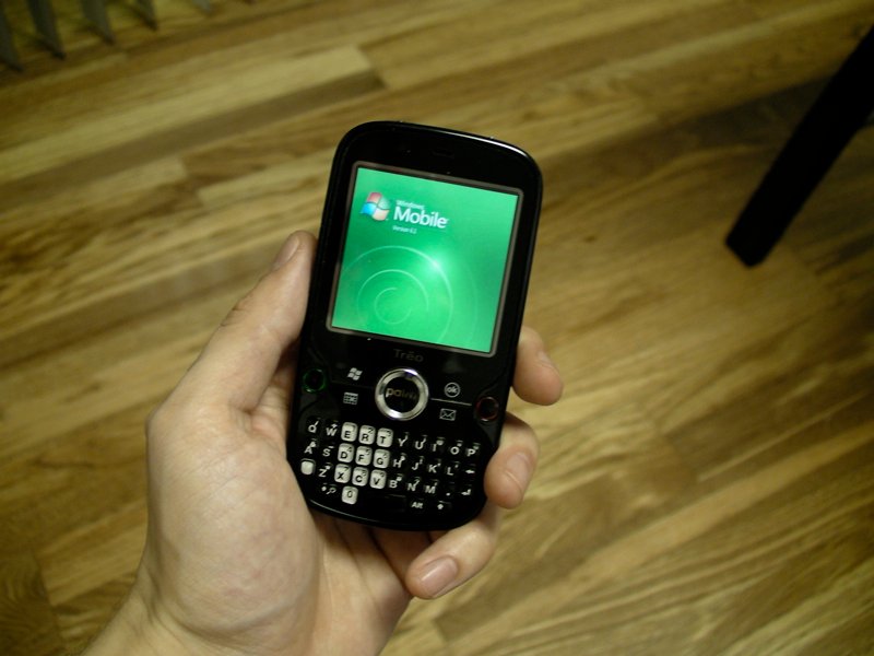
The Treo Pro has done a fine job slipping into my everyday life. Part of the reason that's possible is that I am already familiar with Windows Mobile. However, even to those unfamiliar with the OS it could be a great fit (see more just below).
In my everyday usage of the Treo Pro in the last week I haven't had any crashes that couldn't be attributed to 3rd party, Beta-stage software. In fact, I'm currently using the Treo Pro with Beta software and still taking “No Reboot Challenge” (day 3 and counting!). My battery life is slightly better than most smartphones I've used recently, Treo 800w included, giving me a full day of charge with moderately heavy usage and 2 days with medium usage. That 'medium' usage included push email, at least an hour's worth of web browsing, nearly an hour's worth of calls, an hour or so of music, and easily three hours worth of fiddling around with the OS and games over the course of two days.
Palm is famous for customizing Windows Mobile in a certain way: it may look like a plain-Jane install of WinMo, but underneath the hood there are many enhancements that tie it more closely to the hardware and overall speed it up immensely. The Treo 800w is probably the pinnacle of this philosophy: although it doesn't have specs that scream power, it is the snappiest Treo I've ever used.
Note that last sentence -- the Treo 800w is slightly faster than the Treo Pro in my everyday use. That's not to say the Treo Pro is slow at all -- I still find it faster than most Windows Mobile Pro devices, just not quite as quick as the Treo 800w. That, plus the fact that the Treo 800w has a better keyboard, should help ease some of the pain of Treo 800w owners who feel they've received the short end of the design stick from Palm.
As I mentioned at the beginning of the review, of all the smartphones I have available to me, the Treo Pro is the one I want for my everyday use.
Why the Treo Pro Will Be My “Main Brain”
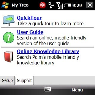
When people approach me and ask what kind of smartphone they should buy, my answer is always to stop them and ask them if they know which carrier or network they want to be on. Monthly fees always end up costing more than the phone itself and your smartphone is no good to you if you can't get signal (For more, see “How to Buy a Windows Mobile Phone”). So while the Treo 800w is “the most productive Treo I have ever used,” it's not a smartphone I can use every day, Sprint's signal is just too poor in my area.

I'm on AT&T, then, and when I wrote at the very beginning of this review that the Treo Pro is the culmination of many years of waiting, I meant it. Every smartphone presents compromises and when you're considering a smartphone you need to think about what's most important to you and find one that emphasizes those things. For me, the Treo Pro hits pretty much all of my “Must Haves” with no difficulty:
One Handed Use: My favorite smartphone form factor is still a touchscreen combined with a QWERTY keyboard underneath it. The Treo Pro fits this bill better than any other device currently on the market: it's easy to use one-handed and the fact that it has 5 customizable buttons within easy reach means it's easy to multitask without having to use both hands. The keyboard is easy to type on with one hand too.
Powerful OS: Windows Mobile 6.1 still isn't especially pretty and Palm hasn't included any of the eye-candy you can find on other Windows Mobile devices. Still, Windows Mobile 6.1 is flexible, powerful, and can be as easy to use as the PalmOS once you get your head wrapped around its metaphors for usage (for more, see “The Windows Mobile Interface”). There's a large body of great 3rd party software too.
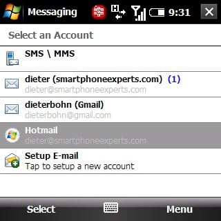
Good Messaging Support: Windows Mobile handles email very well -- with some software from SEVEN and Nuevasync, I am able to get push Gmail without having to hassle with forwarding to an Exchange server. Typing on the keyboard is “good enough” for me.
Decent Browser: Pocket Internet Explorer isn't exactly “decent,” but it does to job for light web browsing. For heavier web browsing, there is a great set of next-gen browsers coming online for Windows Mobile now and in the coming months.
Good Battery Life: The Treo Pro's got it.
Small Form Factor: Ditto.
Business Use
For the reasons above and for a few more, the Treo Pro his the sweet spot for this power user. I suspect it will do the same for other power users. The Treo Pro's real target market is business, however, and there I think it will be a qualified success.
Because it sports Windows Mobile 6.1, the Treo Pro has out-of-the-box support for push email, contacts, calendar, notes, and tasks with Exchange. Just as important for the enterprise, it's compatible with Microsoft's new Mobile Device Manager software, which allows sysadmins to manage Windows Mobile devices as easily as they manage desktops on their network. The Treo Pro is secure, fast, and offers Microsoft Office as well, letting you download, create, and edit documents directly on the device.

The Treo Pro's success in the enterprise will depend largely on whether or not Microsoft is able to make the argument overall that Windows Mobile is a better solution than BlackBerry for large companies. They're making a few inroads (especially internationally), but the jury really is still out on whether or not they'll be able to stop the BlackBerry juggernaut.
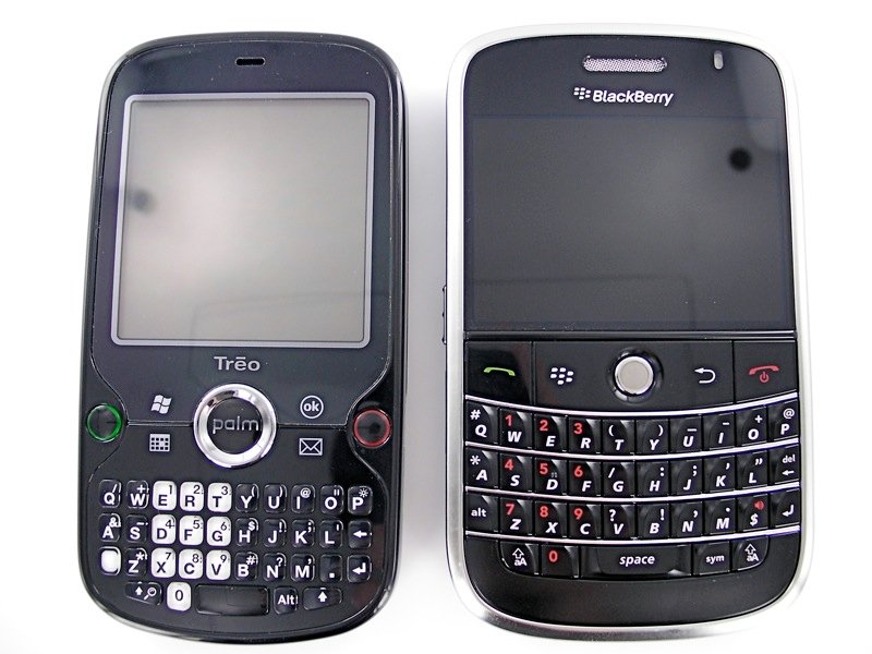
The Treo Pro certainly isn't going to be able to do it singlehandedly. For as innovative and cool as it is, it still isn't a BlackBerry Bold killer. The Bold is definitely the Treo Pro's main competitor, they both feature nearly identical radios and feature-sets. The breakdown of their respective advantages goes something like this:
- Treo Pro Advantages: Windows Mobile 6.1, smaller form factor, touchscreen
- BlackBerry Bold Advantages: BlackBerry OS, larger keyboard, higher resolution screen
Note that the OS is a 'Pro' for both devices. I prefer the Treo Pro because I prefer Windows Mobile, but in the corporate world I'd be in the minority. I personally think that the BlackBerry Bold is RIM's Treo 650: a great device that basically represents the pinnacle of what they can do now, but also signals the end-of-the-line for what they can get out of their current operating system. (There's a Master's Thesis on mobile technology in that last sentence if anybody's interested in writing it)
Time will tell with regard to the fight between Windows Mobile and the BlackBerry OS, but unless RIM has an entirely new OS up its sleeve, it's not well-positioned against Windows Mobile in the long term. Windows Mobile, for all its foibles (and they are many), has a clearer long-term development roadmap, a more flexible and scalable platform, and is much easier for 3rd parties to develop for. So far those advantages haven't been enough to seriously harm RIM, but if RIM doesn't continue to innovate they likely will.
Of course, Apple's the wildcard here, but Palm doesn't expect that the iPhone poses a serious threat in the enterprise space for either RIM or Microsoft (yet). The good news for all three companies is that there's plenty of room for everyone.
As for the other factors like the screens and keyboards, they are what they are. The Bold feels awfully wide, the Treo Pro feels a little cramped: pick your poison.
Conclusion
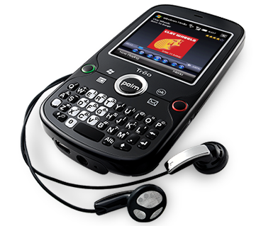
The Treo Pro is easily Palm's best Treo yet. It finally hits all of the feature checkmarks that users have been clamoring for and does it in a way that's well-integrated with the hardware. Where other smartphones have a tendency to just throw hardware onto a device and leave out making it easy to use, the Treo Pro rarely feels awkward.
Just as importantly, the Treo Pro is the first Treo in a long time to sport a thin and sexy form factor compared to other devices on the market. From the packaging to the look to build quality to feature set to battery life, the Treo Pro is a real winner and doesn't feel like it's a year behind the smartphone curve.
Of my quibbles with the Treo Pro, the biggest one is with the keyboard. Given the space Palm had to put the keyboard on this thin device, the sheet-printed, Centro-like keyboard was probably their best option. Even so, it still isn't as easy to type on as some of its competitors. For a device that's meant to compete in the serious email and messaging space, that's a pretty serious problem, but not so serious that I consider it a deal-breaker for the Treo Pro. The keyboard is “good enough” when you first use it and with some practice most users will find that they're nearly as quick as they might be with larger keyboards.
There's a lot to like about the Treo Pro and many of those elements don't come across well in photos or even descriptions. You really will need to get the device in your hands and perhaps even use it for a day or two before you can appreciate just how thoughtful the design is. Hopefully Palm will be able to get enough devices out there in Enterprise circles and get official carrier support from AT&T to enable enough users to experience the Treo Pro directly.
Meanwhile, I'll be keeping my review unit for as long as I can. This is almost exactly the smartphone I've been hoping for since the release of the Treo 700w and now that it's in my hands, I'm loathe to let it go.
| Ratings (out of 5)Form Factor: 5Build Quality: 5Features and Battery Life: 5Keyboard: 4Overall: | ProsThinHits all the big featuresGood battery lifeTreo design touchesConsKeyboardNo 'Soft Buttons' |
Phil is the father of two beautiful girls and is the Dad behind Modern Dad. Before that he spent seven years at the helm of Android Central. Before that he spent a decade in a newsroom of a two-time Pulitzer Prize-finalist newspaper. Before that — well, we don't talk much about those days. Subscribe to the Modern Dad newsletter!

