Review: Motorola Q9h Global for AT&T
All the latest news, reviews, and guides for Windows and Xbox diehards.
You are now subscribed
Your newsletter sign-up was successful
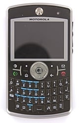
The Motorola Q9h (see our Video First Look Here) is clearly an improvement over its precedessor, the Motorola Q. It's more than just an “improvement,” though, it's an incredible improvement. Motorola has replaced what I considered to be probably the worst Windows Mobile Smartphone on the market with a model that seriously contends on the other end of that spectrum. Even though Motorola has essentially turned lead to gold, they've managed to hang on to what was actually good about the original Q.
The Q9h isn't all wine and roses, though. There are a few issues that, though not deal-breakers for me, might be deal-breakers for you. Read on for the full review.
Form Factor
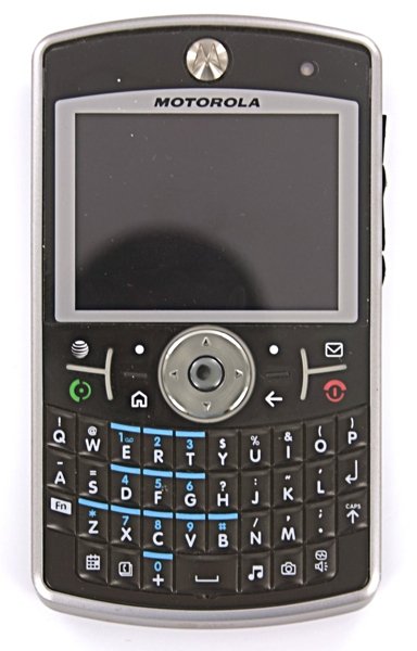
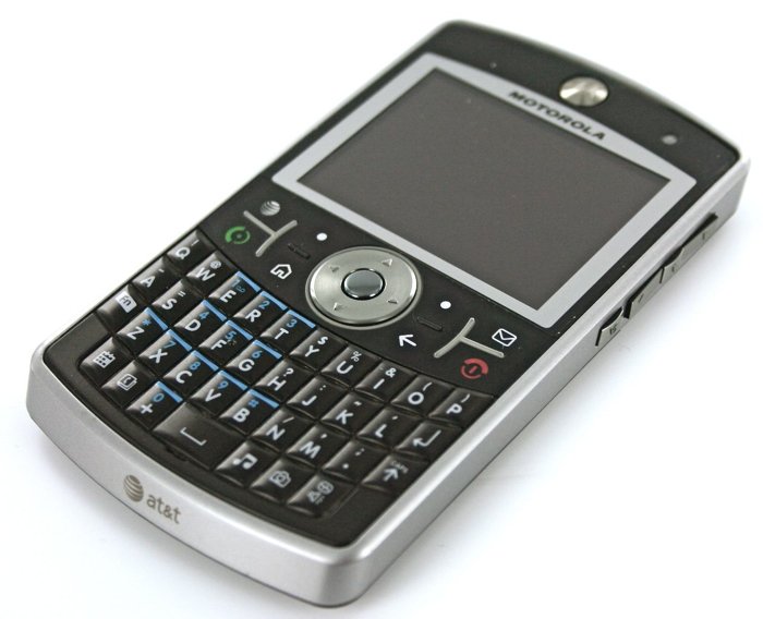
The Motorola Q9h has the standard form factor that I like to refer to as YAQKWMS (Yet Another QWERTY Keyboard Windows Mobile Smartphone). Which is to say it's a thin, flat slab with a full, front-facing QWERTY keyboard underneath a set of main buttons, which is in turn underneath a 320x240 landscape (non-touch) screen. It's the form factor shared by the T-Mobile Dash, the Samsung BlackJack and BlackJack II, the original Q, and several others.
Article continues below 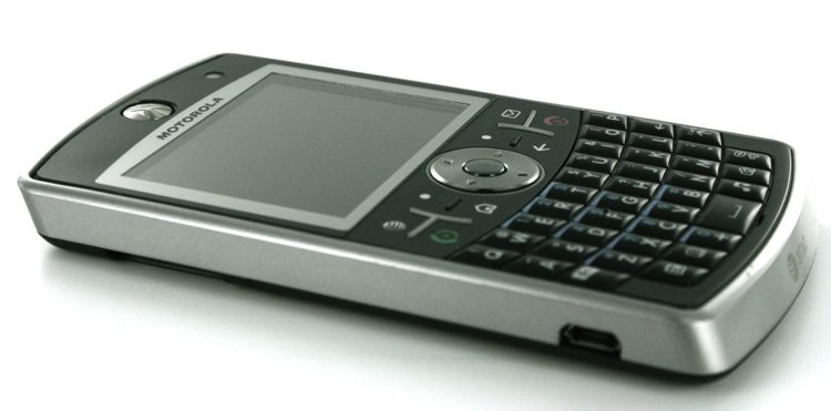
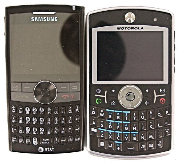
However, the Q9h differs from its YAWKWMS brethren in that it's significantly wider than most. It's wide to the point of feeling awkward in the hand and very awkward when being held up to your ear. At first, I seriously questioned this design decision -- I thought it was a continuation (an exacerbation, really) of a bad design choice made with the original Q. However, the width of the phone begins to make perfect sense when you start typing on the keyboard. Although I generally prefer the Treo's keyboard to the Q9h's (see When Thumbboards Attack!), I very quickly became used to this keyboard. The extra width makes is very nice to people with large thumbs.
Basically, once you realize that the Q9h is designed to be a powerful email and typing machine, you quickly forgive its added width when you're holding it up to your ear.
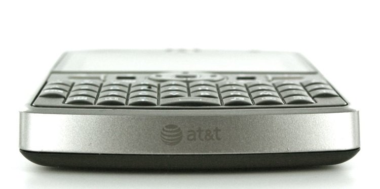
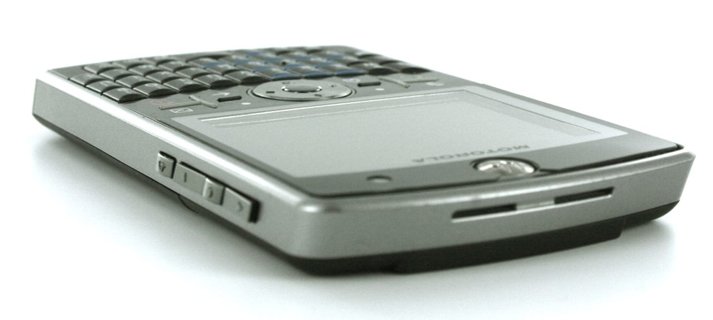
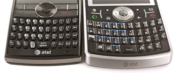
Staying with the keyboard for a moment, it's “smile-shaped” and the buttons have just the slightest matte-texture on them, to help with “gripability” for the keys. Each key is rounded horizontally, resulting in a very nice feel. Though the keys are placed directly adjacent to each other, the rounded shape makes it easy to hit the key you're looking for yet still feel like it's not some tic-tac sort of thing. Definitely a huge improvement over the original Q.
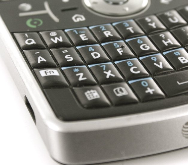
Generally speaking, the Q9h feels rock solid in the hand. There's absolutely no flex whatsoever, it's a solid slab of a device in both the good and the bad senses. The back of the phone has a “soft touch” finish, the edges are a metallic-colored hard plastic, and the front has a glossy plastic screen and the aforementioned keyboard. The main button board does tend to be a fingerprint magnet, but that pain is offset by the fact that the keys are well-separated with little rubber ridges.
All the latest news, reviews, and guides for Windows and Xbox diehards.
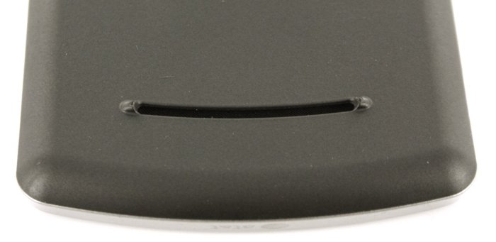
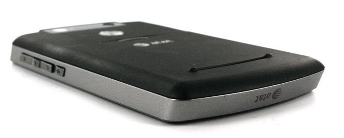
There are all sorts of nice design touches throughout the Q9h. There are ridges at the top of the device that are designed to be locked into Motorola's belt holster. There's an ambient light sensor on the front to automatically adjust the screen brightness. On the speaker grille on the bottom rear of the phone there are two small “nubs” that stick out just enough to ensure that the bottom of the phone won't be flush with your desk, thereby muffling the speaker.
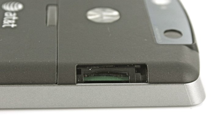
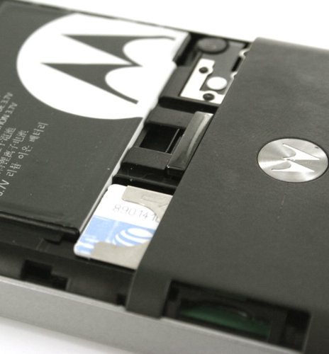
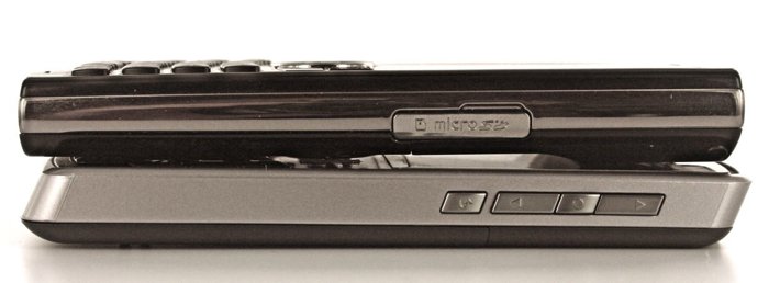
About the only complain I have is that the little rubber flap over the microSD card slot quickly lost its tab and would flap around. It was only a matter of time before I got sick of the thing and just yanked it out completely. Having a memory card slot I don't need to remove the battery cover to access is very nice, having a little rubber gee-gaw flopping around isn't.
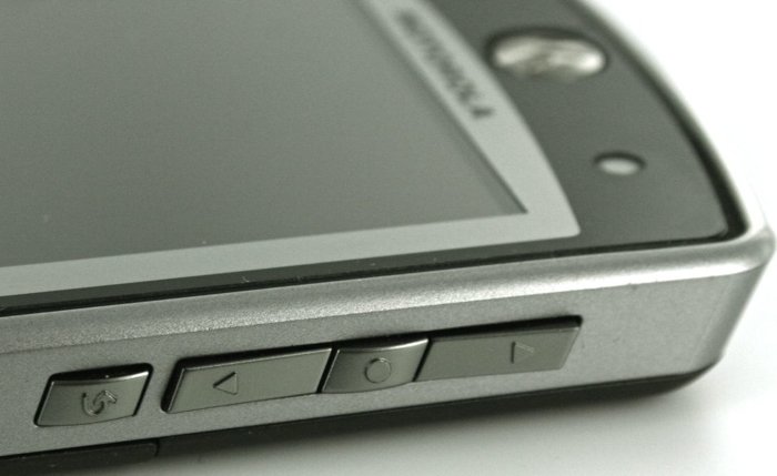
Rounding out the device, there are a few nice extra buttons at the bottom of the keyboard for Calendar, Contacts, Music, Camera, and even a dedicated speakerphone button (long-press for voice-activated commands). I thought that last was a waste of space at first, but I came to like having that button there. I ended up changing what all these buttons point to, I just wish I didn't have to resort to a registry hack to do it.
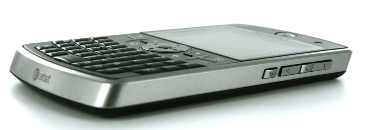
On the right side Motorola has ditched the scroll wheel on the Q9h in favor of Up, Down, Select, and Back. You can hold down the select button to turn the Up/Down into standard volume buttons (they switch automatically to that during a call) and the back button to switch to adjusting the ringer volume. In practice, I almost never used these buttons for navigating the phone, it was just too wide and too awkward to get a thumb or finger over there.
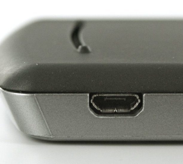
The Q9h uses Micro-USB for connectivity, though there does seem to be the same “standard but not standard” thing that I experienced with the original Q; namely, the phone seems to only want to charge properly with Motorola branded chargers (or chargers specifically designed to work with it). Once nice touch is the Q9h comes with a tiny Mini-USB to Micro-USB adapter.
A couple nice touches that I'll toss in this section: you hold down the home button for the quick list (much better than reaching to top of a device for a power button) and you can easily lock the keyboard by hitting Home + Space. Many devices make you go though hand-contortions or umpteen button presses to lock and unlock keys.
Specs
Let's take a quick look at the specs before we comment on them in detail:
- Weight: 4.73 ounces
- Dimensions: 4.65 x 2.63 x 0.47 inches
- Talk Time: Up to 9 hours
- Standby Time: Up to 30 days
- Bluetooth® Wireless 2.0 with stereo headset support
- Quad-band world phone - 850/900/1800/1900 MHZ
- Dual-band domestic UMTS/HSDPA
- Powered by 325 MHz processor
- Micro USB 2.0
- 256 MB Flash ROM plus 96 MB SDRAM
- MicroSD(TM) removable memory expands up to 32 GB
When comparing the Q9h to the BlackJack II, the thing that gave the Q9h the edge for me was the processor. It's fast for a Windows Mobile Standard device at 325MHz and it feels like its even faster. The OS is very responsive overall. The downside to a speedy processor is that it sucks down the battery life very quickly.
Using the standard, slim battery I was generally only able to eke out about 20 hours, in which span I would talk for about an hour, get email pushed (and checked hourly on my personal account), do a couple hours of web browsing and general fiddling around, and finally maybe 45 minutes of music. With much lighter usage I could maybe push it to 30 hours. Using the hump-back extended battery about doubled the above results.
How Motorola can claim the battery life results they do simply boggles the mind. I use EDGE in my area, making my results all the more disturbing, although I do think it evens out because the phone often had to work harder to get signal because of near-dead zones in my home and office. Still, the Q9h's battery clocks in at just over what I consider to be the absolute minimum acceptable level.
The Q9h has copious amounts of storage and program memory - I very rarely had to jump into the task manager to shut down programs in order to keep things snappy. Additionally, I never bothered storing anything except photos and music on the MicroSD card, the 130 or so megs of user-accessible storage was more than enough.
The Q9h is also called the Motorola Q9 Global, because its radio is a Quad-Band world radio. It will work anywhere on the planet. It supports EDGE and also the faster, 3G UMTS and HSDPA. In my testing the Q9h had significantly better reception than most of the other phones sitting on my desk. Whoever designed the radio antenna for this puppy did an outstanding job. Ditto for the on-board GPS, which was able to get fixes on satellites in under a minute almost without fail. There is no WiFi, unfortunately, but AT&T has 3G in most large areas and they're currently expanding their 3G network very rapidly.
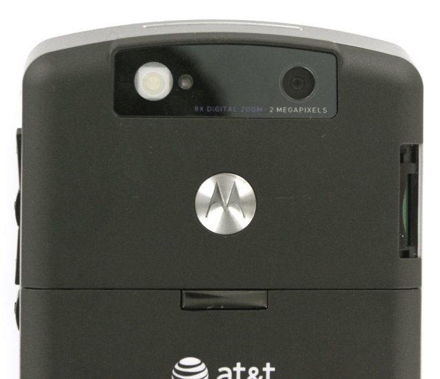
Finally, the 2 megapixel camera on the Q9h is very good. Below is a picture taken under not-ideal circumstances - low light, no flash, and an angry, fidgety, super-unhappy cat. LOLCat Captions are welcome in the comments. ;)

There is also a LED flash on the Q9h that is wickedly strong. You do have to manually turn it on and off via a menu (bummer), but it works very well as a camera flash and also as a flashlight (and heck, as a morse code device!). Rounding out the hardware, there are two (count them - two!) speakers on the rear of the phone for ringing, speakerphone, and music. These speakers have the best quality sound I've ever heard on a smartphone.
The Q9h also happens to be, you know, a phone. As I mentioned, the phone has very good reception, which means that call quality is very good. The speakerphone is loud and works very well.
Software
Of course, the Motorola Q9h runs Windows Mobile 6. This being WMExperts, I'll not say too much about WM6 except that it's the best mobile operating system ever and it may be responsible for bringing peace to the middle east in the near future.
In all seriousness, though, the nice thing about the Q9h and Windows Mobile is that it really shows that Windows Mobile can compete head-to-head with BlackBerrys. I prefer the WM system of email to BlackBerry, of course, but there's more to it. What's amazing is that in a form factor that's nigh-indistinguisable to the layman from a BlackBerry Curve you have two completely different devices. While both operating systems will allow you to do the basics of email fairly well, the Q9h absolutely is capable of better web browsing, document editing, games, you name it. With Motorola's relatively thoughtful integration of the hardware buttons into the Windows Mobile system of doing things, it only loses to the BlackBerry in “ease of use” by a few points.
I've often said that with Windows Mobile devices, the devil is in the details. You can take two Windows Mobile smartphones with nearly identical specs and form-factors and still have radically different experiences based on how much work the manufacturer has put into making the operating system and the hardware work well together. Add in the fact that Windows Mobile's default suite of apps has some very large gaps (Memo pad and a decent alarm clock app, for starters), and you quickly find that the quality of the device has very little to do with what the spec sheet tells you.
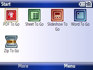
In this regard, the Q9h is a champ. We start out noting that Motorola chose to eschew two core apps in Windows Mobile: Pocket Internet Explorer and Office. Although the Office apps on Windows Mobile are pretty good (especially in Windows Mobile 6), they still aren't nearly as good as DocsToGo, which is the Q9h's default office suite.
But the biggest software advantage on the Q9h is that it uses Opera Mobile as its default browser instead of Pocket IE. Opera Mobile does, admittedly, have a hefty load time (around 10 seconds if it's not running in the background, instant if it is), it's well worth it. Opera mobile renders pages more accurately and also more legibly than Pocket IE. Although Opera Mobile 8.65 ain't no Safari (or SkyFire, or Opera Mobile 9.5, or even NetFront), it's currently the best browser available right now for Windows Mobile. Kudos to Motorola for including it by default on the device.
Other than those big two items, the software on the Q9h is a bit of a wash. You have, of course, the default AT&T applications that come on all their Windows Mobile devices, including download links to Music ID, XM Radio, TeleNav, MySpace Mobile, MyCast Weather, etc. Of those, only TeleNav is notable because the Q9h has built-in GPS. I've actually become a TeleNav convert after using the Q9h, I find it to be much more convenient than card-based GPS systems because I switch devices so often. If you're going to be sticking with the Q9h for awhile, though, I recommend you give On Course Navigator 6 a try (check out our review here).
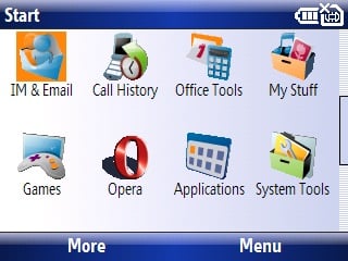
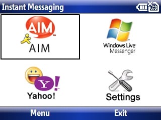
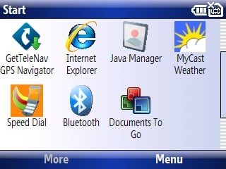
Another built-in app is OZ Messenger (it's called simply “IM”). OZ Messenger is used for IM on AIM, MSN, and Yahoo, and it works very well. They've also bundled downloads for Xpress Mail (AT&T's push-email service based on Seven's software) and Good's push email service as well. I like the idea of Xpress Mail quite a bit and use it whenever I can -- which was sadly not very often because the service seemed to be down so often.
In addition to the bundled apps, Motorola has tried to tame some of Windows Mobile's most arcane and annoying settings with their own custom preference apps. The first is a suite of Bluetooth control applications (which are all hidden away under the “Applications” submenu instead of the “System Tools” submenu, where you'd expect them). These apps offer quick on-off for Bluetooth and management of various Bluetooth devices. Since I use an A2DP device for music in the car and a separate, standard Bluetooth headset for phone conversations, I really appreciated this setup.
Under System tools, there's a nice Quick Start Guide, a couple different options for resetting the phone, a task manager that's fairly decent, and a couple other apps. There's also a “Personalize my Q” directory that contains shortcuts to changing ringtones, shortcuts, wallpapers, and more.
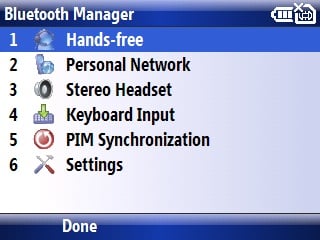
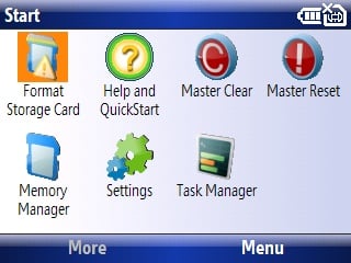
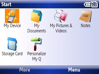
All in all, these extra added apps are very nice, but their placement in the Start menu seems haphazard at best. I would often find myself having to hunt around for this or that app, only to find it in a place I didn't expect. You can, of course, “app-unlock” your Q9h and move stuff in the start menu around, but it seems strange that Motorola put so much thought into the hardware and software integration yet completely dropped the ball on organizing their apps in the start menu. My guess is that, as usual, AT&T muscled their way in to foreground the stuff they make money off of and hide the stuff that's actually useful.
Comparisons
BlackJack II
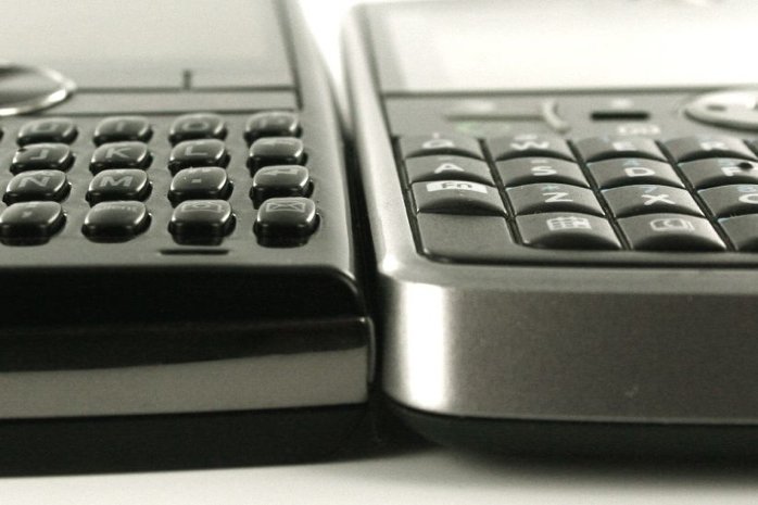
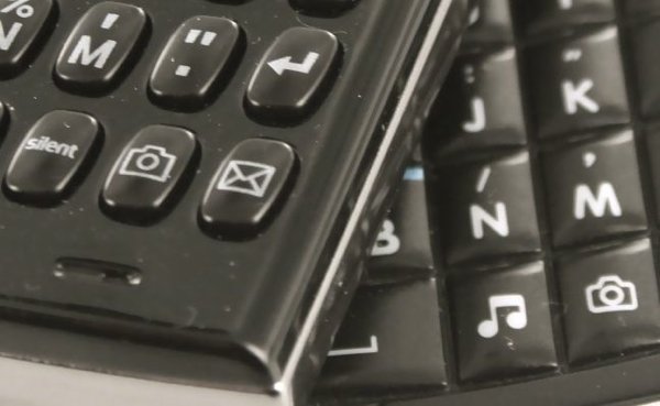
We've already published a fuller comparison of the Motorola Q9h and the BlackJack II. Here's the short version: except for battery life and width, the Q9h beats the BlackJack II in every way.
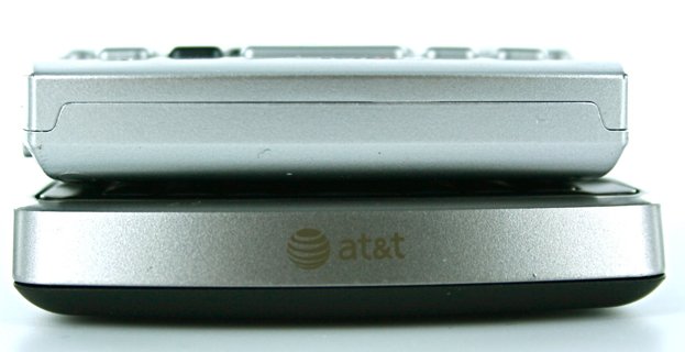
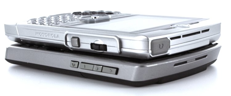
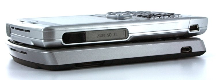
Still, though, everybody loves comparison shots:
Motorola Q
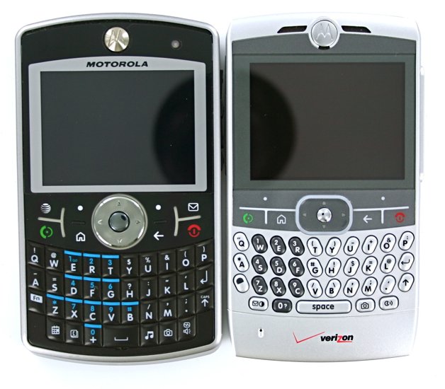
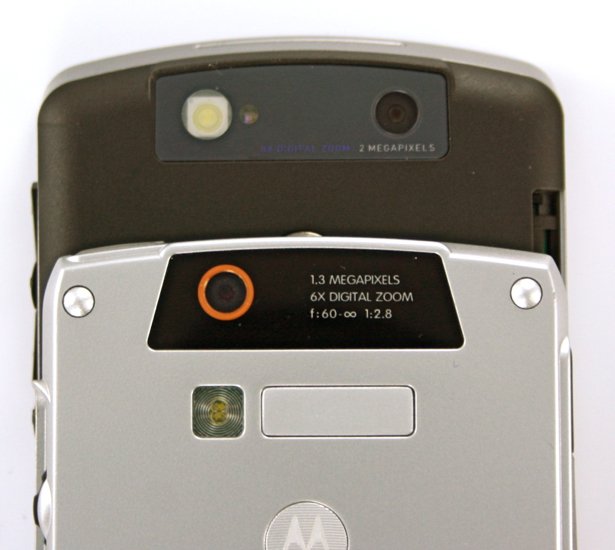
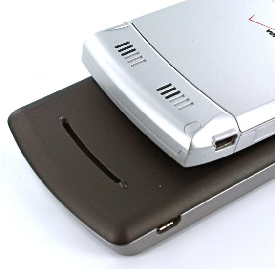
Comparing the Q9h to the original Motorola Q is a bit like comparing apples and oranges. The original Q was never made available on AT&T (or any other GSM network for that matter). A more apt comparison would be to compare the original Q to its direct successors, the Q9m and Q9c. What's more interesting, though, is that the Q9h and the CDMA Q9c/Q9m are actually completely different phones. Although they share similar keyboards and roughly similar form factors, they are in fact very different. Where the Q9h has a wedge-shape, the CDMA versions are squared off. The CDMA versions also kept the original Q's scroll wheel as well.
We'll do a fuller smackdown between the modern Q9s in a later post. For now, the really interesting thing is what I mentioned in the introduction -- that the Q9h keeps some of the original Q's good qualities while completely excising the bad ones. The speaker is kept in the same spot (and still has great volume), but there's no “hump” on the Q9h. The main button bar on both phones share some design cues, but the tactile feel on the newer Q is much improved. The Q9h also keeps that speakerphone button, but adds on several more for faster navigation.
Conclusion
The Motorola Q9h is the most powerful non-touchscreen Windows Mobile device available today, bar none. It's fast, it has a very capable web browser, and with its capacious keyboard it's the best email machine I've ever used. Add in on-board GPS and some other nice built-in software and you're looking at a real winner. The fit, finish, and overall quality of the hardware is second-to-none, as well.
There are downsides, though, two of them to be precise. The first is battery life. Motorola does include an extended battery, but it adds an ugly hump to the back of the phone. Unfortunately, the slim battery will last but a day for even casual users. Power users will need to either plug in or swap batteries at some point during the day.
The second downside is price -- the Q9h is currently $150 after rebates, $499 without. Compare that to the BlackJack II's $100 after, $349 without, and it becomes pretty difficult to justify.
Still, though, if you're in the market for a slim smartphone that rocks at email, the Motorola Q9h is my favorite choice.
| Ratings (out of 5)Fit and Finish: 5Connectivity: 5Software: 5Battery Life: 2Overall: | ProsExcellent keyboard.On-board GPS and 3G connectivityOpera and DocsToGo Standard.Very high quality hardwareExcellent speakerphoneFast and PowerfulConsBattery life is barely enough to get through a single day.More expensive than the competition. |

Home to the most invested and passionate Microsoft fans, Windows Central is the next generation destination for news, reviews, advice and buying recommendations on the Windows, PC and Xbox ecosystems, following all products, apps, software, AI advancements, and accessories. We've been around for more than decade, and we take our jobs seriously. Windows Central writers and editors value accuracy and editorial independence in everything we do, never receiving compensation for coverage and never pulling punches.
