Review: Microsoft KIN, Part Two: Software

While the KIN is being marketed as a Windows Phone, it doesn't run Windows Mobile or Windows Phone 7. The primary mission, if you will, of the KIN is to keep you in touch with your friends and social networks. While the KIN's OS is a dramatic departure from the traditional appearance of a Windows Phone, it does a decent job of keeping you in touch with your social networks.
The KIN may also give us a feel for the social networking abilities the upcoming Windows Phone 7 may have.
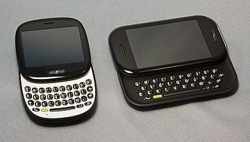
In Part One of this review we looked at the design of the KIN phones. While there are design differences between the KIN One and Two, with respects to the software, I can only think of one (the KIN Two has screen rotation).
Hit the break for more on the software, some screen shots and to find out what's missing.
Set-up
Once you power up your KIN Windows Phone, you are taken through a set-up wizard. You'll need a Windows Live I.D. and if you don't have one already, the wizard walks you through that setup as well. The KIN then walks you through setting up your social network feeds, contacts and email accounts. I found the process laid out rather nicely and it took about ten minutes to get the KIN up and running.
Features
Once set-up, you have three main screens to the KIN; Network Feeds (the main screen), Contacts, and Apps/Settings. There is no directional pad so your navigation is done solely by finger swipes.
Get the Windows Central Newsletter
All the latest news, reviews, and guides for Windows and Xbox diehards.

The Contact Page is much like People Tab in HTC's Sense/Touchflo. You can have nine contacts (your favorites) featured on this page as well as one shortcut to all contacts. Tap on a contact and you pull up that information as well as options to call, email, text and their latest Facebook/Twitter status.

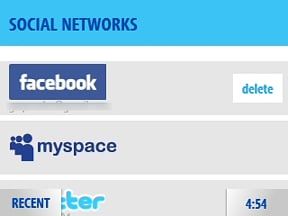
The Social Networking Feed page is the closest thing to a main page on the KIN. It updates automatically or manually and will display status/posts from your social networking friends. It also displays KIN Tips to help you in using your KIN. Tapping on one of the posts pulls it up full screen, shows any comments to the post and a field where you can post a comment.

The Apps Page is where you go to launch your email app, browser, camera gallery, search, phone dialer and various settings menus.
Apps
Browser

The Browser on the KIN takes a little getting used to. You've got the traditional URL entry field but favorites are thumbnailed above the URL field. You also have a back, refresh and stop icons. Zooming is done by "pinch to zoom" touches.
There are a few browser settings available but you have to go to the Settings App to access them. I could not find a way to access these settings directly through the browser.
Zune

The KIN utilizes the Microsoft Zune software for music, radio and video playback. You also have access to Zune Marketplace for songs (no apps yet).
Settings

While the Windows Phones running Windows Mobile has extensive settings, the KIN is rather restrictive in comparison. The KIN allows you access to settings for wireless controls (turning on/off Bluetooth, Wifi, Airplane Mode), a few phone settings, themes, ringers, screen lock and language.

You also have access to setting up/modifying email, social networking feeds, and browser settings from the Settings App.
The rest of the apps
Along with the Browser and Zune, you also have an email app, message center, alarm and camera apps. We'll touch base on the camera app when we discuss the KIN's performance in Part Three.

The Email App allows you to pull your email not only from your Windows Live Account but also other email sources (POP, GMail, Yahoo Mail, Exchange Server, etc.). You can add accounts and email settings directly from the Email App or from the Settings Menu.

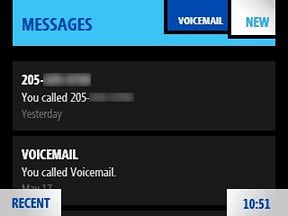
The Messaging App is where you can find your voice mail, call history and view/create text messages.
The KIN Spot
The KIN Spot is a nice software feature on the KIN Windows Phones. It's a que of sorts to drag/drop links, photos, posts, etc. that you find on your KIN that you'd like to share via email, MMS messages or upload to a social networking site.

If you find things from multiple sources (camera gallery, browser, social feed) you can tap/hold, then drag/drop these items into the KIN Spot. They are held there until your ready to send them out. Once your collection is complete, tap the KIN Spot and you are given the choice to upload the items or send them out via email or text message.
It really helps when you want to share multiple items.
KIN Studio

One feature of the KIN that I hope the Windows Phone 7 will have is the online component, KIN Studio. It reminded me a lot of Best Buy's mIQ or a scaled down Windows Live.
The KIN Studio is a little more user friendly than Windows Live in that navigation is more straight forward. I also found the KIN Studio a little smoother to explore than Windows Live (pages loaded quicker).
The KIN Studio offers access to your phone's photos and videos, messages, contacts, and social networking feeds. Photos and videos can be sorted by date and time which in turn can be arranged by month, week or day.
What's Missing?
The one glaring item missing from the KIN is a calendar. Its absence screams at you when you first skim through the software. You do have the ability to set alarms but if your day to day activities full of appointments, you're likely to pass on the KIN.
I'm sure most teenagers wouldn't keep track of their appointment with diligence but many would and the older they became, the more useful a calendar would become. The lack of a calendar is a missing essential in my opinion.

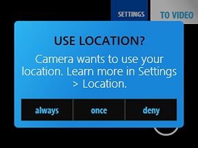
The other big ticket item that's missing on the KIN is GPS. We've gotten spoiled with the Windows Phone of today in that just about every one of them has GPS. The KIN does have a-GPS for geo-tagging your photos and to satisfy 911 requirements.
I don't know if there's a space issue but a full-fledged GPS would have been nice. Even though you can't load BING, Google Maps or other apps on the KIN that would make use of GPS, one day you might.
Lastly, the KIN does not have an on-screen keyboard. While the KIN One doesn't have the screen real estate to accommodate an on-screen keyboard, the KIN Two does. An on-screen keyboard would allow you to type in quick responses without the need to extend the keyboard every time. I think it would help improve the efficiency of the KIN Two.
Overall Impression
I will admit it took some time to get used to the KIN's software. Initially, the main screen with the network feeds seemed cluttered but the software wasn't that difficult to learn. The very noticeable departure from the traditional Windows Phone was what took getting used to.
It was disappointing to see the lack of a calendar and on-screen keyboard. You can probably live without the on-screen keyboard but the KIN just feels incomplete without a calendar.
For what the KIN's are designed for, to navigate your social life, the OS and installed apps do the job well. I like the way the Contacts Page is laid out and the KIN Spot. The Feed Reader pulls all your social networking under one roof and once you get used to the appearance, it does help you stay up to date with your friends.
Next up, the KIN's performance. We've touch on several performance issues while looking at the KIN's design and software but now we'll look to see how well the KIN cranks social up to 11 and allows you to share life as you're living it.
George is the Reviews Editor at Windows Central, concentrating on Windows 10 PC and Mobile apps. He's been a supporter of the platform since the days of Windows CE and uses his current Windows 10 Mobile phone daily to keep up with life and enjoy a game during down time.
