Review: Microsoft KIN, Part One: Design
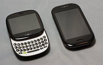
The Microsoft KIN has been on the market for a few weeks now and we've shared a brief video tour of both KIN models and now we'll take a closer look at the latest Windows Phone from Microsoft.
Reviewing a single Windows Phone has its challenges and looking at two phones at the same time is really challenging. To help maintain sanity and break things down a little better, we'll separate things into three parts: design, software and performance.
The initial impression of the KIN (both One and Two) is that the phones were more like a feature phone with a little more "feature" thrown in. I don't believe either were designed to replace your Windows Phone running Windows Mobile but instead, to offer an alternative to those who don't need as much.
We start with looking at the KIN's design. While the KIN Two has more of a traditional design, the KIN One compactness stands out. Ease on past the break to read more on the design and what impression it left.
What's in the Tube?
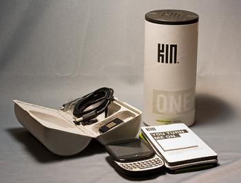
The KIN does make an impression. It's just hard to decide whether or not it's a good one or bad. From the compact style of the KIN One to the cylindrical packaging, the KIN (especially the KIN One) is a unique Windows Phone.
Both KINs are packages in clamshell, cylindrical boxes that slide into tubes. Each are packaged with the battery, USB cable (micro-USB adapter), wall plug, stereo ear buds, and documentation.
Get the Windows Central Newsletter
All the latest news, reviews, and guides for Windows and Xbox diehards.
Build Quality and Design
Out of the box, the KIN One and Two felt solidly built. There was a bit of a plastic feel to both Windows Phones but neither felt flimsy. The sliding keyboards on both, have smooth movement and snap into place with confidence. I have to compliment Microsoft on putting a matte black finish on the back cover of both phones.
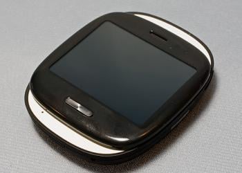
The tale of the tape has the KIN One measuring 3.31x2.66x.73 inches and weighing in at 3.9 ounces. The KIN Two comes in at 4.38 x 2.36 x .64 inches and 4.7 ounces.
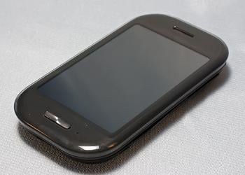
The KIN One has a 2.6" 320x240 capacitive touch screen while the KIN Two sports a 3.4" 320x480 screen. The screens look nice and are very receptive to the touch. My only complaint on the screens is that each phone has a clear plastic facing which is very fingerprint friendly.
Due to it's smaller form factor, the KIN One won't appeal to some. I found it to be too small for my hands but my 14 year old son didn't have the same issues. The compact size is convenient but doesn't always lend itself toward productivity.
The KIN Two is more of your traditional design and feels similar to the Samsung Omnia or a slightly shorter Touch Pro 2.
Button Layout
Both the KINS share the same exterior buttons and ports. The KIN has a micro-USB port, 3.5mm headphone jack, volume keys, camera button, power button and back button. The controls are better spread out on the KIN Two due to its larger size.
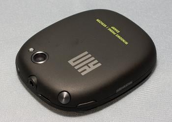
The buttons on the KIN One don't enjoy the same spaciousness that can cause problems until you get used to things. More times than not, I pressed the camera button thinking it was the power button. After a few days using the KIN One, my fingers began to instinctively slide a little further down to find the power button.
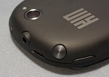
The Camera Button is one of two ways to activate the camera. By pressing it fully and holding it down, you'll launch the camera app. Once the KIN is in camera mode, pressing the button half-way focuses the camera and pressing if down completely takes the picture. You can also use the camera icon that appears on the screen to activate the shutter.
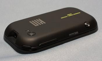
The buttons on both KIN models were responsive but the camera button was a little on the soft side (most notably on the KIN Two). It took a conservative effort to press the camera button all the way down without changing the camera's framing. I found it easier to use the on-screen shutter button.
Under the Hood
Key differences under the hood on the KINS are that the KIN One has 4 gigabytes of storage while the KIN Two has 8 gigabytes. Both have 256mb of RAM, Wifi, Bluetooth, Nvidia Tegra 600mhz processors and utilize a-GPS. The KIN One has a 5mp camera with light, while the KIN Two has an 8mp camera with light. Both have still and video capture capabilities.
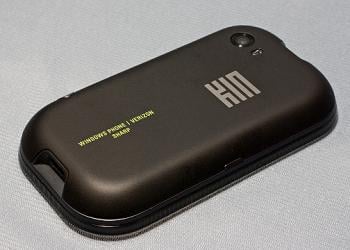
The KIN One is powered by a 1240mah battery while the KIN Two has a 1390mah battery. Both batteries are a little on the light side, especially with the KIN One. As data dependent as these phones are, the batteries really need to be larger. The KIN Two was able to make it through the day on one charge but the KIN One needed a re-charge by mid-afternoon.
The KIN Two has an accelerometer and neither have an on-screen keyboard. The lack of an on-screen keyboard was a little disappointing and while the KIN One doesn't have the screen real estate to accommodate an on-screen keyboard, the KIN Two does. An on-screen keyboard would allow you to type in quick responses without the need to extend the keyboard every time. I think it would help improve the efficiency of the KIN Two.
Keyboard
Speaking of which, the KIN keyboard is very basic in design, offering alpha and numerical characters. There is no function shortcuts or hot keys to applications.
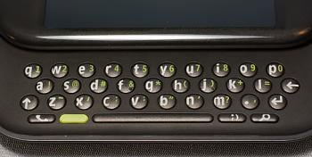
The KIN One's keyboard is more compact (due to the smaller size) and there is a slight curvature to the keyboard that accentuates the compactness. The KIN Two's keyboard has more room and lies flat. Microsoft could probably get away with slightly larger keys on the KIN Two but I would imagine to keep production costs down, they opted for the same size keys for both.
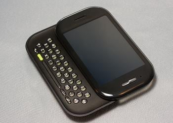
The keys were a little on the firm side but typing wasn't too difficult on either. You do have one key that pulls up symbols to use in emoticons ( :), ;). :p, etc). While this may not be an important feature to most, keep in mind the targeted audience for the KIN. My teenage son liked the convenience of this feature while texting.
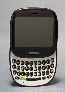
The build quality of the sliding keyboards feels solid. There is a slight wiggle with both the KIN One and Two when the keyboards are extended but not to the level of causing alarm.
Overall Impressions
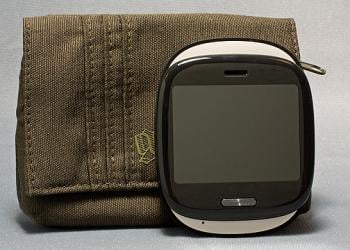
With respect to the KIN's build quality and design, there are very little complaints. Granted, the KIN One was a little on the small size for my hands it did feel well built. I would have liked to have seen the buttons spread out a little more (maybe moving the power button or camera button lower on the phone) but in time, I got used to the layout.
Neither phone will weigh you down and were very comfortable being carried in a shirt pocket. Cases will take a little creativity for the KIN ONE due to its unique size. The KIN Two is close enough in size to other Windows Phones that case selection shouldn't be an issue. Personally, I used a Golla Pouch with the KIN One and a Nite Ize Cargo Case for the KIN Two.
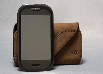
I can see the appeal of the KIN One with the younger crowd but the KIN Two fit my hands better. My son and daughter thought the KIN One was the "cooler" of the two while my wife thought it was the "cuter" of the two but saw the KIN Two as more practical. Just as the KIN itself will appeal to a select Windows Phone crowd, the designs of the two KINs have their own unique target audience.
Stay tuned. In part two of the review, we'll take a look at the software driving the KIN. In using the KIN for a short time, it became clear that the KIN wasn't your typical Windows Phone.

Daniel Rubino is the Editor-in-chief of Windows Central. He is also the head reviewer, podcast co-host, and analyst. He has been covering Microsoft since 2007 when this site was called WMExperts (and later Windows Phone Central). His interests include Windows, laptops, next-gen computing, and wearable tech. He has reviewed laptops for over 10 years and is particularly fond of 2-in-1 convertibles, Arm64 processors, new form factors, and thin-and-light PCs. Before all this tech stuff, he worked on a Ph.D. in linguistics, performed polysomnographs in NYC, and was a motion-picture operator for 17 years.
