Review: HTC Touch Dual
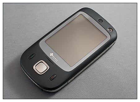
With new devices heading our way like the HTC Touch Diamond 2, Touch Pro 2, the Garmin M20 and possibly the Toshiba TG01, we thought we'd take a step back and look at an older Windows Mobile Phone that has enjoyed its fair share of popularity. The HTC Touch Dual was announced back in October 2007 and was released in European and U.S. versions. The phone briefly went Hollywood with its starring role in the short-lived television series "My Own Worst Enemy". The Touch dual is still in production and can be found at various retail outlets at a modest price. To see what all the HTC Touch Dual has to offer, follow the break.
Out of the Box
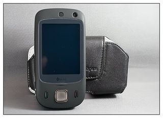
Only knowing the HTC Touch Dual from pictures, I was expecting a larger, heavier phone and was surprised at how it felt out of the box. Measuring 4.21" x 2.16" x .62" and weighing 4.23 ounces, the Touch Dual felt nice in my hands. The matte black finish with the gray trim around the screen and silver accents made the device look equally good. Why HTC didn't continue the soft finish with later models such as the Touch Pro and Diamond is a mystery. The Dual comes package with the customary software disc, documentation, wall charger, sync cable and mini-USB headset.

Installing the SIM card is a bit of a challenge. Remember the puzzle boxes with the secret compartment? The Dual might qualify for such a designation. While most phones place the SIM card beneath the battery, the Dual places it to the side of the phone in a slot that is concealed by the silver side trim. To access it, you remove the battery and "pop" the side trim section just beneath the volume key to reveal the SIM slot. Once the SIM is in place, everything snaps back into place. One footnote with regards to SIM card placement is that it appears that the Dual's design changed at some point, moving the SIM card slot beneath the battery. The online documentation has the SIM located under the battery while the printed documentation has it to the side of the phone.
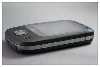
The face of the Dual has a 2.6", 240x320 resistive touchscreen, an answer button, end button and five-way controller. Just above the screen rests a front facing camera that is ideal for video conferencing or self-inflicted photography. On the backside of the Dual, you will find the rear facing camera and the speaker. To the left side you will find the volume keys and micro-SD card slot.
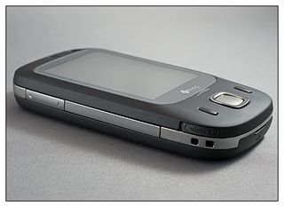
To the right side is the power button and camera button, and the sync/charge/headphone port and reset button located at the bottom of the Dual. Unlike the HTC Touch Diamond/Pro the mini-USB port on the Dual has a plastic cover. The little plastic cover seats really good. So good that it can be a pain to remove. As much as you use this port, I would have rather seen it exposed as it is on the other HTC phones.
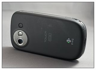
The camera button matches the horizontal layout the camera application presents. You can actuate the shutter with the center control button but the right side button works will with the display orientation. Image quality for the Dual's camera is "so-so."
Under the hood, the Touch Dual sports a 400MHz processor and 128MB RAM/256MB ROM. The Dual runs Windows Mobile 6.1 Professional and features HTC's Touchflo 2 user interface. While it has Bluetooth, what's missing is WiFi and GPS. Everything is powered by a 1350mAh battery that will get you through the day with light to moderate use.
Get the Windows Central Newsletter
All the latest news, reviews, and guides for Windows and Xbox diehards.
Sliding keypad
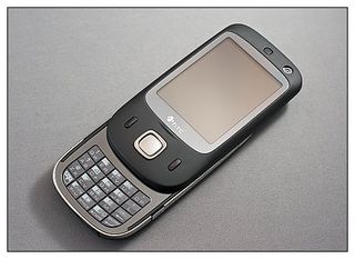
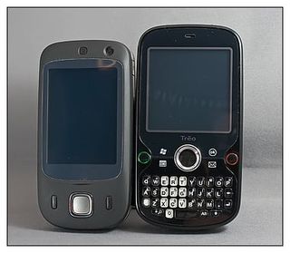
For the most part, the Dual is designed really well. It felt comfortable in my hand, the spring assisted slider was smooth and the controls operated crisply (no soft, mushy feeling buttons). The key design feature is the twenty key, bottom sliding keypad. The keypad is somewhere in between a T9 keypad and a full QWERTY keyboard. The T9, found on most "dumb phones," typically has three characters per key. The 20-key, keypad on the Dual has no more than two characters per key in addition to a enter and back/delete button. It also has an alternate key for symbols, numerics, and one function key (vibrate mode).
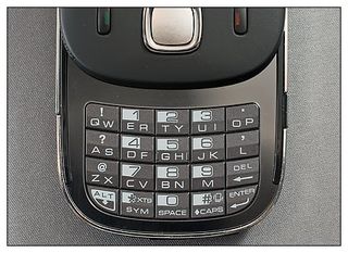
It may be a case that I've grown so accustomed to the full-QWERTY keyboard but I didn't like the 20-key design. It's cumbersome to do any serious typing on and lacks the features/function keys the full keyboard can have. While the Dual was innovative at the time of release, it would have really turned heads if it had a full-QWERTY keyboard. The form factor isn't far from the Palm Pre or Samsung Propel (both of which have bottom sliding QWERTY keyboards) so it shouldn't have been too far of a reach.
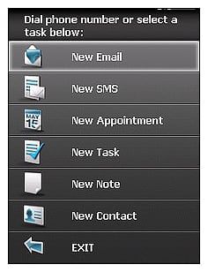
In extending the keypad, you pull up a short cut menu that allows you to go directly to creating a new SMS, email, task, contact, or appointment. Simply hit the "end" key to be sent back to the Today Screen.
TouchFLO 2
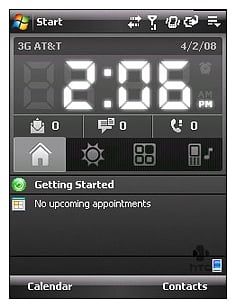
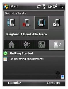
Looking back at older phones can be difficult, especially after being exposed to the more current (and future) models. We look at the old "bag phones" as clunky, large, cumbersome devices but when they first hit the market they were praised as innovative and life-changing. So when you look at older Windows phones you have to put some things in perspective. The Touch Dual featured a relatively new user interface that HTC called TouchFLO 2, which was an updated version of HTC's original TouchFLO user interface. TouchFLO 2 was more robust with a few new features than the original while it wasn't a deal breaker for the Dual, it help distinguish HTC phones from others and was a nice bonus to have.
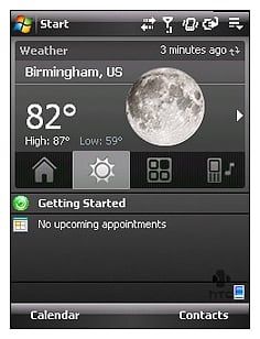
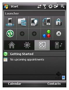
While TouchFLO 2 would eventually be succeeded by TouchFLO 3D, it wasn't too shabby when it showed up on the Touch Dual. It reminds me of SPB Mobile Shell's (version 2) Today Screen plug-in. TouchFLO 2 centered around a clock (that would send you to the alarm screen) with tabbed sections for different software features. The home tab displayed the clock and your messaging icons. The weather tab brought you your local weather information. The Launcher tab pulled up a customizable icon display of your favorite programs and the Sound tab was a short cut to change your phones ringer profile.
While not as snazzy as TouchFLO 3D, TouchFLO 2 put a lot of functionality to the Today Screen and helped make the Dual an attractive phone. While a lot can be said about the flashy appearance of TouchFLO 3D, the simplistic functionality of TouchFLO 2 was hard to ignore.
Performance
As a phone, the HTC Dual performs as any other cellular phone should. Calls came in loud and clear and the microphone picked up my voice without difficulty. Incoming calls are answered by either extending the keypad or pressing the green "answer" key.
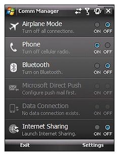
The Dual runs Windows Mobile 6.1 Professional and has the standard bells and whistles most unbranded phones will have. I was a little surprised to see the GPS applications in the settings seeing that the Dual doesn't have a GPS receiver. This is probably standard with WM 6.1 and more trouble than worth for HTC to remove it.
Applications opened, closed and functioned with very little pause and I was surprised how well the 400MHz processor handled things. Battery life was marginal with the Dual lasting a full day (6 a.m. to 8 p.m.) of light to moderate use without the need for recharging.
The resistive touchscreen was responsive. I had no problem getting a response in the corners or edges of the screen. My only nit with the screen is with the on-screen keyboards. This is likely due to the age of the phone, but it would have been nice to have an on-screen QWERTY keyboard of size. You do have a on-screen QWERTY keyboard but it's rather on the small size. I found myself using the slide out keypad for dialing but wanted the advantage of a full keyboard to use when I had to do typing. The size of the on-screen keyboard wasn't much of an advantage.
Overall Advantage
All in all, I liked the Touch Dual. While I didn't care for the 20-key keypad or the on-screen keyboards, there are enough third party virtual keyboards out there to make up the difference. Size, feel, and overall performance was very good.
With the pending release of new HTC phones such as the Touch Pro 2 and Diamond 2, as well as current models such as the Diamond and Touch Pro I tried to find a reason why anyone would choose the Touch Dual. It lacks GPS and Wifi, doubtful it will be upgraded to Windows Mobile 6.5 but would be a good choice for an entry level Windows Mobile phone. The cost is a little on the high side (it may drop when the newer phones become available) but I'd be inclined to choose the HTC Touch Dual over, say, the LG Incite.
Overall: 4/5


| ProsComfortable in the handGood Call QualitySolid ConstructionMatte Black Finish!ConsOlder Phone20-Key Pad takes some getting used toNo Wifi, GPS |
Phil is the father of two beautiful girls and is the Dad behind Modern Dad. Before that he spent seven years at the helm of Android Central. Before that he spent a decade in a newsroom of a two-time Pulitzer Prize-finalist newspaper. Before that — well, we don't talk much about those days. Subscribe to the Modern Dad newsletter!
