Review: HTC Touch Diamond 2
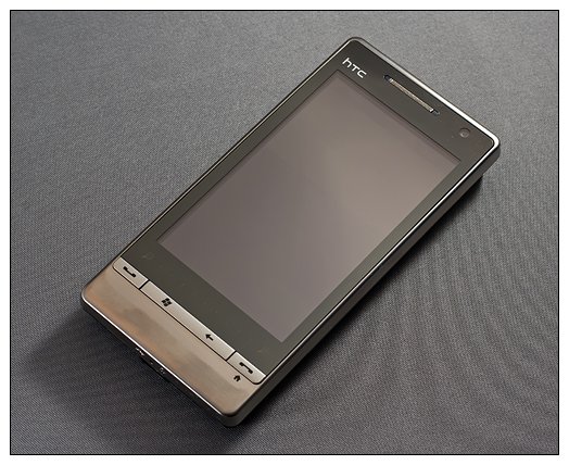
HTC took center stage at the 2009 Mobile World Congress with the introduction of the HTC Touch Pro 2 and the HTC Touch Diamond 2. While we patiently wait for these two new devices to hit U.S. soil, they are finding their way into the European and Asian markets. When offered the chance to review the European version of the Touch Diamond 2, we didn't hesitate. There will may be differences between the European and U.S. versions of this phone, but there should be enough similarities to give us a good idea of what to expect when the Touch Diamond 2 hits U.S. shelves later this year.
Follow the break to see what type impression the European version of the Touch Diamond 2 made.
First Impressions
They say first impressions makes the greatest impact, and the Touch Diamond 2 makes one heck of an impact. Out of the box, the Touch Diamond 2 is very impressive with regards to feel and build quality. Measuring 4.25 inches long, 2.09 inches wide and .54 inches thick, the Touch Diamond 2 weighs in at only 4.15 ounces.
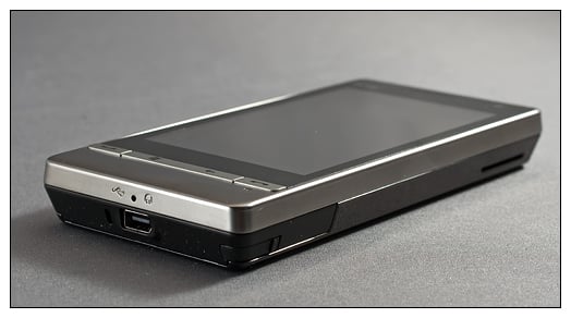
The front of the Touch Diamond is dominated by a 3.2-inch, 480x800 WVGA touchscreen. On the left side you'll find the volume keys (a one-piece toggle button) and on the right is the stylus slot and speaker. On the top is your power/sleep button and at the bottom of the phone is your microphone and mini-USB port (for charging/synchronization/headphones). It goes without saying but bears repeating: There's no 3.5mm headphone jack. Grrrrrrrrr.
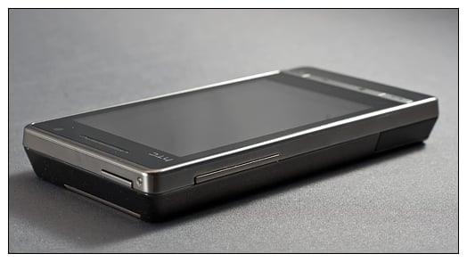
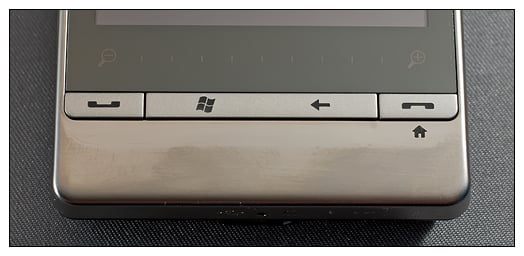
At the bottom of the phone's face are five controls: the answer key, end key, Windows Mobile start key, back button and a zoom slider. The end key also serves as a "home" key. The zoom slider is a nice addition, but it took some time to get used to the lack of a five-way controller. The zoom slider enlarges web sites, emails, notes, etc. I like the slider design better than the spinning wheel design of the original Touch Diamond and Touch Pro. And it takes up way less space.
The only criticism I have on the design and build of the TD2 is the shiny black plastic used for the battery cover. It's nice that HTC opted out of the "diamond cut" pattern for the battery cover but it would have been nice to have seen a matte black finish (a.k.a. HTC Snap finish) on the TD2.
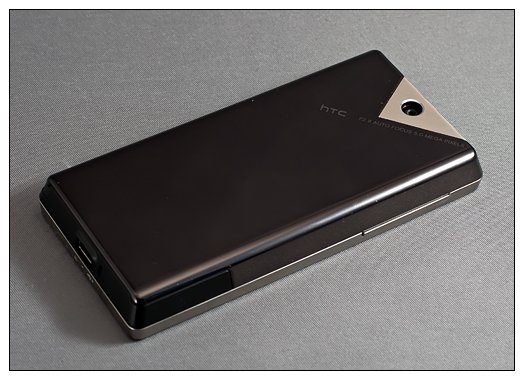
The Touch Diamond 2 felt really good in the hand. It's slightly longer than the original Touch Diamond and a smidgen heavy but the added weight is well balanced.
Get the Windows Central Newsletter
All the latest news, reviews, and guides for Windows and Xbox diehards.
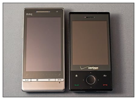
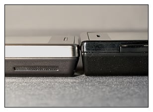
| Diminsions (LxWxD) | Weight | |
| Touch Diamond 2 | 4.25” x 2.09” x .54” | 4.15 oz |
| Touch Diamond | 4” x 2” x .53” | 4.07 oz |
| Touch Pro | 4” x 2” x .7” | 5.8 oz |
| Snap | 4.59” x 2.42” x .47” | 4.23 oz |
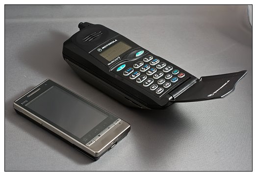
While the original Touch Pro/Fuze isn't a shabby phone by any stretch, the TD2 makes it feel like a small brick. I recently ran across an old Motorola StarTac cellphone that was "the portable phone" about 20 years ago. While the TD2 increased slightly in size from the original, it's puny compared to what used to be considered compact.
The Touch Diamond 2 was packaged with a charger, sync cable, stereo headset, screen protector, extra stylus and a soft case. There's no telling what the U.S. version will be packaged with, but the extra stylus and case were a nice touch.
Looks Ain't Everything
While the TD2 tops the charts in appearance, this won't add up to a hill of beans if it can't perform. Under the hood you will find a Qualcomm MSM7200A 528MHz processor supported by 512MB ROM and 288MB RAM. Where the original Touch Diamond only sported an internal 4GB of storage, the TD2 uses a microSD card for expansion. That's a welcome change for those of us who prefer the portability of memory cards and need more than 4GB of on-board memory.
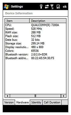
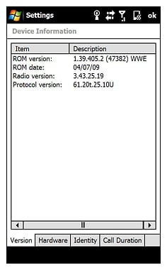
The TD2 we tested is the European version and thus fitted with European radios. That means it's not compatible with U.S. 3G networks. The best reception in the States this TD2 can achieve is 2G. The TD2 has Bluetooth, WiFi and GPS radios and sports two cameras (a 5mp auto-focus on the back, and VGA CMOS camera on the front for video conferencing — something else not really popular in the U.S.).The GPS performed well. Much better than the AT&T Fuze's GPS, actually. Location acquisition was fast and accurate.
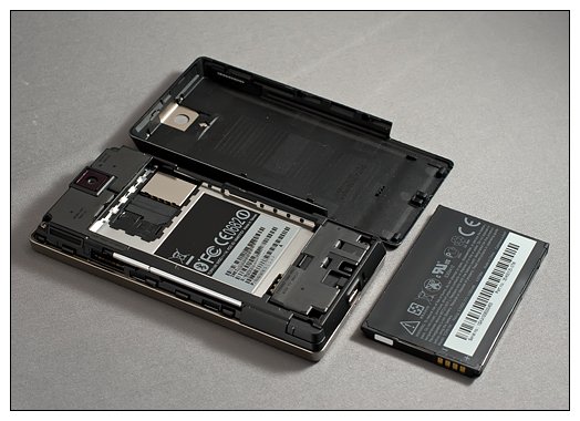
The TD2 is powered by a Lithium-Ion, 1100mAh battery. It seemed a tad on the weak side, but it surprisingly made it through the day with moderate use without needing a recharge. Still, one can hope that a 1500mAh battery finds its way into the U.S. version (hint, hint).
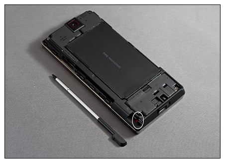
One change in the Touch Diamond's design that I'm not a big fan of is that the reset button was moved from the bottom of the phone to under the battery cover, similar to the Palm Treo Pro. Fortunately, the battery cover on the TD2 is easier to remove than the Treo Pro's cover but it's still a pain to have to take the back cover off to perform a soft reset. I do like that it's a big RED reset button, but it needs to be more conveniently located.
Software
The TD2 is currently running Windows Mobile 6.1 and from what we understand, does qualify for an upgrade to Windows Mobile 6.5. If the software on the European version makes its way onto the U.S. version of the TD2, you'll have plenty of changes to enjoy while you wait for WM 6.5.
You'll see the first change as soon as you power up the TD2 in that you no longer go through the screen calibration process. Once TouchFLO 3D is loaded you'll notice more tabs. Along with the addition of the Stock and Calendar tab, you also have the ability to hide tabs and re-arrange their order.
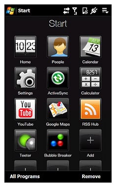
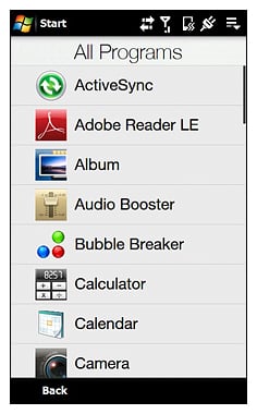
The Start Menu no longer is a drop-down menu. When you tap "Start" you pull up an application window that has customizable program icons, much like the TouchFLO's Program tab (which no longer exists). You can launch your favorite applications from here or tap "all programs" at the bottom to pull up a complete list of programs in a touch navigable listing. If you disable TouchFLO in the Today Screen settings, you revert back to the traditional drop down menu.
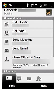
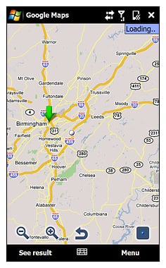
The Contact Screen has a few nice additions, including the ability to map a contact's addresses through Google Maps. You can still send SMS, e-mail and dial numbers from the contact screen, but to be able to pull up a map of the address can be really convenient.
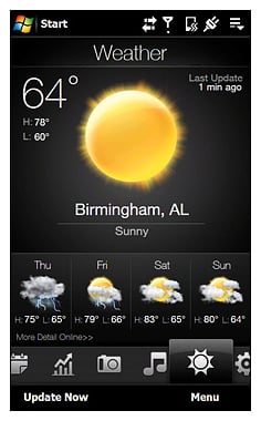
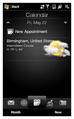
The weather tab still has that "cool" factor and has been incorporated into the TD2's calendar display. If you choose a date within the four-day forecast, you'll see the forecast for that particular day as you enter or view the appointments.
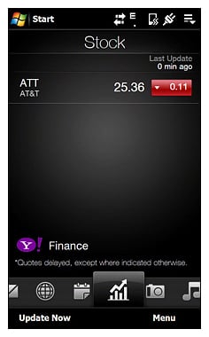
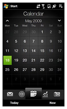

The stocks tab is a nice addition if you want to track your favorite commodities. It doesn't look as if the camera, music player, messaging and email tabs have changed much. The Internet tab now has a search field as well as the ability to launch favorites directly.
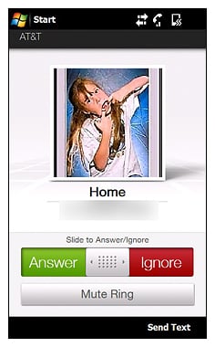
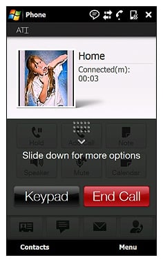
TouchFLO now has "slide to answer," and the menu screen much like a third-party add-on we mentioned earlier this year. It appears that HTC has kept a close eye on the home-grown customizations and incorporated some into the TD2. From the ability to re-organize the tabs to adding slide to answer functionality, TouchFLO looks a little like a "best of" collection from XDA developers.
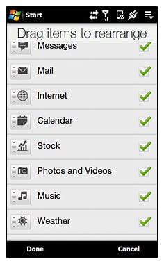
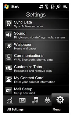
I'm a big SPB Mobile Shell fan. But the changes the TD2 has made with TouchFLO 3D makes the choice a little more difficult to make. Admittedly, SPB Mobile Shell 3.0 does look very nice on the larger screen and the receptive screen makes navigation around the SPB UI very smooth.
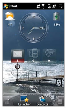
But the addition of the "Map Address" option on the Contact screen and including the four-day forecast on the calendar are both nice additions making the selection between these two all the more difficult.
Phone Quality
The TD2's phone quality is very good and on par with any other phone on the market today. I was a little concerned about having the slim speaker to the side, but calls came in loud and clear. I was curious how the phone would perform without having access to AT&T's 3G network and, honestly, I didn't miss it. Download speeds were respectful with regards to e-mail and other text-only items. I did begin to miss 3G when checking Web sites and downloading larger e-mails, though.
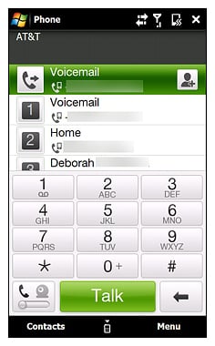
The TD2's dialing screen is spacious and easy to navigate. When the dialing pad is pulled up, the last three calls on your Call Log appear and dropping the dialpad reveals the last seven calls on your log. With the front-facing camera, you have the option for video calls or voice calls. Of course, that depends on your carrier supporting it. Don't bet on it in the U.S.
Screen
The 480x800 touchscreen screen is a tremendous improvement over the original Touch Diamond's 480x640 screen. Colors are crisp and vibrant, contrast and sharpness levels are spot on and I had no problem reading the screen in daylight. It's one of the nicest screens I've used and probably a step better than the screen on the Touch Pro and Touch Diamond.
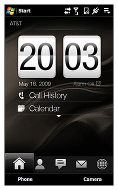
The screen was very receptive to the touch. There were a few blips where swipes were registered as taps, accidentally launching applications instead of movements. Touch navigation was noticeably better than the original Touch Pro and Diamond. The screen was a little temperamental towards the bottom of the screen. At times, I had to make a conscious effort to activate the bottom menu bar commands.
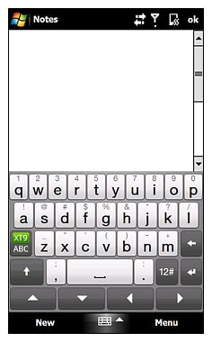
I consider the iPhone to have one of the best on-screen keyboards. It's very receptive to touch typing with large keys. If the iPhone's keyboard is a 10, the TD2's on-screen keyboard is somewhere between an 8 and a 9 (wouldn't that be an eight and a half?). I did have a few mis-keys, but nothing to loose sleep over. I think if HTC made the keys a bit larger, the TD2 would give the iPhone a run for its money in that regard
Overall Impression
Understanding that this was the European version of the phone, I was still very impressed with the Touch Diamond 2. If the U.S. version is a mirror image, with the addition of U.S. 3G compatibility, then U.S. consumers will be in for a treat. If HTC irons out some of the minor quirks with the European version, U.S. consumers will be jumping for joy.
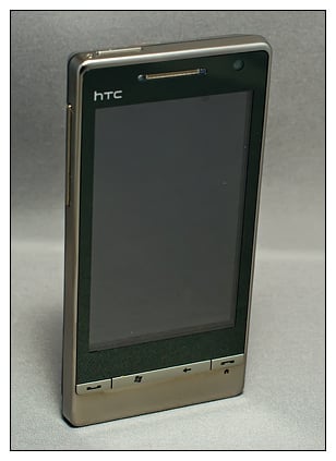
The TD2 is a well-constructed phone that has a sleek, professional appearance. Simply put, it feels and looks good in the hand. The black casing with brushed metal controls are a nice mix. My only wish with regards to construction is that HTC would have gone with a less fingerprint-friendly finish and the reset button was at the bottom of the phone much like the original models (again, hint, hint).
The improvements to TouchFLO are a welcomed change. Having the ability to rearrange the tab sections isn't new but is nice to have native to TouchFLO. The change in the Start Menu surprised me a little, but it puts a "Program Tab" styled screen just a tap away.
With the HTC Touch HD not available in the U.S., the TD2's screen may be the benchmark for other phones to strive for and it will be interesting to see how it compares to the Touch Pro 2's screen. The screen was very receptive to the touch and while the TD2 lacks a physical keyboard, the on-screen keyboard surprised me.
The lack of a physical keyboard may very well be the only drawback to the Touch Diamond 2. While I haven't gotten my hands on a Touch Pro 2 yet, if I can convince myself that a physical keyboard isn't a "must-have" item, the Touch Diamond will be my next phone.
If the Touch Diamond 2 is any indication as to the quality of the Snap and Touch Pro 2, this will be a very good year for HTC. The trio may give HTC the perfect Windows lineup with phones appealing to the WM Standard crowd, the "I have to have a keyboard" crowd and the "Keyboard, we don't need no stinkin' keyboard" crowd.
Regardless of how the other HTC phones measure up, if you are looking for a slim, lightweight, power house of a Windows Mobile phone and don't mind the lack of a physical keyboard the HTC Touch Diamond 2 will be a tough phone to beat. The European version was very impressive and I can only expect that the U.S. version will be equally impressive.
Phil is the father of two beautiful girls and is the Dad behind Modern Dad. Before that he spent seven years at the helm of Android Central. Before that he spent a decade in a newsroom of a two-time Pulitzer Prize-finalist newspaper. Before that — well, we don't talk much about those days. Subscribe to the Modern Dad newsletter!
