Review: HTC S710 (Vox)

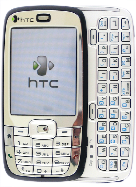
Way back when I first unboxed the HTC S710 (aka the HTC Vox), a reader commented that my voice sounded giddy. Indeed, I was giddy. The s710 was (and is) an exciting form factor for Standard-Edition Windows Mobile phones - a candy-bar slider that includes both a standard 12-key phone pad and a full qwerty keyboard. But innovative form factor does not a usable device make. How does the s710 stand up to actual use? Read on for the full review.
Specs
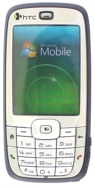
The HTC S710 has pretty ho-hum specs, truth be told. Let's list them and then discuss what's notable:
- Windows Mobile 6 Standard Edition
- 201 MHz OMAP processor
- 128 MB ROM (63 user accessible for storage), 64 MB RAM (49.6 for Program Memory)
- 240x320 non-touchscreen
- Quadband EDGE
- WiFi (b and g), Bluetooth 2.0
- 2 megapixel camera
- 1050 mAh battery
- microSD memory slot
Windows Mobile 6 is interesting because the S710 was one of the very first devices available with the new OS, but no more. As far as the rest goes - I find that processor to be fairly disappointing. I found myself waiting quite a bit for things that should be very simple, even when there were no programs running. Most egregious among these waits is that it takes upward of 2 to 3 seconds for the screen to rotate when you slide out the keyboard. Not good.
It's difficult to rag on the processor, though, as it's fairly common right now (the T-Mobile Wing has an identical processor, for example). It's meant, I suppose, to be a compromise between power and battery life, but mainly I just find it annoyingly slow.
Speaking of battery life - I'm worried that I'm missing something. One of the reasons I spent a month and a half using the device on and off was battery life. HTC claims that you should get around 7 hours of talk time and many reviews I've read said the same. Yet I found myself getting much less - the S710 would barely make it through a single day of moderately heavy usage (I'm talking an hour of talking, push email pinging once an hour or so, and maybe a half hour to an hour of WiFi browsing). It's difficult to justify using a comparatively thick device (see below) when that extra thickness doesn't seem to translate into extra battery life. A full day of moderately heavy usage is good enough, but it's certainly not what I expected.
The camera is splendid, though. Perhaps it's just that this was the first 2 megapixel phone I've owned, but I found it to have very high quality.
The rest of the specs don't really move me one way or t'other. Sure, it's not a 3G device, but again there are still EDGE-only phones being released so that's not a deal breaker for me. The WiFi works as advertised, as does Bluetooth.
Get the Windows Central Newsletter
All the latest news, reviews, and guides for Windows and Xbox diehards.
Form Factor
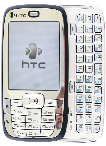
The big news with the HTC S710 is clearly the fact that it's a combination candy bar and slider. You get the best of both worlds - a standard 12-key pad (which works very well with T9) and a slide-out QWERTY keyboard. I'll get to that keyboard in a bit.
The S710 is surprisingly hefty at 140 grams, a fact I don't mind much but that may bother some. It uses the now-common soft-touch black paint around the back and sides. The front, as you can see, is mostly chrome and shows fingerprints a bit. The SIM card slot is hidden underneath the top of the screen when you slide it out, and the microSD slot is also on the screen-side of the phone, on the lower-right.
All in all - the S710 is very comfortable to use as a phone. The slight hump on the back of the phone isn't a significant bother. Overall I'd even go so far to call the S710 ergonomic. After using slab-style phones like the Dash, Q, and Blackjack it's actually nice to have a thicker phone to grab onto and hold up to your ear.
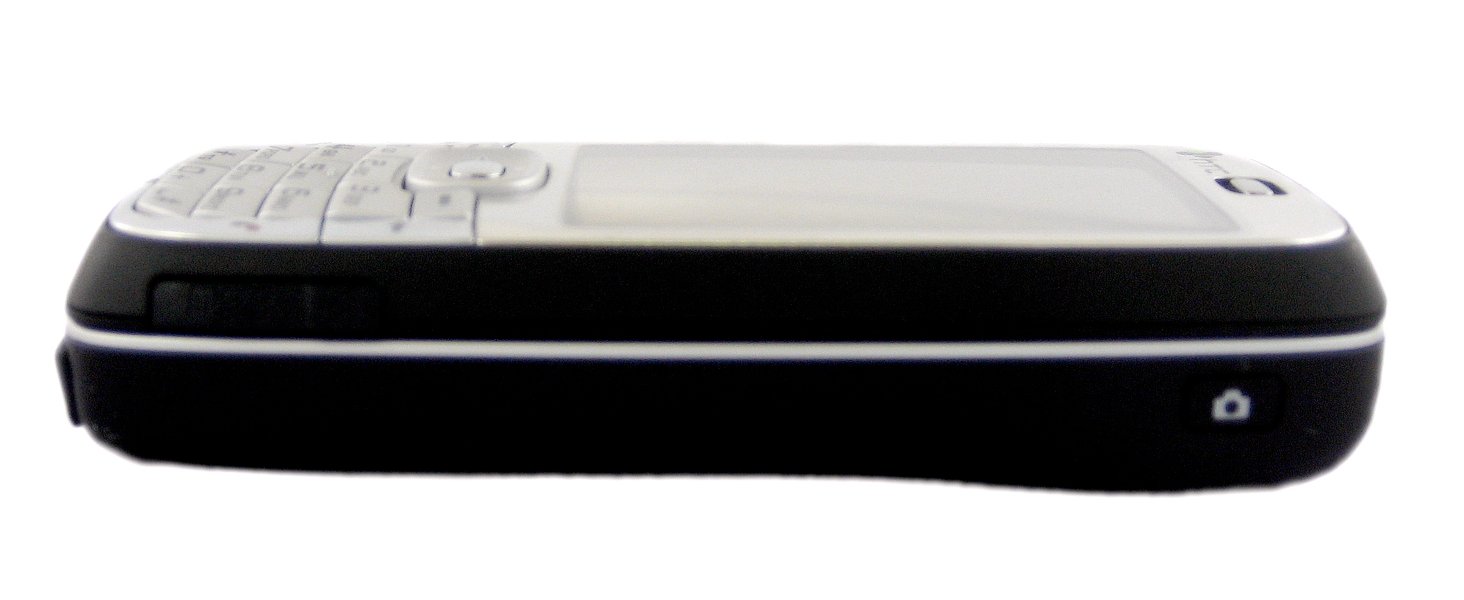
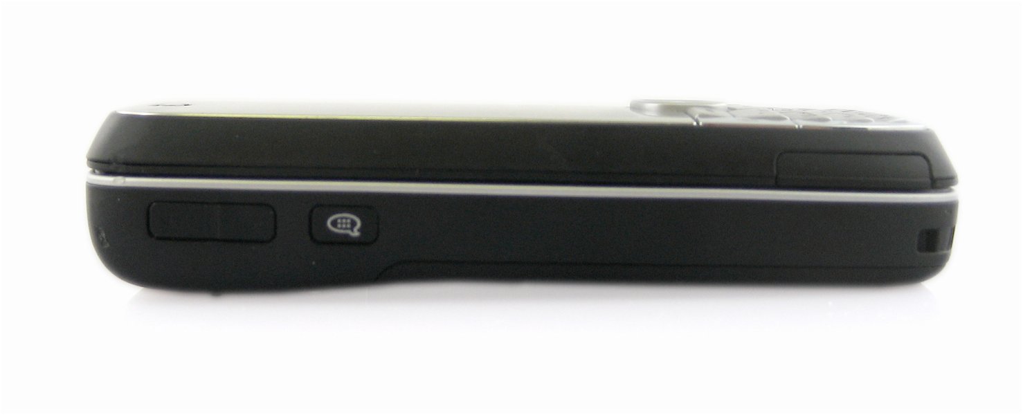
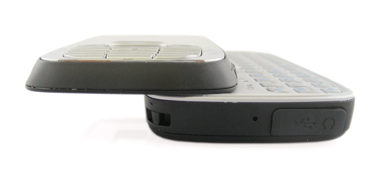
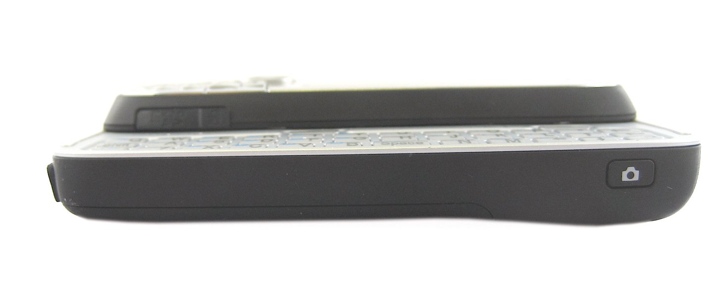
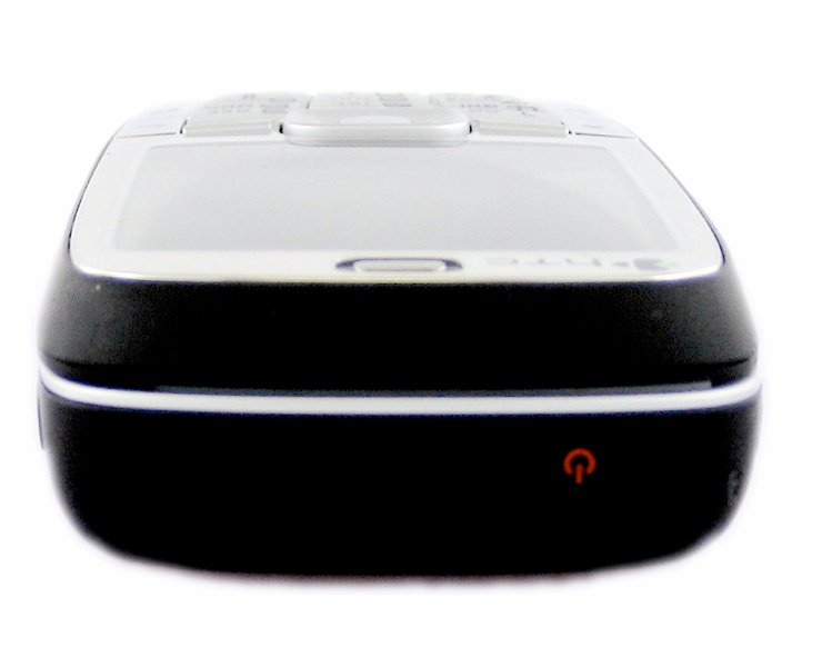
Buttons are a little sparse, truth be told. I like having a few extra hardware buttons around a device that I can assign to commonly used functions. With the slider closed you see the following: On the top is a power button that also brings up the "quick list" that lets you easily assign profiles, turn power off, etc. On the left are the volume buttons and also another button to activate the voice tag system (not voice command, which HTC regularly disables in favor of its own Voice Tag app). On the right you'll find that camera button. Up front is the 5-way, home, back, send, end, soft-buttons, and the handy 12-key phone pad.
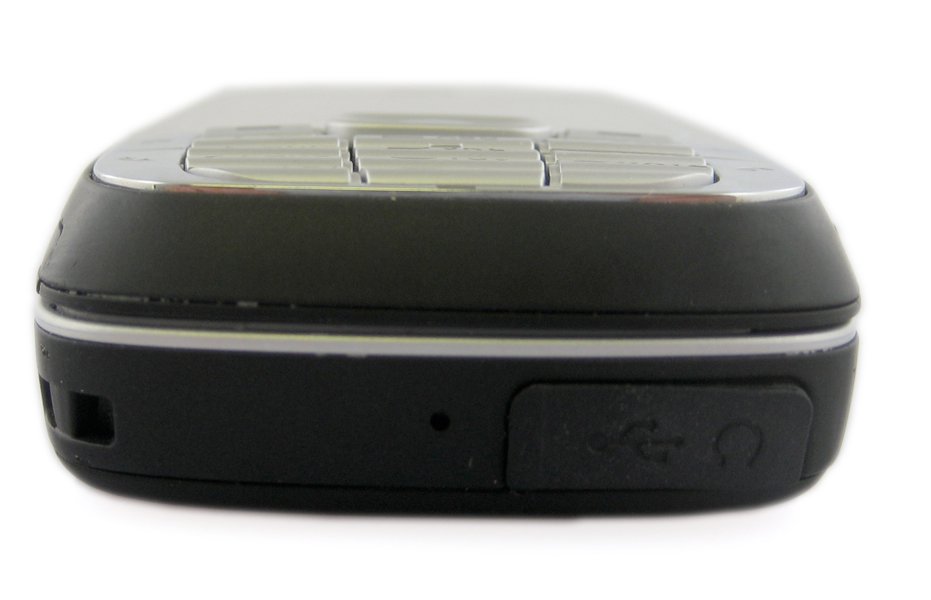
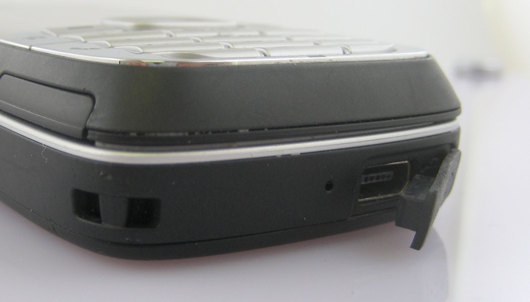
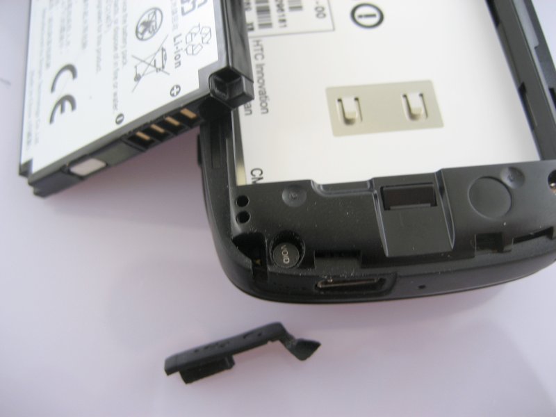
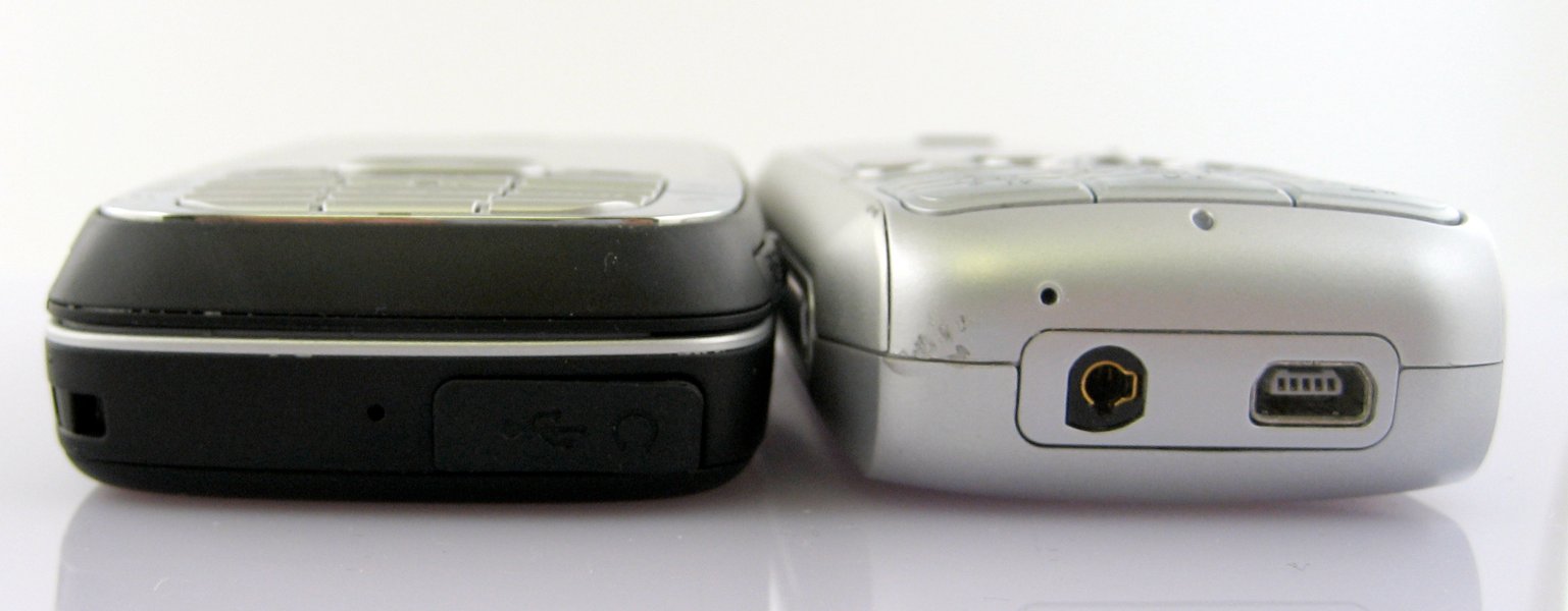
One bit I'm happy about, pictured above, is that you can remove the rubber cover over the mini-USB jack without breaking it. I am not a fan of those rubber covers (I just broke one on my Samsung Blackjack, grr!), so It's nice to see you can remove it and then put it back before you pass the phone one. As long as I'm on the subject, there is no 2.5 or 3.5 audio jack on the S710, instead it's HTC's combo mini-USB/Audio jack. We're seeing this jack now on the Dash, the S710, the T-Mobile Wing, the HTC Touch, and others - my distaste for this solution is as strong as ever, but it's really looking like a losing battle.
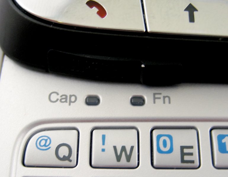
When you slide the S710 open to reveal the keyboard you'll find a few of those missing shortcut buttons - Fn+M for messaging, Fn+back arrow for IE. There are also two extra soft-buttons here - placed where the logically belong, i.e. immediately beneath their labels on the screen. Also visible here is a nice touch: indicator lights for both Caps and Fn.
Software
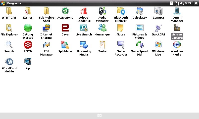
The main thing to mention with software is that the S710 sports Windows Mobile 6 Standard Edition, with all the bells and whistles that come with it. One application in WM6 that I don't think has gotten nearly enough attention is "Internet Sharing," which makes tethering your phone to your laptop to use as a modem dead-simple. It's a pity that it's only over EDGE, but it work. In fact, my favorite use is to set up a "Bluetooth Personal Area Network" (PAN) and get online without the USB cable. Even my MacBook is able to quickly see the PAN and use it to get online.
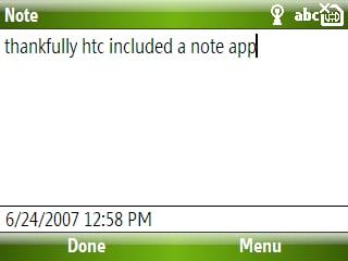
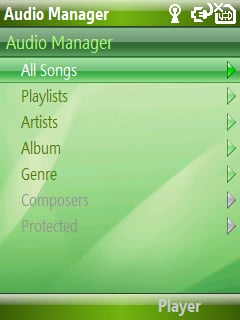
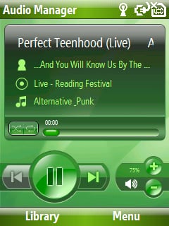
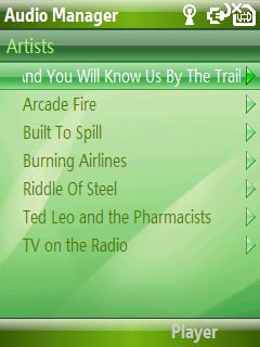
Otherwise, HTC has included a few of their own custom applications, which mostly makes me happy. Microsoft bone-headedly didn't make a standard text-note app standing in WM6 Standard Edition, so HTC gives us one. The other app I'm very pleased to see is "Audio Manager," which gives the S710 an iPod-like interface for browsing and playing music. Even better - Audio Manager is able to make playlists on-the-go (yes!) and even trim MP3s for use as ringtones. It's a great app, you can see a video of Audio Manager in action here.
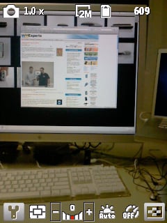
I'm less happy about HTC using its custom camera app. The extra features are nice, but it seems to 1) be a gigantic memory hog and 2) not trigger Windows Mobile to shut down other apps when it launches. The result is I often get the message that there isn't enough memory to use the camera and to shut down some programs. I don't know how other people use the cameras on their phones, but I use mine almost exclusively for candid shots - and taking a minute (or three) to manage the memory on my smartphone is pretty much a guaranteed recipe for killing candid shots.
Keyboard
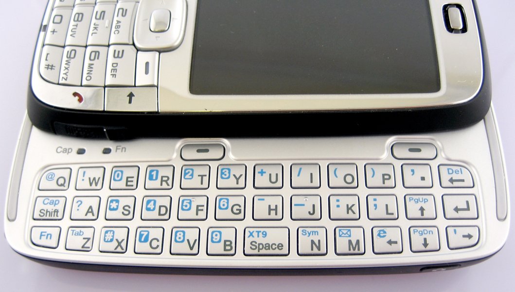
Ah, now we come to it. I referred to the S710 as "disappointing" on Thursday and my gripes with the processor and the battery life aren't actually enough for me to say that. The keyboard, sadly, is.
First, the good. Tactile feedback is fine, as is response time. I'm perfectly happy with the layout of the symbols (I'm glad especially to see that HTC is giving up on a number row across the top of the keyboard in favor of a standard layout). I like that there are lights for Caps and Fn. I'm almost able to use it one-handed comfortably. I'm glad there's a delete/back key on the keyboard itself, unlike on the Q.
I'm picky about keyboards, though, if you didn't figure that out from my QWERTY Thumbboard Smackdown. The Vox's keyboard just doesn't cut the mustard. Here's why: the top row of buttons is shifted one key to the left. This was done, clearly, for spacing reasons. There were only so many places that HTC could put the arrow keys, the delete and enter keys, the Fn and caps keys. The result of these constraints was a keyboard that I've found well-nigh unusable. The top row is aggravating in the extreme, but the bottom row isn't much better. I can't specifically say why, but I seem to mis-hit "m" and "n" nearly all the time.
Now, I should be writing in this paragraph that after a while I became used to the odd, shifted keyboard layout. That once you've used it it's not a problem. I can't write that. I just never did get used to it and I have little faith that I would without using the S710 every day for a good 6 months. It's that bad. The problem is exacerbated by the fact that the keyboard isn't centered on the screen over on the left.
Comparisons
S710 vs Blackjack

Well, first and foremost, the S710 and the Blackjack have different form factors and so comparing the two is a bit like apples and oranges. I find myself heavily favoring the Blackjack overall, but I also heavily favor the QWERTY-slab form over the candybar form. That said, I don't think I'm out of bounds saying that once the Blackjack gets its official upgrade to Windows Mobile 6 (which I expect to come soon), it won't be any contest at all.
The keyboard on the S710 is more capacious and may be slightly easier for those with big or clumsy thumbs to type on (provided they aren't as picky about the placement of those keys as I am). The Blackjack's 3G advantage is evened out by the fact that the S710 has WiFi built-in.
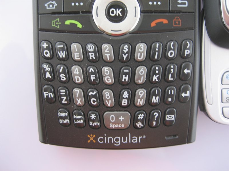
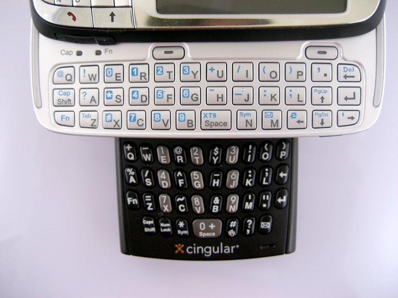
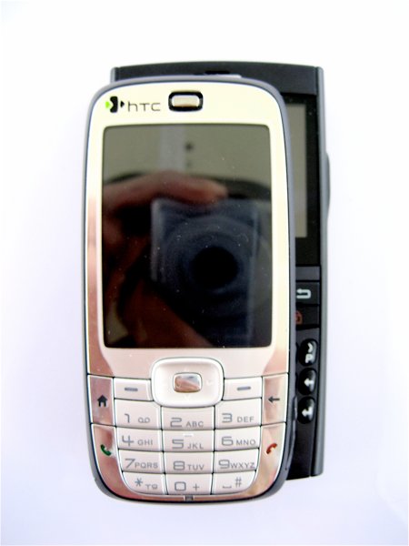
I generally find the Blackjack to be a little snappier (though their processors aren't all that different). This is probably due to the fact that you don't need to wait for the screen to rotate on the Blackjack when it's time to go QWERTY. Battery life is a wash, both are slightly less than I'd like but will get through a day of moderate use.
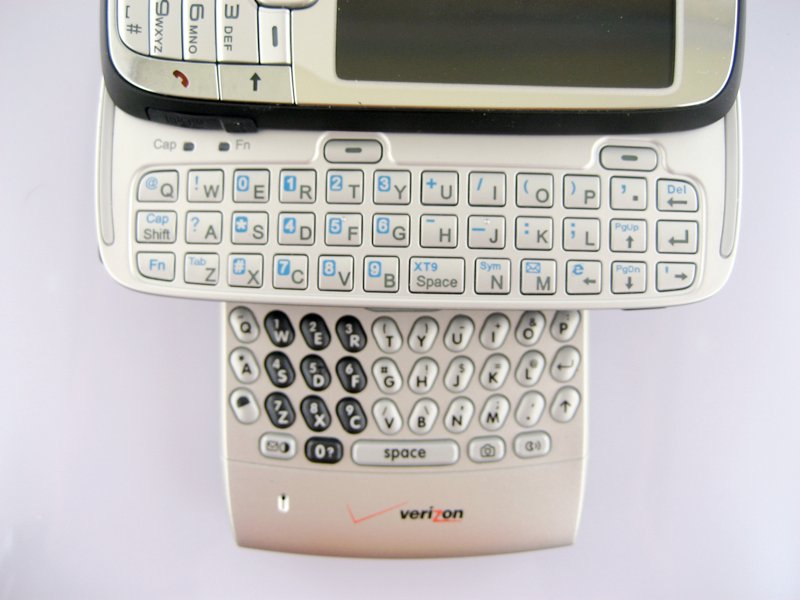
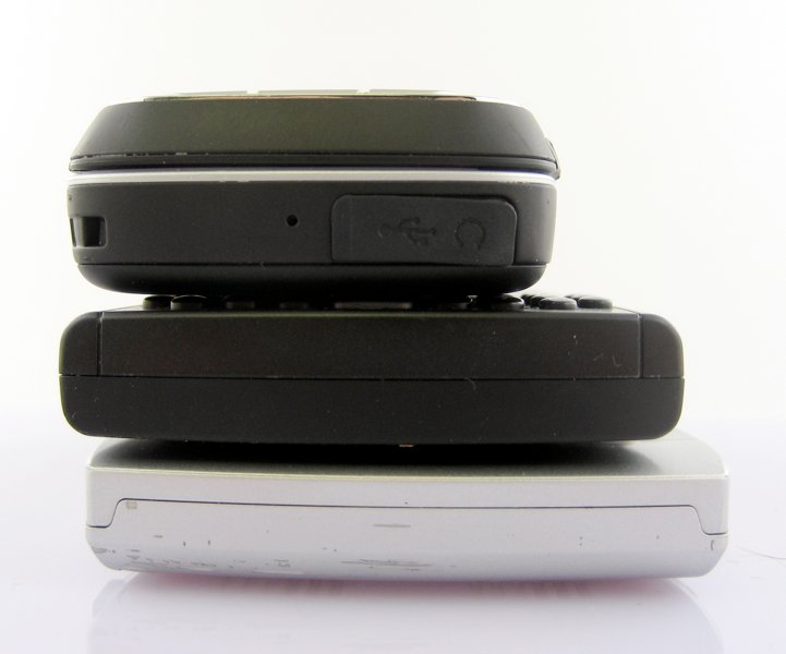
The same basic idea applies to the Motorola Q in its various incarnations - the Q is better (though, in my opinion, not as nice as the Blackjack).
S710 vs T-Mobile SDA (and Cingular 2125)
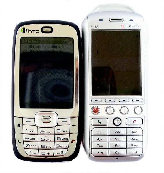
A more natural comparison would be between the S710 and other candybar Windows Mobile Smartphones. In this case it's the T-Mobile SDA. Now when I say it's no contest I mean just the opposite, the S710 wipes the floor with the SDA handily. Although the S710's specs aren't that much better, the form factor makes the S710 the perfect replacement for the SDA.
The S710 is a touch heavier, but for that extra weight you get a smaller phone with a sliding QWERTY keyboard built in. Compared to the SDA, it's literally a marvel of engineering and design.
Conclusion
What you think of the S710 comes down to a matter of context. If your context is a text-heavy email phone, the keyboard just isn't going to be satisfying to long-time smartphone users. But if you put it in the context of candybar smartphones, the S710 really shines. That's how I prefer to think of it when I'm feeling charitable. As a successor to the SDA/2125, the S710 is a flat-out great phone. If you (or someone you know) is looking for something in the candybar form factor but needs occasional email access, the S710 would suit you well.
If you're not wedded to the candybar, though, there's no compelling reason to choose the S710 over the likes of the T-Mobile Dash or Samsung Blackjack. The slider keyboard should be easier to use two-handed than these other phones, but its awkwardness keeps that from happening. I wanted to love the HTC S710. Then I wanted to just like it. Now I just want to give it to somebody else who will appreciate its form-factor more than I do.
| Ratings (out of 5)Form Factor: 5Keyboard: 2Software: 3Battery life: 3Connectivity: 3Overall: 3 | ProsCandy Bar form-factor (if you like that)Windows Mobile 6Audio Manager for musicGreat CameraConsKeyboardBattery life only decent, not great as advertisedEDGE only |
Home to the most invested and passionate Microsoft fans, Windows Central is the next generation destination for news, reviews, advice and buying recommendations on the Windows, PC and Xbox ecosystems, following all products, apps, software, AI advancements, and accessories. We've been around for more than decade, and we take our jobs seriously. Windows Central writers and editors value accuracy and editorial independence in everything we do, never receiving compensation for coverage and never pulling punches.

