Review: HTC Fuze on AT&T
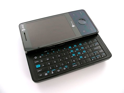
We've given you a video and photo gallery of the Fuze, the time has come for the full review!
The Fuze has the feel and specs of a 'next gen' WinMo device. So while it joins the latest and greatest generation of smartphones, the devil is, as always, in the details. While we at WMExperts had worked ourself up into a lather during the run-up to the release of the Fuze's predecessor, the AT&T Tilt, the actual experience of the Tilt ended up disappointing us. Will it be the same with the Fuze? Read on.
The New Generation of Windows Mobile
Along with the Sprint Touch Diamond and the Sprint Touch Pro, the Fuze on AT&T represents the latest generation of Windows Mobile smartphones. With it, WinMo devices on AT&T graduate into a 'next gen' world that truly feels like late 2008. These devices (we could also add other upcoming devices like the Omnia, the Xperia X1, and a few others) truly feel competitive against other smartphones like the BlackBerry Bold, the iPhone, and the G1. While I do believe that was the case before, of course, the higher resolution, smaller size, and full feature set of these devices makes it an easier case to make.
What makes the Fuze 'next gen?' It's a mix of a few things: A slick, modern UI in TouchFlo 3D, a screen that finally gets beyond QVGA with 640x480 resolution, a smaller, compact size, more capacious memory, a default browser that isn't flat-out embarrassing, and a processor that able to keep up with it all. While all of these increases can fairly be called evolutionary instead of revolutionary, they do add up to a qualitative change.
(In other words, for those of you that have been wondering, I've found the device that will be Windows Mobile's entrant in the Smartphone Round Robin.)
Specs
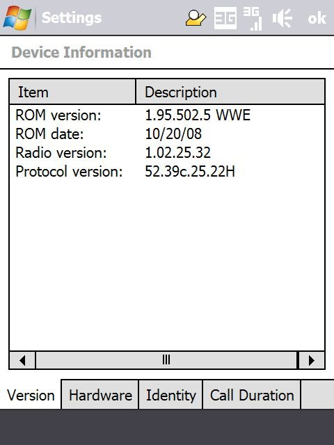
Although I've made the argument that Specs only tell half the story for any Windows Mobile device, it's still important to list them out and talk about whether or not they 'make the grade.' A 'necessary but not sufficient' description of a device. Let's go through them, then.
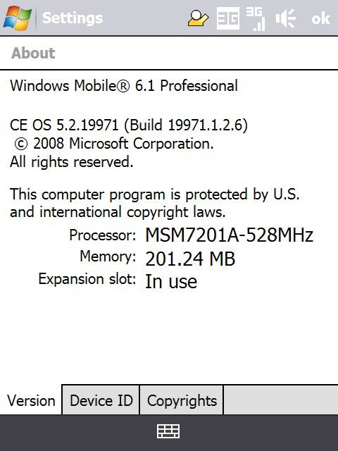
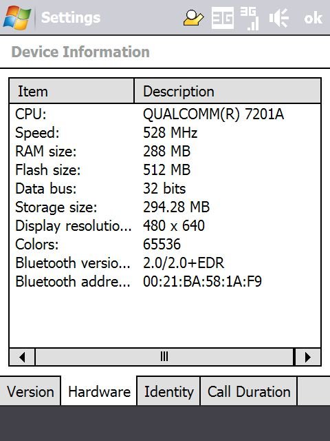
Processor: Qualcomm MSM7201A, 528MHz. The MSM7201A has become the go-to processor for many of the latest Windows Mobile devices (especially those made by HTC). While there have been questions of “GPS Lag” with the chipset, overall it's a very powerful and very snappy proc. I find that it has a decent good mix of power and battery life (especially on the Treo Pro), and the Fuze is no exception (more on the battery life below).
Get the Windows Central Newsletter
All the latest news, reviews, and guides for Windows and Xbox diehards.
Memory: ROM: 512MB, RAM 288MB (corrected!).
I am tempted to say that the real reason for the occasional slowdown is the large amount of resources taken up by TouchFlo 3D. After a soft reset, running only SEVEN Beta in the backround, I get the following free memory:
- Without TouchFlo 3D: Total 200.99, In use: 60.52, Free: 140.47
- With TouchFlo 3D: Total 200.99, In use: 71.52, Free 129.45
In other words, although TouchFlo 3D takes up quite a lot of RAM, the fact that the Fuze has a large amount of RAM set aside for Program Memory really helps mitigate that.
The Fuze definitely performs a bit more snappily when I turn off TouchFlo 3D than it does with it on, but I'd be hard pressed to say it's more than, say, 10% faster. Screen rotation time in both cases ranges from well nearly instantaneous to up to 2 seconds in extreme situations.
In truth, the Fuze better than any other Windows Mobile slider device I've ever used. I was hoping it would be stupendously fast, instead it's 'just' very fast with the occasional freeze that's difficult to assign exactly to a particular program. I would add that TouchFlo 3D doesn't suffer from any of the pauses or slowdowns that I've seen on the original GSM Touch Diamond. In other words: once I brought my expectations down to earth, the Fuze met and surpassed them, performance-wise.
Display: 640x480 resolution, 2.8“, flush touchscreen. The display on the Fuze is great. It makes all other Windows Mobile devices with QVGA or even 320x320 resolution feel cramped and small by comparison. The screen is bright, the colors vivid, and the dpi is pretty much off the charts. Windows Mobile was meant to be viewed at this resolution (or higher!).
Radios: GSM/EDGE: 850, 900, 1800, 1900. HSPA/UMTS/3G: 850, 1900, 2100. You'll get your 3G on in the US just fine, and reception, I should add, is just fine -- no complaints here. The Fuze also features Bluetooth 2.0 + EDR, and WiFi 802.11b and g.
GPS: The Fuze features full A-GPS, meaning it can get extra information from AT&T's cell towers for a faster fix on satellite locations -- this in addition to the standard GPS location app found on many Windows Mobile devices. In my testing I was able to get a GPS fix in under a minute several times in Google Maps. Note that I didn't have to mess around with any GPS settings in order to make that happen -- GPS is fully unlocked out of the box.
Some other specs: there's an accelerometer that works in Opera and Photos by default and that there's a light sensor to auto-adjust brightness. I wasn't able to test the TV-out functionality, unfortunately, but it is there. Not there: the FM Radio capability, though I've read elsewhere that it may be possible to enable it with a simple cab download.
Hardware
Build Quality
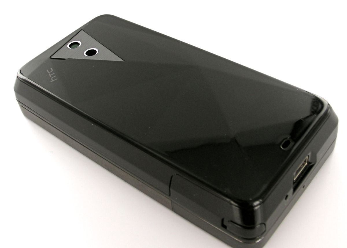
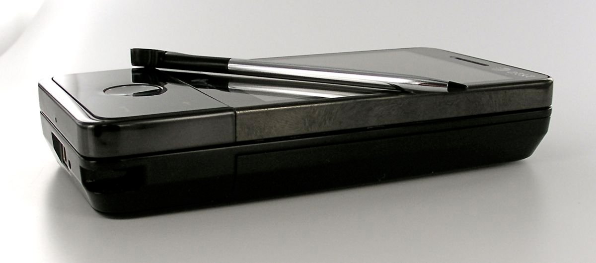
The words that come to mind as I hold the Fuze: Solid, Compact, Dense, Tank, Small, Thick, and again Dense. The Fuze is very well built, with nary a creak or wiggle to be found. The slider, as with previous HTC devices, is spring-assisted, though it doesn't pop out with quite the same spring as other devices. Still, it's solid and satisfying. The screen and front-facing buttons are all flush and overall the Fuze exudes a feel of professionalism and power.
Dimensions: 2” x 4“ x .73” by my eyeballed ruler measurements. I want to spill some ink pixels here complaining about the thickness of the device, but honestly I'm having a difficult time working myself up to it. Yes, the Fuze feels thicker than a 'next gen' Windows Mobile Smarpthone perhaps ought to, but overall the device feels smaller than you might expect. I've said it over and over on this blog, but let me say it again: the other dimensions more than make up for the fact that they didn't manage to radically reduce the thickness compared to the Tilt.
The reduced height helps, as does the fact that we have a flush touchscreen, as also does the fact that the device angles in slightly in the rear. More than anything else, however, the Fuze's reduced width makes the device feel compact. Remember, we're looking at the exact same height and width and the shockingly small GSM Touch Diamond and Sprint Touch Diamond. So yes, while the thickness isn't great, I have no complaints about the overall size.
Around the Device, Buttons
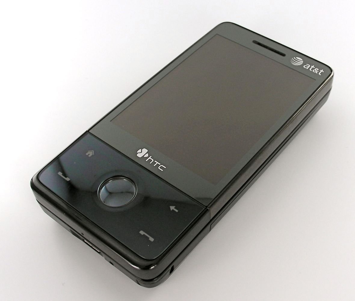
On the front of the device we have, as I mentioned, the flush touchscreen that reaches just far enough to the edges to feel like it's not wasting space, but not all the way to the edge. We have an indicator light next to the speaker and at bottom, the now-familiar Home, Back/OK, Send and End Keys surrounding the 5-day/zoom-wheel. I still find that I occasionally miss have some difficulty hitting the left/right buttons next to the other buttons. The 5-way also lights up in a very elegant way for notifications. There are no physical buttons associated with the soft buttons.
On the left side we have our volume buttons and also the PTT button, which I quickly assigned to the Start Menu (An aside, for all my previous griping about the Start Menu, I find it essential on a device that uses TouchFlo 3D). Update: It looks like the ability to assign the PTT button to something other than PTT has be stripped from the final ROM. However, you can assign a long-press of the Send key to the Start Menu (it goes to Voice Command by default). One notable bit here is that these buttons are on the front of the slider, not on the main body. This makes these buttons particularly difficult to hit when the slider is open.
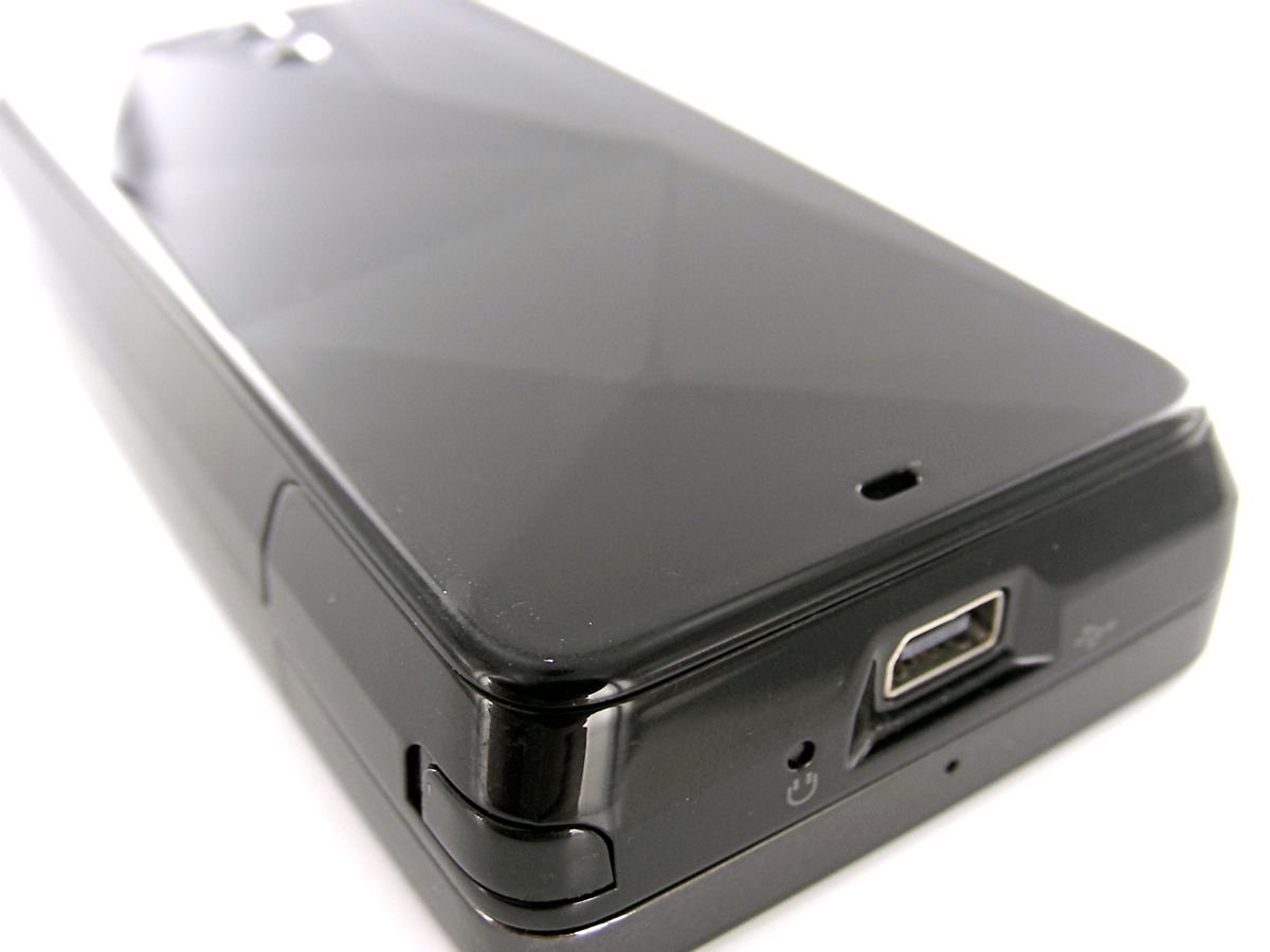
On the bottom we have the microphone, a reset button, and HTC's ExtUSB port. There is no 3.5mm headset jack and despite the fact that the Fuze ships with a muli-adapter that works with both 3.5 and 2.5mm headset jacks, I can't forgive the lack of 3.5mm jacks on smartphones anymore.
The rightside is empty of all buttons, though you'll find the stylus on the bottom-right. It's a solid metal stylus of a decent length and as with other Diamond-family devices, it's magnetic and turns on the smartphone when you pull it out. It also sticks conveniently to the side via the same magnet if you temporarily want to set it there as you interact with the device.
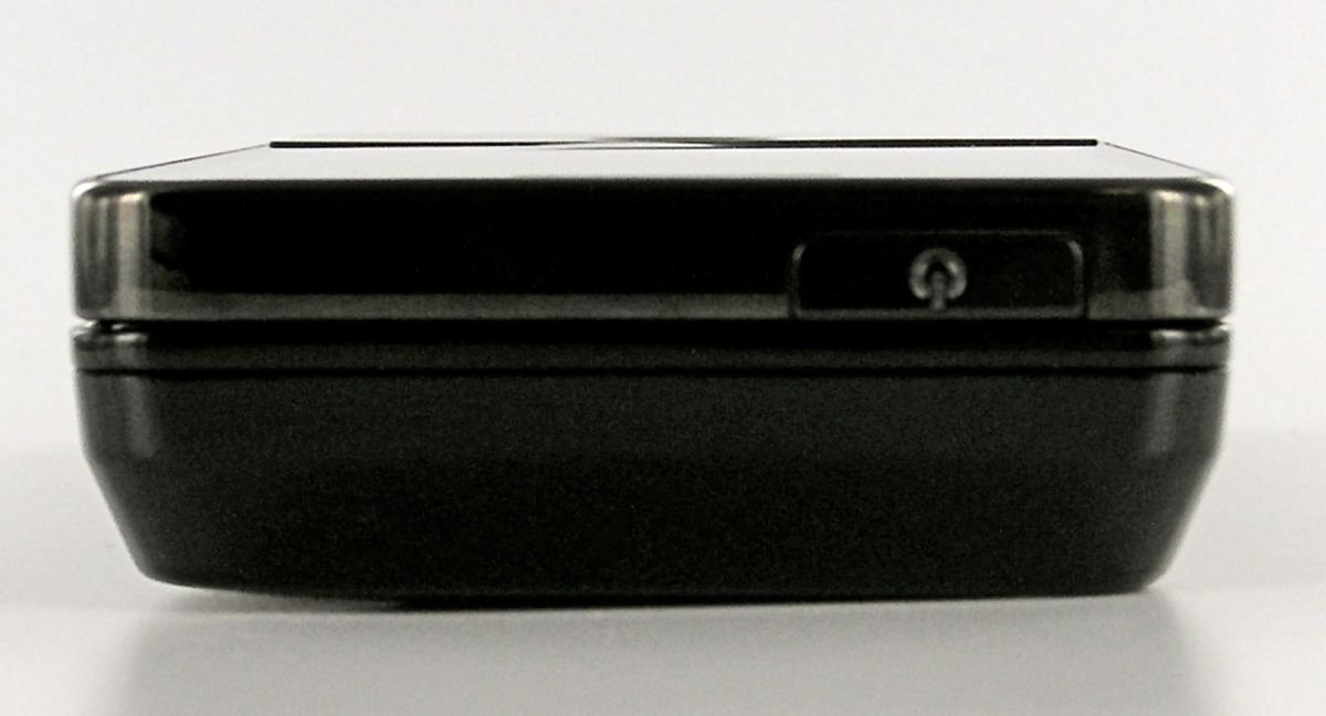
The top has your power button and that's about it. In what may be a disappointment to some, the microSD card is underneath the battery cover -- though of course you don't need to remove the battery to access it. The Fuze handles my 8gig microSDHC with no issues and I expect larger sizes won't be a problem, either.
The rear is faceted, as with the Touch Diamond, and it is also glossy (read: fingerprint magnet). There's a small hole for the speaker to kick out sounds here -- the speaker is decent enough but not at all loud compared to the gold standard for Windows Mobile speakers (the Q9h). You'll also find the excellent 3.2 megapixel camera (more on that below) and a LED light as well. Lastly, there's a tiny hole on the bottom through which you can thread a lanyard.
Overall, while I am sympathetic to people who prefer the aesthetics of a device that has fewer buttons, I'm not that sympathetic. Windows Mobile is a powerful OS that works better when there are plenty of buttons. The lack of a camera button especially grates. Given that you can't even remap the PTT button (thanks a lot, AT&T), long-time WinMo users will find themselves changing some their habits for this device.
Keyboard
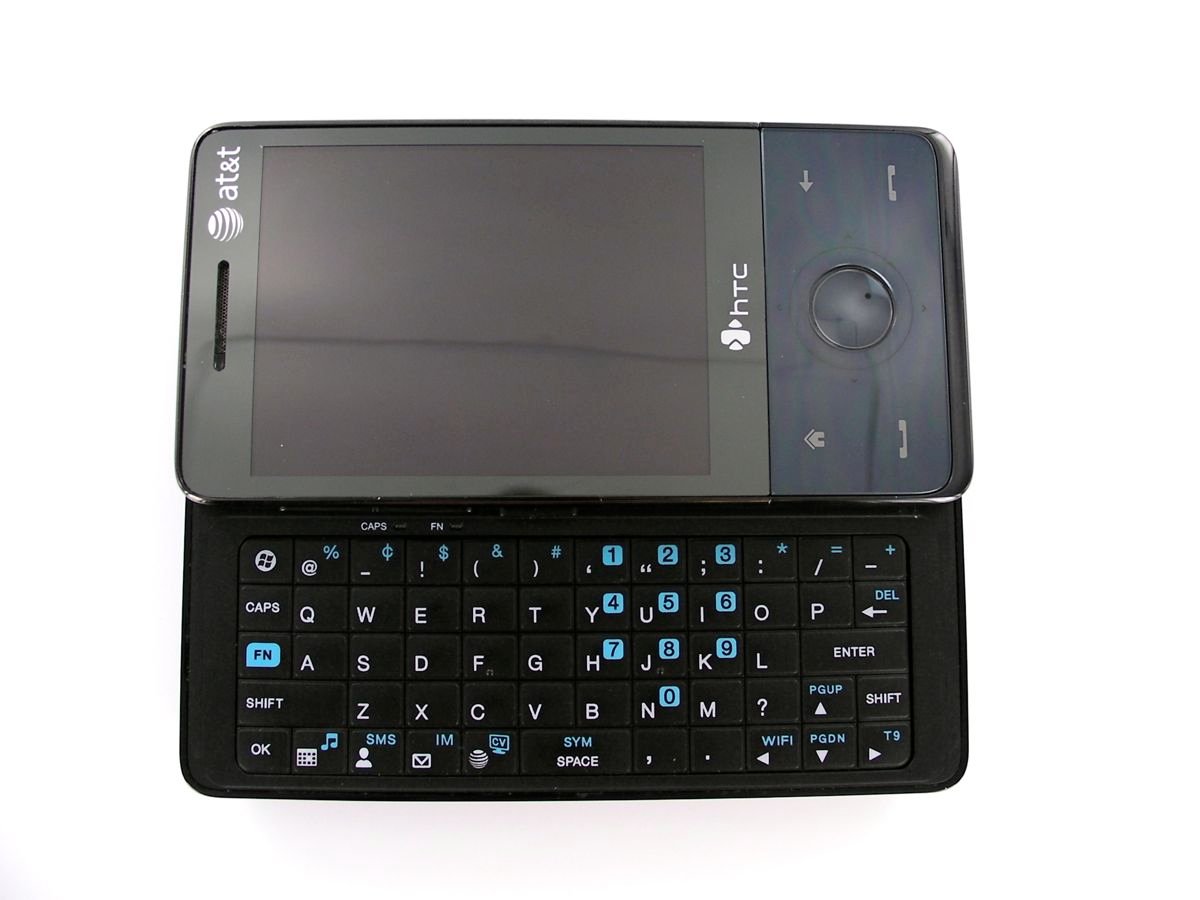
The keyboard on the Fuze is pretty darn good -- the keys aren't mushy at all. HTC has decided to pack quite a lot into this space -- a 5 x 12 grid of 57 keys compared to the Tilt's 41 keys (including the soft buttons on the Tilt). This does mean that the overall surface area of each key is quite a bit smaller than most slider-lovers will be used to. However it's still quite a bit easier to type on (with two hands) than any front-facing QWERTY device. You'll find that you're using the tips of your thumbs rather than the flats of your thumbs, but it takes almost no time at all to get used to.
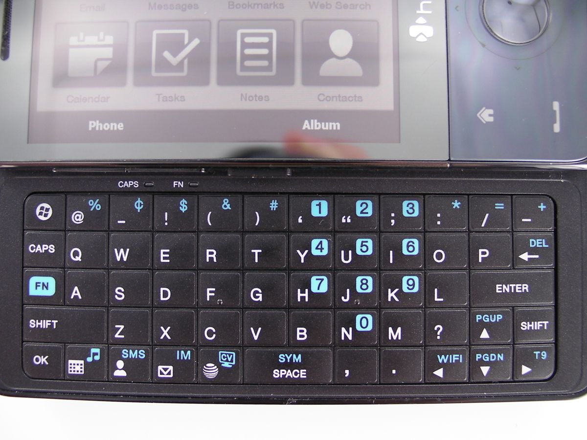
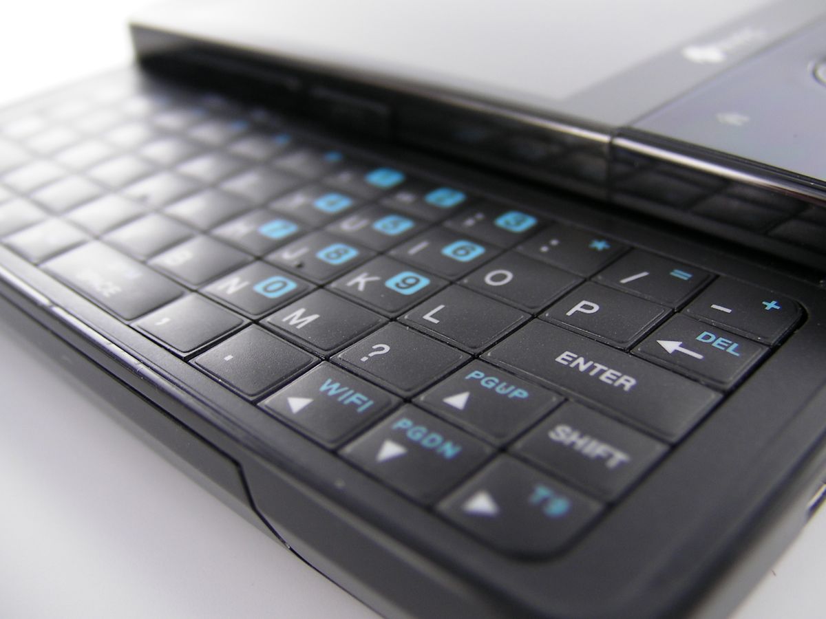
There are two controversial aspects to the keyboard that I suppose I should address. The first is that there are no soft-buttons, but honestly that top row abuts the front of the device so closely I'd find any attempt to fit them in there annoying. The second and perhaps more troublesome trade-off is that the Fuze, unlike the Sprint Touch Pro or the European Touch Pro, does not have a dedicated number row. Instead you'll be using key-combos with the Fn key. The tradeoff here is that you get common punctuation marks across the top and also dedicated Caps, Start, and OK keys. Those last three make the tradeoff completely worth it, in my opinion. I don't have any real complaints about the key layout.
There are also dedicated shortcut keys for calendar, contacts, email, and web; also Fn+ shortcuts for SMS, IM, AT&T's Music directory, AT&T's Video service, the Wireless manager, and switching between T9 and ABC modes. In all, these shortcuts more than make up for my earlier complaint about the lack of external buttons. I do wish that these shortcuts were re-mappable, but I suspect that it won't be long until the necessary registry edits for that are uncovered.
We get indicator lights for Caps and Fn, too.
Screen
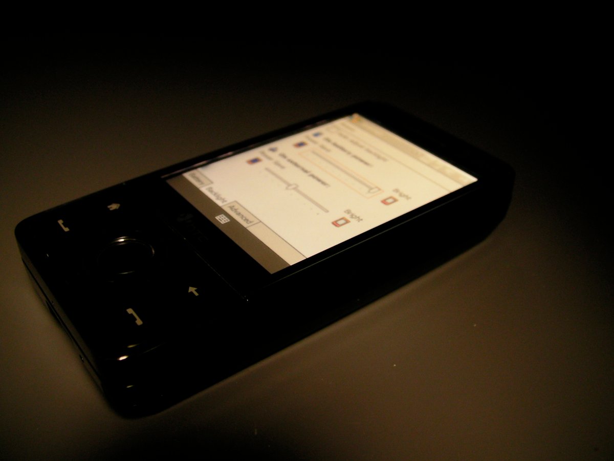
I already enthused about the 640x480 touchscreen above, but I'll add a few more notes. We have a plastic screen here, but it doesn't exhibit a lot of give like other flush-plastic screens I've used. The backlight defaults to auto-adjust and I see no reason to mess with it -- the brightness level seemed to be 'just right' in all the situations I've used it in.
It's not just flush, but the screen itself is closer to that flush surface than on other devices like the Treo Pro or the Samsung Epix, whose screens appear to be inset quite a bit deeper inside the device. In practice there's no real functional difference, but qualitatively it looks much better. The screen is also nicely responsive to taps, though it's not perfect. HTC has done a remarkable job here, to be honest, as the screen 'gets' whether I'm trying to scroll, tap, or highlight text 95% of the time.
I cannot wait for Windows Mobile to graduate to capactive touch screens, because I think HTC has brought resistive touch screens pretty much as far as they can go at this point.
Camera
I am very pleasantly surprised with the camera on the Fuze. Although the interface is fairly basic and responsiveness isn't lightning-quick, the pictures themselves are very good. The fact that you can rest your finger on the center of the 5-way pad to autofocus and then press in to take a shot is elegant and intuitive. I have had some lag here and there, but not enough to drive me crazy.

Dim fluorescent lighting (yes, that's a charity check in the corner that SPE recently gave away :D )

Near total darkness with Flash

Near total darkness without Flash
The images themselves are much better than most other smartphone cameras I've used on Windows Mobile devices -- both in good and low light. The addition of a LED lamp for flash seems cheesy, sure, but darned if that LED doesn't do a great job providing relatively diffuse light for shots that flat out wouldn't work with other WinMo phones. Here are a couple shots with the camera in low-light and in total darkness with the flash -- they're not great, of course, but both shots on the Treo Pro would have results in completely black 'pictures.'
I'll put it another way: best camera since the Q9h.
Battery Life
I've only had the Fuze for a few days now so I can't say this with 100% confidence, but here goes: the Fuze's 1340mAh battery just barely powerful enough to last through a day of medium to heavy usage. While the device certainly seems to last on standby without significant issues, I've found that as I use the device it drains rather quickly and overall I don't have much confidence that I could get two full days of light to medium usage.
If you're a power user who intends on using the Fuze for a lot of media, GPS, or a very significant amount of web browsing, I recommend you look into a spare battery right away.
On the bright side, the battery does appear to charge up very quickly -- from near dead to near full in well under an hour (and maybe faster -- I wasn't watching closely enough each time I charged it. ;) ).
Software
TouchFlo 3D
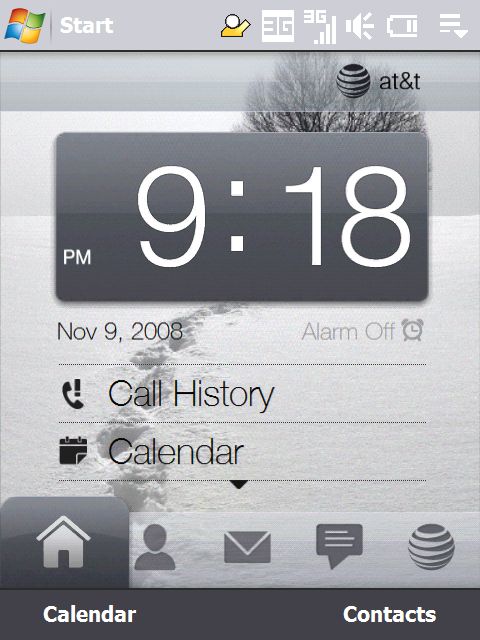


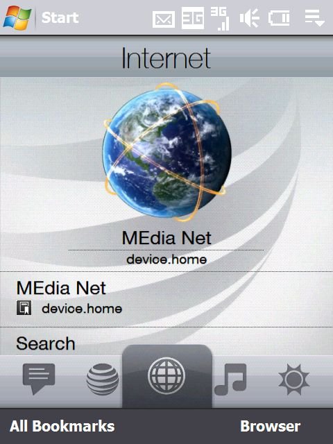
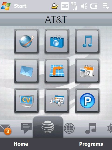
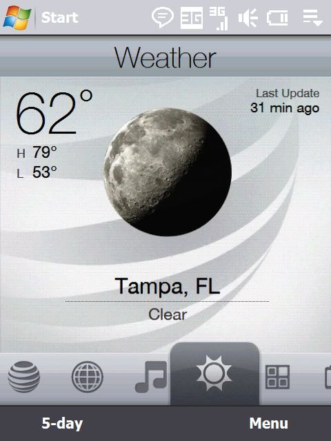
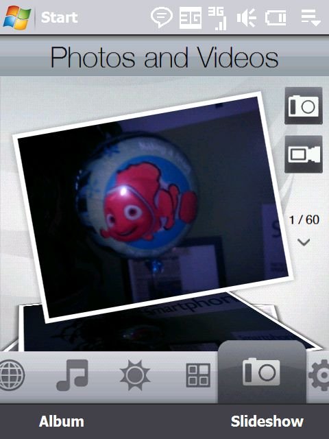
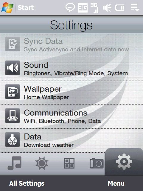
TouchFlo 3D on the Fuze performs admirably -- very quick and snappy. The tabs that are included are pretty standard ones: Home, Contacts, Email, Messaging, AT&T, Internet, Music, Weather, Programs, Camera/Photos, and Settings. The tabs are not editable, but as I mentioned in my initial video review it is nice that AT&T's proprietary applications are nestled within their own TouchFlo 3D tab instead of taking over the entire interface.
In any case, as I said, the animations are quick, dragging your finger across the 'dock' is quick and it's very easy to hit the TouchFlo tab you're aiming for.

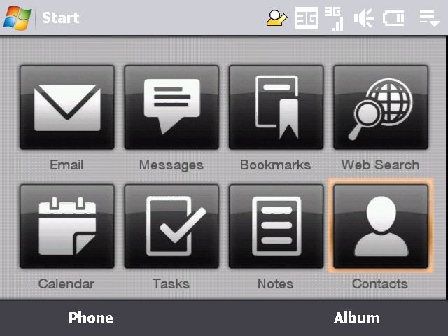
When the keyboard is open, you're met with a simple set of large shortcuts to commonly used applications. Although I appreciate the list and find it relatively useful, it is a little jarring to lose TouchFlo 3D's full functionality when opened. It's a habit of mine with sliders to just pop them open when I want to use them -- a habit I needed to break a little bit with the Fuze.
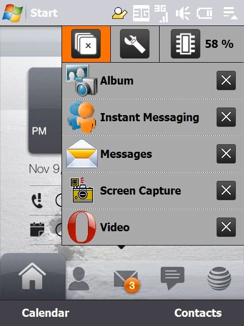
While we're on the subject of the home screen, I'll note that of course we have HTC's memory manager in full effect.
Music Player

The TouchFlo 3D / Music Player app on the Fuze is a big step up from the default Windows Media Player. Before that sounds like damning with faint praise, though, I'll say that the Music player is good in its own right. ;) You can scan through your artists, albums, and playlists quickly and easily.
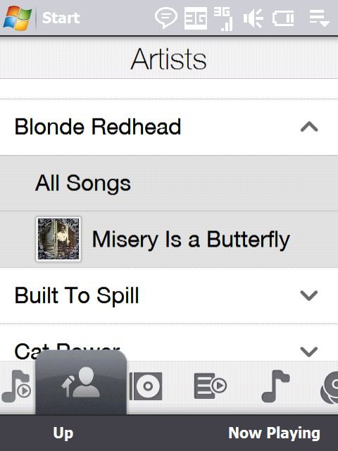

The Music player is also fully A2DP and AVRCP compatible -- meaning it will not only play via Bluetooth but you can also control the player via the controls on your Stereo Bluetooth Headset.
On Screen Keyboard
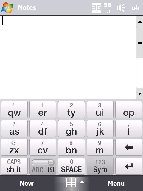
If you're looking for one-handed use, the Fuze does offer the full compliment of HTC soft-keyboard, including full QWERTY and their “Compact QWERTY” sure-type-esque keyboard. In my use I found that the Compact QWERTY was the best -- it's much easier to target those keys with your thumb than the full version. I especially found it was difficult to hit the keys on the very edge of the Full QWERTY keyboard, I often hit 's' when I wanted to hit 'a.'

AT&T Programs
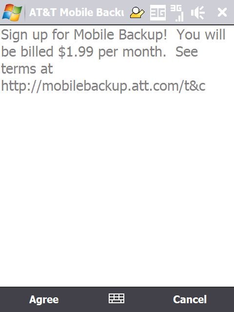
AT&T has included several of their custom apps, including:
- AT&T GPS (aka TeleNav)
- AT&T Mobile Backup (New to me!), but I didn't try this out due to the monthly charge
- Links to AT&T Services like their Cellular Video Service, Music store, Music ID app, online store for ringtones and such, etc.
- Push To Talk
- IM, based on OZ Messenger
- Proxy Manager
Other Included Apps (and What's Missing)
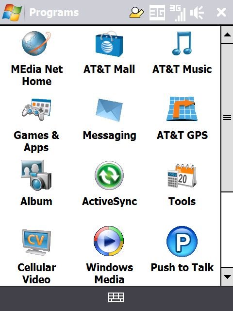
Of course, Office Mobile is here, as are some other popular Windows Mobile applications like:
- Internet Sharing (Hooray!)
- Adobe Reader LE
- Bluetooth Explorer
- a Java Virtual Machine (Esmertec Jbed)
- Jetcet Print, QuickGPS
- Remote Desktop (Hooray x2!)
- Sprite Backup (Hooray x3!)
- Streaming Media for Video
- Zip for unzipping
- the Teeter game
- A whole gamut of trial-ware like MobiTV, Ms. Pac Man, etc.
- WikiMobile
- Worldcard Mobile Business Card Scanner
- Download links for Xpress Mail and BlackBerry Messenger
What's missing? Well, Windows Live for one, although you can download that separately. That download, however, won't include MSN Messenger -- you'll have to use the built-in IM client for that. The biggest thing that's missing, sadly, is HTC's excellent YouTube application. My guess is AT&T wasn't keen on having their Cellular Video offering shown up by it. Major Bummer. Update: In the comments, NotATreoFan notes that the YouTube app is sitting happily in the \Windows\ Directory. Sure enough, there is it and works perfectly! Just throw a shortcut into your Start Menu and you're good to go!
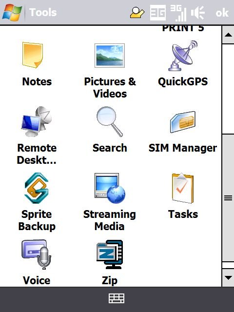

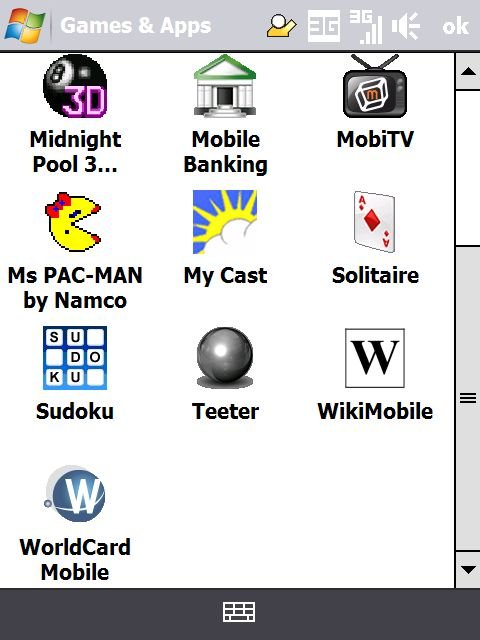
Other than the missing YouTube app, however, there's really not a lot to complain about. Although there is a lot of AT&T trialware/crapware to wade through, there are also a ton of great gems and otherwise really useful stuff that they could have just as easily excised.
Opera Browser

The default browser on the Fuze is Opera Mobile 9.5. Internet Explorer is also included and actually isn't half-bad with the extra pixels on the Fuze. Still, most will prefer to use Opera because it performs quite admirably on the Fuze. It's clearly been optimized for the device -- pages seem to render much faster on the Fuze than they do with the Opera Mobile 9.5 Beta on my Treo Pro.
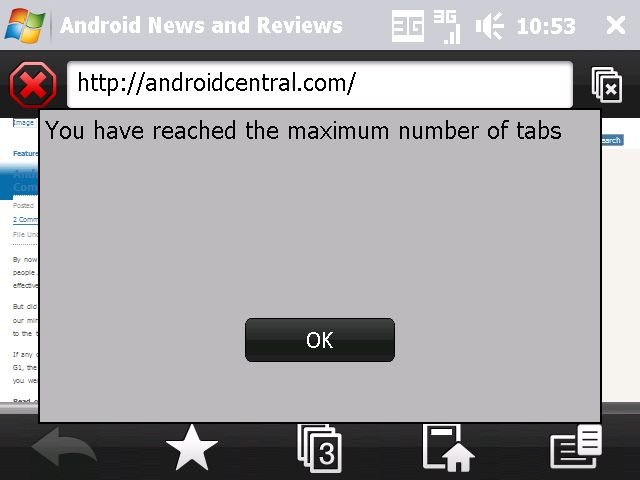
You can use the zoom wheel to zoom in or just double-tap on a section. When you zoom in, the text automatically wraps to fit the width of the zoom area. The only knock I have against the browser is that they've set the limit for the number of tabs you can have open at any time to 3 (there is a registry edit to change this).
Ok, one other knock -- the default to launch Opera from TouchFlo 3D is actually a shortcut to the standard AT&T homepage instead of simply launching the browser.
Call Quality and Bluetooth
Both reception and call quality on the Fuze are excellent -- I've had nary a dropped call and no complaints on either end. If you can't tell by the fact that it took me this long to get to call quality, I'm not a heavy phone user. I will note that the speaker could be a little louder when used as a speakerphone, but it's not a dealbreaker for me.
Bluetooth also seems to be very good -- I am especially glad to see that HTC didn't mess around with the standard Windows Mobile 6.1 feature that automatically guesses common pairing codes. I paired up my set of Jabra BT3030s in mere seconds.
Bluetooth range is nothing short of spectacular. I left my Fuze sitting on my desk and walked away to see how far I could get before I heard a stutter in my music. I'm 6'2“ and I got a full 30 steps away and on the other side of a fire door before I started hearing some blips in sound. I'm admittedly not a heavy bluetooth user, but the Fuze has the best range I've even experienced.
Conclusion
The Fuze is a powerful and polished Windows Mobile smartphone. If you don't mind needing two hands to type and you're on AT&T, the only reason I see not to upgrade is if you're holding out for the Xperia X1. Even compared against the X1, however, the Fuze more than holds its own. The high resolution screen, decent performance, small form factor, and included software mean that it really does deserve the 'next gen' moniker I gave it at the beginning of the review.
My quibbles: Battery life is only barely adequate, I wish there was a 3.5mm headset jack, I did experience occasional lag, and I do think that there's still too much UI dissonance between Windows Mobile and TouchFlo 3D. Experienced Windows Mobile users know how to get around all of those issues, though, and if that's you, then the Fuze just may be in your future.
Now, if only I weren't such a stickler for one-handed use!
| Ratings (out of 5)Build Quality: 5Speed and Responsiveness: 4.5Screen: 5Keyboard: 5Battery Life: 3Overall: | ProsCompact size, despite thicknessGreat screenGood suite of built-in software3G, WiFi, GPS, BluetoothMuch faster and more responsive than the TiltConsBattery good for a full day at bestDissonance between TouchFlo 3D and Windows Mobile UI |
(Thanks to Tom for the RAM correction!)

