Review: First Impressions of the Xperia X1
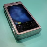

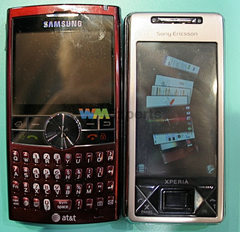
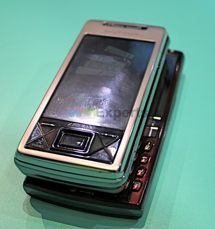
We finally got real hands on the Xperia X1 (we're done putting “Xperia” in caps, btw). Let us tell you - the hardware is simply top notch. It's a decent weight, not too heavy, and feels remarkably thin for all the power they've got under the hood. Sony Ericsson also made a good decision by making this phone not feel too “wide”, it's less wide than a BlackJack II, in fact. Overall this might be the best hardware I've ever seen on a Windows Mobile device.
...and those thoughts are just the start of it. After the break, our first impressions of the Xperia X1's hardware, details on the development and innards of the X1 from our chat with Martin Winkler, Director of Global Marketing for Sony Ericsson, and full gallery of hands-on photos.
Also, we put your questions to him, and we'll put his answers to you.
What are you waiting for? Read on!
Hardware
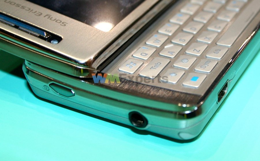
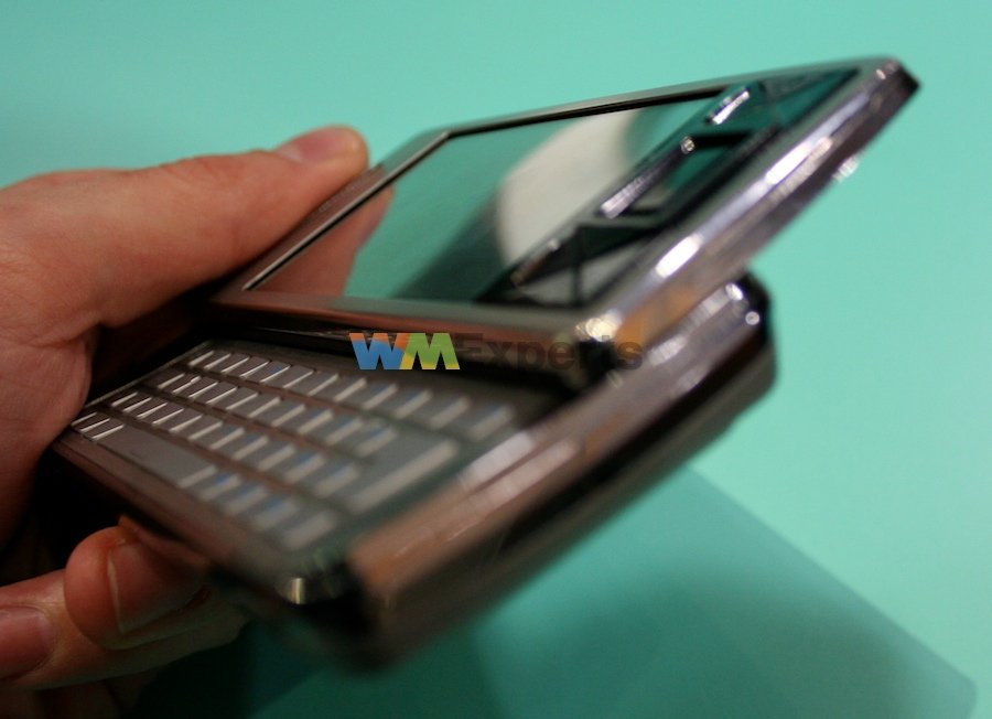
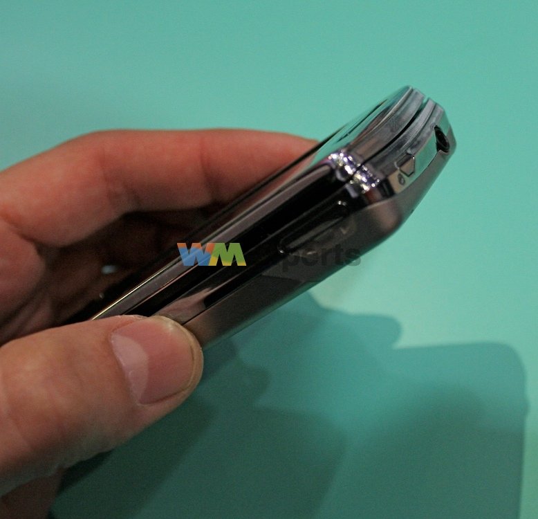
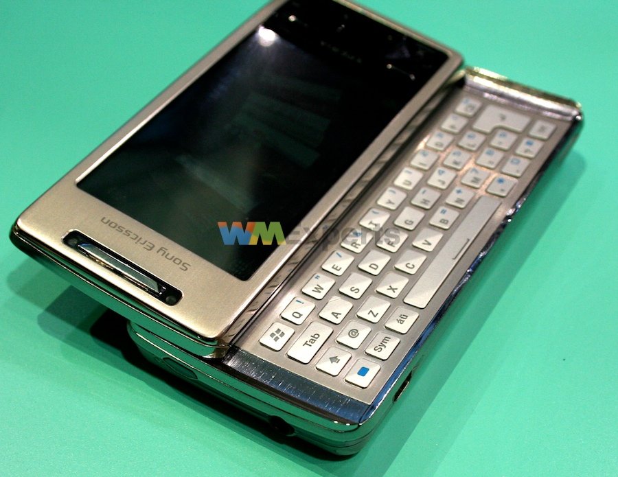
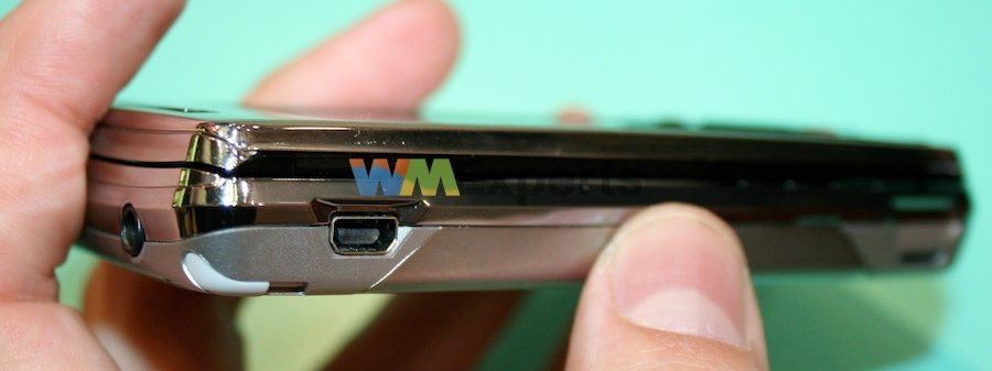
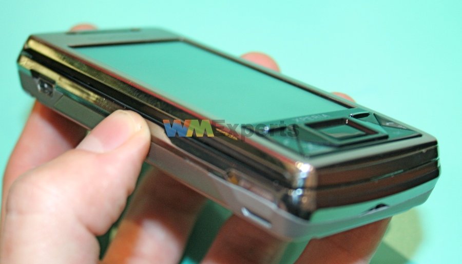
The X1 has a “curved slide” that angles the screen up, banana-style, when you slide out the keyboard. The hinge feels very sturdy without being difficult to use (go hinge nerds!), and overall the brushed metal to be found throughout the device is just beautiful. Moving around the device, the peripheral buttons are decent enough and there's no floppy rubber doors over ports or the MicroSD card slot to ruin the feel of the device. That feel, in case I haven't made it clear yet, is great.
The physical keyboard is pretty good, though perhaps not quite up to HTC's standard on the Mogul or the Tilt. There is more horizontal separation between keys, which helps reduce incorrect key presses. That's great if you're a fan of two-handed use, but it basically guarantees that if you want to use this one-handed, you'll use it with the slider closed.
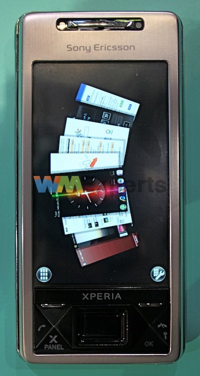
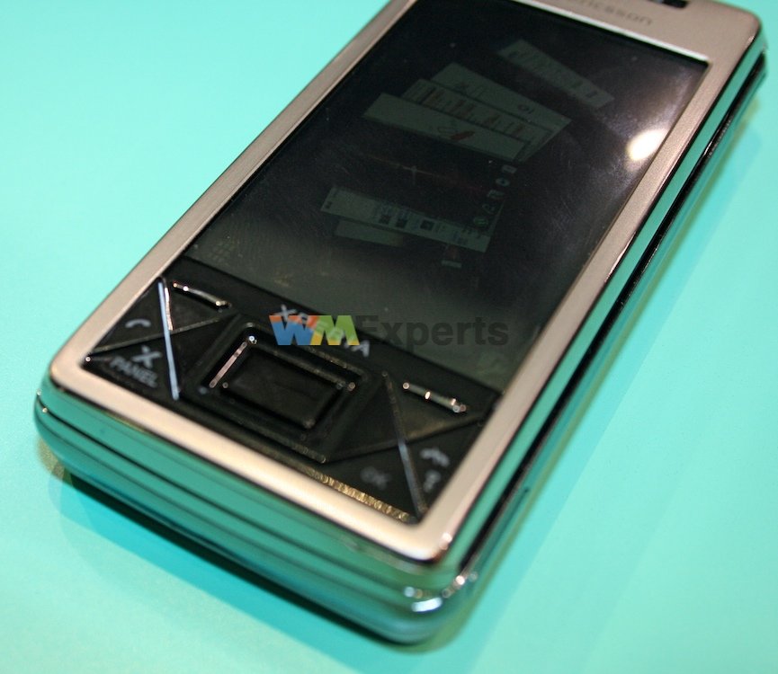
The main buttons have this “X” theme to them, 4 laid out on either side of the way in an inverted diamond shape that I'm not particularly fond of, but it works. The 5 way is a great combination of a touch-mouse (like the Samsung SCH-i780) and a typical D-Pad surrounding it (where the i780 falls on its face). The touch mouse is really great for scrolling quickly, the 5 way lets you do more discrete movements.
Get the Windows Central Newsletter
All the latest news, reviews, and guides for Windows and Xbox diehards.
The screen. Good god, the screen is really beautiful. Flush, bright, and very high resolution.
So yes, the hardware delivers. The software is Windows Mobile 6.1, so there's not much to say there (we'll get to these “Panels” in just a minute). If you like horizontal sliders, you will covet this device. If you don't like them, you might well covet it anyway.
Under the Hood
Here are the specs, in case you're wondering:
- HSDPA/HSUPA (Quad Band, too)
- WiFi and Bluetooth
- aGPS
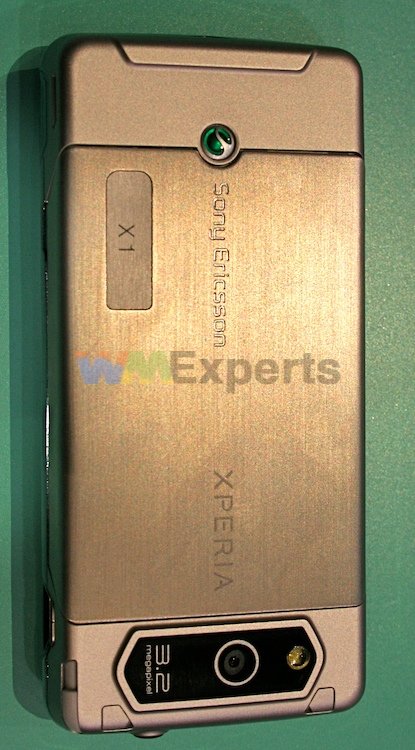
- 3.2 Megapixel Camera
- 110 x 53 x 16.7 mm
- 145 grams
- 1500 mAH Battery
- Qualcomm's MSM7200A CPU, 528Mhz (confirmed)
- 800x480 resolution Touchscreen (flush)
- MicroSD for expansion
- MiniUSB for data and chargin
- 3.5mm headset jack for music
They are, in short, nothing less than top of the line.
According to the folks at Sony Ericsson, the battery life is supposed to be stupendous (think over 6 hours of talk time or browsing time), though of course that's not finalized yet. As far as Windows Mobile's performance goes, it's as snappy as I've seen. Screen switching isn't instantaneous, but it is a sight faster than on the Tilt. That's likely because the X1 does utilize quite a bit of hardware acceleration, according to Winkler they are taking full advantage of the necessary drivers to do hardware acceleration.
Excepting the new panels interface (seriously, more on that below), the built-in software looks pretty standard. Of course, it's not finalized, but I don't expect that Sony has any plans to include Opera as the default browser.
The Panels
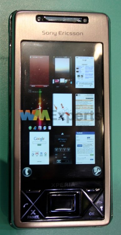
Winkler (who we interviewed about the X1) spent quite a bit of time talking to us and answering our questions about the infamous panels. The panel interface is actually the thing that kept me from giving you a hands-on video -- it's still a little buggy and in “debug mode” and so nowhere near as fast and snappy as it ought to be or (hopefully) will be at release.
The main purpose of the panels seems to be threefold:
- Give consumers ways to customize their device
- Integrate disparate functions of the smartphone onto a single screen
- Make Sony Ericsson some money.
We're pretty much just assuming the third part, by the way, but it's a safe assumption that Sony would 'get a piece' if AT&T made a music store panel. You can scroll through panels (and download new ones) fairly easily. Some examples of panels they showed me:
- A Google search page
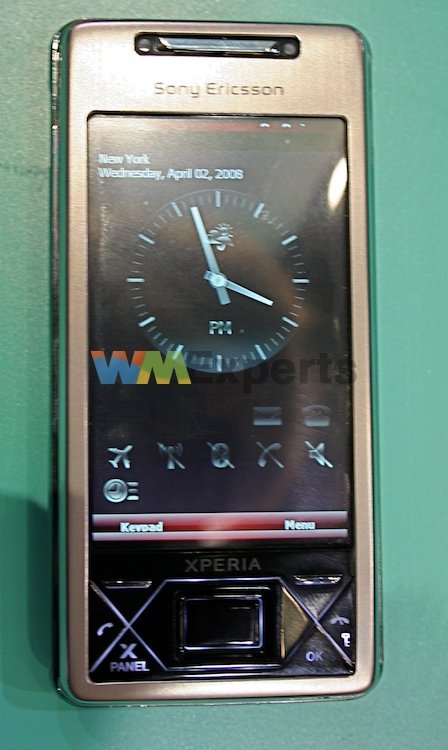
- A clock that showed time, appointments, weather (they said they were thinking of adding GPS coordinates)
- A “mini aquarium” where you could feed the fish and pester them. Even better - the different fish reflected the state of the phone. One fish changed colors if you had voicemail, another if you had email, and yet another told you whether or not the phone was on silent or vibrate or LOUD or whatnot. This panel was super fun.
As far as developing panels, Winkler said that it's relatively easy though not identical to developing a Windows Mobile app. Programmers can use stuff as simple as XML (to make a web-like panel) to C++. Sony will be vetting all the panels they'll offer through their panel update interface, though they don't have plans to try to “lock out” people from creating and loading their own panels that aren't “Sony approved.”
Ok ok. Panels are neat. You can choose from lots of different panels. Some of them are innovative and clever. There's a business case to panels. All of this we sort of knew. What we didn't know though, was this: What the hell are they? Do they sit on top of Windows Mobile? Is it a completely new OS? What?
Panels are Today Screen Replacements. That's it. You choose a panel and it replaces your today screen. That's why SE said that “one of the panels is Windows Mobile.” What they meant was one of the “panels” is just the default WinMo today screen. The rest of them replace it.
On Sony Getting Into the Windows Mobile Game
A couple of details that I learned from talking to various people at the Sony Ericsson booth that might be of interest:
They took care to emphasize that HTC didn't have a large hand in developing the hardware. “We designed it, HTC is just the ODM” was a phrase I heard twice. SE is (rightfully) very proud of this hardware and though they're utilizing HTC to do the manufacturing, they really want to make sure that they get the credit.
As for using HTC to manufacture it, my personal opinion is still mixed. HTC is very good at making great hardware and clearly has much more experience at this sort of thing than Sony Ericsson. Likely that's why SE made the decision to go with them. It's still surprising to me, however, as SE makes all sorts of phones and consumer devices and thus they likely had a lot of options. If nothing else, I see it as a testament to HTC's incredibly ability to crank out Windows Mobile devices as a manufacturer that they could beat out the other ODMs that Sony uses for their other products.
The other interesting bit is that SE developed the X1 as a “North American Device.” Most of the design and development work was done in San Diego and has a “North American mindset.” If there was any doubt that Sony Ericsson is aiming this device primarily at the US market, that doubt can now be laid to rest. SE has traditionally done much better in the Asian and European markets with their high-end phones, the Xperia X1 is clearly intended to reverse that trend.
Answers to your Questions
You asked us questions, let's provide you with answers!
From surur:
Is flash lite pre-installed - can you ask them to go to YouTube and play a vid?
Flash lite will be pre-installed, but the unit I used wasn't connected to the net so I couldn't test YouTube.
Would they consider shipping with Opera Mobile instead of PIE.
They will consider it, but don't expect it. Software not finalized yet.
Would they consider arrow keys on the keyboard?
Nope. They're pretty happy with the tradeoff of leaving 5-way keys off the full keyboard. Winkler pointed out that there are three parts of the X1's design means that it's not cumbersome to reach up to the regular 5-way:
- The device isn't as wide as other sliders, so it's not as far to reach
- The curved nature of the slide means that it's also closer vertically to your right thumb
- The touch mouse offers really convenient scrolling of web pages (you can just swipe down on it to scroll), so you may not have to leave your thumb up there the whole time.
Does it actually have a d-pad in addition to the optical joystick?
Yes, thank the gods of all that is technical.
Any T-Mobile 3G support?
I assume you aren't talking about T-Mobile USA. ;) They naturally can't talk about carriers yet, so your guess is as good as mine. My guess is “No.”
Main question - when is it shipping and to which countries.
They can't and won't say. Ditto price.
From Palm_forlackofchoice
will it ever see CDMA?
They're not going to rule it out, but signs point to no.
From adamz
I second the T-Mobile US 3G and arrow keys on the keyboard questions. Not having those arrow keys is pretty dumb.
Shrug, if it were me I would have done the same thing wrt the arrow keys. They have to make choices about where to put the buttons on the keyboard and having 5 extra (redundant) buttons would cause other buttons to be cramped or eliminated.
I definitely wouldn't want Opera Mobile preinstalled to replace PIE though.
I would, but to each his own, that's the story of, that's the glory of ...Windows Mobile.
From pdaluver
How about bringing that sweet gadget back home with you and shipping it to me? LOL, just kidding!
If I had managed to steal one, you'd have to pry it from my cold, dead hands.
How do you like the keyboard? It looks really nice from the pics I've seen.
I like it about as well as I like any slider keyboard. It is remarkably wide (since the X1 is such a tall device to accommodate 800 pixels of height on the screen), which I'm not fond of. Key travel and feel was decent, though I do wonder if people might have to develop callouses to type on metal keys all day.
How smoothly does that arc slider move back and forth?
Like butter.
Did you get to watch any videos on it? I read that it's supposed to have DVD quality video. Thanks!
Sadly, no. However the high resolution and graphical acceleration gives me hope.
From cmajewsk
It's too beautiful, too powerful, too functional - it will NEVER see that light that is CDMA...
Hey now, with the latest ROM update I officially, here and now, bestowing the WMExperts Best Damn Windows Mobile Pro Device Available Today title onto the Mogul, a CDMA device.
From Hollywould
Will it ship with WM6.1, how good is the camera with photos and videos, is it finger friendly when using the Windows Mobile Part of the device.
Yes. I'm sorry, I don't know, but it's 3.2 megapixels. Meh. The touch mouse is cool, but the device would really benefit from TouchFLO-style scrolling.
From Malatesta
What type of chipset--its rumored to be MSM-7xxx(a), which is a 63nm variant.
Qualcomm's MSM7200A CPU, 528Mhz (confirmed and utilizing graphic acceleration drivers)
From Snowman
My main thing is how much do they think its going to cost (full retail price).
They ain't saying.
From rasti
I want to know if it have Video performance issues, like his twin brother, the Toshiba G900 or his father, the HTC TYTNII (At&tTilt)
It doesn't appear to. Now the Panels interface, as I mentioned, was still Beta and therefore slow. Windows Mobile 6.1 was very snappy, though.
So there you have it, the X1 looks to be an incredible device, though the Panels interface does leave me a little worried that we're looking at yet another target for developers to have to think about wrt Windows Mobile. I wish they would have let us do video and I wish I could have spent a bit more time with the device, but you takes what you can get and Sony Ericsson gave as much as they were able by giving me face time with the man in charge of marketing the Xperia brand and the X1 worldwide.
On to the Gallery!
Gallery


Home to the most invested and passionate Microsoft fans, Windows Central is the next generation destination for news, reviews, advice and buying recommendations on the Windows, PC and Xbox ecosystems, following all products, apps, software, AI advancements, and accessories. We've been around for more than decade, and we take our jobs seriously. Windows Central writers and editors value accuracy and editorial independence in everything we do, never receiving compensation for coverage and never pulling punches.

