Review: Dorothy Browser Beta 0.2.0

Just when it looked as if the mobile web browser market had settled down a bit, another one emerges from the shadows. Dorothy Browser is the latest webkit powered browser to hit the Windows Mobile scene. Dorothy is only for WM Professional devices (no word if a Standard Version is to follow) with a 400mhz or higher processor, 128mb or greater RAM and screen resolution of 800x480. It will work on smaller screens but you'll just need to scroll around more.
Dorothy Browser is in Beta development so performance was sporadic. Pages loaded fast but seemed to stall half way every so often. That last little bit of the page load seemed to take forever to complete. I didn't experience any lock-ups but there's obviously still some work to be done on the page load end.
While performance still has some bugs to iron out, follow the break to see what impression the application's features and design made.
To download Dorothy, you need to visit Dorthybrowser.com and sign up for the Beta test. Once a verification email is sent, another email is sent with the download link (that expires after 24 hours so don't dilly dally). Installation was uneventful and in a matter of minutes I had Dorothy up and running.
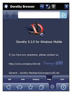
The layout reminded me of Opera's browser. The main screen has the URL window (with front/back/stop/reload buttons), a tab for the main menu and zoom controls. Tap the main menu button (the little triangle) and it reveals your menu options (sound familiar). Here your can return to your home page, add/modify favorites, open another page, and adjust settings. Still working on what the "+" sign is supposed to do. Unfortunately, there's not enough chatter on Dorothy's blog and the developer didn't include any instructions with the Beta release.

Some won't care for the zoom buttons and prefer a double-tap-to-zoom feature. Personally, it doesn't make a difference to me but the double-tap-to-zoom feature does make life a little easier. The zoom buttons do help you avoid accidentally double-tapping a web link.
Pages are touch navigable or you can use your phone's directional pad (if you have one). In testing the Beta version out on the AT&T Fuze pages scrolled rather nicely. When you touch the screen to scroll the bottom buttons disappear and are replaced with a horizontal indicator to show you where you're at in relation to the full page.
Get the Windows Central Newsletter
All the latest news, reviews, and guides for Windows and Xbox diehards.

Dorothy Browser seems to have promise and if they can shore up the page load times, it will definitely give Iris, Opera and Skyfire a run for their money. Browser design will definitely be an issue of personal preference and those who don't care for zoom buttons may look elsewhere. It is a work in progress so the final version may be noticeably different than the early Beta builds. We'll keep an eye Dorothy and see if it's worth the trip down the yellow brick road.
Phil is the father of two beautiful girls and is the Dad behind Modern Dad. Before that he spent seven years at the helm of Android Central. Before that he spent a decade in a newsroom of a two-time Pulitzer Prize-finalist newspaper. Before that — well, we don't talk much about those days. Subscribe to the Modern Dad newsletter!
