Reading on Windows 8 - a look at Kindle, Nook, and Kobo

While many readers still embrace the paper pages of a book, others have moved on to the embrace of an electronic ink or LCD display. Amazon was the first company to push eBooks into the mainstream market in 2007. Today, many readers choose to pick up a tablet, cellular phone, or dedicated eInk device to dive into a world of adventure. We are taking a look at the top three eBook reading apps (Kindle, Nook, and Kobo) for Windows 8 and Windows RT devices.
Kindle
Amazon still clutches onto first place with its range of electronic ink reading devices and suite of Kindle apps. Opening the Windows 8 application throws you into a grid list of your eBook library that can be sorted alphabetically or by your most recently read content. Switching between content on your device and content stored in the cloud is only a click away.
The Kindle Store itself mimics the layout that we have seen on the Kindle Fire HD; it is easy to find new content, locate specific genres, and see personal recommendations.
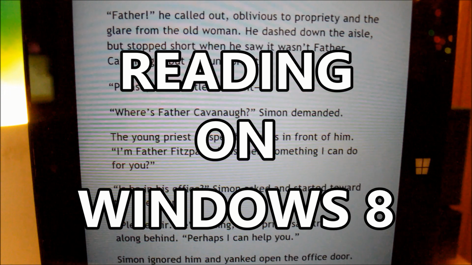
Reading within the Kindle app is a pleasant experience as you swipe or tap your way through a novel. We did enjoy the added features including note highlights and quick dictionary definition look ups. There were times that the application detected a swipe or tap as a dictionary look up, but it was easy to note the mistake being made and correct our actions. It is my personal hope that Amazon works on a better way to detect swipes and taps.
Overall: The Kindle app has a large selection of eBooks and a super easy UI that allows readers to get to all their content quickly. The Kindle app also has the most unique feature set and dictionary definition lookups should not be underrated.

You can grab the Kindle app here.
UPDATE: Since this article, a new version of the Amazon Kindle app with a brand new UI has been published; click here to learn more.
Get the Windows Central Newsletter
All the latest news, reviews, and guides for Windows and Xbox diehards.
Nook
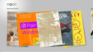
The Nook app opens up to display your “Daily Shelf”, a five item collection of your latest content. The application design is a nice bright refresher compared to Amazon’s dark Kindle UI. Users can scroll to the right to access more of their collection or start browsing content from the store. Unlike the Kindle UI, which tucks the store away until you need it, the Nook app’s start screen is a mixture of your content and what Barnes and Nobles hopes will soon be your content.
The Nook store has a vibrant collection of media including books, magazines, and comics. Amazon has begun to introduce comic book content into their store, but for now – Nook has the edge. That being said, we recommend using comiXology’s app for comic book reading.
Reading with Nook is also enjoyable. The application has a page slide animations which pushes pages out of the way; while more beautiful, I find the animations a bit distracting after an extended reading period.
We also enjoy the fact that the Nook app’s settings allow for a “Publish Defaults” option; it is easy to switch on, and almost always seems to format an eBook perfectly.
We did not like the fact that columns could not manually be adjusted for reading within the application. The Nook app automatically selects a number of columns for you based on your text size – for me, this is a deal breaker and makes reading not as comfortable.
Overall: The Nook’s UI is a welcomed change from the dark Kindle UI and offers a beautiful layout. If you insist on integrating comics and books in the same app, Nook has you covered. We enjoyed the option to switch on “Publish Defaults” for text, but the inability to select the number of reading columns - just might be a deal breaker.

You can grab the Nook app here.
Kobo
The Kobo ecosystem might be considered a much smaller player next to Amazon’s Kindle and Barnes & Noble’s Nook, but it still provides a great selection of content.
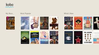
Kobo’s app start screen mimics the simplistic design of the Kindle app with similar store integration as seen in the Nook app.
Navigation between areas is cumbersome as the developer decided to ditch Microsoft’s guidelines, and buried the nav bar inside the settings panel; this is extremely disappointing as the rest of the application, including the reading experience, feels great.
Navigation within your eBooks takes a slight turn from the Kindle and Nook apps as you are only allowed to tap through pages – no swiping for Kobo. The app does include an option for publisher defaults which we enjoyed.
Overview: The Kobo app creates a great alternative for readers who don’t want to feed into the Kindle or Nook machines. The content selection for books is still vast, and reading is enjoyable. We would like the option to swipe through our content though. Also, a redesign of the navigation is a must.

You can grab the Kobo app here.
For more information about reading eBooks on your Windows 8 tablet – stay tuned to Windows Phone Central. For more information about reading paper books – ask your grandmother.
Are you a bookworm - how do you consume your content?
P.S.- Any fellow nerds can join me on GoodReads by clicking here.
