Pouch for Windows Phone 8 and Windows 8, an elegant Pocket client

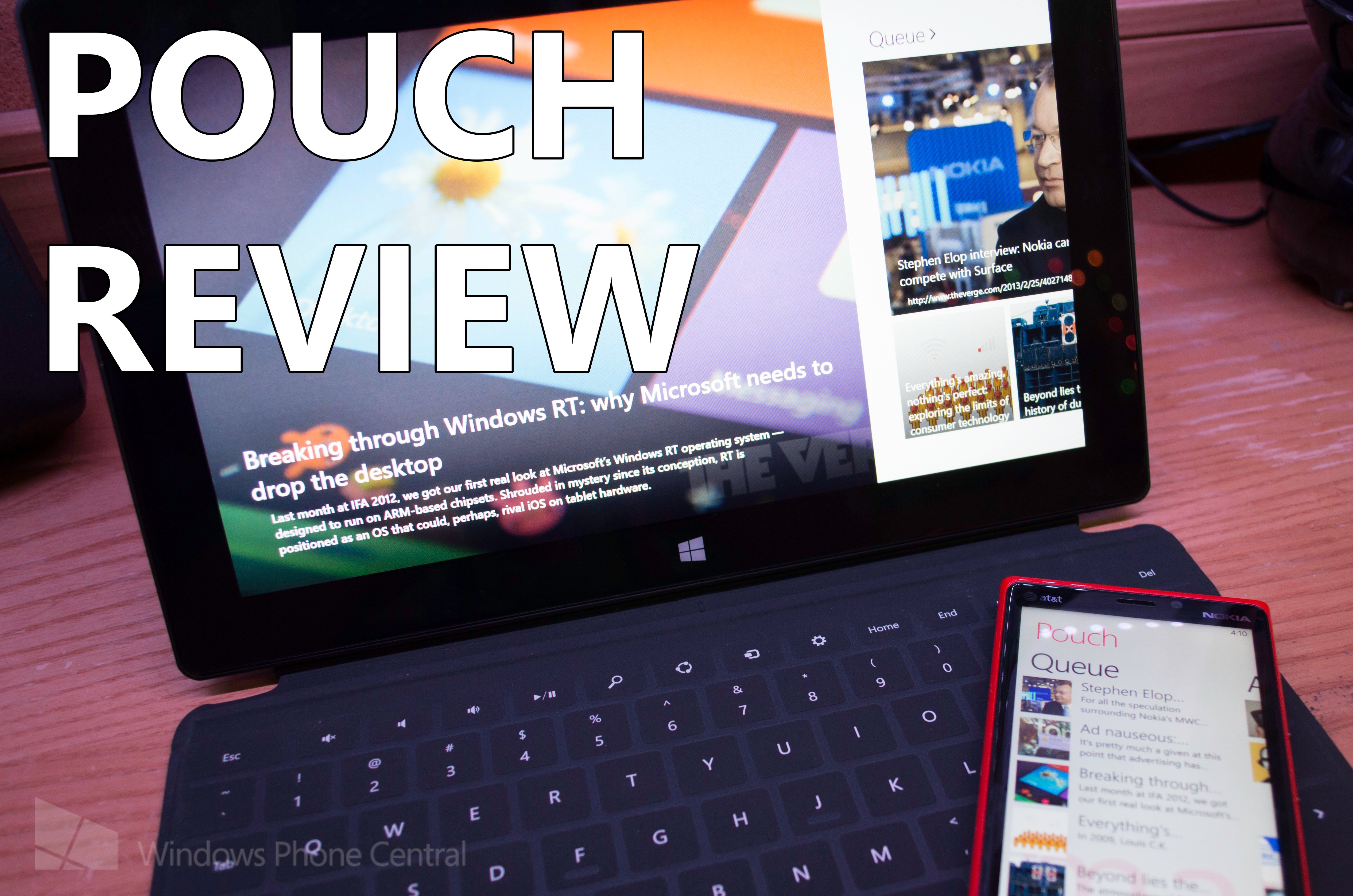
In today’s world, we gather our news from a multitude of sources. Pocket (formally Read it Later) has always been one of my favorite ways to save articles and content on the web for later mobile consumption. Pouch, is a set of apps for both Windows Phone 8 and Windows 8 that delivers your Pocket content in one of the most elegant designs I have yet seen.
Before we begin, I should state that the version of Pouch for Windows 8 you are about to see is a beta and has not been seen by public eyes before; we are happy to take you on the grand tour courtesy of the developer.
Design
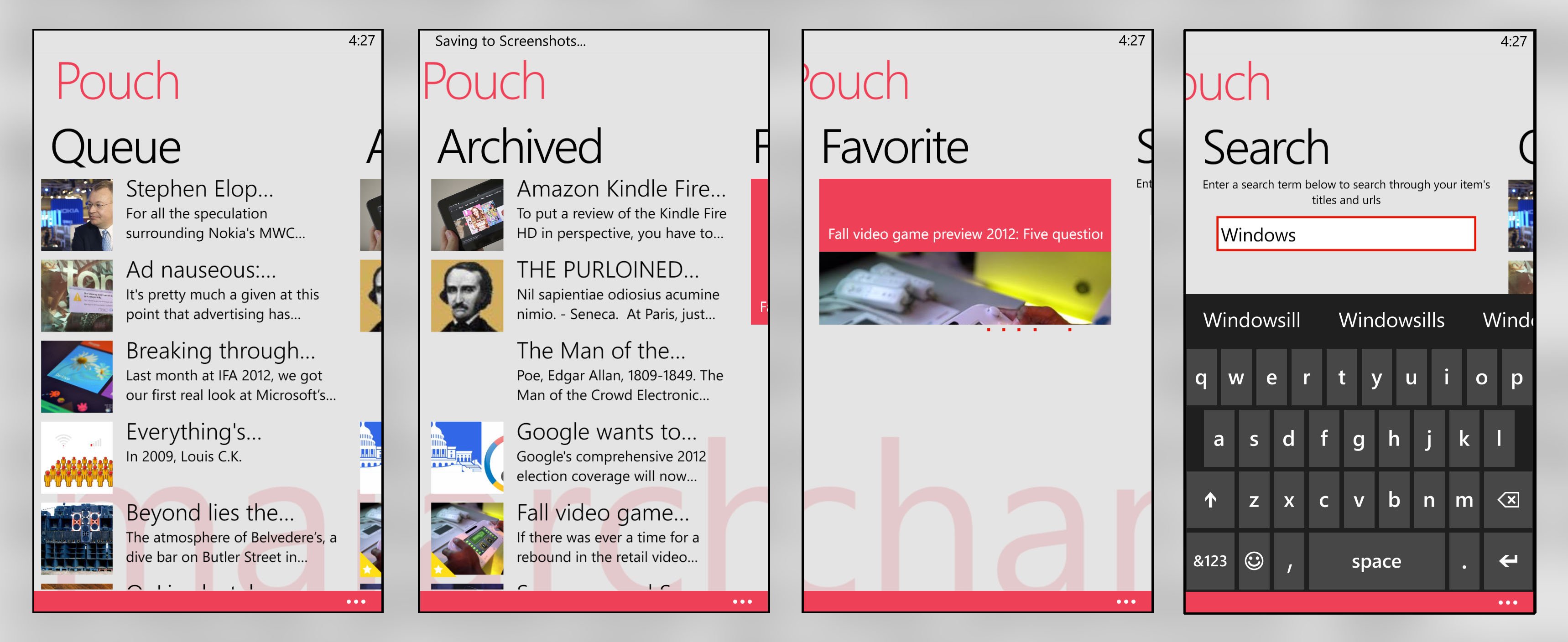
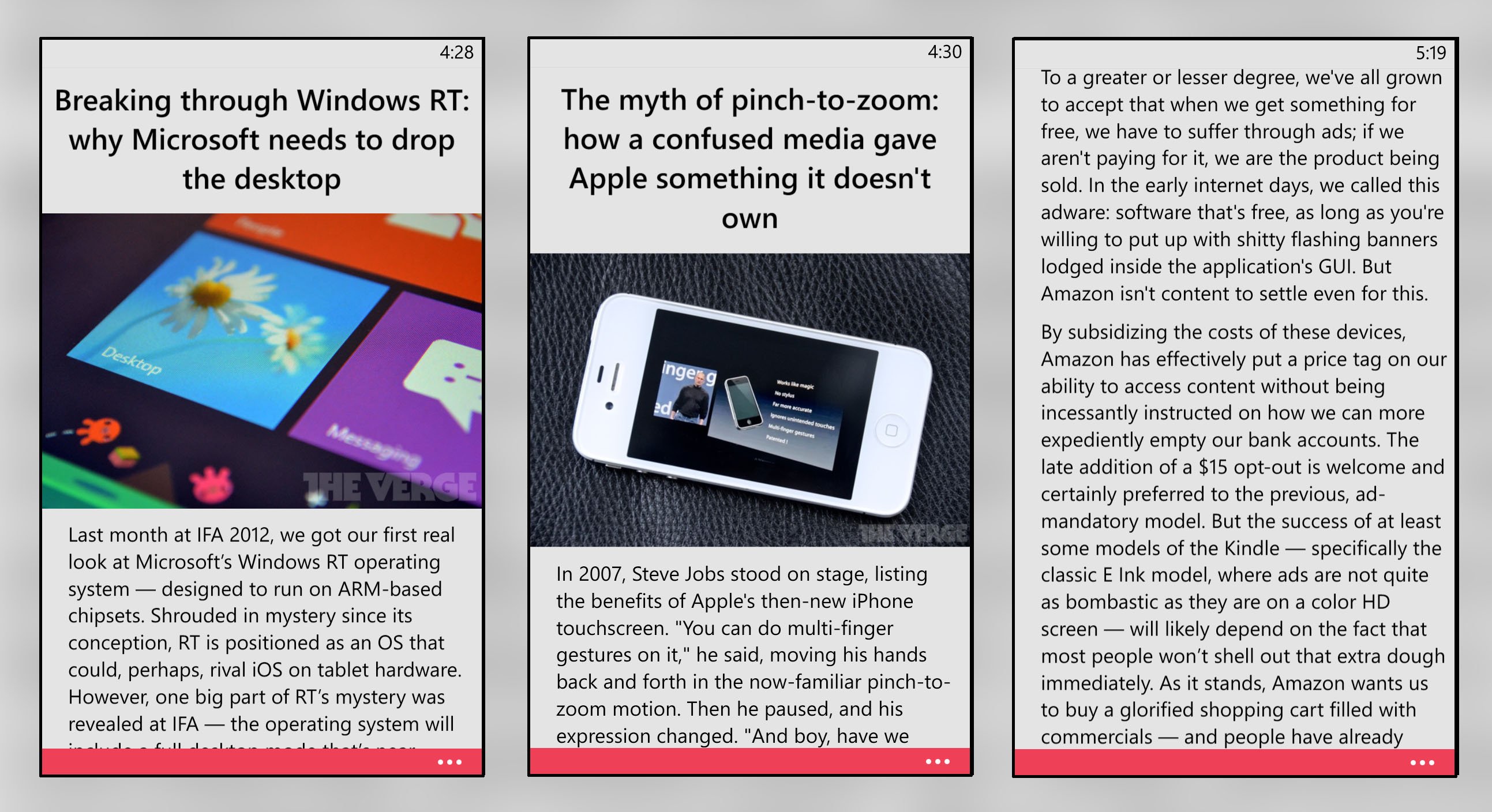
Pouch’s app for Windows Phone 8 follows Microsoft’s design guideline down to the punctuation. The design is minimalistic and simple; the screen is reserved for your content, while settings are neatly packed away – out of sight, out of mind. The application’s homepage is based on the Windows Phone “panorama style” which allows for fluid and native scrolling between the application’s categories. Reading a story within Pouch is one of the cleanest news reading experiences I have seen in any Windows Phone app to date.

The app’s Windows 8 counterpart is also designed well, taking a cue from Microsoft’s Bing News application. When you open the app, you are presented with a large slideshow of the latest content in your Pocket Queue – the slideshow is useful, while also aesthetically pleasing to the eye. When swiping to the right, you are presented with your articles arranged in a grid formation; the articles are arranged by the date in which they were added to your queue, archive, or favorites.

Functionality
Pouch has a small collection of settings on Windows Phone 8, but they should suffice for most users. By accessing the Settings screen you can adjust font size, app bar size, system tray settings, and what YouTube application to use. On my Windows Phone, I have MetroTube and the official YouTube app installed, but Pouch only lets me open YouTube links in the browser, a bug or a teaser for a future update - I am not sure. When reading an article, the user is presented with the options to favorite it, archive it, delete it, or share it with friends.

Since the version of Pouch we received for Windows 8 is still in beta there are some features currently missing, but we are told by the developer to expect to see them in the final release. Current missing features that will be in the Windows Store release include the ability to resize text, snap mode, and customization of the apps’ start screen. Overall, the app shares its feature set with its smaller mobile brother; users can easily favorite articles, move them to the archive, or delete them completely. Sharing an article is accomplished via Windows 8’s charm bar.
There are a few features that aren’t implemented or planned as of now, but we would like to see. The first feature, would be the ability to resize the columns of text the application presents its stories in. Currently, on my Surface RT, an article is displayed in three columns – I would prefer to view them in two. In addition, the current version of Pouch (the one currently in the Windows Store), has its text resize button above the article’s content – in keeping with a universal design layout, I would like to see the font resize option located within the application settings.
Get the Windows Central Newsletter
All the latest news, reviews, and guides for Windows and Xbox diehards.

Value
Pouch for Windows Phone 8 costs $1.99 and in my opinion it is worth the price tag. You can download the trial of the app which allows you to read articles, but not share or manage content. In addition, the application constantly nags you to upgrade, so you might as well just do it.

Click here to be linked directly to the Windows Phone store page
Pouch for Windows 8 costs $2.99 which is a bit more expensive than junior, but still reasonable. We would like to see a slightly cheaper price tag that matches its Windows Phone counterpart, but even at $3, it is hard not to recommend it. As of now, if you download the current Pouch trial, the application has its full functionality and simply adds advertisements to the top nav bar – we don’t know if this will change in the future version of the app which the developer tells us will be available soon. You can find the current version of Pouch available for download on the Windows 8 Store by clicking here.
Wrap-up
Pouch is not only one of the cleanest and well-designed Pocket clients I have used, it is one of the cleanest and well-designed Windows Phone apps I used overall. I cannot recommend Pouch any more highly than I currently do and it is an important part of my news consumption arsenal. If you consume news like Cookie Monster consumes cookies, you should definitely considering downloading Pouch.
The Good:
- Beautiful and minimalistic application design
- Easy to manage, move, or delete Pocket content
- Live tiles keep you updated
- Price tag that matches its value
The Bad:
- Inability to resize the width of story columns

