Overview and review of Windows Phone 8
All the latest news, reviews, and guides for Windows and Xbox diehards.
You are now subscribed
Your newsletter sign-up was successful
Let’s be clear about something: Windows Phone 7 was simply a warm up act for Windows Phone 8. It was the start of something big and different for Microsoft, a way for them to take a distinctive approach to the current smartphone exemplar. But Microsoft were hindered by numerous roadblocks: an aging kernel (the core of the OS), limited hardware and a desire to be more conservative in features waiting instead for user-feedback and to see how people actually use their phones.
With Windows Phone 8, the gloves are off.
There are two areas in which Windows Phone 8 differs from its predecessor: the core of the OS has been updated with the NT kernel and the addition and refinement of features. Consumers don’t need to know about the kernel specifics but they will see the results: new, top of the line hardware. That hardware will be evident in a few weeks when devices like the HTC 8X and Nokia Lumia 920 become available.
Article continues belowMicrosoft has also spent a lot of time listening to feedback on how people used their phones. As a result, Windows Phone 8 brings many new refinements that should please current users and make new ones happy.
The odd thing about Windows Phone 8 is there is no single killer feature. So when people ask “Why do I need Windows Phone over Android or iOS?” it’s hard to give a distinct, concise answer. That’s not a knock on the OS or Microsoft; in fact it’s a compliment. Often in the smartphone business, gimmicks are touted as "flagship features" or “must haves”. The problem with that is they are usually short lasting. All a competitor has to do is match that same feature by mimicking it (or sometimes just plain stealing it).
No, Windows Phone 8 is the whole package. It’s a fast stable OS that is as beautiful as it is functional. Combined with Microsoft’s might behind Windows 8 for the desktop, Surface tablets, Xbox 360 with Kinect and what you have is a single, united front attacking mobile, gaming and the PC. It’s a force to be reckoned with and it is just starting.
Windows Phone 8: The OS
Windows Phone 8 on the surface looks a lot like Windows Phone 7. Instead of messing with a good thing, namely the look of their OS, Microsoft took the concept and philosophy behind Metro/Modern UI and let it evolve.
All the latest news, reviews, and guides for Windows and Xbox diehards.
And that’s the key description for the overall appearance and function of this OS: evolution.
Sure, there are numerous new whole features like Rooms, Kid’s Corner and private Stores for enterprise that bring some exciting new experiences, but it’s about the little things. And it’s that attention to detail that will make current fans of this OS pleased as punch. That’s not to say Microsoft checked off every complaint on the list from users, but they did get many and they did it smartly.
Live Tiles and Live Apps
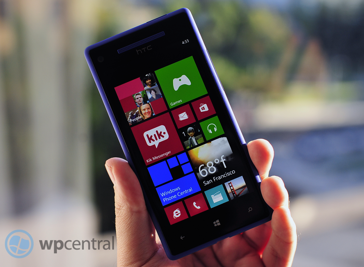
Turning on the phone for the first time, we see those familiar Live Tiles appear on screen, flipping and changing gleefully, bringing that “glance and go” approach to the end user with ease. What is different about the design this time is the tile-size options: small, medium and large (affectionately called “double wide”). Users can now prioritize their Tiles by manipulating their dimensions, obviating the uniformness of its predecessor.
Not only does this make organizing your Tiles smarter it gives users a new level of customization. Sure, it’s not slapping on hideous wallpaper or changing the Tile’s physical look (i.e. skinning), but surprisingly such a small addition has dramatically changed the way the Phone behaves. And when placed next to Microsoft’s Windows 8 (Surface RT tablet), you can see the same look and vision oozing over.
Another simple but useful addition is the ability to share apps right from the App list. By simply pressing and holding on the app, not only do you get the usual options to review, uninstall or pin to the Start screen, but you can now directly share it via email, SMS or tap to share. The old method would require you to go search for the app in the Store and hit the Share button. This is obviously much more direct.
Bing it on
Bing services have had a major overhaul in Windows Phone 8, bringing more of the web features to the device, and expanding upon existing services like Local Scout. Once again, while launching Bing via the Search key initially looks the same, save for the moved microphone icon, the surprise happens when you swipe to the right.
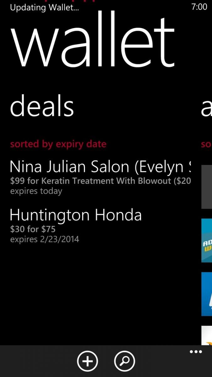
From there you get many Bing services including Local Deals, Movies (info, time, reviews), Bing News and Top Videos. Local Deals brings down coupons and discounts right to your phone based on your current location. With a single touch you can also save them to your Wallet, which itself is a new feature (more on that below).
One of our favorite feature? You can now save and share images from Bing image search.
With Bing News, Movies and Videos at the tip of your finger, finding the latest happenings in the world based on what people actually do with their phones is now a reality. It also saves on having multiple apps in the device making many of them redundant when it comes to basic information.
We’ve always liked Bing but like some other features on Windows Phone, lamented its somewhat limited roll when compared to the web version on the desktop. Now, Microsoft has taken many of those features and elegantly integrated them into the Search area. It doesn’t feel tacked on but rather integral.
Microsoft rethinks Windows Phone Camera and fixes the Photo Hub
One of the crowing features of Windows Phone is the quick ability to take photos, including waking the phone and going right to the camera function just by holding the hardware shutter button. Having said that, there were always quirks with Camera in Windows Phone 7. Thankfully those have been ironed out in Windows Phone 8.
The new functions or changes to the camera module are the following:
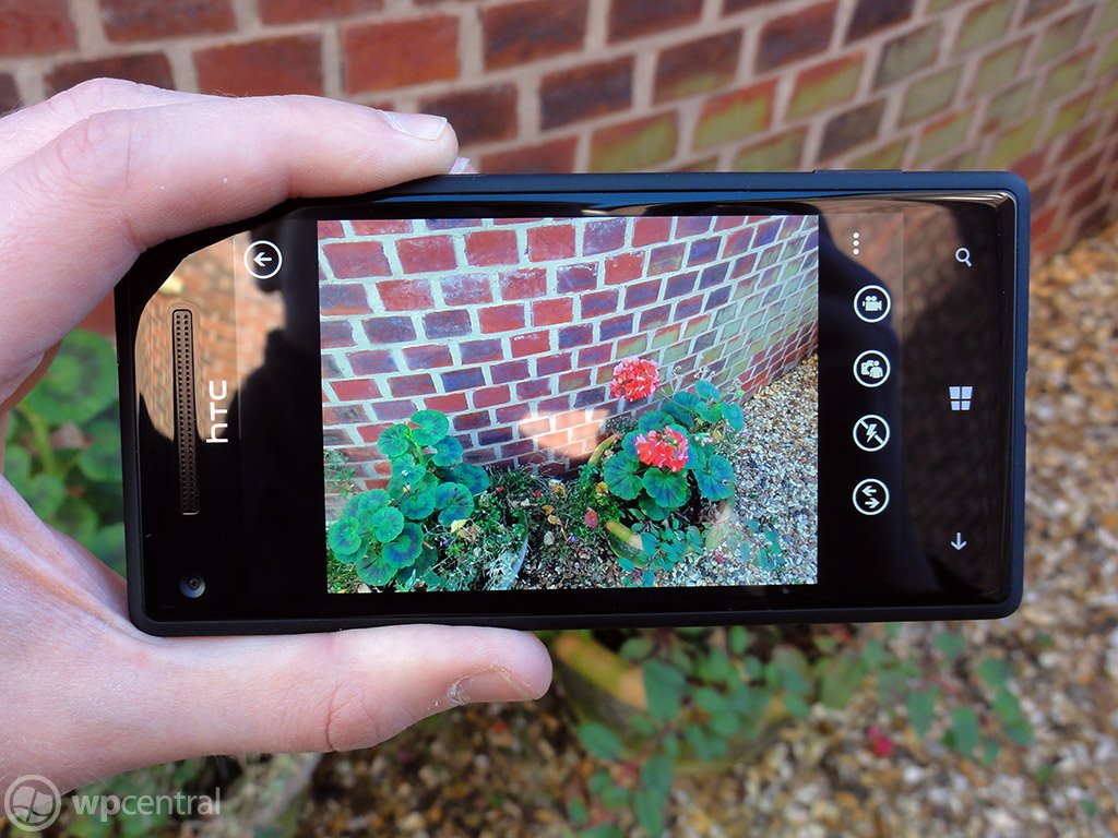
- Pinch to zoom – Microsoft has removed the +/- buttons, saving space on the screen. Instead, you can just zoom in by pinching your fingers right on the display
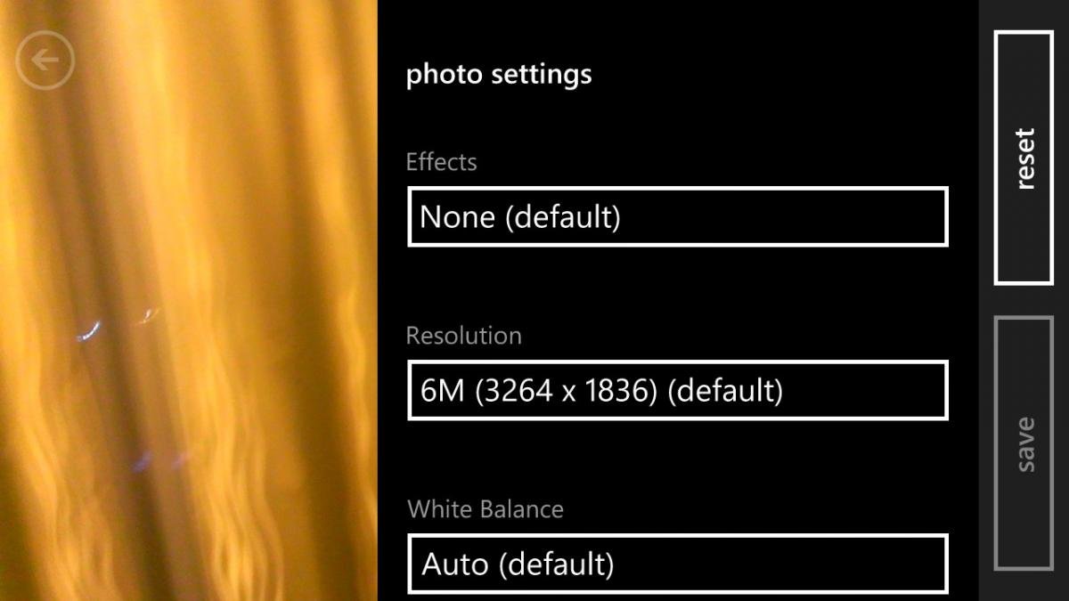
- Unified Settings – The settings section is no longer a sprocket and the menu system has been redesigned
- On-screen Flash control – Turning the flash on/off/auto was previously buried in the menu on Windows Phone 7. Windows Phone 8 makes it a permanent icon on the screen. Tapping it also flashes the text of the selection briefly on screen for a good visual confirmation.
- Photo Review – In WP7, users would see about 1/12 of the previous photo on screen in the camera with an arrow. Grabbing that tidbit allowed you to review your photos on the fly. Now, it is just an arrow and more interestingly, it is dynamic. By that we mean it is based on your orientation: horizontal results in a horizontal film strip, but holding the phone vertically will match that.
- Lenses – Lenses are third-party photo “mini-apps” that can be used dynamically while the camera is running, allowing users to add effects “live” to their pics
- More edits – In addition to auto-fix, users can now crop and rotate images instantly
Like we said, we always liked the camera function on Windows Phone 7 but the changes to 8 have been stellar. While we’ll have to wait to see how well Lenses work out, being able to do basic edits like crop and rotation were absolutely necessary, so we’re glad to see that added. The Pinch to Zoom feature just expands that paradigm from the photo viewer to the camera; it also gives a clearer look to the viewfinder with less clutter. All in all, we’re quite pleased.
Multi-select is finally here
If there was one super frustration in Windows Phone 7, it was deleting photos from your collection. You used to have to press-n-hold on each photo to bring up the context menu, deleting them one by one. If you have 20 photos to delete, you’re going to need some time, patience and will probably get a sore finger.
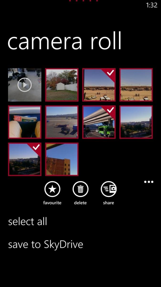
Luckily Microsoft did the obvious thing here and added a multi-select feature. Just tap the icon in the Photo Hub and tap to check your photos. From there you can delete them or use the Share function to post to social networks, email, etc. Two birds down with one stone.
People Hub + Rooms
Up until recently, running into people on the streets who were using RIM’s BlackBerry OS you could almost guess the reasons why they had it: work or BBM. Thankfully the days of BYOD (bring your own device) are upon us so people can choose their phones for work and play, but BlackBerry Messenger (BBM) was a huge selling point for that system. And although cross-platform services like Kik are taking that concept further, Microsoft thinks it can do more with it hence the inclusion of Rooms.
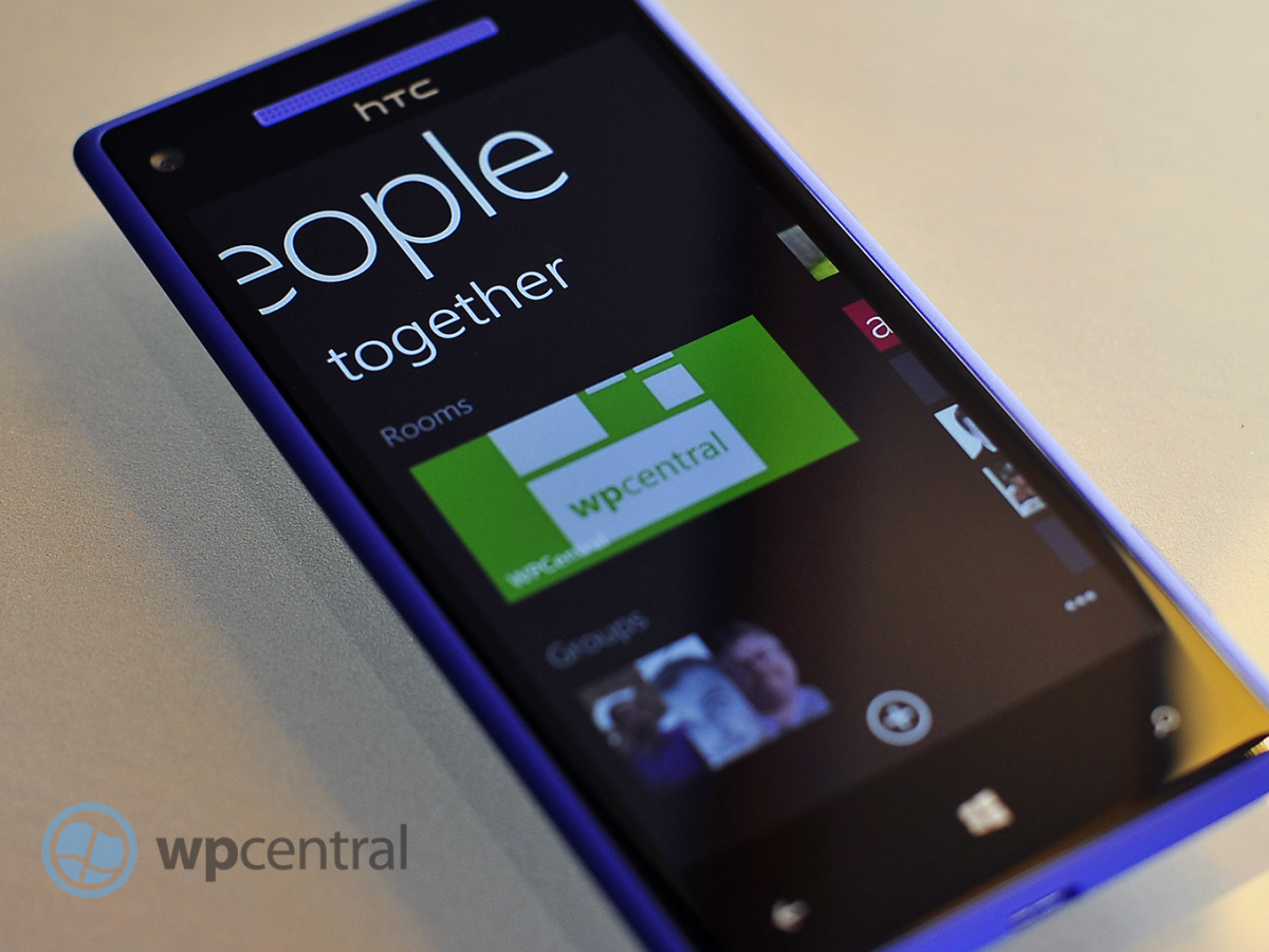
The concept of Rooms is fairly simple: create a space for people to discuss and share things online. By swiping over to the Together section under the People Hub, users can create a Room, invite their friends or family and begin interacting.
Rooms have five areas: members, chat, photos, calendar and notes. Under the members section, you can single-tap invite your contacts to your new Room. You can name the room and even add wallpaper to it to give it some flare. The Chat area is built off of Microsoft Messenger and allows users to instant message each other. Photos and Notes allow you to share those items, including videos while Calendar is just that, a center for sharing appointments. Finally, you can pin that Room to your Start screen where the Live Tile will keep you posted on any updates via Notifications.
Rooms are darn cool. The idea of having a shared “common space” online via your phone seems like a no-brainer to us and having live Chat could be serious contender for killer feature on Windows Phone 8. Of course the downside is that Chat does require other Windows Phone users—so the pressure will be on to convince your friends and family to join the movement. The good news though is even iPhone and Android users will be able to utilize photos, calendar and notes from Rooms. That gives those users a way in to Microsoft’s system but still saves the “premium” experience for Windows Phone.
It’s a great idea but it remains to be seen if it pays off.
Other than tossing Groups under the Together section (Groups are clusters of contacts where you can keep track of their social updates or mass email/text), there are not too many other changes to the People Hub. But one big new addition is the ability to share contact info via email, text or NFC (‘tap to share’). Info is sent by the universal VCF format although info from social networks (Twitter, LinkedIn) are not included.
Don’t forget your Wallet and the NFC connection
The other major feature in Windows Phone 8 is the Wallet, which was introduced back in June during the Summit. Not much has changed since that time and that’s okay as Wallet was in many ways ahead of the competition (and still is). For those who are not familiar, Wallet allows users to store personal information like credit cards, Paypal, frequent flier information, coupons and more all in a PIN protected mini-vault.
Apple recently introduced a similar feature called Passbook in iOS 6 but they omitted near-field communication (NFC) support. Microsoft has embraced this technology. NFC allows you to make payments in stores and outlets that support it by simply tapping the phone to a device. While NFC is still in its infancy for mobile payments, Windows Phone 8 has been made future-proofed for when this technology finally does go mainstream. In the meantime you and your friends can use NFC for sharing contacts, photos and other bits of info simply by tapping your phones together or with NFC enabled PCs.
Wallet itself is also impressive because it allows developers to link to your Wallet for in-app or in-game purchases. If using Fandango, theoretically it could call up Wallet when you want to purchase tickets and import your payment info for you, saving you from having to pull out your card and fumble with your phone. The same with games, which now often have ways to buy things within them for things like avatar gear, game cheats, equipment and more.
We’ve already talked about Apple eschewing NFC in iOS6 and as of now, Google does not have a Wallet/Passport solution. Android does have Google Wallet for making mobile payments via NFC and they have had that for some time but they don’t have a central storage location for credit cards, PayPal or whatever. Instead, theirs is just tied to the credit card associated with your Google account. Surely though this is something that Google could quickly write up for Android 4.2 and beyond so we don’t expect Microsoft to maintain an advantage here for long.
One neat feature of Wallet was how it automatically imported our Microsoft Account information including our stored payment options. For us, that included PayPal and a Visa card and it was curious to see that stored automatically on our device.
The success of Wallet will depend on developers embracing the technology and the widespread adoption of NFC by banks. That could take some time but we think it is worth the wait.
No notification center but we have live Wallpaper
Despite having glance-and-go Live Tiles on Windows Phone, users have clamored for a notification center of some sorts akin to what is found on competing platforms. Unfortunately, Windows Phone 8 does not offer a direct solution to this but that’s not to say that all is bad. With smaller tiles, users can now fit more on their screens making number counts for each app more visible. But it’s on the Lock screen that has the more significant changes for your everyday routine.
Users can now have up to five notification icons on their Lock screens to show missed events. Previously, this was out of the users control with only mail, SMS, missed calls and voicemail showing up. Now with Windows Phone 8, you can pick what Inbox you want (if at all) and developers can choose to opt in for lockscreen notifications too. That means an app like Kik Messenger could shows missed Kiks right when you turn the screen on. While five options may seem like too few for some, we think for most folks it should be okay (though we suppose Microsoft could revise this in the future).
Likewise, the Lock screen previously would display your next calendar appointment in text below the time. That feature is of course still present but once again, the user can opt to show different information e.g. missed phone calls, SMS messages, latest email or any third party app that is optimized for Windows Phone 8 like the new Skype.
Finally there is the “live” wallpaper, which was revealed recently in some leaked screenshots. This ability is tied to apps designed for Windows Phone 8 and it allows developers to offer an extended method by which to deliver information. Examples are found in HTC’s own app, which shows you the current weather, today’s high/low temperature and a background image that corresponds to that forecast. ESPN could deliver sports scores for your favorite team and Facebook can show you your photo stream. In reality, what developers do with this feature is limitless as they can base changes using time (hourly updates), pushed updated for new stories or even geo-location.
The Lock screen is the fist thing a user sees when they turn on the phone. In essence, it should be the “high priority” area for information and Widows Phone 8 allows that concept to flourish. While it’s no notification center, Microsoft has instead continued in a unique direction. We think it works for their design philosophy and we’re real excited to see what developers do with these new tools.
Wait, is that it?
Much like Windows Phone 7.5 aka “Mango”, Windows Phone 8 is chockfull of new features or revised functions. It would be near impossible for us to show you every last tidbit or even define some of it.
For instance, the Live Tiles themselves have an updated animation—we can’t quite put our finger on it, but they flip a little more quickly and jump a little bit more on the screen. While Live Tiles have always made Windows Phone feel “alive” with Windows Phone 8, the timing and animation make the experience even more interesting.
Multi-tasking has now been bumped to eight apps, allowing users to switch between more apps with the same “hold back arrow” function.
There’s also Skype, which is not built into the OS but rather a separate app. But Skype takes advantages of new features in Windows Phone 8 that allows it to integrate into the OS upon installation. It will show contacts in your People Hub, work in the background (without using your battery) and when a Skype call comes in your phone will treat it as a normal phone call.
Skype and Windows Phone will be the first, true legitimate usage of the voice-over-internet technology. By that we mean current iterations allow the app to run on other smartphone platforms but it needs to stay constantly connected to Skype’s servers for presence, draining CPU cycles and battery. In other words, it was kludge: Skype worked but it was far from ideal. Skype on Windows Phone 8 is ideal as it leverages the Cloud to maintain presence. No unnecessary CPU cycles, no wasted battery life and zero compromise in functionality.
The Games Hub is also more refined but let’s cut to the point: you can finally now mobile message your Xbox LIVE buds instead of using Xbox Extras. The Hub is also smoother, faster and better organized with Tile notifications for your requests
Data Sense is a new feature that will allow users to save money by managing data. It works by using the cloud to compress information before being sent to your phone, thereby cutting down on bandwidth. It can also help you find Wi-Fi spots to offload data from your carrier and become more aggressive as you data limit is reached.
Data Sense though is carrier-supported and integrated, so don’t expect it on all Windows Phone 8 devices, though surprisingly Verizon will be the first out the door with it with other carriers following in 2013.
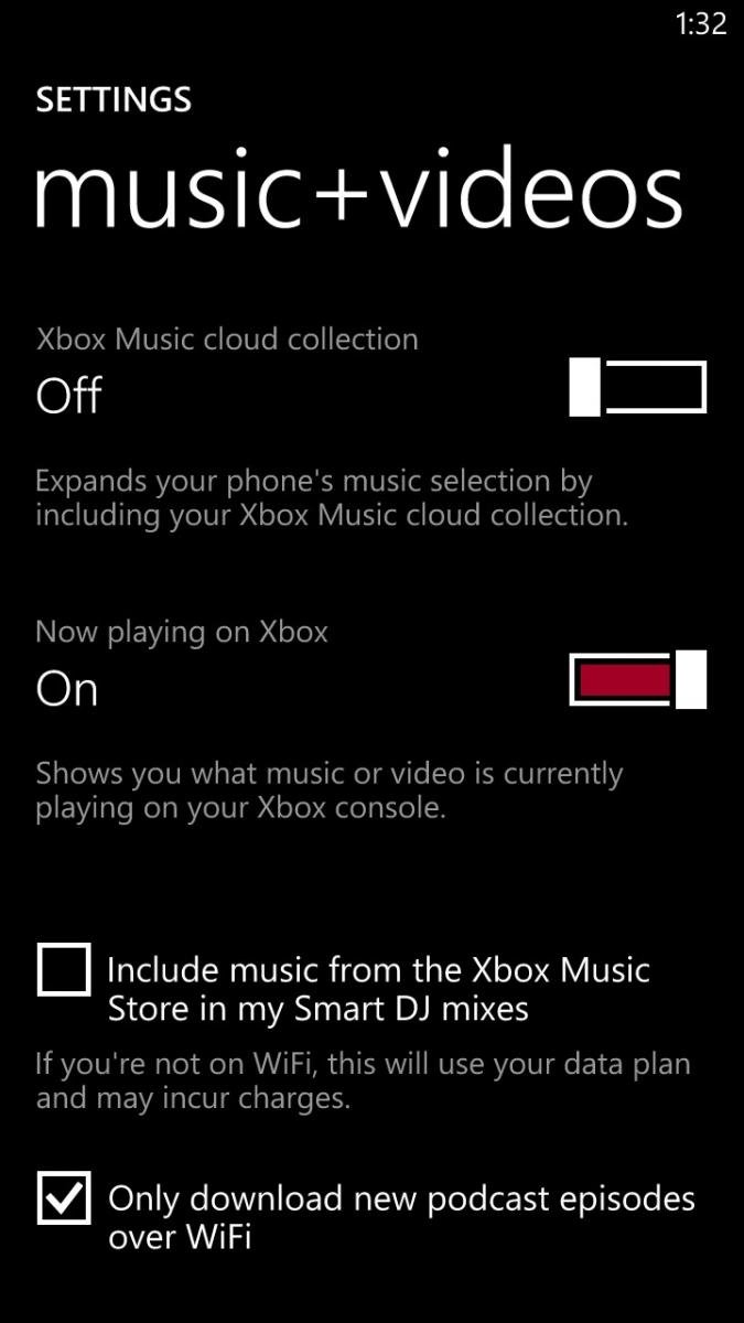
Xbox Music, which takes the reigns from Zune, brings many new features like Xbox Music Cloud sync. It works by having Xbox maintain your collection of purchased songs “in the cloud” and instantly syncing to your device (Windows 8 PC, tablet, Xbox 360 or Windows Phone 8). It’s just a list of songs with the ability to stream or download the media should you want off-line play. It’s neat, it’s hands off and it works quite well. If you don’t want to see your cloud collection, you just flick a switch and you will only see local media on your phone.
The Store maintains most of the same functionality but now features a new area with six Tiles. Those Tiles reflect Top Free, New + Rising, Top paid, Best Rated, Collections and Picks for you. It’s a great addition as it brings some personalization to the mix by giving you recommendations based on app reviews and previous downloads. It also allows you to tap into the Zeitgeist of “what’s hot” in Windows Phone by cutting through some of the less than stellar fare found in the Store.
Internet Explorer 10 is also not too shabby and although it feels and looks just like 9 in Windows Phone 7 the new iteration of the browser is on parity with Windows 8 and brings much better performance. Microsoft has also brought back the “Find on page” feature, which should make many people happy. We’re probably not giving Internet Explorer its proper due, as bringing that full browser experience with all of that raw performance is no trivial task. And with Windows Phone 8’s new hardware, performance in scrolling is exceptionally smooth with no lag in graphic drawing.
Windows Phone 8: Hardware
The flipside to all of the aforementioned software changes is the hardware. While Windows Phone 7 ran “okay” on a single core, Windows Phone 8 gets some serious speed increases with Qualcomm’s S4 chipset featuring dual-core 1.5GHz processor. In fact, Windows Phone 8 can support quad and even octa-core CPUs, which we’re sure we’ll see in 2013 and beyond.
From our tests with the HTC 8X, Windows Phone 8 is significantly faster for all tasks. Whether it is opening up an app or loading games, the changes at the kernel level have really allowed the new hardware to shine. Even previously sluggish apps on Windows Phone 7 devices run much better under the beefy WP8 gear.
Windows Phone 8 also brings higher resolution displays, including 1280x720 and 1280x763. Once again, while we didn’t have too many complaints with 800x480 from the Windows Phone 7 days, no one is going to deny that the OS looks much better at the higher resolution. Contact photos (especially on the People Hub Tile), text in IE10 and games all look much sharper to the eye and the OS just pops now.
Things like near-field communication (NFC), more sophisticated camera hardware e.g. PureView for Nokia and Beats Audio for HTC will bring new and innovative technology to WP8 devices, making sure that they not only keep up with the latest gizmos but also lead in being the first in some areas as well.
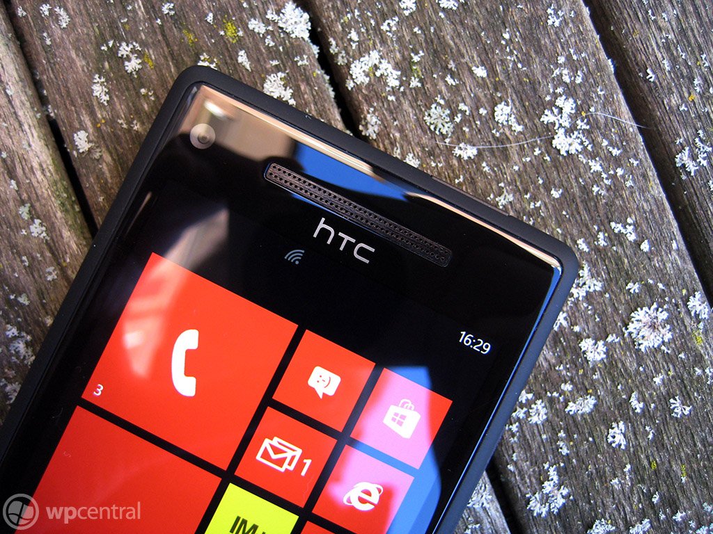
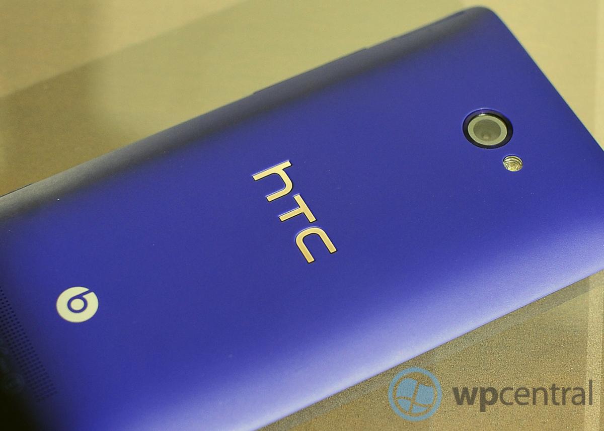
Our initial impression of the HTC 8X, touted as being the “signature” Windows Phone 8 experience is excellent. It’s amazingly fast for daily use, feels great in the hand and the audio fidelity for music and phone calls is top notch.
We’ll have more on that specific device in the future but for now you can read Alex Dobie’s excellent first-impressions right here. Suffice it to say, it’s a big leap in terms of performance and it does make a significant difference to the OS.
Windows Phone 8: The Take Away
Windows Phone 8 is a major step forward but it’s not the end of Microsoft’s tale, it's merely a re-beginning. Saying that is a bit humorous because Windows Phone 7 was also a restart for the software maker. But whereas Windows Phone 7 was a major break from Windows Mobile, Windows Phone 8 is a continuation. Evolution.
With the new NT kernel, the same as found in Windows 8, Microsoft can finally reach for the stars by allowing developers native access to bring Direct 3D games to the OS, allow new hardware onto the platform to stay ahead of the competition and to find a balance between the chaotic world of Android and the walled garden of Apple.
Some current users may still find some feature lacking e.g. that notification center, a color selector for Accents, static IP address, etc. But even there Microsoft may have a trick up their sleeve, as OS updates in theory should be easier. With Windows Phone 8, users can now update their device over-the-air (OTA) and we’re hoping that Microsoft can finally get those updates delivered to end users in a more direct fashion if carriers stand in the way. We say that only because we know Microsoft already has new features planned for future updates and whatever is missing today could be filled in within the next few months.
To the detractors out there, the only issue we still see as potential hurdle for the OS is the so-called “app gap”. This argument suggests that since Windows Phone “only” has 110,000 apps it is not position to compete with Android and iOS. That argument will never go away for some but it is becoming clear that such a fall back criticism is becoming less relevant everyday. That’s not to suggest that Windows Phone doesn’t have hurdles both in the market and with developers—it certainly does on both accounts. But we don’t see them as insurmountable.
For current Windows Phone users, Windows Phone 8 is a major step in the right direction. It continues to fill in gaps, expand functionality and create some new areas. The new hardware abilities make what was already a fast OS even more horsepower and you can feel it when doing everyday tasks. Combined with the new bold phones designed by HTC and Nokia, Windows Phone 8 has the best chance ever to succeed. Let’s see what happens.

Daniel Rubino is the Editor-in-Chief of Windows Central. He is also the head reviewer, podcast co-host, and lead analyst. He has been covering Microsoft since 2007, when this site was called WMExperts (and later Windows Phone Central). His interests include Windows, laptops, next-gen computing, and wearable tech. He has reviewed laptops for over 10 years and is particularly fond of Qualcomm processors, new form factors, and thin-and-light PCs. Before all this tech stuff, he worked on a Ph.D. in linguistics studying brain and syntax, performed polysomnographs in NYC, and was a motion-picture operator for 17 years.
