New images reveal an overhauled Store for Windows Phone 8.1, includes automatic app updates and more

The Windows Phone 8.1 core has been finished today, so it seems appropriate to take a look at an area that is need of some improvement: the Windows Phone Store.
The Windows Phone Store has been both a source of inspiration (e.g. trials), and tribulations (e.g. weak tools for reviews). Luckily for you, it looks like the Windows Phone team is delivering some user-requested features and parity with Windows 8.1. Hopefully these changes will deliver a more satisfying user experience.
The information comes to us from people familiar with the matter, and we have been able to verify that the information is accurate. Having said that, there may be some changes to the final design for the RTM release of Windows Phone 8.1.

NEW Store layout for apps in 8.1
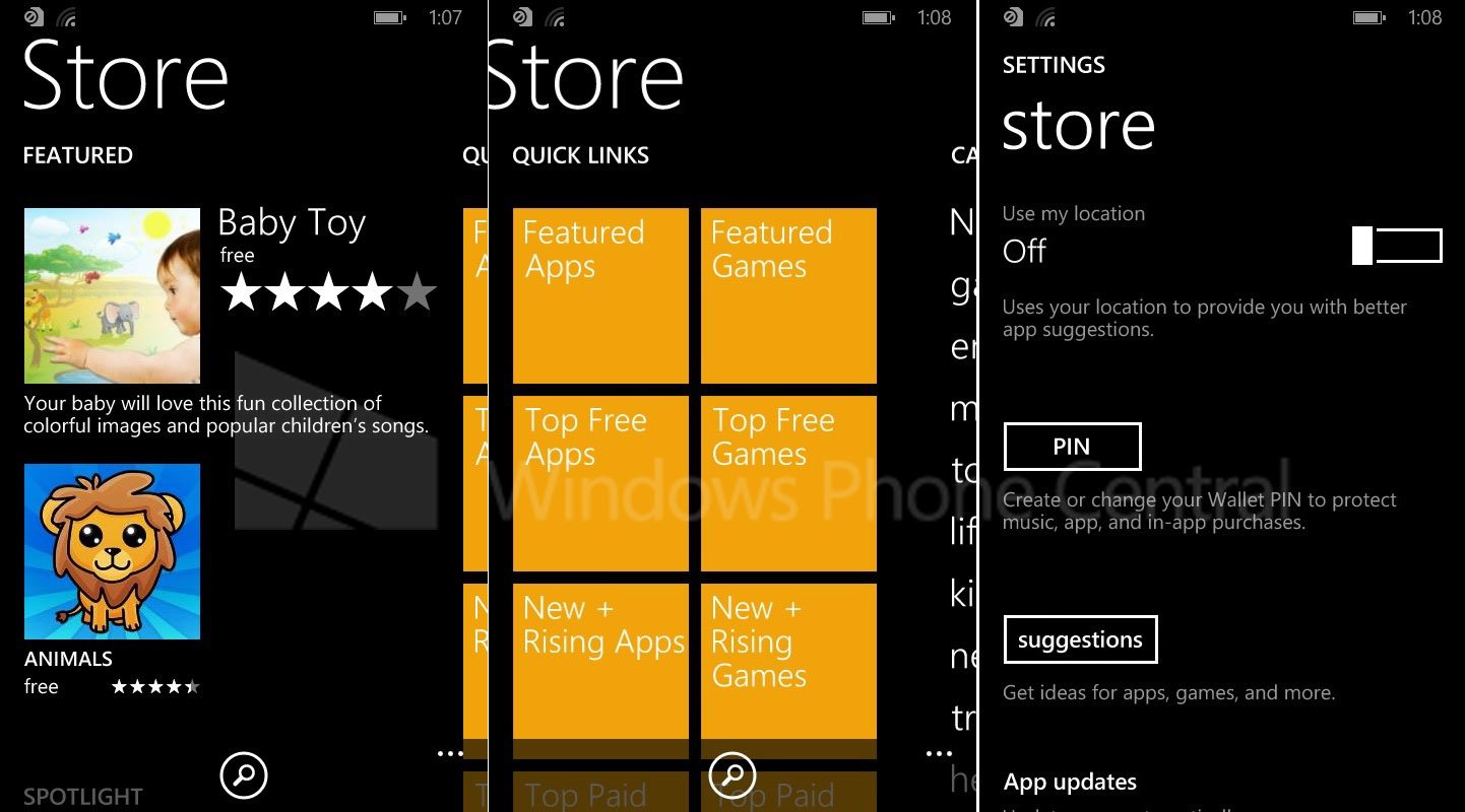
When it comes to graphic design, the Store has quite a few noticeable changes:
- ‘Store’ is now capitalized
- ‘Featured’ is now the first pane, with more than one app or game presented
- ‘Quick Links’ with featured apps, games, Top, New + Rising Apps, etc.
- ‘Categories’ section with general games, entertainment, lifestyle, etc.
- ‘Personalized’ for app recommendations based on your history, likes and interests with the ability to dispose of recommendations via a ‘not interested’ button
Overall, the new scheme looks to be tighter with a heavier focus on promoting fresher and higher profile applications. It also resembles the Store on Windows 8.1, which should be expected as Windows Phone and Windows 8 come closer together in their development.

OLD store layout for apps in 8.0
Get the Windows Central Newsletter
All the latest news, reviews, and guides for Windows and Xbox diehards.
Regarding new features, we’re told there will be quite a few that Windows Phone users have been clamoring for, including dedicated sections for:
- My apps – Checks for updates
- Downloads – See active downloads
- App Updates – Option for automatic updates; only over Wi-Fi
- Use my location – For better app suggestions

New Store design for 8.1, including Settings
When diving into an app or game listing, consumers will have various new additions to make the Store more potent:
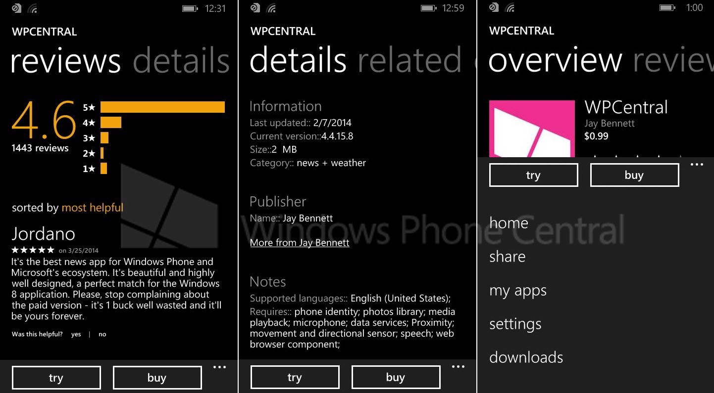
- New layout – overview, reviews, details, related (versus: details, reviews, screenshots, related)
- Menu (via ellipsis) – New shortcuts to Home, Share, My Apps, Settings, Downloads
- App screenshots merged below app description instead of own section
- Reviews – This section gets a graph of stars for reviews; ability to sort reviews by most helpful, most recent, highest rated or lowest rated; users can judge user reviews as helpful/unhelpful
- App details such as language, version number, last updated is now on a separate page
While the screenshots here are from a slightly older build of Windows Phone 8.1, they should convey these general changes that are expected in the final release. We’ll have to reserve final judgment until we get our hands on 8.1 in the coming weeks, but so far it looks like the Windows Phone team has taken pointers from Windows 8.1 and consumer feedback to build off of an already solid foundation.
The ability to automatically download app updates see app update history and a more logical organization of software should make the Store an even better experience going forward.
What do you folks think of the changes? Let us know in comments!

Daniel Rubino is the Editor-in-chief of Windows Central. He is also the head reviewer, podcast co-host, and analyst. He has been covering Microsoft since 2007 when this site was called WMExperts (and later Windows Phone Central). His interests include Windows, laptops, next-gen computing, and wearable tech. He has reviewed laptops for over 10 years and is particularly fond of 2-in-1 convertibles, Arm64 processors, new form factors, and thin-and-light PCs. Before all this tech stuff, he worked on a Ph.D. in linguistics, performed polysomnographs in NYC, and was a motion-picture operator for 17 years.
