Outlook.com snags dark mode as new design exits beta
Turn out the light.

All the latest news, reviews, and guides for Windows and Xbox diehards.
You are now subscribed
Your newsletter sign-up was successful
Join the club
Get full access to premium articles, exclusive features and a growing list of member rewards.
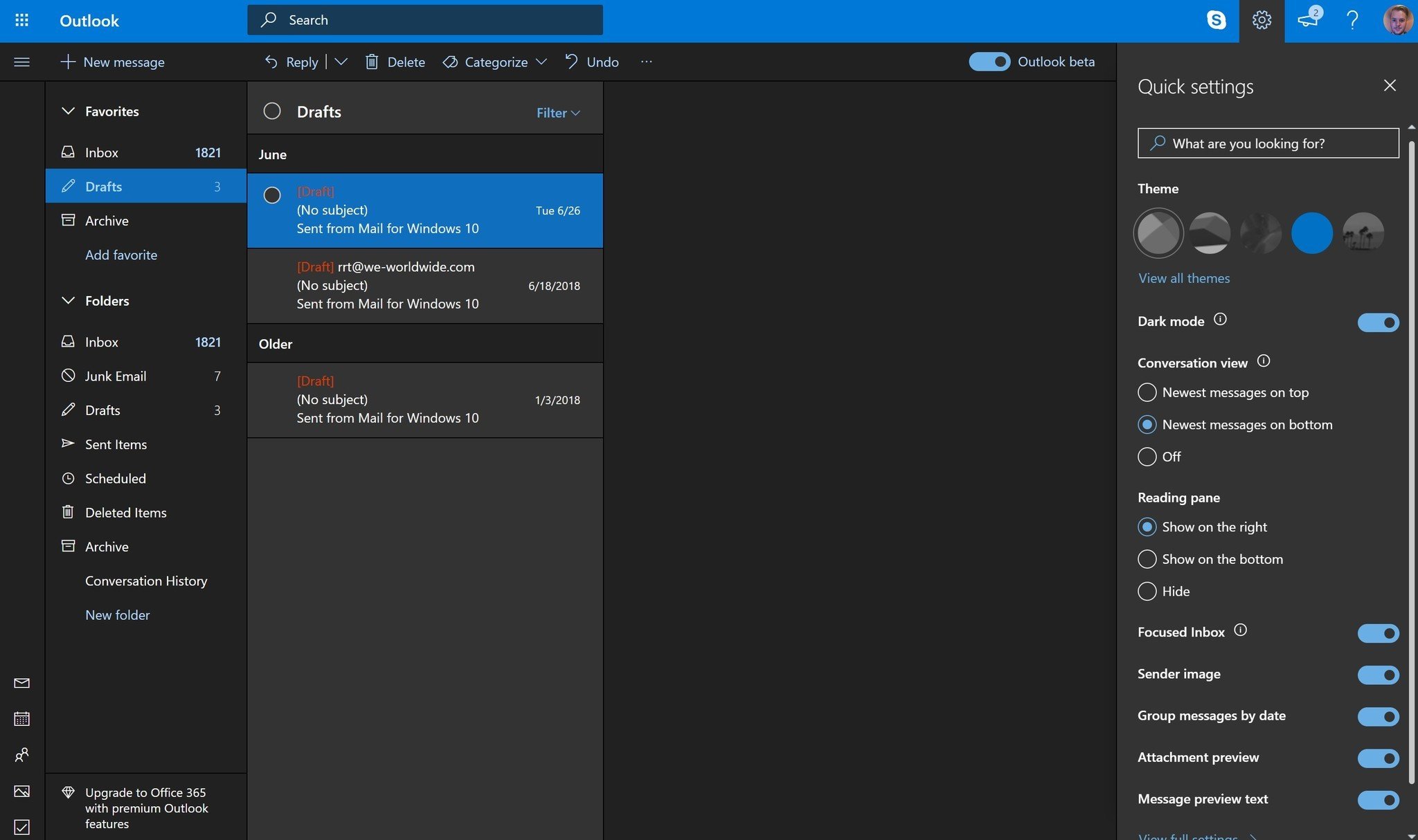
Not long after teasing its impending arrival earlier in July, Microsoft is now rolling out a dark mode to all Outlook.com users. Built off of the Halloween theme that Microsoft introduced last year, the new dark mode operates exactly as you'd expect, transforming Outlook.com's typically bright experience into a darker one with deep greys and blacks accented with blue and white text.
From Microsoft (via The Verge):
One of the most crucial principles we had when designing Dark Mode was to minimize the amount of eye strain that people felt. Many email clients on the web today advertise a dark mode, but we learned from interviews with others and our own usage that having the reading pane be on-light while the rest of the interface was left on-dark often made the experience worse than if the full screen were left on-light.
Dark mode can be toggled on through the quick settings pane with the flip of a switch. For now, the function only works with the default blue theme. However, Microsoft appears to have plans to make the dark experience compatible with more themes in the future.
Article continues belowFinally, in addition to the dark mode, Outlook's new design is now leaving beta. "Dark Mode is available on the new Outlook.com experience (formerly known as the Outlook.com Beta experience) only," Microsoft says. As of this writing, we're still seeing a beta toggle on Outlook.com, but that will presumably be removed soon.
All the latest news, reviews, and guides for Windows and Xbox diehards.

Dan Thorp-Lancaster is the former Editor-in-Chief of Windows Central. He began working with Windows Central, Android Central, and iMore as a news writer in 2014 and is obsessed with tech of all sorts. You can follow Dan on Twitter @DthorpL and Instagram @heyitsdtl.
 Join The Club


